
Wikipedia:Featured picture candidates/March-2009
| Featured picture tools |
|---|
Please cut and paste new entries to the bottom of this page, creating a new monthly archive (by closing date) when necessary.
Fluorite[edit]

- Reason
- An aesthetic and encyclopaedic combination of minerals.
- Articles this image appears in
- Fluorite
- Creator
- Noodle snacks
- Support as nominator --Noodle snacks (talk) 07:38, 23 February 2009 (UTC)
- Oppose I think the extra minerals are too distracting; an illustration of fluorite should be clear enough that a caption shouldn't be necessary to identify what is actually fluorite and what isn't. Also this isn't a particularly compelling specimen - this is far more striking. Finally the blur you applied (?) to the background doesn't really work for me aesthetically --Fir0002 10:06, 23 February 2009 (UTC)
- Oppose per Fir, also, Fluorite has a very characteristic cubic geometry, and this doesn't show that particularly well. de Bivort 21:55, 23 February 2009 (UTC)
- Actually, cubic geometry isn't always a characteristic of fluorite. "It is an isometric mineral with a cubic habit, though octahedral and more complex isometric forms are not uncommon". Noodle snacks (talk) 05:12, 24 February 2009 (UTC)
- Doesn't really exhibit those forms either. de Bivort 01:05, 28 February 2009 (UTC)
- Actually, cubic geometry isn't always a characteristic of fluorite. "It is an isometric mineral with a cubic habit, though octahedral and more complex isometric forms are not uncommon". Noodle snacks (talk) 05:12, 24 February 2009 (UTC)
- Oppose per Debivort. Based on this image, the cubic structure is essential. ~ ωαdεstεr16«talkstalk» 01:43, 24 February 2009 (UTC)
- Oppose per above. Sasata (talk) 08:26, 24 February 2009 (UTC)
Not promoted MER-C 02:41, 1 March 2009 (UTC)
Render of Balls[edit]

- Reason
- The image quality is high, the resolution is a good 1080p, and the picture adds significantly to the article by demonstrating the capabilities of V-Ray at raytracing. In addition, the picture is very aesthetically pleasing.
- Articles this image appears in
- Ray tracing (graphics); V-Ray
- Creator
- Mimigu
- Support as nominator --Mimigu (talk) 19:39, 22 February 2009 (UTC)
- Support Well executed, and quite encylopedic at the articles where it appears. Good job! DurovaCharge! 23:40, 22 February 2009 (UTC)
- Oppose. I see neither the claimed aesthetic value, nor how this illustrates V-Ray particularly well. I understand that there is a tradition of using balls to illustrate raytracing abilities, but curved surfaces can be used to make far more interesting compositions. Papa Lima Whiskey (talk) 00:44, 23 February 2009 (UTC)
- Oppose per above. Looks attractive, but the blurred effects and lighting is not the best for FP. ZooFari 02:08, 23 February 2009 (UTC)
- Support I like the way so many effects are demonstrated. I thought I was imagining a hexagonal aperture but that's labelled, so cool. I wish more of the image was in focus, but it's ok. Would prefer a slight crop off the left for balance (green ball is cut off, hence blue ball should be too). Stevage 02:21, 23 February 2009 (UTC)
- Comment I probably lowered the f-number too much, causing the DOF to be too shallow. I had intended it to have a rather shallow DOF so that the hexagonal aperture can be observed. Also, the blur quality is rather low (meaning that blurred edges are slightly grainy), but if I had increased the number of samples further it would take much longer to render... this picture, as it is, took around 2 hours to render on my Asus M50VM-B1 laptop, and I don't have a faster computer.Mimigu (talk) 02:55, 23 February 2009 (UTC)
- Well, we're in no rush. Unless you're worried about your laptop melting, why not increase the quality and render overnight? 2 hours is nothing in render terms. :) Stevage 06:32, 23 February 2009 (UTC)
Or give someone else the required files and instructions on how to render, then ask them to send back the finished product, if they have a faster PC. I can do it on my desktop (Core2Duo E6750, 2GB DDR2 PC6400, BFG/NVIDIA GeForce 8800GTS 320MB) if you like, doubtless somebody around here has a much more powerful machine, mine's over a year old.—Vanderdecken∴ ∫ξφ 11:12, 23 February 2009 (UTC)- If you don't have V-Ray license, that will set you back 250 USD, and that's just the educational discounted version, otherwise you're looking at a grand. Hopefully you wouldn't have to buy Rhino on top of that... Papa Lima Whiskey (talk) 18:29, 23 February 2009 (UTC)
- Ah... I had assumed that V-Ray or an equivalent was freely licensed... d'oh. —Vanderdecken∴ ∫ξφ 12:14, 24 February 2009 (UTC)
- If you don't have V-Ray license, that will set you back 250 USD, and that's just the educational discounted version, otherwise you're looking at a grand. Hopefully you wouldn't have to buy Rhino on top of that... Papa Lima Whiskey (talk) 18:29, 23 February 2009 (UTC)
- Perhaps I will re-render the picture again with higher settings (and possibly resolution, and I will reposition the camera so that the blue ball on the left is equally as cut off as the green ball on the right, or something like that. But not this week... I have exams. Mimigu (talk) 03:57, 24 February 2009 (UTC)
- Well, we're in no rush. Unless you're worried about your laptop melting, why not increase the quality and render overnight? 2 hours is nothing in render terms. :) Stevage 06:32, 23 February 2009 (UTC)
- Oppose. Not an interesting picture. Sorry, but I don't think it would be possible to make a more clichéd 3D rendering than colored spheres on a flat surface. How about a fire-breathing dragon or something? Kaldari (talk) 17:26, 23 February 2009 (UTC)
- Comment A fire-breathing dragon may not show the features of 3D raytracing as clearly, because surely the focus of a picture of a fire-breathing dragon would be the fire effects and the surface of the dragon (e.g. scales). Fire is not generated using raytracing (and is in fact in some cases applied after the model has rendered), and the surface of the dragon would better exemplify techniques such as texture mapping rather than stuff like fresnel reflections... whoever looks at a fire-breathing dragon to notice subtle reflections on its scales? Moreover, a picture of a fire-breathing dragon probably cannot effectively demonstrate the depth of field in the rendered scene (We do want the whole dragon to be in focus), not to mention the shape of the aperture. As such, the fire-breathing dragon would fail to demonstrate the features of raytracing which I had intended to demonstrate with this picture. Spheres, on the other hand, though not necessarily as thrilling to observe, demonstrate, among other features, depth of field and fresnel reflections better than a picture of a fire-breathing dragon would. Thus the picture of spheres may be considered more encyclopedic, in my opinion, as it is more informative than merely entertaining. Also of note is that the spheres do not rest on a "flat surface" as you termed it. Each tile on the tiled floor is in fact slightly convex, with filleted edges. Mimigu (talk) 03:57, 24 February 2009 (UTC)
- I think you took my criticism a bit too literally :) How about a vase of flowers, if you want a realistic example of a scene that could be both interesting and demonstrate numerous 3D rendering effects. Kaldari (talk) 19:47, 26 February 2009 (UTC)
- Also, what's the deal with the weird doubling effect going on in the floor reflection? Is that a rendering bug? Kaldari (talk) 19:49, 26 February 2009 (UTC)
- Each tile on the floor is convex, so it reflects like a curved mirror. Mimigu (talk) 01:47, 27 February 2009 (UTC)
- Also, what's the deal with the weird doubling effect going on in the floor reflection? Is that a rendering bug? Kaldari (talk) 19:49, 26 February 2009 (UTC)
- I think you took my criticism a bit too literally :) How about a vase of flowers, if you want a realistic example of a scene that could be both interesting and demonstrate numerous 3D rendering effects. Kaldari (talk) 19:47, 26 February 2009 (UTC)
- Comment A fire-breathing dragon may not show the features of 3D raytracing as clearly, because surely the focus of a picture of a fire-breathing dragon would be the fire effects and the surface of the dragon (e.g. scales). Fire is not generated using raytracing (and is in fact in some cases applied after the model has rendered), and the surface of the dragon would better exemplify techniques such as texture mapping rather than stuff like fresnel reflections... whoever looks at a fire-breathing dragon to notice subtle reflections on its scales? Moreover, a picture of a fire-breathing dragon probably cannot effectively demonstrate the depth of field in the rendered scene (We do want the whole dragon to be in focus), not to mention the shape of the aperture. As such, the fire-breathing dragon would fail to demonstrate the features of raytracing which I had intended to demonstrate with this picture. Spheres, on the other hand, though not necessarily as thrilling to observe, demonstrate, among other features, depth of field and fresnel reflections better than a picture of a fire-breathing dragon would. Thus the picture of spheres may be considered more encyclopedic, in my opinion, as it is more informative than merely entertaining. Also of note is that the spheres do not rest on a "flat surface" as you termed it. Each tile on the tiled floor is in fact slightly convex, with filleted edges. Mimigu (talk) 03:57, 24 February 2009 (UTC)
- Oppose Drawing a surface and spheres is very simple, even if the rendering took hours. I don't think it shows any optical effect simulated by ray tracing except reflection. Noodle snacks (talk) 05:22, 24 February 2009 (UTC)
- Look closer. The depth of field effects are obvious. The blue-purple ball left of centre, foreground shows the hexagonal aperture. There's two. Stevage 06:07, 24 February 2009 (UTC)
Not promoted MER-C 02:41, 1 March 2009 (UTC)
Solar glory at the steam from hot spring[edit]


- Reason
- A good quality, interesting image that adds value to the articles it is used in
- Articles this image appears in
- Glory (optical phenomenon);Refraction;Diffraction
- Creator
- Mbz1
- Support as nominator --Mbz1 (talk) 04:03, 22 February 2009 (UTC)
- Reluctant oppose photographer's shadow in frame. Otherwise a fine shot. DurovaCharge! 23:42, 22 February 2009 (UTC)
- Difficult to photograph this effect otherwise (not saying it isn't possible, but most photographs of this phenomenon *do* have the shadow of the photographer in them). Papa Lima Whiskey (talk) 00:46, 23 February 2009 (UTC)
- Isn't the name given *because* it's around the head of the shadow? Shoemaker's Holiday (talk) 07:22, 25 February 2009 (UTC)
- Difficult to photograph this effect otherwise (not saying it isn't possible, but most photographs of this phenomenon *do* have the shadow of the photographer in them). Papa Lima Whiskey (talk) 00:46, 23 February 2009 (UTC)
- Oppose All these light effects like glories, sun dogs and the like leave me cold, I'm afraid. It's probably a good photo of a difficult-to-photograph phenomenon, but it's not very attractive. And the vast majority of the photo is trees, sky, dirt and smoke. Stevage 02:24, 23 February 2009 (UTC)
- Oppose While this picture does significantly contribute to the article, the image quality is mediocre: In the background, there is considerable chromatic aberration and blurriness. Also, the position of the solar glory is rather awkward; usually the most important object should be in the center of the picture, but in the two photos the solar glories appear slightly to the side and nearer to the bottom of the photo. Whilst I am certain that such phenomena are hard to capture in photos, the FP criteria does not take into account the "level of difficulty in taking the photo" when addressing image quality. Mimigu (talk) 03:15, 23 February 2009 (UTC)
- That's not strictly correct, perhaps it's not formerly defined in the criteria but it's commonly accepted that the difficulty of taking a photo is a factor. For example a building shot must be extremely well taken because a building is quite permanent and hence easy to revisit and reshoot. --Fir0002 10:04, 23 February 2009 (UTC)
- Oppose
The shadow's too much for me (in spite of the apparent difficulty of doing this shot otherwise). Sorry Sasata (talk) 06:27, 23 February 2009 (UTC)Per Mimigu. Sasata (talk) 07:32, 23 February 2009 (UTC) - Comment. Um, have people bothered to read about what this is meant to be showing? Wouldn't it be more like impossible to do this shot without the shadow? To quote the first line of the article "A glory is an optical phenomenon appearing much like an iconic Saint's halo about the head of the observer", and from further down in the article "The colorful halo always surrounds the observer's own shadow" (emphasis added). Can't exactly get a halo around the shadow if there's no shadow there. I'm just saying... --jjron (talk) 07:00, 23 February 2009 (UTC)
- Good point, didn't read the article. Sasata (talk) 07:32, 23 February 2009 (UTC)
- Thank you all very much for the votes and for comments. Special thanks to Jiron for taking the time to do my job and explain what is going on with the image and my shadow. Glory is an interesting phenomenon. Let's say two people are staying next to each other.Each of them will still be able to see a shodow of the other, but each of them will see the glory only around his own shadow. If one sees a glory around his head, he could be thinking that he's is very special. Not so fast. As you could see from this image File:Solar glory at hot springs moves after the camera.jpg I made an experiment and took the camera off my face. The glory on the picture moved to my camera shadow, but while my camera was taking an image of the glory around itself, I still saw the glory only around my head. Glories are more or less common from the air. It is quite rare to see a glory not from a plane. Yellowstone with its hot spring is the right place to try. I'm sure that 99.99% of the park visitors miss it because they do not know how and where to look for this. That's why I thought that it might be interesting to make FP from this image and to make more people learn about glories. Anyway... Thank you all again for the interest in the images.--Mbz1 (talk) 14:56, 23 February 2009 (UTC)
- Just to nitpick, the phenomenon must appear around the *observer's* shadow, but with creativity, that could be more interesting than merely the photographer's silhouette. If the photographer was standing in front of a statue, for instance... Stevage 00:08, 24 February 2009 (UTC)
- If a photographer was standing in front of a statue, the glory would not be seen. The only way to see a glory is to see your own shadow. The shadow of a statue will close your own shadow and the glory with it.--Mbz1 (talk) 00:25, 24 February 2009 (UTC)
- Just to nitpick, the phenomenon must appear around the *observer's* shadow, but with creativity, that could be more interesting than merely the photographer's silhouette. If the photographer was standing in front of a statue, for instance... Stevage 00:08, 24 February 2009 (UTC)
- Thank you all very much for the votes and for comments. Special thanks to Jiron for taking the time to do my job and explain what is going on with the image and my shadow. Glory is an interesting phenomenon. Let's say two people are staying next to each other.Each of them will still be able to see a shodow of the other, but each of them will see the glory only around his own shadow. If one sees a glory around his head, he could be thinking that he's is very special. Not so fast. As you could see from this image File:Solar glory at hot springs moves after the camera.jpg I made an experiment and took the camera off my face. The glory on the picture moved to my camera shadow, but while my camera was taking an image of the glory around itself, I still saw the glory only around my head. Glories are more or less common from the air. It is quite rare to see a glory not from a plane. Yellowstone with its hot spring is the right place to try. I'm sure that 99.99% of the park visitors miss it because they do not know how and where to look for this. That's why I thought that it might be interesting to make FP from this image and to make more people learn about glories. Anyway... Thank you all again for the interest in the images.--Mbz1 (talk) 14:56, 23 February 2009 (UTC)
- Note:When adding another image to a nomination page, it is best to place the wikicode for the image directly below the first image. This avoids creating whitespace in the page. See my change here and the difference before and after. Raven4x4x (talk) 23:09, 23 February 2009 (UTC)
- Thank you.--Mbz1 (talk) 00:25, 24 February 2009 (UTC)
- Oppose - per Stevage and mimigu. They have some very strong points. Sorry - Fastily (talk) 05:42, 25 February 2009 (UTC)
Not promoted MER-C 02:40, 1 March 2009 (UTC)
Champs Élysées[edit]

- Reason
- Very high image quality, high resolution, and the artistic use of long exposure time.
- Articles this image appears in
- Champs-Élysées
- Creator
- Benh LIEU SONG
- Support as nominator --Mimigu (talk) 01:28, 22 February 2009 (UTC)
- Wai Hong (talk) 11:15, 22 February 2009 (UTC)
- Oppose I find the people extremely distracting. Also, I don't think this has exceptional EV. Makeemlighter (talk) 01:53, 23 February 2009 (UTC)
- Weak oppose To me, the ghostly apparitions made this pic some kind of surreal art—which looks cool—but distract from the EV. Admittedly, it would be difficult to get everyone to step out of the way while you took a pic! Sasata (talk) 06:35, 23 February 2009 (UTC)
- Weak oppose - with such a long exposure, it's sort of neither day nor night. The focus of this image is the footpath which is...not very interesting. Also not fond of the ghosts. Stevage 06:35, 23 February 2009 (UTC)
- Oppose. Very sharp and detailed as are all of Benh's panoramas, but I'm not convinced about the exposure. As Stevage says, it is a sort of a wishywashy twilight image, lacking in contrast. It is an interesting view and good for the article, but not a stand out FP in my opinion. Diliff | (Talk) (Contribs) 13:39, 23 February 2009 (UTC)
- Oppose. Overexposed. Kaldari (talk) 17:31, 23 February 2009 (UTC)
- Support: I don't find the ghosts distracting. I think this really shows off Champs-Élysées; I have trouble imagining that another picture could do it much better. The amount captured here is great; plenty of scope. This place has obviously been lit to be glorious at night, which this photo captures. It's always going to be busy, in fact it would be ghostly if it wasn't, and the people present and there in ghost are evidence of that, and yet there aren't so many that you lose the street scene. I imagine that, in daylight, this would all look rather ordinary. Maedin\talk 18:02, 27 February 2009 (UTC)
Not promoted MER-C 02:40, 1 March 2009 (UTC)
Ty Cobb[edit]

- Reason
- Photographically a wonderful capture for 1924, and in terms of encyclopedic value North American reviewers probably need no explanation. Ty Cobb was one of the greatest baseball players of all time, with one of its worst personalities. Still a household name among fans of the game more than 80 years after his retirement. Restored version of File:Ty Cobb sliding.jpg.
- Articles this image appears in
- Ty Cobb
- Creator
- National Photo Service
- Support as nominator --DurovaCharge! 08:08, 21 February 2009 (UTC)
- Conditional Support - once the caption includes a translation. —Vanderdecken∴ ∫ξφ 11:16, 21 February 2009 (UTC)
- I hope the wikilinks help? Cobb's foot must make contact with the padded object before the other player can catch the ball and touch him. So he drops in the final moment and slides to base while avoiding the other player. The ball is still in the air and the other player's foot is off the base, so Cobb is safe. The context of a triple means he is completing one of the game's more difficult plays. (Hope that's sufficient translation?--the game is ubiquitous in my part of the world and this is the first time I've attempted to explain sliding to third base to an adult). DurovaCharge! 16:59, 21 February 2009 (UTC)
- Weak Oppose Setting aside resolution this is the least compelling image in the article. Yes the high res is nice but it doesn't mitigate the fundamental deficiencies of this photo. Out of interest why is the stadium virtually empty? --Fir0002 12:06, 21 February 2009 (UTC)
- Possibly because this occurred during practice? I found a few shots of him with full stadiums, but none of the captures were nearly as good. The precise timing that's become commonplace in recent decades--ball in the air--was rare in professional sports photography in the first quarter of the twentieth century. DurovaCharge! 16:59, 21 February 2009 (UTC)
- Since the bleachers are the only part of the stadium shown, it is possible that it is just the beachers are empty (or nearly so). The bleachers would not necessarily have needed to be used if the attendance was such that all the patrons could fit in the other seats. I know that some teams closed down the bleachers at times when attendance did not require their use, but I can't speak for certain about this particular instance. Rlendog (talk) 20:39, 21 February 2009 (UTC)
- Possibly because this occurred during practice? I found a few shots of him with full stadiums, but none of the captures were nearly as good. The precise timing that's become commonplace in recent decades--ball in the air--was rare in professional sports photography in the first quarter of the twentieth century. DurovaCharge! 16:59, 21 February 2009 (UTC)
- Regretful Oppose I really wish we had more photos like this. Unfortunately, I think neither the quality nor the EV is high enough to feature this. Makeemlighter (talk) 03:40, 23 February 2009 (UTC)
- Oppose per Makeemlighter. Sasata (talk) 06:39, 23 February 2009 (UTC)
Not promoted MER-C 02:40, 1 March 2009 (UTC)
Air conditioning unit[edit]

- Reason
- The image has a good compromise of simplicity and detail. I feel that it explains the subject pretty well.
- Articles this image appears in
- Air conditioning
- Creator
- Pbroks13
- Support as nominator ----Pbroks13talk? 19:40, 22 February 2009 (UTC)
Oppose No source, and no explanation of what is 'typical'. And the image description page has ~0 info on what the labels mean (nor is it nearby in the article) or what the parts do.Narayanese (talk) 21:38, 22 February 2009 (UTC)Oppose for now Would reconsider with sourcing.DurovaCharge! 23:41, 22 February 2009 (UTC)Conditionalsupport. Please include page numbers. Otherwise fine. DurovaCharge! 07:30, 23 February 2009 (UTC) Done --Pbroks13talk? 08:43, 23 February 2009 (UTC)
- Thank you. :) DurovaCharge! 17:13, 23 February 2009 (UTC)
- Comment The image now has a source and a detailed description. --Pbroks13talk? 06:49, 23 February 2009 (UTC)
- Comment This is a clear and colorful diagram, but the evaporator section is wrong. A centrifugal fan does not work the way you have drawn. The air doesn't go in the side of the unit, but goes through a big grill in the front. The air is drawn through a filter and over the coil (which cools it) and into the "eye" of the blower, where it is then flung out to the side. Now the air is going perpendicular to its original direction, so it makes a 90 degree turn and is directed out a second vent in the front of the unit. If you look at pictures you will clearly see the inlet and outlet vents in the front. The filter makes the inlet grill look kind of opaque, like with this one.
- To fix it, you can:
- - Take the bottom blue arrow in the front, reverse its direction, make it red until it gets to the coil, and move it up until it's pointed into the center of the fan blower. Label it indoor air.
- - The blue arrow on top can stay where it is, but it should be all blue. This is the cooled air.
- - The big red arrow on the bottom can be deleted, as it just doesn't work like that.
- The condenser section looks ok to me. HowStuffWorks has a diagram here showing how the air does a U-turn in the evaporator side. Hope that helps. Fletcher (talk) 23:33, 26 February 2009 (UTC)
Not promoted without prejudice against rerunning it later, once issues are dealt with. --Shoemaker's Holiday (talk) 04:40, 2 March 2009 (UTC)
Sarus Crane[edit]

- Reason
- High technical standards, high resolution, beautiful composition, adds EV to several articles; FP on wiki Commons
- Articles this image appears in
- Sarus Crane, List of birds of Western Australia, List of birds of India, Phnom Srok District
- Creator
- Luc Viatour
- Support as nominator --Sasata (talk) 06:19, 23 February 2009 (UTC)
- Alright, I'll say something, since nobody else seems to want to bite. It's cut off. Yes, we all knew these words were coming, so I might as well get them out of the way. Photographically, it's good, as expected of the contributor, but not perfect - I'm sure the photographer would readily admit that the angle between the bird and the sun wasn't ideal - we're spreading the contrast rather thinly between light and dark, just as we're straddling between a full-body and head-only portrait here in a void filled but with trenches. I'm not even going to download this to confirm that the bright patch on the neck is burnt out - contrast issues, like I said. I'm sure it could be argued that this composition is better than a whole-body shot because the patterning of the neck and head provide the species ID. However, the detail of the collar tuft is what's suffered most from the lighting of the moment, and I find myself yearning for more detail of this intriguing feature, as well as some independent confirmation that this is a typical specimen - the wild specimens in the gallery of the same article look different enough for me to raise this issue. Finally, this is highly likely a zoo shot, giving not only a little push to my tendency to oppose, but also making a reshoot a much more plausible possibility for the future. Mostly oppose. Papa Lima Whiskey (talk) 03:26, 25 February 2009 (UTC)
- Weak oppose as per Papa Lima Whiskey, if the lighting was right I'd change to weak support.Terri G (talk) 13:31, 25 February 2009 (UTC)
Not promoted --Shoemaker's Holiday (talk) 04:42, 2 March 2009 (UTC)
Tibetan Quartz[edit]

- Reason
- A specimen with large clear crystals. I find the rainbow spectra produced by the point source back lighting interesting.
- Articles this image appears in
- Quartz, Mineral
- Creator
- Noodle snacks
- Support as nominator --Noodle snacks (talk) 07:33, 23 February 2009 (UTC)
- Support per nom. Good illustration of the crystalline structure. DurovaCharge! 07:40, 23 February 2009 (UTC)
- Support Good shot --Fir0002 10:05, 23 February 2009 (UTC)
- Support Very good illustration of the quartz. ErikTheBikeMan (talk) 20:09, 23 February 2009 (UTC)
- Support per above. Nicely done. ~ ωαdεstεr16«talkstalk» 20:41, 23 February 2009 (UTC)
- Support Crystal-clear resolution. Sasata (talk) 08:28, 24 February 2009 (UTC)
- Support per above. Staryash (talk) 00:40, 27 February 2009 (UTC)
- Support - Absolutely wonderful clarity, good EV. — neuro(talk)
Promoted Image:Quartz, Tibet.jpg --Shoemaker's Holiday (talk) 04:45, 2 March 2009 (UTC)
Jimmy Carter and Anwar Sadat[edit]

- Reason
- One of the most significant accomplishments of Jimmy Carter's term as President of the United States was the Camp David Accords between Israel and Egypt, which had several effects including Israeli withdrawal from the Sinai Peninsula and the eventual assassination of Egyptian President Anwar Sadat. Here Carter greets Sadat at the White House shortly after the Camp David Accords went into effect. Sadat was killed the following year. Restored version of File:Carter and Sadat White House.jpg.
- Articles this image appears in
- Presidency of Jimmy Carter, Camp_David_Accords#Consequences
- Creator
- Warren K. Leffler or Marion S. Trikosko
- Support as nominator --DurovaCharge! 07:19, 23 February 2009 (UTC)
- Support Another great photo. Sasata (talk) 07:25, 23 February 2009 (UTC)
- Weak Support Main weakness is that Anwar Sadat's face can't really be seen. It isn't a major issue since it isn't in an Anwar Sadat article however. Noodle snacks (talk) 07:47, 23 February 2009 (UTC)
- Found another shot of Sadat and Menachem Begin shoulder to shoulder smiling to a crowd when the accord was signed. Perhaps adding that to make the nomination a set? DurovaCharge! 08:00, 23 February 2009 (UTC)
- Is File:Camp David, Menachem Begin, Anwar Sadat, 1978.jpg it? I am leaning towards oppose as colour shots are available. Noodle snacks (talk) 08:43, 23 February 2009 (UTC)
- File:Sadat and Begin1.jpg (cropped but not restored yet). Does the mere existence of low-res color change your review that much? DurovaCharge! 10:36, 23 February 2009 (UTC)
- Depends on if a high resolution colour image is likely to be available. Noodle snacks (talk) 05:19, 24 February 2009 (UTC)
- What's surprising is that in the mid-eighties when I started doing serious photography, most of the serious amateurs and pros preferred black and white. They were doing their own black and white developing, and color photography was considered lightweight stuff unless you paid a very pretty penny for premium developing (and even then you gave up control over the outcome). DurovaCharge! 05:55, 24 February 2009 (UTC)
- Depends on if a high resolution colour image is likely to be available. Noodle snacks (talk) 05:19, 24 February 2009 (UTC)
- File:Sadat and Begin1.jpg (cropped but not restored yet). Does the mere existence of low-res color change your review that much? DurovaCharge! 10:36, 23 February 2009 (UTC)
- Is File:Camp David, Menachem Begin, Anwar Sadat, 1978.jpg it? I am leaning towards oppose as colour shots are available. Noodle snacks (talk) 08:43, 23 February 2009 (UTC)
- Found another shot of Sadat and Menachem Begin shoulder to shoulder smiling to a crowd when the accord was signed. Perhaps adding that to make the nomination a set? DurovaCharge! 08:00, 23 February 2009 (UTC)
- Support. Good quality, attractive, and decent EV for what it illustrates. Mostlyharmless (talk) 01:19, 28 February 2009 (UTC)
Promoted Image:Carter and Sadat White House2.jpg --Shoemaker's Holiday (talk) 05:26, 2 March 2009 (UTC)
First silk parachute[edit]

- Reason
- A schematic for the first successful human descent by a frameless silk parachute. A bit similar to a current featured picture; this version has more than 10 times the resolution and illustrates both before and after deployment. Restored version of Image:First parachute.jpg.
- Articles this image appears in
- André-Jacques Garnerin, Parc Monceau, parachute
- Creator
- Unknown artist; comes from the Tissandier collection at the Library of Congress
- Support as nominator --DurovaCharge! 22:02, 19 February 2009 (UTC)
- Comment. The caption at the bottom presumably describes the three figures, but is in French. It should be translated into English on the image page as a matter of course, and because it's not entirely clear what each image is showing. I for one aren't too clear on the middle image for starters, as it looks quite different to the modern use of a parachute, it's not explained on the image page, and doesn't seem to be explained anywhere in the article/s. The articles suggest he jumped out of a balloon, by which I'd assume the basket, but this looks like the parachute was in some way cut loose or separated from a free floating balloon while he remained in the basket, which is clearly not the same as jumping from a balloon. Hmm, something needs fixing... --jjron (talk) 14:27, 20 February 2009 (UTC)
- Translation F1 Parachute canopy. F2 Parachute folded at take-off. F3 Parachute deployed at separation from balloon. (Could probably be improved...) Stevage 10:11, 22 February 2009 (UTC)
- Thanks - needs to be added to the image page though, unless someone comes up with an improved version. Probably confirms what I thought I was seeing, but as I said above it doesn't gel with the mentions of this event in the articles, as he's not 'jumping' from the balloon. --jjron (talk) 13:15, 22 February 2009 (UTC)
- I'll have a look at the article text and seek additional sourcing. Did about 350 miles of driving yesterday (500km) so have been pretty busy off-wiki. Thanks for your help, Stevage, and for your patience, Jjron. DurovaCharge! 23:52, 22 February 2009 (UTC)
- My reading of the caption is that the parachute was attached to the bottom of a balloon, then released. Stevage 02:12, 23 February 2009 (UTC)
- I've found three sources that support this depiction as correct, and expanded the article citing the most detailed of the three. Also added English translation of the French captions to the image hosting page. DurovaCharge! 01:36, 24 February 2009 (UTC)
- Thanks - needs to be added to the image page though, unless someone comes up with an improved version. Probably confirms what I thought I was seeing, but as I said above it doesn't gel with the mentions of this event in the articles, as he's not 'jumping' from the balloon. --jjron (talk) 13:15, 22 February 2009 (UTC)
- Translation F1 Parachute canopy. F2 Parachute folded at take-off. F3 Parachute deployed at separation from balloon. (Could probably be improved...) Stevage 10:11, 22 February 2009 (UTC)
- Support very good historical illistration, my reading of the image is the first view is from above, second is the ascending configuration and the third is the decending configuration. Gnangarra 04:27, 23 February 2009 (UTC)
- Support Good restoration of picture with good EV.Terri G (talk) 13:25, 25 February 2009 (UTC)
- Support: Nicely restored, interesting with EV. Maedin\talk 20:28, 27 February 2009 (UTC)
Promoted Image:First parachute2.jpg --Shoemaker's Holiday (talk) 05:27, 2 March 2009 (UTC)
Mars' Surface - Victoria Crater - colour adjusted image[edit]

- Reason
- It is high quality, high resolution and provides an accurate photo of mars
- Articles this image appears in
- Mars
- Creator
- Scottcabal using a NASA public image
- Support as nominator --Scottcabal (talk) 17:35, 25 February 2009 (UTC)
- It's already featured. Do you want to replace? I'm not at all convinced yours is more correct since skies on Mars are meant to be red due to suspended dust, the producers are the guys who made and run the camera, the Viking blue skies were due to incorrect calibration, yours looks a lot like the false color version and HiRISE is not true color but near IR + red + cyan. MER-C 12:04, 26 February 2009 (UTC)
- if it was incorrectly calibrated can you explain why the ground pics with a dark red sky have a significantly different colour to the ones from above the ground? the sky should be a misty white/blue rather than just blue or dark red which is what i've tried to show in this pic, as well as showing the ground colour to be correct - just look on the page about the Victoria Crater on here... the ground in the pic I uploaded, and the aerial pic of the crater match. I guess If you were physically there it could appear slightly darker than I have shown due to the distance of the sun, but the colouration would be the same. Scottcabal (talk) 14:47, 26 February 2009 (UTC)
- As I said above, the aerial pics are not true color while the ground ones are. MER-C 00:23, 27 February 2009 (UTC)
- Oh, and the image no longer appears in any articles. Speedy close. (I feel a little too involved to nuke this myself). MER-C 00:36, 27 February 2009 (UTC)
- As I said above, the aerial pics are not true color while the ground ones are. MER-C 00:23, 27 February 2009 (UTC)
- Comment. I think there is potential for improvement in the featured image. They should have calibrated these values before putting them on the guns. Once again, we have an example of a histogram with huge amounts of dead space, and I can actually get a version very close to Scottcabal's by executing an auto-WB command. If we're going to feature an image of Mars that isn't true colour, we might as well use the full dynamic range we have available in our output medium. At the very least, the contrast should be stretched. Oppose speedy at this point. Papa Lima Whiskey (talk) 04:36, 27 February 2009 (UTC)
- But they already have. If you want to have a fling, here's some calibration images, which you'll need to combine in such a way to produce something like this (some more info). MER-C 12:19, 27 February 2009 (UTC)
- Color channels can be edited independently in GIMP without taking the image apart first, using curves for instance, or using the Color->Decompose/Recompose mechanism (which automatically creates the layers you're referring to). As it stands, the image seems very poorly calibrated since there's dead space both in the value view (i.e. all three "channels" have *some* dead space) as well as the blue gun specifically. Even if the blue gun were to carry a blue wavelength channel, and blue light were underrepresented on Mars, I'm not sure that's an excuse to consign the blue gun to being only 2/3 used, rather than compromising on the final image not having the correct hues as the human brain would reconstruct them (were a human observer actually present on Mars, without a color-filtering visor), but in return giving the user a contrast-rich image. Papa Lima Whiskey (talk) 16:55, 27 February 2009 (UTC)
- Oppose - Upon close inspection this image is fairly drab. Not worthy of FP. Why is 'color-accurate' better than an adjusted histogram image? Teque5 (talk) 04:52, 1 March 2009 (UTC)
- Comment original nomination. Papa Lima Whiskey (talk) 20:54, 1 March 2009 (UTC)
Not promoted —Wronkiew (talk) 18:23, 2 March 2009 (UTC)
Citrus leaf close-up[edit]

- Reason
- High resolution, shows great detail on veines and pores (the bright dots which are pigments).
- Articles this image appears in
- Leaf, Citrus
- Creator
- ZooFari
- Support as nominator --ZooFari 01:26, 25 February 2009 (UTC)
- weak oppose - for this kind of image, you really want an amazing amount of detail, or something very special. This falls a bit short on both, imho. Stevage 23:22, 25 February 2009 (UTC)
- Not really relevant to the nom, but looks eerily similar to one of the stock desktop backgrounds in Vista. --jjron (talk) 07:20, 26 February 2009 (UTC)
- Hehe, that's a fine reason to oppose :-) ~ ωαdεstεr16«talkstalk» 15:42, 26 February 2009 (UTC)
- Weak Oppose I think Stevage said it well. ~ ωαdεstεr16«talkstalk» 15:42, 26 February 2009 (UTC)
- Oppose. Yup, 'tis so. Papa Lima Whiskey (talk) 04:04, 27 February 2009 (UTC)
- Copyvio? Needs suspension and a deletion tag then. Mostlyharmless (talk) 01:29, 3 March 2009 (UTC)
- Why would it violate the copyright law? I took it myself (see its camera details, which is the same as all my other images). ZooFari 02:11, 3 March 2009 (UTC)
Not promoted MER-C 06:11, 3 March 2009 (UTC)
The Journey[edit]

- Reason
- Believe it or not, the only example of illustration at children's literature was a small black and white nonfree image until this took its place. Elizabeth Shippen Green was a children's book illustrator and this example seems especially apt: a child peers through a train window and imagines palaces in the air. Scanned from the original oil painting and restored from File:The Journey.jpg. Lower resolution version for slower connections available at File:The_Journey2_courtesy_copy.jpg.
- Articles this image appears in
- Elizabeth Shippen Green, Children's literature, Josephine Preston Peabody
- Creator
- Elizabeth Shippen Green
- Support as nominator --DurovaCharge! 16:40, 24 February 2009 (UTC)
- Comment A propos of nothing, you're prompting me to look for some good hi-res scans of the N.C. Wyeth illustrations for books like Treasure Island. Spikebrennan (talk) 19:51, 24 February 2009 (UTC). I can't upload from where I am, but what about this? [1]
- Support This is encyclopedic and relates to the subject very well. An excellent illustration! Mimigu (talk) 03:28, 25 February 2009 (UTC)
- Support Excellent EV and simply beautiful. Makeemlighter (talk) 13:31, 25 February 2009 (UTC)
- Support per Mimigu. Fletcher (talk) 23:30, 25 February 2009 (UTC)
- Support - beautiful in detail. Complete and informative caption. —Mattisse (Talk) 20:52, 26 February 2009 (UTC)
- Comment: Are we certain that this is a picture of an oil painting? I don't know that much about painting and the different media, but this doesn't look like an oil to me. Would someone be able to elaborate? Maedin\talk 19:33, 28 February 2009 (UTC)
- That's what it says in the Library of Congress bibliographic notes.[2] DurovaCharge! 19:50, 28 February 2009 (UTC)
- What is the likelihood that they may have it labelled incorrectly? I'm not certain that the Library of Congress could have got it wrong, but I think it would be very embarrassing to feature a painting as an oil when it might not be. Shame my oil painter friend and I have separated, or I would ask him. Does anyone else think this looks like an oil? Maedin\talk 20:10, 28 February 2009 (UTC)
- See WP:RS, WP:V, and WP:NOR. DurovaCharge! 20:15, 28 February 2009 (UTC)
- Thank you, I know all of those. I wasn't suggesting that it be labelled as something else; I was suggesting that it needn't be heralded in the caption if there was some reasonable doubt. I'm not even suggesting that my doubts are reasonable, which is why I was asking for further opinions, which haven't been provided yet. Maedin\talk 20:27, 28 February 2009 (UTC)
- We have no source as a basis for doubting the accuracy of the caption. There are many styles of oil painting, and a highly reliable source that states this is in that medium. If a new source emerges to contradict that, then of course that would be a different matter. DurovaCharge! 20:42, 28 February 2009 (UTC)
- Thank you, I know all of those. I wasn't suggesting that it be labelled as something else; I was suggesting that it needn't be heralded in the caption if there was some reasonable doubt. I'm not even suggesting that my doubts are reasonable, which is why I was asking for further opinions, which haven't been provided yet. Maedin\talk 20:27, 28 February 2009 (UTC)
- See WP:RS, WP:V, and WP:NOR. DurovaCharge! 20:15, 28 February 2009 (UTC)
- What is the likelihood that they may have it labelled incorrectly? I'm not certain that the Library of Congress could have got it wrong, but I think it would be very embarrassing to feature a painting as an oil when it might not be. Shame my oil painter friend and I have separated, or I would ask him. Does anyone else think this looks like an oil? Maedin\talk 20:10, 28 February 2009 (UTC)
- That's what it says in the Library of Congress bibliographic notes.[2] DurovaCharge! 19:50, 28 February 2009 (UTC)
Promoted File:The Journey2.jpg MER-C 06:12, 3 March 2009 (UTC)
Rust Mite[edit]

- Reason
- Good quality, good Ev and lots of wow. Image was previously nominated here as an alternative. IMO, the picture shows a different kind of mite than the featured one and deserves to be featured.
- Articles this image appears in
- Mite, Acarina, Eriophyidae, Eriophyoidea
- Creator
- Erbe, Pooley: USDA, ARS, EMU.
- Support as nominator --Muhammad(talk) 11:36, 24 February 2009 (UTC)
- Support. Very clear and 'otherworldly'. Definitely striking. Diliff | (Talk) (Contribs) 12:15, 24 February 2009 (UTC)
Comment It's already featured. But if you want to feature it twice, Go ahead. ;)DurovaCharge! 16:47, 24 February 2009 (UTC)- Yes, on Commons - unless there's a duplicate? Papa Lima Whiskey (talk) 17:18, 24 February 2009 (UTC)
- Oops, right you are. Checking further, I nominated it there but not here because it had already been a candidate here and was not promoted in 2005. Wikipedia:Featured picture candidates/Mites. DurovaCharge! 18:52, 24 February 2009 (UTC)
- Thinking this over, support. No reason why not. DurovaCharge! 00:59, 26 February 2009 (UTC)
- Oops, right you are. Checking further, I nominated it there but not here because it had already been a candidate here and was not promoted in 2005. Wikipedia:Featured picture candidates/Mites. DurovaCharge! 18:52, 24 February 2009 (UTC)
- Yes, on Commons - unless there's a duplicate? Papa Lima Whiskey (talk) 17:18, 24 February 2009 (UTC)
- Support Although what's the white stuff? Possibly sap leaking out?Terri G (talk) 13:33, 25 February 2009 (UTC)
- Support Interesting, and seems like good quality for this magnification. Can someone explain the "rust" in the name? Fletcher (talk) 23:26, 25 February 2009 (UTC)
- Quoating from here, "Rust mites suck juices on conifer needles. When many mites are present their damage gives the needle a dusty, rust-colored appearance" --Muhammad(talk) 03:15, 26 February 2009 (UTC)
- Thanks, now I get it. Fletcher (talk) 12:06, 26 February 2009 (UTC)
- Quoating from here, "Rust mites suck juices on conifer needles. When many mites are present their damage gives the needle a dusty, rust-colored appearance" --Muhammad(talk) 03:15, 26 February 2009 (UTC)
- Support. Checking the 'previous nom' it looks like a quirk of that actual nomination that it wasn't promoted then. Looks good. --jjron (talk) 07:13, 26 February 2009 (UTC)
- If this one is promoted that will be good evidence against the practice of nominating multiple photographs. Fletcher (talk) 12:06, 26 February 2009 (UTC)
- Maybe, maybe not. When I said it was 'a quirk' of the nom, I guess I was suggesting the nom was done in an odd way. To clarify, the nom was put up as 'mites', but the three alts offered were very different photos of entirely different species. You would therefore generally expect them to be put up as three different noms, not as alts for one nom, though maybe that's how it was done at the time. --jjron (talk) 14:26, 26 February 2009 (UTC)
- If this one is promoted that will be good evidence against the practice of nominating multiple photographs. Fletcher (talk) 12:06, 26 February 2009 (UTC)
- Hmm, not sure why I didn't renominate this separately back in 2005. I guess back then it didn't seem right for one article (mite) to have more than one featured picture. Oh well, support now. — BRIAN0918 • 2009-02-26 17:54Z
- Yeah, I also considered that back at the first nom they were maybe all only in the same article. Having two FPs for the same article used to be considered a no-no as I remember it, but seems to be rarely thought about now. --jjron (talk) 08:44, 27 February 2009 (UTC)
- Support: Great magnification and detail. And very interesting. Maedin\talk 19:23, 28 February 2009 (UTC)
Promoted File:Rust Mite, Aceria anthocoptes.jpg MER-C 06:12, 3 March 2009 (UTC)
King Vulture 001[edit]

- Reason
- Found this while scheduling main page featured articles. I think it's a great image that deserves to be featured.
- Articles this image appears in
- King Vulture
- Creator
- commons:user:Ltshears
- Support as nominator --Raul654 (talk) 06:31, 24 February 2009 (UTC)
- Support That's one freaky-looking bird at full size. Sasata (talk) 08:06, 24 February 2009 (UTC)
- Question In what environment was the picture taken? The background seems to have a doorknob? --Muhammad(talk) 08:44, 24 February 2009 (UTC)
- Ltshears would be the best person to ask that to. Raul654 (talk) 09:13, 24 February 2009 (UTC)
- Oppose. Lots of detail, but the composition and lighting is pretty ordinary. Diliff | (Talk) (Contribs) 10:58, 24 February 2009 (UTC)
- Oppose. Per Diliff. Kaldari (talk) 16:47, 24 February 2009 (UTC)
- Comment There appears to be a bright vertical band through the lower half of the image, dead center. DurovaCharge! 16:49, 24 February 2009 (UTC)
- Oppose per Diliff. High res not a featured picture makes. Papa Lima Whiskey (talk) 03:03, 25 February 2009 (UTC)
- Oppose - High res != FP. Aesthetically very uninteresting. — neuro(talk) 10:51, 1 March 2009 (UTC)
Not promoted MER-C 06:12, 3 March 2009 (UTC)
Western Sushi[edit]

- Reason
- Displays a variety of western sushi and clearly provides visual example of such.
- Articles this image appears in
- Sushi
- Creator
- Mrmcdonnell
- Support as nominator --Mrmcdonnell (talk) 17:32, 29 December 2008 (UTC)
Apparently this nomination was never listed. Adding it now. MER-C 05:52, 24 February 2009 (UTC)
- Oppose Depth of field way too narrow; almost everything out of focus. Shoemaker's Holiday (talk) 06:45, 24 February 2009 (UTC)
- Oppose Per above.
- Oppose. DOF too narrow. Diliff | (Talk) (Contribs) 11:04, 24 February 2009 (UTC)
- Oppose per above. Makeemlighter (talk) 13:34, 25 February 2009 (UTC)
Not promoted MER-C 06:12, 3 March 2009 (UTC)
Peruvian Terraced Farming[edit]

- Reason
- An interesting angle on beautiful peruvian terraced farms, where different crops and land uses can be seen. Accompanied by good information.
- Articles this image appears in
- Terrace (agriculture)
- Creator
- User:Jethrothompson
- Support as nominator --J. Thompson (talk) 20:32, 27 November 2008 (UTC)
Apparently this nomination was never listed. Adding it now. MER-C 05:52, 24 February 2009 (UTC)
- Oppose Like the concept, but the vegetation in the foreground is annoying. Sasata (talk) 08:10, 24 February 2009 (UTC)
- Reluctant oppose per Sasata. DurovaCharge! 16:51, 24 February 2009 (UTC)
- Oppose I just find it disorientating, and can't see any good reason for that. Papa Lima Whiskey (talk) 03:05, 25 February 2009 (UTC)
- Oppose. Not a particularly good illustration of terraced farming in my book - really looks more like just farming on a hill. Composition isn't great per PLW. I think there's other photos in the article that show terraced farming much better (haven't viewed them fullsize for FP-worthiness). And for the record it only appears in a single article gallery, so insufficient EV as well. --jjron (talk) 07:09, 26 February 2009 (UTC)
- Oppose Lighting issues. The way the image looks down on the terraces is distracting, I would have prefered a head-on view looking towards them (not looking down from them). SpencerT♦C 21:49, 26 February 2009 (UTC)
Not promoted MER-C 06:12, 3 March 2009 (UTC)
Folsom Lake in Panorama[edit]

- Reason
- A photo showing a desolate landscape... in the middle of a very popular recreational facility. I love the conflict the image brings forth.
- Articles this image appears in
- Folsom Lake
- Creator
- User:J.smith
- Support as nominator -----J.S (T/C/WRE) 02:37, 13 October 2008 (UTC)
Apparently this nomination was never listed. Adding it now. MER-C 05:52, 24 February 2009 (UTC)
- Oppose just for the sake of getting a vote down. Shows us the lake, yes, but composition is nothing striking, the left hand side just cuts out (maybe the shore's too far away?), the right side is clipped too tight at the bank, and there's not that much of particular interest in between. The lighting strikes me as a bit harsh - harsher at least than I'd expect of an FP standard image for this type of subject. And FWIW the photo does not appear in Folsom Lake. (And why's it a PNG?). --jjron (talk) 07:06, 26 February 2009 (UTC)
- Comment: Image now added to Folsom Lake. SpencerT♦C 21:45, 26 February 2009 (UTC)
- Oppose. I was going to take the leap too. I agree with Jjron, the composition is fairly ordinary. I think only an elevated position would really give you a decent view of the lake. Diliff | (Talk) (Contribs) 10:16, 26 February 2009 (UTC)
Not promoted MER-C 06:12, 3 March 2009 (UTC)
Amanita muscaria[edit]

- Reason
- I think this is a fantastic image of one of the best-known mushrooms - maybe a bit more open and mature than the "classic" image used in a million 1960s images, but I don't see that as a problem, given that if we only showed the classic stage of development, how would people know what the other stages looked like?
- Articles this image appears in
- Amanita muscaria
- Creator
- Tim Bekaert
- Support as nominator --Shoemaker's Holiday (talk) 02:12, 24 February 2009 (UTC)
- Comment The white balance seems very yellowish (Compare to File:Amanita muscaria Cuenca.JPG or File:Amanita muscaria 2.jpg). Any chance of a fix? Noodle snacks (talk) 05:16, 24 February 2009 (UTC)
- I've seen these fairly regularly - though not in a while - and I'd have said this was right for the mature mushroom, but there's some WikiProject Fungi people around, so let's see what they say. Shoemaker's Holiday (talk) 05:24, 24 February 2009 (UTC)
- Weak support It would have better EV with the leaves removed at the base of the stem, and maybe the top is a little OOF, but otherwise it's solid. I see what you're saying about the yellow tint; however the stem color for the species is "white to cream" (gills "whitish"), and this is an older specimen, so its in the range of normal. Sasata (talk) 08:04, 24 February 2009 (UTC)
- Weak oppose IMO, lighting is not ideal --Muhammad(talk) 08:42, 24 February 2009 (UTC)
- Oppose. Strong flash photography is almost never ideal and although it does bring out the colours of the mushroom, it does look a bit unrealistic. Diliff | (Talk) (Contribs) 11:17, 24 February 2009 (UTC)
- Oppose This is just about to be delisted as a Commons FP because of the poor lighting. See Commons:Commons:Featured picture candidates/removal/File:Amanita muscaria tyndrum.jpg. --MichaelMaggs (talk) 21:59, 24 February 2009 (UTC)
- Reluctant oppose Shame about the lighting, which is too bright to see the detail of the gills even.Terri G (talk) 13:32, 25 February 2009 (UTC)
Not promoted MER-C 06:13, 3 March 2009 (UTC)
Hiroshige II - Iwatake gathering at Kumano in Kishū[edit]


- Reason
- A very high quality Ukiyo-e print, historically, sociologically, gastronomically, and artistically interesting.
- Articles this image appears in
- Hiroshige II, Umbilicaria esculenta, Lichen.
- Creator
- Hiroshige II
- Support as nominator --Shoemaker's Holiday (talk) 21:34, 23 February 2009 (UTC)
- Comment - Feel free to tweak the capitalisation in the translations - it can be a little ambiguous with these Japanese description-names. Also, the lines in the image are the paper grain, for anyone not familiar with Ukiyo-e. Shoemaker's Holiday (talk) 21:35, 23 February 2009 (UTC)
- Support: High resolution and quality. Has encyclopedic value as an example of the artist's work, and as a helpful look at the way Umbilicaria esculenta has been used in the past. J Milburn (talk) 21:51, 23 February 2009 (UTC)
- Support Per nom. Wow that's a big file... I'm considering printing it out as a poster. Sasata (talk) 08:14, 24 February 2009 (UTC)
- Support per nom. DurovaCharge! 16:54, 24 February 2009 (UTC)
- Support - A beautiful print; the color is wonderful. Appreciate the informative caption. —Mattisse (Talk) 21:02, 26 February 2009 (UTC)
- Support. Papa Lima Whiskey (talk) 18:23, 1 March 2009 (UTC)
Promoted File:Hiroshige II - Kishu kumano iwatake tori - Shokoku meisho hyakkei.jpg MER-C 06:13, 3 March 2009 (UTC)
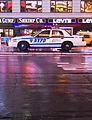
New York City Police Department (N.Y.P.D.) Crown Victoria[edit]
-
 Original (not for voting) - A New York City Police Department Ford Crown Victoria Police Interceptor on Times Square in New York City, United States of America.
 -
 Edit 1 (not for voting)
 -
 Edit 2 - White Balance Fix, Crop, Sharpen
 -
 Edit 3 - White Balance Fix, Sharpen with Original Crop


- Reason
- This picture is technically good, visually attractive and it has good EV in the articles it is currently used in.
- Articles this image appears in
- New York City Police Department, Ford Crown Victoria Police Interceptor and Times Square
- Creator
- Massimo Catarinella
- Support as nominator --Massimo Catarinella (talk) 22:56, 24 February 2009 (UTC)
- Oppose The image is mostly street and the image should not include logos or names of companies. The lights distract as well, but that is not much of a problem. ZooFari 23:20, 24 February 2009 (UTC)
- Since when are names of companies in pictures prohibited on Wikipedia? And every aspect of the car is visible...not every picture has to be a close-up. --Massimo Catarinella (talk) 23:24, 24 February 2009 (UTC)
- I never said it can't. I simply said it shouldn't as a candidate of FP. Also, yes, on FP images should be cropped to the subject. ZooFari 01:21, 25 February 2009 (UTC)
- Although FP doesn't allow fair use, I'm not aware of any consensus against showing company signs, and many of our FPs have such signs visible (example: File:New York Midtown Skyline at night - Jan 2006 edit1.jpg). I would suspect textual signs fall more under trademark law than copyright, but I'm not sure. Regardless, you will have to substantiate the view that signs are not acceptable, as we have other FPs that have them. Fletcher (talk) 23:20, 25 February 2009 (UTC)
- I can't say for sure as IANAL, but I would expect that we would have no problem using photos that contain trademarks as long as they are incidental to the photo and not the actual focus of the photo. In any case, I disagree with Zoofari that a FP should be cropped to include only the subject. Often the surroundings are just as important as the subject itself, especially somewhere iconic like Time Square in NYC. Diliff | (Talk) (Contribs) 21:15, 28 February 2009 (UTC)
- Although FP doesn't allow fair use, I'm not aware of any consensus against showing company signs, and many of our FPs have such signs visible (example: File:New York Midtown Skyline at night - Jan 2006 edit1.jpg). I would suspect textual signs fall more under trademark law than copyright, but I'm not sure. Regardless, you will have to substantiate the view that signs are not acceptable, as we have other FPs that have them. Fletcher (talk) 23:20, 25 February 2009 (UTC)
- I never said it can't. I simply said it shouldn't as a candidate of FP. Also, yes, on FP images should be cropped to the subject. ZooFari 01:21, 25 February 2009 (UTC)
- Since when are names of companies in pictures prohibited on Wikipedia? And every aspect of the car is visible...not every picture has to be a close-up. --Massimo Catarinella (talk) 23:24, 24 February 2009 (UTC)
Oppose. Distracting background, the car makes up only a small part of the photo (this would not be an issue of course if the background told us about the functions of the car etc.)Mostlyharmless (talk) 23:36, 24 February 2009 (UTC)
- Support Edit two. Concerns have been resolved, and now a much more dynamic picture. Mostlyharmless (talk) 00:00, 28 February 2009 (UTC)
- Support. Encyclopedic: a good clear capture of a New York City police car. Foreground shows reflections on the wet pavement; adds to the urban feel of the setting. Doesn't look like there are any copyright issues here. DurovaCharge! 06:07, 25 February 2009 (UTC)
- Oppose Too much pavement, not enough detail on the car. Makeemlighter (talk) 13:30, 25 February 2009 (UTC)
- Weak Oppose - too much red. I suggest tweaking the color balance a tad. Xavexgoem (talk) 14:04, 25 February 2009 (UTC)
- I've created an edit to address this "problem". --Massimo Catarinella (talk) 18:08, 25 February 2009 (UTC)
- Weak Oppose The edit seems to help color balance, but I find the portrait orientation jarring for a car, which has strong horizontal lines. It also creates too much empty space in the foreground. Fletcher (talk) 23:20, 25 February 2009 (UTC)
- Weak Support Edit 2 The quality is only just sufficient with the crop. The edit fixes white balance and minor sharpness issues. Noodle snacks (talk) 00:45, 26 February 2009 (UTC)
- Oppose original per Fletcher, weak oppose crop - seems cramped. Calliopejen1 (talk) 04:07, 26 February 2009 (UTC)
- Comment. Edit 3 is without a doubt the most aesthetic photograph of the line-up here, but I'm pretty sure we need to crop it for the sake of WP's encyclopaedic value criterion. Papa Lima Whiskey (talk) 22:50, 26 February 2009 (UTC)
- Weak support to edit 2, but others are probably ok. You have to judge a photo like this in context, and it does add a lot to Ford Crown Victoria Police Interceptor. There are lots of other photos of the car there, but the dramatic lighting, and background really make it stand out. It's not just a car, it's a New York car. :) A photo with a policeman would be even better though. Stevage 00:45, 27 February 2009 (UTC)
- Oppose Overly contrasty and distracting unrelated logos in background. --Leivick (talk) 03:04, 28 February 2009 (UTC)
- Oppose Poor angle. Very easily reproduced shots like this should be close to flawless. Here is a good example of what an automobile FP should look like. Cacophony (talk) 03:56, 28 February 2009 (UTC)
- Easily reproducible shot? Good luck with that. It was taken at night in the poring rain in the middle of Times Square, which is always crowded with people. --Massimo Catarinella (talk) 12:16, 28 February 2009 (UTC)
- Oppose: This doesn't work for me. I don't think it flatters the car, or Times Square. I would expect this sort of photo to do at least one of those things, if not both. The car is dirty, its markings are chipped in places, the City of New York sticker can't be seen in detail, and the detail and (interest) of all the various things on top of the car are lost by the angle and background. There are umbrellas around, but no people. I wouldn't go as far as Cacophony and suggest that this sort of shot should be flawless, but I think a whole lot more can be coaxed out of the subject. Maedin\talk 20:01, 28 February 2009 (UTC)
- I know that aesthetic images are nice, but sometimes you have to acknowledge that Wikipedia is an encyclopaedia, and it has to reflect the truth, not an idealism. If NYC police cars are dirty, and Time Square is dirty, then that is reflected in the photo. Diliff | (Talk) (Contribs) 21:19, 28 February 2009 (UTC)
- Hi Diliff, and I agree . . . I found it disappointing that Noodle Snacks' dahlia graceland didn't make it because it had been enjoyed by a rather hungry insect. If anything, I thought that added encyclopaedic value, as I pointed out in my comments. As far as I'm aware, though, police services and fire services go to a lot of effort to keep their vehicles extremely clean. I assume that this is true in New York City, although it may not be as easy to catch the vehicles at their opportune moments. The car is probably only dirty because it's end of shift on a wet day, and if the other elements of the photo had been good enough, this wouldn't have been an issue. It isn't that the car has to be unrealistically clean. And sorry, I hadn't noticed your comments before, which is why my response is so late! :-) Maedin\talk 08:15, 3 March 2009 (UTC)
- No problem. I still disagree with the Dahlia nomination though. The difference between this image nomination and the Dahlia is that an image that illustrates a flower should show the complete flower IMO. A random visitor to the article might assume that all Dahlia's look like that, otherwise. But if the image was used in an article that related to bugs eating flowers, then it might be ideal, although even then you should expect to see a bug actively eating it, not just the leftovers! ;-) Diliff | (Talk) (Contribs) 08:45, 3 March 2009 (UTC)
- That said, by the way, I agree that the composition isn't ideal. :-) It's just that I sometimes take issue when people want a photo to look prettier it simply isn't the reality of the situation. Diliff | (Talk) (Contribs) 21:22, 28 February 2009 (UTC)
- So, Diliff, where do you stand on this one then? :) Stevage 05:45, 2 March 2009 (UTC)
- Okay okay. I Oppose. I disagreed with some of Maedin's justifications, but I agree with her conclusion. ;-) Compositionally, I don't think that side-on is the best view of a car, and I can imagine a busier but more interesting view of Time Square. It is a difficult location to shoot, but I'm sure it could be done. Diliff | (Talk) (Contribs) 08:15, 2 March 2009 (UTC)
- I'd actually agree with the Dahlia nomination, I didn't realise it'd been eaten, neither did most of the supports, therefore it would have been misleading. Noodle snacks (talk) 09:28, 3 March 2009 (UTC)
- Okay okay. I Oppose. I disagreed with some of Maedin's justifications, but I agree with her conclusion. ;-) Compositionally, I don't think that side-on is the best view of a car, and I can imagine a busier but more interesting view of Time Square. It is a difficult location to shoot, but I'm sure it could be done. Diliff | (Talk) (Contribs) 08:15, 2 March 2009 (UTC)
- So, Diliff, where do you stand on this one then? :) Stevage 05:45, 2 March 2009 (UTC)
- You and Diliff have a point about the dahlia, :-) Maedin\talk 09:36, 3 March 2009 (UTC)
- Hi Diliff, and I agree . . . I found it disappointing that Noodle Snacks' dahlia graceland didn't make it because it had been enjoyed by a rather hungry insect. If anything, I thought that added encyclopaedic value, as I pointed out in my comments. As far as I'm aware, though, police services and fire services go to a lot of effort to keep their vehicles extremely clean. I assume that this is true in New York City, although it may not be as easy to catch the vehicles at their opportune moments. The car is probably only dirty because it's end of shift on a wet day, and if the other elements of the photo had been good enough, this wouldn't have been an issue. It isn't that the car has to be unrealistically clean. And sorry, I hadn't noticed your comments before, which is why my response is so late! :-) Maedin\talk 08:15, 3 March 2009 (UTC)
Not promoted MER-C 06:13, 3 March 2009 (UTC)
Las Meninas[edit]


- Reason
- High-quality reproduction of iconic artwork
- Articles this image appears in
- Las Meninas (via imagemap template, so it's not shown in file links), Western painting, Baroque painting, Diego Velázquez, Museo del Prado, Spanish art, several more
- Creator
- Diego Velázquez
- Support as nominator --Calliopejen1 (talk) 18:56, 25 February 2009 (UTC)
- Support per nom. Famous painting; one of the images we really ought to feature. DurovaCharge! 00:07, 26 February 2009 (UTC)
- Support Meant to support earlier. From my initial look, the photograph seems ok but the painting itself seemed not in very good shape, but there's not much we can do about that. Fletcher (talk) 12:15, 26 February 2009 (UTC)
- Question Does this need a slight CW rotation? The ceiling and picture frames on the rear wall are tilted. Papa Lima Whiskey (talk) 12:16, 26 February 2009 (UTC)
- I'm not sure. This comes direct from the Prado, and one would think they know what they're doing. Looking at the other versions of this on the commons, this is probably in the middle in terms of rotation (some are slightly clockwise of this, some are slightly counterclockwise). Calliopejen1 (talk) 15:18, 26 February 2009 (UTC)
- Is there a line that catches your eye as out of place, PLW? At far left that's a canvas on an easel, so of course it would be tilted. The rest seems fine, unless you've spotted something I haven't? DurovaCharge! 16:59, 26 February 2009 (UTC)
- You're right, Durova, I apologise for my mistake. "The ceiling and picture frames on the rear wall" should of course have read "easel". It's the same thing, after all, and "easel" is a much more professional way to say "ceiling and picture frames on the rear wall". Unfortunately, wiktionary doesn't have a reverse look-up. Which brings me back to my other fault, that I make very exact statements when they aren't really required, so I use technical phrases like "reverse look-up" and "ceiling and picture frames on the rear wall". At yet other times, I can be overly sarcastic. I'll work on it, I promise! Papa Lima Whiskey (talk) 21:10, 26 February 2009 (UTC)
- The gallery below demonstrates the effect of rotating the image so that the left edge of a background picture frame is vertical: doors, door frames, and floor boards end up slanted. Three factors might account for this: the canvas might have might have gotten slightly loose over three and a half centuries, the original artwork might have been a couple of tenths of a degree off, or else Diego Velázquez accurately depicted a frame in the background that was hanging incorrectly on the wall. DurovaCharge! 15:30, 27 February 2009 (UTC)


- Comment: What's up with the vertical lines all over it? And the speckles? Surely this could benefit massively from some attention from one of our restorers? J Milburn (talk) 20:55, 26 February 2009 (UTC)
- That's a natural effect of how oil paintings age over time. With internationally famous artwork a conservative approach is worthwhile. DurovaCharge! 21:44, 26 February 2009 (UTC)
- Support: Definitely. Maedin\talk 20:05, 28 February 2009 (UTC)
Promoted Image:Las Meninas 01.jpg --Shoemaker's Holiday (talk) 08:07, 4 March 2009 (UTC)
Brighton Promenade[edit]

- Reason
- A detailed and interesting view along the promenade in Brighton, a popular seaside city in the south of England. Admittedly, this is a busy composition, but I think the scene is interesting and manages to show a lot of activity and sights within the frame (best viewed at full size obviously).
- Articles this image appears in
- Brighton
- Creator
- User:Diliff
- Support as nominator --Diliff | (Talk) (Contribs) 10:40, 24 February 2009 (UTC)
- Comment
The blonde woman by the Brighton's Smoked Fish Shop apparently has a massive hole in her back through which the pavement is visible. Also, a lot of the promenade is in shadow-- would a shot a few hours earlier in the afternoon been lit better? (I've never been to Brighton, so I have no idea what would be the best time of day to shoot). Is this shot less encyclopedic due to it being taken during the "off-season"? (Again, I have no idea whether that's true). Spikebrennan (talk) 15:46, 24 February 2009 (UTC)- Haha, I don't know how I managed to miss that, as I had a good look at it to make sure there were no faults. The panorama blender has obviously decided to make it look like a window into her soul or something, as it has a definite rectangular shape to it. :-) I will endeavour to fix that issue. I guess voting should be held off on voting until this is corrected, to confirm I can definitely do it without causing other stitching issues as it is quite a serious fault. As for it being less encyclopaedic, I wouldn't say so. It probably has slightly less people walking along the promenade, but other than that it doesn't change significantly. Diliff | (Talk) (Contribs) 16:05, 24 February 2009 (UTC)
- Okay, I've just uploaded a replacement over the top of the original that addresses the stitching fault. It also happens to be slightly higher res (no significant change to the detail visible though I don't think). I also forgot to respond to the issue you raised of the shadows. It is pretty difficult to take any photo in winter that far north without shadows of some kind, as the sun is never directly overhead. I don't personally see them as distracting, and the elements in shadow aren't particularly dark. Diliff | (Talk) (Contribs) 19:46, 24 February 2009 (UTC)
- Now there appears to be a problem with the man in the gray hooded sweatshirt near that blond girl. It looks to me like his left shoulder/arm are missing. Makeemlighter (talk) 03:09, 25 February 2009 (UTC)
- I'm not sure that this is a fault, but I can't check the original files at the moment to confirm. If it is a fault, it isn't a major one and only visible to pixel peepers. ;-) Diliff | (Talk) (Contribs) 08:37, 25 February 2009 (UTC)
- Perhaps not. Just thought I'd mention it. Makeemlighter (talk) 13:34, 25 February 2009 (UTC)
- I'm not sure that this is a fault, but I can't check the original files at the moment to confirm. If it is a fault, it isn't a major one and only visible to pixel peepers. ;-) Diliff | (Talk) (Contribs) 08:37, 25 February 2009 (UTC)
- Now there appears to be a problem with the man in the gray hooded sweatshirt near that blond girl. It looks to me like his left shoulder/arm are missing. Makeemlighter (talk) 03:09, 25 February 2009 (UTC)
- Okay, I've just uploaded a replacement over the top of the original that addresses the stitching fault. It also happens to be slightly higher res (no significant change to the detail visible though I don't think). I also forgot to respond to the issue you raised of the shadows. It is pretty difficult to take any photo in winter that far north without shadows of some kind, as the sun is never directly overhead. I don't personally see them as distracting, and the elements in shadow aren't particularly dark. Diliff | (Talk) (Contribs) 19:46, 24 February 2009 (UTC)
- Haha, I don't know how I managed to miss that, as I had a good look at it to make sure there were no faults. The panorama blender has obviously decided to make it look like a window into her soul or something, as it has a definite rectangular shape to it. :-) I will endeavour to fix that issue. I guess voting should be held off on voting until this is corrected, to confirm I can definitely do it without causing other stitching issues as it is quite a serious fault. As for it being less encyclopaedic, I wouldn't say so. It probably has slightly less people walking along the promenade, but other than that it doesn't change significantly. Diliff | (Talk) (Contribs) 16:05, 24 February 2009 (UTC)
- Comment Interesting photo, it's a bit like a where's wally: what's going on in that first boat on the left? What *is* that girl doing with that anchor? Does that man on the right have a dog between his legs? What is a "smoke house"? etc :) Stevage 03:34, 25 February 2009 (UTC)
- Yeah, I tend to take a lot of those Where's Wally kind of photos (Joss Bay, Richmond and Watson Bay). I guess some of your questions may remain unanswerable though. :-) Diliff | (Talk) (Contribs) 08:37, 25 February 2009 (UTC)
- Oppose Composition lacks focus, leading the viewer to wander around aimlessly, much like the people in the photo. And unlike the beach photos cited above, the "Where's Waldo" aspect isn't as interesting (for better or worse!) when the people are wearing all their clothes. :-) Fletcher (talk) 00:00, 26 February 2009 (UTC)
- I would argue that the lack of focus is the point though. The promenade isn't one single object/concept. It is a number of different things (people, shops, the pier in the background, the random boats and artwork etc) all combined in a (relatively) compact composition. But I accept your reasoning. Diliff | (Talk) (Contribs) 10:22, 26 February 2009 (UTC)
- Support There's nothing really happening in the image; yeah, people are wondering around aimlessly, going about their daily lives, meandering and such, but I think that's one of the reasons I like it: it makes me a bit homesick. I agree with Diliff that the prom is made of a number of individual things, and so there isn't really one thing to focus on. Matthewedwards (talk • contribs • email) 18:36, 27 February 2009 (UTC)
- Suport Personally I love this type of picture - most pictures I take tend to be of "random" scenes like this... I hate posed pictures of people so much prefer to take a pic of people doing their normal thing - seems more interesting to me... Gazhiley (talk) 09:35, 27 February 2009 (UTC)
- Support I like it as welll...it's a normal scene, not looking staged or anything. Per nom. SpencerT♦C 00:56, 28 February 2009 (UTC)
- Weak oppose, there is nothing technically wrong with this image (although the writing on some of the signs seems odd). I just don't think this is the best way to represent the promenade. It shows a tiny portion and doesn't seem to be a very good way to represent it. I'm thinking what is really needed is some kind of aerial shot. gren グレン 23:38, 2 March 2009 (UTC)
- What exactly do you find odd about the writing? There has been no photoshop trickery.. The writing's as-is. And yes, an aerial shot would be interesting, but completely unrealistic to expect of a FP! ;-) Diliff | (Talk) (Contribs) 23:57, 2 March 2009 (UTC)
- Support Shadows of the boat is a bit distracting but overall lighting is good. --Muhammad(talk) 04:06, 3 March 2009 (UTC)
Promoted Image:Brighton Promenade, England - Feb 2009.jpg --Shoemaker's Holiday (talk) 08:05, 4 March 2009 (UTC)
Pharyngeal jaw in moray eel[edit]

- Reason
- Brilliant illustration, high res, might need minor editing (watermark remove?).
- Articles this image appears in
- Jaw, Moray eel, Pharyngeal jaws
- Creator
- Zina Deretsky, US National Science Foundation (after Rita Mehta, UC Davis)
- Support as nominator --Papa Lima Whiskey (talk) 15:45, 14 February 2009 (UTC)
- Support GerardM (talk) 23:16, 14 February 2009 (UTC)
- Comment, no real artifacting but this should compress better as PNG / SVG. Also, I think we should remove the NSF seal and the symbol on the bottom left. Also, could probably remove the border. gren グレン 03:16, 15 February 2009 (UTC)
- Agreed - Might want to bring this over to Wikipedia:Graphic Lab/Image workshop and ask for these to be done. ~ ωαdεstεr16«talkstalk» 03:31, 15 February 2009 (UTC)
- I have removed the border and watermarks. I have requested conversion at the graphics lab for png or svg. ZooFari 17:50, 15 February 2009 (UTC)
- PNG conversion will only give a smaller file if you flatten the gradients, and I'm not sure that that would make a better picture. The same comment goes @SVG conversion. I predict it will look a lot less appealing, and at 230kb, this is already a slim JPG file considering its dimensions. You can try PNG conversion for yourselves to see if you can come up with a smaller file without loss in quality. Papa Lima Whiskey (talk) 23:24, 15 February 2009 (UTC)
- Well, converting won't help in the direct sense... it's remaking as a PNG / SVG. Mostly so it will scale well, I thought that was the main reason we only really promote diagrams in PNG or SVG. gren グレン 01:29, 16 February 2009 (UTC)
- PNG conversion will only give a smaller file if you flatten the gradients, and I'm not sure that that would make a better picture. The same comment goes @SVG conversion. I predict it will look a lot less appealing, and at 230kb, this is already a slim JPG file considering its dimensions. You can try PNG conversion for yourselves to see if you can come up with a smaller file without loss in quality. Papa Lima Whiskey (talk) 23:24, 15 February 2009 (UTC)
- I have removed the border and watermarks. I have requested conversion at the graphics lab for png or svg. ZooFari 17:50, 15 February 2009 (UTC)

- New Version Thanks to Pbroke13 for rewriting it as SVG. What do you think? Adjustments can be made by the way. ZooFari 00:25, 19 February 2009 (UTC)
CommentIn my opinion a fun picture of the day, however, the illustration is poorly colored, making it seem as if the muscles are the primary feature of the second part of the illustration. Needs work.Strong oppose A featured picture should feature what it is featuring, and this image does not, and this whole board now seems to be a private club with only input from the regulars welcome or dealt with. This image will not be seen on the main page by the experts here alone, it will be seen by a general audience, and this image gives misinformation by labeling what is primary in a manner that recedes it into the background, according to the caption, at least. --KP Botany (talk) 07:41, 16 February 2009 (UTC)- First of all, what do you mean by "private"? This is a very open discussion; anyone is allowed to put in their input. And, all input is used to make a decision, so I'd have to say that this is not private by any means. Secondly, just because the background is blue and the font is a different shade of blue does not mean it doesn't feature what is trying to be described. Besides, do you have a better color scheme in mind? I feel that if you are opposing, you should bring in a suggestion to fix the problem described, especially if it is a strong oppose. --Pbroks13talk? 00:38, 22 February 2009 (UTC)
- I posted this five and half days ago, the first time. You ignored my comment, and a color change (my suggestion) would have helped me to make a decision. I oppose because the feature of interest is lost in the color scheme. I strongly oppose because of this. If a featured picture does not feature what it is supposed to feature it loses encyclopedic value. --KP Botany (talk) 00:50, 22 February 2009 (UTC)
- I'm sorry if you feel that I ignored your comment, but as you can see, my first time commenting on this page was today (yesterday UTC). ZooFari gave me requests, I just did them. But now, I've decided to get involved in the discussion. What I was trying to ask you is what color scheme would you suggest? I'm no color expert, so I look to you guys for specific suggestions to make the image better, not just a general "color needs to be better." --Pbroks13talk? 01:23, 22 February 2009 (UTC)
- Just lighten the red a bit for the muscles, which are very important for pharyngeal jaws, and make the bones themselves darker, doing the same for the accompanying text. That should do it. --KP Botany (talk) 04:42, 22 February 2009 (UTC)
- Hows that? I removed the other labels per Stevage's request. Does black look good? I also fixed the colors. What do you think? --Pbroks13talk? 19:33, 22 February 2009 (UTC)
- Just lighten the red a bit for the muscles, which are very important for pharyngeal jaws, and make the bones themselves darker, doing the same for the accompanying text. That should do it. --KP Botany (talk) 04:42, 22 February 2009 (UTC)
- I'm sorry if you feel that I ignored your comment, but as you can see, my first time commenting on this page was today (yesterday UTC). ZooFari gave me requests, I just did them. But now, I've decided to get involved in the discussion. What I was trying to ask you is what color scheme would you suggest? I'm no color expert, so I look to you guys for specific suggestions to make the image better, not just a general "color needs to be better." --Pbroks13talk? 01:23, 22 February 2009 (UTC)
- I posted this five and half days ago, the first time. You ignored my comment, and a color change (my suggestion) would have helped me to make a decision. I oppose because the feature of interest is lost in the color scheme. I strongly oppose because of this. If a featured picture does not feature what it is supposed to feature it loses encyclopedic value. --KP Botany (talk) 00:50, 22 February 2009 (UTC)
- First of all, what do you mean by "private"? This is a very open discussion; anyone is allowed to put in their input. And, all input is used to make a decision, so I'd have to say that this is not private by any means. Secondly, just because the background is blue and the font is a different shade of blue does not mean it doesn't feature what is trying to be described. Besides, do you have a better color scheme in mind? I feel that if you are opposing, you should bring in a suggestion to fix the problem described, especially if it is a strong oppose. --Pbroks13talk? 00:38, 22 February 2009 (UTC)
- Comment FP criterion 7: "Has a good caption". Also, does "Moray eels" really need to be in the picture? It seems superfluous since the file name, the picture description, and the caption in the article list the species. Makeemlighter (talk) 04:38, 17 February 2009 (UTC)
- It is better within the image, as people who may want to use images on Wiki will already have a title and captions. ZooFari 00:28, 19 February 2009 (UTC)
- How hard is it to change three pages? Removing it will allow you to crop out the negative space, meaning the thumbnail will contain more pixels of the actual jaw. I'm not a fan of the the blue fading to white background, either. HereToHelp (talk to me) 03:22, 19 February 2009 (UTC)
- Perhaps you are right. I have asked the SVG uploader to do the removal and crop, and the new version is now update to the right. ZooFari 00:21, 20 February 2009 (UTC)
- How hard is it to change three pages? Removing it will allow you to crop out the negative space, meaning the thumbnail will contain more pixels of the actual jaw. I'm not a fan of the the blue fading to white background, either. HereToHelp (talk to me) 03:22, 19 February 2009 (UTC)
- Support SVG Also, since the new image was only put up on the 19th, I'm going to pop this up the page a bit, as it was effectively suspended Shoemaker's Holiday (talk) 05:30, 21 February 2009 (UTC)
- Comment Would like to see more consistency between the two states, eg label "muscles" on both. --Fir0002 12:03, 21 February 2009 (UTC)
- Comment I'd also like to see better labelling. IMHO the best would be to *only* label the pharyngeal jaw, and to use an arrow or line to point it out precisely. The "oral jaw" and muscles (in particular) are pretty self-explanatory. The text as it is sort of floats around and doesn't really show what it's labelling - particularly the PJ label in between the two eels could be labelling anything. Consider this a support if that's done. Stevage 10:07, 22 February 2009 (UTC)
- (edit conflict) Good points, the labeling is just not useful. However, the muscles and oral jaw should all be labeled, as the pharyngeal jaw does not work without them, yet, somehow it is not what is emphasized in the illustration. I think if the coloration is improved and the labeling changed the image will be improved as well, or its value as an encyclopedic illustration. --KP Botany (talk) 19:34, 22 February 2009 (UTC)
- Done How does the black text look? And do the lines work for you? --Pbroks13talk? 19:33, 22 February 2009 (UTC)
- Looks good to me. If I was quibbling, I'd avoid the lines actually crossing the jaws themselves, and I'd use the text "pharyngeal jaws" rather than "jaw", but not important. If KP Botany really wants the muscles labelled, I'd suggest using a more specific term than "muscles" (ie, what muscles are they?), and a smaller font than that used for the jaws. Stevage 02:16, 23 February 2009 (UTC)
- Smaller font would be good. I don't quite like the first labeling of the pharyngeal jaws location. You know, now that you bring it up, they're technically pharyngeal jaw bones and pharyngeal jaw muscles. I don't understand how that would enhance an otherwise good illustration for the laymen. Maybe you could elaborate? --KP Botany (talk) 02:30, 23 February 2009 (UTC)
- Looks good to me. If I was quibbling, I'd avoid the lines actually crossing the jaws themselves, and I'd use the text "pharyngeal jaws" rather than "jaw", but not important. If KP Botany really wants the muscles labelled, I'd suggest using a more specific term than "muscles" (ie, what muscles are they?), and a smaller font than that used for the jaws. Stevage 02:16, 23 February 2009 (UTC)
So I looked it up, just at onelook.com, and it says in the medical dictionaries that it is just the bones, so I suppose just the bones is okay. It seems less encyclopedic when the muscles are so involved. Still don't understand why it has to be all the muscles for a general pictures for the layman. It should say Moray Eel, though, because their pharyngeal jaws are very unique. If it's labeled just "pharyngeal jaw" it should be a typical one, not a unique one. I like the coloration as redone as I think it puts emphasis and is cleaner and clearer than the prior. Support when Moray Eel added back to illustration. What's the caption, though? --KP Botany (talk) 05:35, 26 February 2009 (UTC)
- Okay, "Moray Eel" is now labeled. There's a caption for it (what do you think?). Also, the lines aren't over the jaws. Now, I'm a bit confused. Are the bones and muscles to be labeled? If they are, smaller text would be good; however, should there be lines pointing like the pharyngeal jaws are? --Pbroks13talk? 18:54, 26 February 2009 (UTC)
- I hope noone minds, but it's only in the last couple days that things calmed down here, so I've moved it up the page to make sure that consensus is achieved, without the need to run this again later. Shoemaker's Holiday (talk) 04:32, 2 March 2009 (UTC)
- Support SVG per the long discussion above me. ZooFari 04:43, 2 March 2009 (UTC)
- Support SVG From my understanding, this meets FP criteria. Nice work. §hepTalk 08:07, 2 March 2009 (UTC)
- Support SVG Meets FP criteria. --Pbroks13talk? 19:50, 4 March 2009 (UTC)
- Support SVG High EV, better as an SVG. ErikTheBikeMan (talk) 00:48, 5 March 2009 (UTC)
- I like it. --KP Botany (talk) 06:53, 5 March 2009 (UTC)
Promoted File:Pharyngeal jaws of moray eels.svg MER-C 07:20, 5 March 2009 (UTC)
One More Step, Mr. Hands, And I'll Blow Your Brains Out[edit]

- Reason
- As promised, another hi-res scan of a PD children's book illustration. (Yes, earlier generations considered Treasure Island a kids' book). A propos of nothing, see here [3] for the 1885 edition's illustration of the same scene in the book. Besides-- we need a good POTD for September 19.
- Articles this image appears in
- N. C. Wyeth, Treasure Island
- Creator
- N. C. Wyeth, illustration for a 1911 edition of Treasure Island
- Support as nominator --Spikebrennan (talk) 21:24, 26 February 2009 (UTC)
- Reluctant weak oppose. Excessive reflections on LHS. Papa Lima Whiskey (talk) 22:46, 26 February 2009 (UTC)
- Oppose - very weak pic Little Professor (talk) 22:47, 26 February 2009 (UTC)
- Support Highly encyclopedic, well known novel and artist. I'll be uploading a version with the edges sharpened slightly. DurovaCharge! 23:28, 26 February 2009 (UTC)
- Oppose per Papa Lima.-- mcshadypl TC 03:44, 27 February 2009 (UTC)
Not promoted MER-C 07:20, 5 March 2009 (UTC)
The Tempest[edit]


- Reason
- This one was a fun one - heavy damage to the left side, including some sort of mold. Luckily, I was able to fix it all. Mwahaha! Anyway, high-resolution, Shakespeare, major artist - what's not to love?
- Articles this image appears in
- The Tempest
- Creator
- George Romney (painter), B. Smith (engraver), etc.
- Support as nominator --Shoemaker's Holiday (talk) 07:52, 26 February 2009 (UTC)
- Support although it seems that George Romney created only the painting, not this version. Papa Lima Whiskey (talk) 12:11, 26 February 2009 (UTC)
- I've clarified. It's all on the information page, but I summarised a bit much here. Shoemaker's Holiday (talk) 17:22, 26 February 2009 (UTC)
- Support Suggest altering the creator line to 'unknown engraver, based on a painting by George Romney'. Either way, fine ev for the article it illustrates. Maybe you could work on getting an FP for each of Shakespeare's plays? These are wonderful. :) DurovaCharge! 16:53, 26 February 2009 (UTC)
- Actually, the engraver is B. Smith, who the Library of Congress thinks may be Benjamin Smith. He's credited in the lower right of the image. See the image information page. As for getting an FP of every Shakespeare work - well, you saw the troubles I found with the Titus Andronicus one =) Think I could get six or seven, at the least, though. Shoemaker's Holiday (talk) 17:19, 26 February 2009 (UTC)
- Thank you. Wish I still had my old high school copy of Shakespeare. It had wonderful artwork. As many as you could do would be great. :) DurovaCharge! 20:59, 26 February 2009 (UTC)
- Actually, the engraver is B. Smith, who the Library of Congress thinks may be Benjamin Smith. He's credited in the lower right of the image. See the image information page. As for getting an FP of every Shakespeare work - well, you saw the troubles I found with the Titus Andronicus one =) Think I could get six or seven, at the least, though. Shoemaker's Holiday (talk) 17:19, 26 February 2009 (UTC)
- Support Excellent quality image of artwork... with prints, even more so than paintings, it is important to be able to see the marks made by the artist. This would also be an excellent illustration for Stipple engraving (which really needs its own article at some point... sigh) Lithoderm 22:11, 27 February 2009 (UTC)
- Support: So well restored. And the EV is high—it's Shakespeare, after all! Maedin\talk 20:16, 28 February 2009 (UTC)
- Support: nice restoration and wonderful imagery.--Caspian blue 02:04, 2 March 2009 (UTC)
Promoted File:George Romney - William Shakespeare - The Tempest Act I, Scene 1.jpg MER-C 07:21, 5 March 2009 (UTC)
Aida[edit]


- Reason
- I think this poster - almost certainly showing the triumphal march in Act II, Scene 2 - is one of the best images we have for Verdi operas. A rather nice, detailed lithograph, as well, if not, perhaps, the most delicate. If I missed anything, just tell me and I'll do my best to fix it up.
- Articles this image appears in
- Aida. Could reasonably go in others, but this will do for now.
- Creator
- The Otis Lithograph Co
Support as nominatorSupport Alt 1 - Kaldari's right. It's better. I was so busy fixing the damage that I forgot completely about colour (also, I looked at the bar, but didn't realise the leftmost one was magenta, with red next to it. Magenta looked such a bright red....) --Shoemaker's Holiday (talk) 01:32, 26 February 2009 (UTC)- Support. Papa Lima Whiskey (talk) 12:17, 26 February 2009 (UTC)
- Comment Needs sharpening. What happens with a lot of these slide film reproductions is that the focus may be slightly soft. If you don't have a 'sharpen edges' filter on your software, load an uncompressed file and I'll do it. Only takes a minute. Otherwise ready to support. DurovaCharge! 16:56, 26 February 2009 (UTC)
- I don't have one beyond a basic "sharpen" tool, as far as I can tell, but I've been automatically uploading a PNG as well as a JPG for all these images. See Image:Giuseppe Verdi - Hippodrome Opera Company - Aida_poster.png. Shoemaker's Holiday (talk) 17:25, 26 February 2009 (UTC)
- Support Alt 1. It's a useful tool for correcting edge blur without making an image look grainy. Next time you upload one of these slide film copies in soft focus, ping me at user talk and I'll run a quick filter on it. Best regards, DurovaCharge! 00:35, 27 February 2009 (UTC)
- I don't have one beyond a basic "sharpen" tool, as far as I can tell, but I've been automatically uploading a PNG as well as a JPG for all these images. See Image:Giuseppe Verdi - Hippodrome Opera Company - Aida_poster.png. Shoemaker's Holiday (talk) 17:25, 26 February 2009 (UTC)
- Support Alt 1. Colors corrected per color key in original photograph. Edges sharpened. Kaldari (talk) 18:35, 26 February 2009 (UTC)
Promoted File:Aida poster colors fixed.jpg MER-C 07:21, 5 March 2009 (UTC)
Fadeaway girl[edit]

- Reason
- Coles Phillips was a U.S. illustrator whose most influential innovation was the "fadeaway girl", in which foreground and background color match to create an impression of negative space. Cover art for an issue of Life Magazine, his principal publisher. Digitized from the original artwork. Restored version of File:Coles Phillips Life.jpg; smaller size version for slow connections available at File:Coles Phillips2 Life courtesy copy.jpg.
- Articles this image appears in
- Coles Phillips, Life (magazine)
- Creator
- Coles Phillips
- Support as nominator --DurovaCharge! 00:40, 26 February 2009 (UTC)
- Support good EV, and just beautiful. my new userpage pic! Calliopejen1 (talk) 04:05, 26 February 2009 (UTC)
- Support. Papa Lima Whiskey (talk) 12:14, 26 February 2009 (UTC)
- Support Very pretty. -- Papercutbiology♫ (talk) 14:46, 26 February 2009 (UTC)
- Support - Yes, wonderful in all ways. —Mattisse (Talk) 20:22, 26 February 2009 (UTC)
- Support I'm glad to acknowledge of another great artist who produced such the gorgeous image!--Caspian blue 02:08, 2 March 2009 (UTC)
Promoted File:Coles Phillips2 Life.jpg MER-C 07:21, 5 March 2009 (UTC)
Plasma Ball Vid1[edit]
- Reason
- Self nom but I feal it is a good video that shows the movement aspect of a plasma ball better than an image could. It is nominated here because featured videos (unlike featured sounds) dosen't appear to have got off the ground.
- Articles this image appears in
- Plasma_lamp#History
- Creator
- Myself user:geni
- Support as nominator Geni 21:24, 1 March 2008 (UTC)
- Oppose. Ridiculously blurry- filesize is not a limitation here, this is wikipedia. Anyway we could have a razor-sharp barely compressed video this size and only be a bit larger than some other FPs. Also, the entire audio track should be cut out with an OGG splitter :D\=< (talk) 03:03, 2 March 2008 (UTC)
- Oppose Froth's concerns having been aired, I'd love to see a bit more hi-def version and would absolutely support it. SingCal 16:32, 3 March 2008 (UTC)
- currently haveing camera issues bot once sorted yes I can give it a go.Geni 02:43, 4 March 2008 (UTC)
Conditional Support if the video is reshot - I successfully nominated the still version of this years ago, I'd be interested to seen the video one too. —Vanderdecken∴ ∫ξφ 11:21, 4 March 2008 (UTC)
- That being the case could this be withdrawn for the time being (not quite sure how that works here).Geni 18:31, 4 March 2008 (UTC)
- Okey I've reshot. I can't get the resultion any higher without loseing FPS.Geni 22:39, 12 March 2008 (UTC)
This seems to have fallen off the nomination pile. Relisting it. MER-C 05:59, 24 February 2009 (UTC)
- Comment - Do these things make noise, or is that just background noise in the original? Shoemaker's Holiday (talk) 06:38, 24 February 2009 (UTC)
- They make a quiet hum, but only if you put your ear right up against them. For the purposes of the video, cutting out the sound channel completely and having it totally silent is the best way to go (does it actually have no sound channel or is it just a silent one? Removing the channel would shrink the file a little). We should add on the description page though, "This video intentionally has no sound" so people don't think their soundcard's bust or something. And for the second one, maybe emphasise that the video is not sped up in any way - someone could assume it was from the fast motion. —Vanderdecken∴ ∫ξφ 12:06, 24 February 2009 (UTC)
- Support - now it's reshot, the quality and size are fine, the soundtrack (in fact, lack of it) is appropriate and it's educational. Well done. As per Wikipedia:Creation and usage of media files#Offering multiple bit-rates it might be a good idea to make a smaller version (just scale to 25% of the size with an appropriate bitrate) for thumbnailing. —Vanderdecken∴ ∫ξφ 12:06, 24 February 2009 (UTC)
- Support per Vanderdecken. Concerns are assuaged. Shoemaker's Holiday (talk) 16:32, 24 February 2009 (UTC)
- Support per Vanderdecken and Shoemaker. DurovaCharge! 16:53, 24 February 2009 (UTC)
Promoted File:Plasmaball vid2.ogv MER-C 07:21, 5 March 2009 (UTC)
Samurai archer on horseback[edit]

- Reason
- An illustration (c. 1878) of a samurai archer on horseback.
- Articles this image appears in
- Yabusame
- Creator
- Unknown
- Support as nominator --Xavexgoem (talk) 03:24, 6 February 2009 (UTC)
- Comment Who's the author? I can't vote on something that I can't give credit to. ZooFari 03:38, 6 February 2009 (UTC)
- Actually plenty of featured pictures have unknown/anonymous authorship. Author attribution is not an FPC requirement. DurovaCharge! 03:46, 6 February 2009 (UTC)
- Question What is it depicting? A warrior from an earlier (i.e. not 19th century) time? Or someone taking part in sport archery? Narayanese (talk) 07:29, 6 February 2009 (UTC)
- This was made after the Meiji Restoration. It's unlikely that this is a drawing of an "actual" samurai, or a recollection of what they used to look like. Likely, this is an illustration of an intentionally anachronistic samurai in an event. So probably more sporty than samurai-y (per se) Xavexgoem (talk) 21:19, 19 February 2009 (UTC)
- That makes me doubt it fits at the current place in the article, which is a section about sport/ritual. The section "The decline and revival of the bow" seems like a better place. Narayanese (talk) 14:14, 21 February 2009 (UTC)
- This was made after the Meiji Restoration. It's unlikely that this is a drawing of an "actual" samurai, or a recollection of what they used to look like. Likely, this is an illustration of an intentionally anachronistic samurai in an event. So probably more sporty than samurai-y (per se) Xavexgoem (talk) 21:19, 19 February 2009 (UTC)
- Question Just to pile on... has the contrast and/or saturation been boosted here? It also seems a little on the pink side to me. mikaultalk 11:35, 7 February 2009 (UTC)
- Alt 1 fixed the red-tint; the picture was fairly saturated to begin with; Alt 1 also fixes the overly saturated paper. Xavexgoem (talk) 21:20, 19 February 2009 (UTC)
- Support GerardM (talk) 08:32, 11 February 2009 (UTC)
- Support, but I would like to hear an answers to above questions also. M.K. (talk) 15:46, 12 February 2009 (UTC)
- Comment Not sure why Xavexgoem hasn't answered by now, but as his coach on this restoration a few comments may be appropriate. To the best of my knowledge neither the contrast nor the saturation was boosted. In fact, the saturation was selectively reduced on the background paper. This needs an upload of the unrestored version for comparison. Authorship was uncredited in the original bibliographic notes and needs to be noted as unknown in the upload. Regarding the depiction, this was created shortly after the Meiji restoration during a transitional period in Japanese history. DurovaCharge! 16:17, 12 February 2009 (UTC)
Request suspension - there are a few kinks to work out, yet. And this is my first FPC nom, so I'm not entirely familiar with the entire process, so a lot of things are missing. Xavexgoem (talk) 07:18, 13 February 2009 (UTC)Relist Xavexgoem (talk) 21:21, 19 February 2009 (UTC)- Support, strongly prefer original: colours seem dull in the alternative Nice work. Shoemaker's Holiday (talk) 11:20, 13 February 2009 (UTC)
- Support Sasata (talk) 06:48, 23 February 2009 (UTC)
- Oppose Without additional info about the period this samurai is supposed to be dressed as, etc (see concerns above), I don't think the EV is there. Calliopejen1 (talk) 17:17, 24 February 2009 (UTC)
- Weak support edit EV seems a little tentative (one article)so weak support, and prefer non-pink backgoround.Terri G (talk) 13:28, 25 February 2009 (UTC)
Needs further input as to which version and enc. MER-C 02:40, 1 March 2009 (UTC)
- Oppose for the same reason as Calliopejen1. Narayanese (talk) 04:26, 2 March 2009 (UTC)
- Oppose Not enough info on this image to give it EV for FP status. ~ ωαdεstεr16♣kiss mei'm Irish♣ 03:57, 4 March 2009 (UTC)
Not promoted MER-C 07:21, 5 March 2009 (UTC)
Gerrymander[edit]


- Reason
- This is an iconic image of American history that most American citizens should recognize from middle and high school history classes. It is a political cartoon that depicts a bizarrely shaped congressional district in Massachusetts in 1812 created solely to keep the incumbent congressmen in office by "rigging" (if you will) the election by having a significant majority of same-party voters in the district. US congressional districts change every 10 years after the US Census finishes its work (hence the action taking place in 1812). The governor at the time was named Gerry and eventually, the animal in this cartoon (a dragon) was likened to a salamander, giving way to the term Gerrymandering. The term is still in common use in the American vernacular today.
- Articles this image appears in
- Gerrymandering, Essex County, Massachusetts, Portmanteau, Elbridge Gerry The image was just added to Elbridge Gerry
- Creator
- Elkanah Tisdale (1771-1835) [References: D. C. O’Brien, “Elkanah Tisdale: Designer, Engraver and Miniature Painter” Connecticut Historical Bulletin, Vol. 49 No. 2, 1984, 83-96. Kenneth C. Martis, “The Original Gerrymander” Political Geography, Vol. 27, No. 4, November 2008, 833-839.] (uploaded by Chowbok)
- Support as nominator --ωαdεstεr16«talkstalk» 20:36, 23 February 2009 (UTC)
- Conditional support You beat me to this one. Highly encyclopedic; good find. Clone stamp out the stray spots, please? DurovaCharge! 02:05, 24 February 2009 (UTC)
- Done as far as I can tell. My first ever retouch (if you could even call it that). Seems GIMP is easier to use than I expected. Let me know if I've missed anything. ~ ωαdεstεr16«talkstalk» 06:34, 24 February 2009 (UTC)
- Very good for a first time effort. :) If you get the bug do let me know; historic political cartoons can be very encyclopedic and relatively easy to restore. Best regards. DurovaCharge! 18:58, 24 February 2009 (UTC)
- Done as far as I can tell. My first ever retouch (if you could even call it that). Seems GIMP is easier to use than I expected. Let me know if I've missed anything. ~ ωαdεstεr16«talkstalk» 06:34, 24 February 2009 (UTC)
- Comment Would it be worthwhile/possible to fix up the white patch on the lower part of the wing, and the A of Andover? Sasata (talk) 08:24, 24 February 2009 (UTC)
- Support alternative But I'd suggest tweaking the levels so the lines are darker - it'd thumbnail better. Shoemaker's Holiday (talk) 02:03, 26 February 2009 (UTC)
- Support. High enc., good quality. I'm suprised that there isn't one like this already featured. SpencerT♦C 21:17, 3 March 2009 (UTC)
Original reviewers please comment on edited version. Wronkiew (talk) 06:19, 5 March 2009 (UTC)
Promoted File:The Gerry-Mander Edit.png MER-C 07:22, 5 March 2009 (UTC)
Tom Cobb[edit]

- Reason
- One of W. S. Gilbert's most successful non-musical plays. Tom Cobb, a hilarious little farce, wowed reviewers and the public alike, but, like many of Gilbert's non-Sullivan works, it faded into obscurity in the early 20th century. This is, perhaps, the only major contemporary illustration for the play, as there were only a few newspapers doing illustrated reviews at the time.
- Articles this image appears in
- Tom Cobb
- Creator
- D. H. Friston
N.B. This was nominated before, but... It's probably one of the only, or one of very few historic images of one of Gilbert's major non-musical plays, and wonderfully illustrates its article. So I'm going to ask for reconsideration.
- Support Shoemaker's Holiday (talk) 05:25, 21 February 2009 (UTC)
- Support GerardM (talk) 08:18, 22 February 2009 (UTC)
- Support per nom. Only previous oppose asserted insufficient ev, and it appears to have plenty of ev at the article it illustrates. DurovaCharge! 23:49, 22 February 2009 (UTC)
- Strong Oppose Very low EV. What scene is this? Which characters? This picture tells me nothing at all about the play. Makeemlighter (talk) 01:50, 23 February 2009 (UTC)
CommentConditional support Makeemlighter has a point; I'd probably support if the caption mentioned that info. Sasata (talk) 06:46, 23 February 2009 (UTC)- Should be able to get it, just might take a day or two. Will have to go to the original newspaper again. Proceed with conditional supports if it's a major issue. Shoemaker's Holiday (talk) 22:20, 23 February 2009 (UTC)
- Note to MER-C - if I haven't got the info when this closes, can you just shove this into suspended? It shouldn't take too long, but I am a University student, I have other time commitments. =) Shoemaker's Holiday (talk) 16:30, 24 February 2009 (UTC)
- Should be able to get it, just might take a day or two. Will have to go to the original newspaper again. Proceed with conditional supports if it's a major issue. Shoemaker's Holiday (talk) 22:20, 23 February 2009 (UTC)
- Conditional support as per makeemlighter.Terri G (talk) 13:30, 25 February 2009 (UTC)
Oppose. As per Makeemlighter - give us the EV! Thanks. Papa Lima Whiskey (talk) 23:46, 26 February 2009 (UTC)
Opening of Act III:
SCENE.--A drawing-room, shabbily furnished, in MR. EFFINGHAM's house. COBB is discovered smoking a pipe on balcony with CAROLINE. The EFFINGHAM family is discovered grouped:--MRS. EFFINGHAM seated; old EFFINGHAM leaning on her chair, with his arm round her neck, and BULSTRODE standing moodily behind. As curtain rises CAROLINE enters from balcony, and throws herself at her mother's feet.
Obviously, there was either a slight change made to this in the original production, or the artist mis-remembered when trying to work from his sketches. But it's pretty clearly this scene, and shows the much-praised Effingham family of the original production. Shoemaker's Holiday (talk) 10:59, 5 March 2009 (UTC)
Shoemaker's Holiday (talk) 10:28, 5 March 2009 (UTC)
Promoted File:Tom Cobb.png MER-C 01:04, 7 March 2009 (UTC)
Red Fox in winter coat[edit]

.jpg)
- Reason
- This picture of a wild fox (nicknamed Freddy by the photographer) was taken in the middle of the winter in the photographer's yard. I think it meets the FP criteria as it a) has high EV, in the article Red Fox, b) is of sufficient quality, and c) is of a sufficient resolution. (It's also hella cute!)
- Articles this image appears in
- Red Fox
- Creator
- Rob Lee
- Support as nominator --Xclamation point 23:47, 1 March 2009 (UTC)
- Support — So cute! Yes, I know that's not part of the criteria... — Jake Wartenberg 23:52, 1 March 2009 (UTC)
- Support Per jake. ErikTheBikeMan (talk) 00:10, 2 March 2009 (UTC)
- Support — agree with Jake. Extremely cute, and a good picture at it. Goosta (talk) 00:19, 2 March 2009 (UTC)
- This is this users second edit. The first was a userpage edit Noodle snacks (talk) 03:42, 2 March 2009 (UTC)
- Support Shoemaker's Holiday (talk) 00:22, 2 March 2009 (UTC)
- Support Although the picture is little dark, wow......the subject is tooooo cute to oppose! — Preceding unsigned comment added by Caspian blue (talk • contribs) 01:58, 2 March 2009
- Oppose Undersaturated and cut off, insufficient depth of field. And presumably because of the 85% jpeg encoding (which is rather low for an FP candidate), it dips into artefact country on the neck. It's a clear-as-rain oppose to me. Papa Lima Whiskey (talk) 02:46, 2 March 2009 (UTC)
- While it may be a little undersaturated and a little cut off, getting an up close picture of a wild animal such as this is extremely difficult, and should be taken into consideration. Xclamation point 04:11, 2 March 2009 (UTC)
- I can appreciate the difficulty in closeups of wild animals,
but you got too close unfortunately!Noodle snacks (talk) 10:06, 2 March 2009 (UTC)- I actually had a look at the flickr source. It seems there are plenty to choose from (which puts forward the argument that this fox is in fact fairly tame). see this set. I bet there is a superior image there somewhere Noodle snacks (talk) 10:13, 2 March 2009 (UTC)
- I can appreciate the difficulty in closeups of wild animals,
- "Extremely difficult"? Hardly. Foxes are commonplace in many areas. I took this horrendous photo when a fox wandered up totally unexpected in a national park, and stood waiting for 30 seconds. It was actually too close for my crappy telephoto! Anyway, the FPC here is a very nice photo at thumbnail size, but blown up it's pretty noisy and lacks detail. Stevage 23:09, 2 March 2009 (UTC)
- While it may be a little undersaturated and a little cut off, getting an up close picture of a wild animal such as this is extremely difficult, and should be taken into consideration. Xclamation point 04:11, 2 March 2009 (UTC)
- Oppose per PLW, and it seems underexposed too. Noodle snacks (talk) 03:33, 2 March 2009 (UTC)
- Oppose per Papa Lima Whiskey and Noodle Snacks - but it is a cute picture :) - Fastily (talk) 07:04, 2 March 2009 (UTC)
- Aww, cute. Oppose per PLW: my principal objection is the fact that so much of the head is cut off. Other featured animal head-shot portraits do not have this problem. Spikebrennan (talk) 16:23, 2 March 2009 (UTC)
- Oppose. Noisey, not very good lighting/contrast. Kaldari (talk) 00:43, 3 March 2009 (UTC)
- Strong Oppose Cut off. This greatly detracts from EV. Makeemlighter (talk) 04:49, 3 March 2009 (UTC)
- Oppose Insufficient technical quality, bad composition and poor EV. --Jf268 (talk) 13:15, 5 March 2009 (UTC)
Not promoted MER-C 01:05, 7 March 2009 (UTC)
Haeckel's tree of life[edit]


- Reason
- This is a cleaned-up version of an evocative and well-known design by a significant historical figure.
- Articles this image appears in
- History of evolutionary thought, Tree of life (science)
- Creator
- Ernst Haeckel. Nominated version restored by User:Ragesoss, further adjustments by User:Durova in alternative.
- Support as nominator. I prefer the color version, but the Alternative by Durova is another possibility. --ragesoss (talk) 21:52, 1 March 2009 (UTC)
- Support original - I too thinkt his is one where paper tone adds instead of detracting. There's no colours to bring out, after all. Shoemaker's Holiday (talk) 23:13, 1 March 2009 (UTC)
- Strong support (original) Great EV here. Excellent quality scan. -- mcshadypl TC 02:01, 2 March 2009 (UTC)
- Support original Agreed about paper tone. How accurate is this portrayal compared to modern evolutionary understanding? Discrepancies should be noted in the caption.--HereToHelp (talk to me) 01:44, 3 March 2009 (UTC)
- Support Either Good EV. I suppose if forced to choose I'd take the original, but it doesn't really matter to me. Makeemlighter (talk) 04:47, 3 March 2009 (UTC)
- Support original Great EV. Could be my rubbish screen, but the alternative looks pink.Terri G (talk) 10:57, 3 March 2009 (UTC)
Promoted File:Tree of life by Haeckel.jpg MER-C 01:05, 7 March 2009 (UTC)
Pavel Bure[edit]

- Reason
- High quality sports photograph, a rarity on Wikipedia.
- Articles this image appears in
- Pavel Bure, Maurice "Rocket" Richard Trophy, Calder Memorial Trophy, etc...
- Creator
- Hakandahlstrom
- Support as nominator —Krm500 (Communicate!) 13:23, 1 March 2009 (UTC)
- Oppose. Not a very interesting picture. Shouldn't he be shooting a puck at a net or something ;) Kaldari (talk) 18:38, 1 March 2009 (UTC)
- Oppose -- like Kaldari stated, there isn't much be shown here. Maybe if he were shooting the puck into the net in a camera angle so great, then it would be better than this one where he is just standing clueless ;)--₮RUCӨ 19:34, 1 March 2009 (UTC)
- Oppose Notablity lacks for a FP. The shadowing is not great either. ZooFari 23:26, 1 March 2009 (UTC)
- Notability? —Krm500 (Communicate!) 00:25, 2 March 2009 (UTC)
- I don't mean how well the man is known. What I mean is that where is his notablity shown in the photo? It only shows that he is a hocky player. An image with his actions should be included. ZooFari 01:45, 2 March 2009 (UTC)
- Oppose per Kaldari. Papa Lima Whiskey (talk) 02:38, 2 March 2009 (UTC)
- Support. I don't think that a hockey player FP need illustrate them in action, any more than a politician FP need illustrate them in a legislative assembly. Mostlyharmless (talk) 01:25, 3 March 2009 (UTC)
Not promoted MER-C 01:05, 7 March 2009 (UTC)
Montana state capitol[edit]

- Reason
- High resolution chromolithograph print. Unique historical depiction of the building; very good EV. Restored version of File:Montana state capitol.jpg.
- Articles this image appears in
- Montana; Helena, Montana; Montana State Capitol; Montana State Legislature; List of Montana-related topics
- Creator
- Geo. R. Mann
- Support as nominator — Jake Wartenberg 06:29, 1 March 2009 (UTC)
- Support God, that must have taken you a while. This excellent work, and I love all the detail - if you zoom in, all the people and things you can just see even at 2000px wide turn out to have a surprising amount of detail. I presume there isn't an article on the Montana state capitol building itself for this to go in? Also, have you considered sending a link to your work to some Montana legistators and such? Shoemaker's Holiday (talk) 07:36, 1 March 2009 (UTC)
- There is an article. No idea how I missed that—replaced the lead image. Thanks, — Jake Wartenberg 18:57, 1 March 2009 (UTC)
- Support -- Excellent picture.--₮RUCӨ 19:34, 1 March 2009 (UTC)
- Support Remarkably detailed, and the sky helps to give it the necessary 'wow factor'. Reguiieee (talk) 20:45, 1 March 2009 (UTC)
- Support. Papa Lima Whiskey (talk) 02:55, 2 March 2009 (UTC)
- Support. per Shoemaker's Holiday - Fastily (talk) 07:03, 2 March 2009 (UTC)
- Support, really love the sky. J Milburn (talk) 21:32, 2 March 2009 (UTC)
- Support ~ ωαdεstεr16«talkstalk» 22:33, 2 March 2009 (UTC)
- Question Is there anything about this depiction of the building that gives it special EV that a current photograph wouldn't have? Makeemlighter (talk) 04:52, 3 March 2009 (UTC)
- Its artistic merit is quite high, and that quality of it would be very difficult to get in a modern photograph. Its high quality and resolution also mean that it has at least equal encyclopedic value than a hypothetical modern photograph, but the artistic value and age gives it more inherent interest. Shoemaker's Holiday (talk) 14:03, 3 March 2009 (UTC)
- The left corner reads 'Copyrighted by Geo. R. Mann, architect'. DurovaCharge! 16:06, 3 March 2009 (UTC)
- ...Wait. The building wasn't done being constructed until 1902, so that means that this is the original - what d'ye call it - mock up? - for the State Capitol by the architect. Shoemaker's Holiday (talk) 03:08, 4 March 2009 (UTC)
- The left corner reads 'Copyrighted by Geo. R. Mann, architect'. DurovaCharge! 16:06, 3 March 2009 (UTC)
- Its artistic merit is quite high, and that quality of it would be very difficult to get in a modern photograph. Its high quality and resolution also mean that it has at least equal encyclopedic value than a hypothetical modern photograph, but the artistic value and age gives it more inherent interest. Shoemaker's Holiday (talk) 14:03, 3 March 2009 (UTC)
Promoted File:Montana state capitol 2.jpg MER-C 01:05, 7 March 2009 (UTC)
Carmen[edit]

- Reason
- Continuing my current opera kick, I found this excellent poster for Bizet's Carmen. I actually ended up having to restore it twice, as I discovered a better version after doing the first. Ah, well!
- Articles this image appears in
- Georges Bizet, Carmen
- Creator
- Liebler & Maass Lith.
- Support as nominator --Shoemaker's Holiday (talk) 00:20, 1 March 2009 (UTC)
- Support - For an image from the 19th century, this is a very good quality image. Xclamation point 02:51, 2 March 2009 (UTC)
- Support. Very nice. Papa Lima Whiskey (talk) 02:52, 2 March 2009 (UTC)
- Support - La fleur que tu m'avais jetée / dans ma prison m'était restée... -- Alvesgaspar (talk) 23:37, 2 March 2009 (UTC)
- Support - A very impressive restoration. Kaldari (talk) 00:47, 3 March 2009 (UTC)
Promoted File:Rosabel Morrison - Carmen poster.png MER-C 01:05, 7 March 2009 (UTC)
Statue of Pierre Cambronne[edit]

- Reason
- Good details and exposure, used in several wikis to illustrate Pierre Cambronne, French general of the Old Guard at Waterloo.
- Articles this image appears in
- Pierre Cambronne
- Creator
- Eusebius
- Support as nominator --Eusebius (talk) 10:17, 28 February 2009 (UTC)
- Weak Oppose. The quality/detail is good, but a cropped image of a statue isn't ideal, as (IMO) the setting/surrounds of the statue is often interesting and important. Diliff | (Talk) (Contribs) 20:13, 28 February 2009 (UTC)
- Oppose - The crop compromises on EV. — neuro(talk) 02:31, 1 March 2009 (UTC)
- Oppose per neuro. ErikTheBikeMan (talk) 17:32, 1 March 2009 (UTC)
Not promoted MER-C 01:06, 7 March 2009 (UTC)
Early science fiction[edit]

- Reason
- Old conceptions of the future often look quaint, and this one is downright charming. Notice the couple flirting through the rooftops at lower left. Restored version of File:Aerial house.jpg. Reduced size version available at File:Aerial house3 courtesy copy.jpg.
- Articles this image appears in
- Albert Robida, History of science fiction, Scientific romance, Steampunk#Proto-steampunk
- Creator
- Albert Robida
- Support as nominator --DurovaCharge! 02:52, 28 February 2009 (UTC)
- Support Excellent depiction of early science fiction. Well known artist, visually interesting. Chillum 02:57, 28 February 2009 (UTC)
- I am going to see if I can get a better copy from the original. Chillum 02:59, 28 February 2009 (UTC)
- Does anyone know why I can't have an image with more than 12.5 million pixels suddenly File:Aerial_house3.png when I have uploaded 35 million pixel images before without issue File:British Columbia Parliament Buildings - Pano - HDR.jpg? This makes it very hard to have the best possible image. Chillum 04:25, 28 February 2009 (UTC)
- That's the .png bug. DurovaCharge! 05:09, 28 February 2009 (UTC)
- Tim makes a very good point there. I will try tomorrow with a better jpeg than what is up. I will link to the png from the jpgs file page. Chillum 06:32, 28 February 2009 (UTC)
- Support. This is a marvelous find.--ragesoss (talk) 03:01, 28 February 2009 (UTC)
- Support What a great image!--Caspian blue 02:02, 2 March 2009 (UTC)
- Support, lovely. Greatly benefitted from restoration. J Milburn (talk) 21:35, 2 March 2009 (UTC)
Promoted File:Aerial house3.jpg MER-C 01:06, 7 March 2009 (UTC)
Letharia vulpina[edit]

- Reason
- High quality, with fantastic contrast and colours. Looks great at high resolution, and is highly encyclopedic as a great illustration of a specific species. Most of the objections in the previous nomination should be addressed by this crop.
- Articles this image appears in
- Letharia vulpina (current version will be replaced if promoted)
- Creator
- Jason Hollinger
- Support as nominator. Thanks to J Milburn for the first nomination, which is mostly copied here. Papa Lima Whiskey (talk) 02:11, 27 February 2009 (UTC)
- Has anything changed between this and the previous nomination except a crop? Noodle snacks (talk) 10:27, 27 February 2009 (UTC)
- Contrast stretch, which really didn't have much effect on this image. Papa Lima Whiskey (talk) 12:12, 28 February 2009 (UTC)
- Also, the un-cropped version is a candidate at VPC. ~ ωαdεstεr16«talkstalk» 13:13, 27 February 2009 (UTC)
- Has anything changed between this and the previous nomination except a crop? Noodle snacks (talk) 10:27, 27 February 2009 (UTC)
- Support - most of the opposes of the last nom had to do with things now cropped out. Shoemaker's Holiday (talk) 17:28, 27 February 2009 (UTC)
- Oppose - The crop still doesn't address Mfield's oppose from last time: "suffering from some pretty unpleasant halation and chromatic abberation, especially on the branch and the bits of the fungus/lichen itself that are on the edge of the DoF. Either way it is distracting. At F8 on a Casio EX-Z1080 I am not sure whether it is purely the lens or if it is compounded by diffraction on a sensor that small. It is obviously not well suited to plant photography at this distance/magnification though." SpencerT♦C 22:40, 27 February 2009 (UTC)
- I'm afraid I've not yet been able to see that flaw, maybe due to the technical language used by Mfield. Where is it? I understand the first part of the comment is about haloes, but I don't see any. Papa Lima Whiskey (talk) 12:12, 28 February 2009 (UTC)
- Halation is blurring of light around the out of focus areas - it causes that vaseline on the lens look, where the out of focus areas themselves blur into the in focus areas so you don't get a clear delineation. It is what you can see where the out of focus background seems to melt into the edges of the plant itself and most notbly the branch at the bottom (which is itself out of DoF, but not anywhere near as much). I think the bit on the branch is more acceptable than the soft focus result on the top extremities of the plant, being the subject. At any rate halation is very unpleasing to the eye - it is commonly found in primes like cheap F1.8 primes wide open but I would imagine that the cheap lenses in P&S cameras exhibit a lot of it, its just that normally they aren't operating at such wide apertures and narrow dof and the effects are less often observable. Mfield (talk) 18:44, 28 February 2009 (UTC)
- Not knowing the definition of halation either, I decided to look it up, but your description of it doesn't seem to match what I've found from other sources. Essentially a number of them describe halation as specifically being an issue of the emulsion used in film (not digital). (Source 1, Source 2 and Anti-halation backing). That said, I understand the issue you're describing and I have seen it on my cheap 50mm f/1.8 lens... I guess the thing is, it might not technically be halation? Diliff | (Talk) (Contribs) 00:22, 1 March 2009 (UTC)
- The lens effect I am describing is quite separate from film halation, but it is the only term I have ever heard used to describe the out of focus smearing at wide apertures as I and you describe. Here a and section 2 of hereare references which link it - incorrectly or not - to axial chromatic abberation. Mfield (talk) 01:13, 1 March 2009 (UTC)
- I'm afraid I've not yet been able to see that flaw, maybe due to the technical language used by Mfield. Where is it? I understand the first part of the comment is about haloes, but I don't see any. Papa Lima Whiskey (talk) 12:12, 28 February 2009 (UTC)
- Oppose Halation/inadequate DOF, per my comments above and on original nom. Mfield (talk) 18:47, 28 February 2009 (UTC)
- Support. I am the original nominator, and I maintain that this is an excellent and striking illustration of the species. The tightened crop has improved the image (especially when viewed as a thumbnail) and I have replaced it in the article. J Milburn (talk) 18:49, 28 February 2009 (UTC)
- Oppose for inadequate depth of field to capture the subject. Wronkiew (talk) 04:48, 6 March 2009 (UTC)
- Weak oppose, mainly for DOF.--ragesoss (talk) 18:42, 6 March 2009 (UTC)
Not promoted MER-C 01:06, 7 March 2009 (UTC)
Emerald cockroach wasp[edit]


- Reason
- IMO, wasps are much harder to photograph than bees and flies as they hardly stay in one place for a long time. I found this wasp near a cockroach and thus it was more cooperative. This picture is of good quality and good EV. The foreground may be distracting to some, but it is unavoidable. The image is the only decent image wiki has of any member of the family, genus and species of the wasp! The wasp was on a cement sprayed wall looking down.
- Articles this image appears in
- Emerald cockroach wasp, Spheciformes, Ampulicidae, Ampulex
- Creator
- Muhammad
- Support as nominator, Original, Edit1, Edit 2 in order of preference --Muhammad(talk) 14:37, 27 February 2009 (UTC)
Weak SupportSupport Edit 1. Although the DOF and composition are not ideal, the difficulty of the shot and it's EV makes me inclined to support it.The thing that is actually most distracting to me is the orientation of the ground. Looking at the photo I have no idea which way is up :PKaldari (talk) 17:20, 27 February 2009 (UTC)- The wasp is looking down at an angle. Does that explain anything? --Muhammad(talk) 05:52, 28 February 2009 (UTC)
- So what's the surface it's on? --jjron (talk) 09:43, 28 February 2009 (UTC)
- I incorrectly assumed everybody would know what the wasp was on. In Tanzania, some walls are sprayed with cement and when the cement hardens there are these small heaps of accumulated cement. I am not sure why the walls are sprayed, maybe its a design or maybe to stop robbers from climbing over them. The wasp was found on such a wall, looking down. --Muhammad(talk) 10:09, 28 February 2009 (UTC)
- I've seen that type of surface, though it's not that common in these parts - that was probably one of several guesses I would have made as to what the surface was :-). A type of cement rendering I spose. So the next (dumb) question is, was the wall on this angle, or was it vertical as you'd expect? And if vertical, why is the image therefore at this angle? --jjron (talk) 12:25, 28 February 2009 (UTC)
- I think I may have leaned slightly to keep away from the paralyzed cockroach and hence the tilt. Not a dumb question at all :) Will upload a rotated version later tonight --Muhammad(talk) 15:31, 1 March 2009 (UTC)
- I've seen that type of surface, though it's not that common in these parts - that was probably one of several guesses I would have made as to what the surface was :-). A type of cement rendering I spose. So the next (dumb) question is, was the wall on this angle, or was it vertical as you'd expect? And if vertical, why is the image therefore at this angle? --jjron (talk) 12:25, 28 February 2009 (UTC)
- I incorrectly assumed everybody would know what the wasp was on. In Tanzania, some walls are sprayed with cement and when the cement hardens there are these small heaps of accumulated cement. I am not sure why the walls are sprayed, maybe its a design or maybe to stop robbers from climbing over them. The wasp was found on such a wall, looking down. --Muhammad(talk) 10:09, 28 February 2009 (UTC)
- So what's the surface it's on? --jjron (talk) 09:43, 28 February 2009 (UTC)
- The wasp is looking down at an angle. Does that explain anything? --Muhammad(talk) 05:52, 28 February 2009 (UTC)
- Weak oppose Though good enc., the DOF is too shallow, and the tilt of the image is somewhat bothersome. SpencerT♦C 22:37, 27 February 2009 (UTC)
- Regarding the tilt, this was how the wasp was. I can upload a straightened out version but ts does not not look as interesting. Regarding the DOF, most of the wasps body parts are in good focus, including the antennas. Having the wall in focus is impossible without losing out on something else. --Muhammad(talk) 05:52, 28 February 2009 (UTC)
- The tilt is understandable, so that's why my oppose is weak. I still think the DOF could be big enough so that the whole subject is in focus (i.e., the legs). SpencerT♦C 16:33, 28 February 2009 (UTC)
- Hm, a rotate and a small crop may look better...some test previews on my computer look a bit better. SpencerT♦C 20:48, 28 February 2009 (UTC)
- Weak support edit 1. SpencerT♦C 02:19, 6 March 2009 (UTC)
- Hm, a rotate and a small crop may look better...some test previews on my computer look a bit better. SpencerT♦C 20:48, 28 February 2009 (UTC)
- The tilt is understandable, so that's why my oppose is weak. I still think the DOF could be big enough so that the whole subject is in focus (i.e., the legs). SpencerT♦C 16:33, 28 February 2009 (UTC)
- Regarding the tilt, this was how the wasp was. I can upload a straightened out version but ts does not not look as interesting. Regarding the DOF, most of the wasps body parts are in good focus, including the antennas. Having the wall in focus is impossible without losing out on something else. --Muhammad(talk) 05:52, 28 February 2009 (UTC)
- Oppose Shallow DOF terribly distracts. ZooFari 01:14, 28 February 2009 (UTC)
- Support any, but preference for original. The DOF is very much normal for a macro shot and the composition is ideal to make the most of the DOF, so I have no complaints. I can't make my mind up about whether the tilt is ideal or not. I have to admit that it does make it a bit harder to view the wasp from this angle, and I don't know whether you can rotate it without cropping out the animal itself, but I support it either way. Between yourself, Fir0002 and Macro Freak, you have lifted the macro bar very high. :-) Diliff | (Talk) (Contribs) 20:10, 28 February 2009 (UTC)
Provisional Support: I'd like to see this rotated to the left 90°. Do you think that will improve it? I tried it and I thought it looked much better and less "bothersome". Maedin\talk 20:42, 28 February 2009 (UTC)- Support Edit 1: Just right with that rotation. This one doesn't give me vertigo like the original does! Maedin\talk 19:26, 1 March 2009 (UTC)
- Support - In contrast to some others I like the DOF effect and angle. Its a good macro with everything possible (and important) in focus. Composition and the dull background make the subject pop out - great shot - Peripitus (Talk) 11:39, 1 March 2009 (UTC)
- Comment I have uploaded a rotated version. Some of the tilt is still there which I can remove at the expense of even more background and foreground being lost. --Muhammad(talk) 19:23, 1 March 2009 (UTC)
- Comment The cropped version is much better, but it gives the false impression that the subject is on level ground. Should it be rotated 90˚ so the cockroach wasp appears to be on a wall like it really was, or is that too distracting?--HereToHelp (talk to me) 01:51, 3 March 2009 (UTC)
- For encyclopedic reasons, I don't think it makes much of a difference. The wasp can be found on level ground as in the edit and vertically as in the original. --Muhammad(talk) 03:55, 3 March 2009 (UTC)
- Weak Support Original, Strong Oppose Edit 1 I think the EV is high enough that the somewhat distracting angle and DOF are acceptable. I think the edit is inappropriate manipulation. Maybe it's just because I've seen the original, but the wasp in the edit looks odd on a horizontal surface. I much prefer to see the wasp as the photographer did. Makeemlighter (talk) 04:45, 3 March 2009 (UTC)
- But you're not - the photographer has already said this was on a basically vertical surface, but he had to lean to take the photo. As HereToHelp suggests, I wouldn't mind seeing a vertical edit as well (was going to dump one up myself, but I guess Muhammad may as well since he's got the source). --jjron (talk) 07:43, 3 March 2009 (UTC)
- I wouldn't call rotating and cropping an image as inappropriate. For encyclopedic purposes, both orientations have similar value. --Muhammad(talk) 16:58, 3 March 2009 (UTC)
- Edit 2 Uploaded. Got named a bit funny but upload speed is too slow to do it again :)--Muhammad(talk) 16:58, 3 March 2009 (UTC)
- I can sympathise, though seemingly few others here can. Indeed I have suffered the dreaded 'jpg.jpg' mistake on uploading alts in the past myself, and have also just left them. :-) --jjron (talk) 08:33, 4 March 2009 (UTC)
- I've managed to do the Image:Image: a couple of times, actually, after copying the full image name when uploading an edit. ;-) They can be renamed by an admin on Commons though, from memory, so you don't have to upload a new version. Diliff | (Talk) (Contribs) 09:33, 4 March 2009 (UTC)
- There is a template {{bad name|correct name}} that has to be used after another correctly named version is uploaded so that the admin can delete the incorrectly named. At least that's what I always do --Muhammad(talk) 11:37, 4 March 2009 (UTC)
- I've managed to do the Image:Image: a couple of times, actually, after copying the full image name when uploading an edit. ;-) They can be renamed by an admin on Commons though, from memory, so you don't have to upload a new version. Diliff | (Talk) (Contribs) 09:33, 4 March 2009 (UTC)
- I can sympathise, though seemingly few others here can. Indeed I have suffered the dreaded 'jpg.jpg' mistake on uploading alts in the past myself, and have also just left them. :-) --jjron (talk) 08:33, 4 March 2009 (UTC)
- Support any Shoemaker's Holiday (talk) 08:48, 4 March 2009 (UTC)
- Support original, oppose others. Has enough detail on the wasp, and I rather like the angle and foreground/background effect.--ragesoss (talk) 18:40, 6 March 2009 (UTC)
- Support original. Let's stick with the convention that the direction of gravity is down. Papa Lima Whiskey (talk) 19:55, 6 March 2009 (UTC)
                                                                          |
                                                                         \|/
                                                                          V
Promoted File:Ampulex compressa.jpg MER-C 01:06, 7 March 2009 (UTC)
Water Babies[edit]
.jpg)
- Reason
- Scan of an original illustration by Jessie Willcox Smith for the children's book The Water-Babies. An unrestored version can be found here.
- Articles this image appears in
- Water Babies, Jessie Willcox Smith
- Creator
- Jessie Willcox Smith (Illustrator)
- Support as nominator ErikTheBikeMan (talk) 03:13, 28 February 2009 (UTC)
|
- Per above discussion, and some followup, the crop is a reasonable choice if no border of blank paper is to be allowed. That said, it worries me that, in order to crop it without a border, part of the art was lost. Even if the borderless version is preferred in Wikipedia articles, the lack of an alternate uncropped version means that anyone using the restoration in future will, by necessity, have to leave a small part of the artwork out. No vote. Shoemaker's Holiday (talk) 07:47, 1 March 2009 (UTC)
- Support per above. No issue about the signature. Atlantic Gateways (talk) 21:48, 28 February 2009 (UTC)
- Oppose I think this is a beautiful and interesting image. However, picking up from where Shoemaker left off, I'm wondering if there's some tiny rotation or negligible stretch that could be performed on this image to put all of it in the rectangular frame. In my mind, it would hardly affect the rest of the image, but be a lot more professional. Papa Lima Whiskey (talk) 18:18, 1 March 2009 (UTC)
- Most likely not. Stretches usually end up being pretty messy. ErikTheBikeMan (talk) 00:50, 5 March 2009 (UTC)
- And why is that? Papa Lima Whiskey (talk) 14:21, 5 March 2009 (UTC)
- [Off-topic discussion moved to WT:FPC]
- Comment in the "off-topic discussion" (err, not really...), Shoemaker offered to upload a crop with the picture fully preserved, along with a bit of frame. This might be helpful. Papa Lima Whiskey (talk) 14:25, 5 March 2009 (UTC)
- Comment. I'm also uncomfortable supporting this excellent image because of the crop. Nothing wrong with leaving a border of blank paper when images aren't precisely rectangular. I hope it's possible to get a wider crop to vote on.--ragesoss (talk) 18:49, 6 March 2009 (UTC)
Not promoted MER-C 01:06, 7 March 2009 (UTC)
John Paul Jones[edit]

- Reason
- The most successful US Navy captain of the American Revolution, and the only one daring enough to raid British home waters. From a high resolution etching made during Jones's lifetime after his victory at the Battle of Flamborough Head. Restored version of File:John Paul Jones.jpg.
- Articles this image appears in
- Battle of Flamborough Head, John Paul Jones
- Creator
- Carl Guttenberg engraver. From a drawing by C. J. Notté.
- Support as nominator --DurovaCharge! 19:42, 5 February 2009 (UTC)
- Support this must have been before his glory days as Led Zeppelin's bassist. Sasata (talk) 01:15, 6 February 2009 (UTC)
- Support--Mbz1 (talk) 06:37, 6 February 2009 (UTC)
- Support per nom. ~ ωαdεstεr16«talkstalk» 06:46, 7 February 2009 (UTC)
- Question: Though I'm having some technical issues viewing the original, are the black dots throughout the etching (for example the one when viewed top left, full-res) from the original...and what's your opinion on editing them out? If I'm being confusing I can upload a picture highlighting what I'm seeing. SpencerT♦C 02:08, 12 February 2009 (UTC)
- I have uploaded a crop of a section (upper left) highlighting what I mean. My upload is rather jpeggy, and you may want to compare my upload with the nominated image. SpencerT♦C 02:20, 12 February 2009 (UTC)

- Good eye. Could we suspend the nomination for a day or so while I attack that? :) DurovaCharge! 03:15, 12 February 2009 (UTC)
- Suspended. SpencerT♦C 00:34, 13 February 2009 (UTC)
- A "day or so" is now over two weeks. Is this ready to get out of suspension yet? --jjron (talk) 16:37, 27 February 2009 (UTC)
- Relisting should occur soon. SpencerT♦C 00:50, 28 February 2009 (UTC)
- Another 24hrs is up (8 times over). Durova suggests "If it's not ready by then I'll start from scratch another time". Time to close...? --jjron (talk) 13:59, 7 March 2009 (UTC)
- Yes. Durova, I'm closing this, but feel free to relist once you're ready. SpencerT♦C 17:09, 7 March 2009 (UTC)
- Another 24hrs is up (8 times over). Durova suggests "If it's not ready by then I'll start from scratch another time". Time to close...? --jjron (talk) 13:59, 7 March 2009 (UTC)
- Relisting should occur soon. SpencerT♦C 00:50, 28 February 2009 (UTC)
- A "day or so" is now over two weeks. Is this ready to get out of suspension yet? --jjron (talk) 16:37, 27 February 2009 (UTC)
- Suspended. SpencerT♦C 00:34, 13 February 2009 (UTC)
Not promoted --SpencerT♦C 17:09, 7 March 2009 (UTC)
Queen Elizabeth II Bridge[edit]

- Reason
- It is a high resolution panoramic image of virtually the entire span of the half mile long bridge and the night time lighting provides an aesthetic view (it tends to be quite hazy during the day due to the significant industry in the area) in which the bridge is able to stand out.
- Articles this image appears in
- Queen Elizabeth II Bridge and Dartford
- Creator
- User:Diliff
- Support as nominator --Diliff | (Talk) (Contribs) 22:24, 28 February 2009 (UTC)
- Oppose It doesn't add anything particular to the article beyond aesthetics. Considering the nominator removed this image from the bridge article, the replacement night shot shows comparatively little, I think that article is now in a poorer state in terms of using images to convey educational value to the reader. If the idea of this shot is to convey span, this image that the panorama has replaced did a passable job in my opinion without needlessly taking up the entire width of the article. I think the width also induces an uneccessary break of flow in the dartford article, and is of questionable value there, considering the view of the bridge from that far away is not synonymous with Dartford at all. This is Wikipedia not Commons, where featured images are intended to significantly inform the reader about the subject, which this just doesn't. Having said that, it is a visually nice image. MickMacNee (talk) 05:34, 1 March 2009 (UTC)
- I think you're a bit confused. I never removed this image, and it is still in the article now. I removed this image, which is a poorer quality view from practically exactly the same angle as the panorama and therefore a bit redundant in the article. And I completely disagree that it doesn't add anything particular to the article. None of the other images show the entire length of the bridge from Kent to Essex. If that doesn't make it a useful image, I don't know what does. And I also disagree that the view from Greenhithe makes it unsuitable for existing in the Dartford article, as the bridge itself is in Dartford on the southern side, and is therefore relevant to Dartford and nothing says the bridge has to be taken from Dartford. The image that I replaced in the Dartford article was also taken from Greenhithe (a different location) anyway. The only point that I can appreciate the merits of is one of aesthetics in the article, although I personally disagree that it significantly breaks the flow of the article. I think quality encyclopaedic panoramas add visual flair to an article, but I know that a number of others disagree and I am obviously biased towards them, so it isn't a black & white issue really. But please reconsider its validity on the basis of adding to the article, as I think a full view of the bridge is about as encyclopaedic as you can expect of a bridge photo. Diliff | (Talk) (Contribs) 09:43, 1 March 2009 (UTC)
Extended content
|
|---|
|
- Support MickMacNee's arguments are a little unusual here. "Cut-off" compositions are usually not given favourable reviews. Noodle snacks (talk) 08:47, 2 March 2009 (UTC)
- To be fair, whenever a new image is added to an article, it tends to polarise the article regulars who either love it or hate its presence, and tend to navigate their way to the nomination as a result. :-) It seems that his interest in this nomination stems from his involvement in the Queen Elizabeth II Bridge and Dartford articles, rather than FPC, and his review doesn't necessarily correspond to our usual criteria and expectations... Diliff | (Talk) (Contribs) 11:30, 2 March 2009 (UTC)
- Guilty, never been in a Wikipedia FPC before, but as I read the rules, this is not merely the same as a Commons one, featured images need to dovetail with and complement article content, and not merely be a nice picture. In my initial oppose I had made a mistake misreading what images had been added/removed, and if it had been the case that the image showing for example the concrete supports had been removed in favour of this panorama, that imo would have been a net negative to the article. MickMacNee (talk) 14:10, 2 March 2009 (UTC)
- Yes you're right, English Wiki FPC is different to the Commons one in that encyclopadic value is a significant portion of the criteria. You seem fairly rational so I don't doubt that you are able to make an objective decision on the nomination, and indeed the criteria is written to allow the uninitiated to get involved without too many teething problems, but it is still inevitable that without the participation, you won't have a full grasp of where the bar is set and what sort of images we're trying to feature. No problem though, you're still entitled to your opinion and no disrespect intended. :-) Diliff | (Talk) (Contribs) 15:23, 2 March 2009 (UTC)
- A blank user page always has its downsides. MickMacNee (talk) 01:32, 3 March 2009 (UTC)
- To be fair, whenever a new image is added to an article, it tends to polarise the article regulars who either love it or hate its presence, and tend to navigate their way to the nomination as a result. :-) It seems that his interest in this nomination stems from his involvement in the Queen Elizabeth II Bridge and Dartford articles, rather than FPC, and his review doesn't necessarily correspond to our usual criteria and expectations... Diliff | (Talk) (Contribs) 11:30, 2 March 2009 (UTC)
- Support per nom. Excellent twilight panorama. DurovaCharge! 20:04, 2 March 2009 (UTC)
- Support Nice image, good enc., high quality. SpencerT♦C 20:39, 2 March 2009 (UTC)
- Support per nom. Jenuk1985 | Talk 23:43, 2 March 2009 (UTC)
- Comment On the monitor I'm using (not necessarily good) I find it very dark in the "thumbnail" version, which obscures the detail. Perhaps a little earlier in the day would have been better. I'll try to take a look on another monitor so I can vote one way or the other, but at the moment I agree with MickMacNee. Terri G (talk) 11:04, 3 March 2009 (UTC)
- MickMacNee didn't mention that it was very dark... What part of Mick's argument do you agree with specifically? Diliff | (Talk) (Contribs) 12:06, 3 March 2009 (UTC)
- Support tending to 'Weak'. I've said before that while these twilight/night-time shots look nice, I think they compromise EV (I realise you justify the choice of time above for this one). Concerns from 'article regulars' always worry me a bit as well (which is why I'm not usually a fan of fast-tracking noms) and EV for Dartford does seem limited. Still it does seem to have value showing the whole bridge in good detail and has a certain 'wow'. --jjron (talk) 13:53, 7 March 2009 (UTC)
- Support per nom and convincing reasons above. ~ ωαdεstεr16♣kiss mei'm Irish♣ 19:02, 7 March 2009 (UTC)
Promoted Image:Queen Elizabeth II Bridge, Dartford, England - Feb 2009.jpg ~ ωαdεstεr16♣kiss mei'm Irish♣ 19:05, 7 March 2009 (UTC)
Gothic arches in Nantes cathedral[edit]

- Reason
- Gives a nice view of typical 15th century gothic arches.
- Articles this image appears in
- Creator
- Eusebius
- Support as nominator --Eusebius (talk) 09:16, 7 March 2009 (UTC)
- Oppose ineligible unless in an article... and, it has to be stable in that article. So, I'd close this nom see, if it gets accepted into an article and if it does try later. gren グレン 13:12, 7 March 2009 (UTC)
- Sorry about that. I was unaware of that rule, my apologies. --Eusebius (talk) 13:46, 7 March 2009 (UTC)
- Speedy close per above. Just out of interest's sake, why do you think it is better than File:Cathédrale de Nantes - nef.jpg which has been in Nantes Cathedral for some time (not that I've compared them closely)? --jjron (talk) 14:11, 7 March 2009 (UTC)
- I didn't think in terms of comparison, but maybe I should: as you've seen I'm not very familiar with FP candidateship here. I don't think this one is better (although it may be a bit sharper), the subject is simply not the same. The nave view is more obviously encyclopedic. I thought both could be FP candidates, but now I'd like another opinion before nominating the nave. --Eusebius (talk) 16:55, 7 March 2009 (UTC)
Not promoted MER-C 00:15, 8 March 2009 (UTC)
Brighton Pier[edit]

- Reason
- Shows a complete and very detailed view of the Brighton Pier along the coast on a clear sunny day.
- Articles this image appears in
- Brighton and Brighton Pier
- Creator
- User:Diliff
- Support as nominator --Diliff | (Talk) (Contribs) 11:43, 2 March 2009 (UTC)
- Support Wladyslaw (talk) 20:21, 2 March 2009 (UTC)
- Support per nom. DurovaCharge! 02:43, 3 March 2009 (UTC)
- Support Good quality as usual and qood EV --Muhammad(talk) 03:49, 3 March 2009 (UTC)
- Support Impressive. I find it very hard to take stitched panoramas of the ocean without getting artefacts. Also, lol at the poms sitting on a pile of pebbles and thinking they're at the beach...Stevage 04:00, 3 March 2009 (UTC)
- Yeah, I lol too. Brighton is actually a pretty cool little city, but an inviting sandy beach, it is not. I've been to Brighton numerous times and I could count the number of people in the water on a single hand. ;-) And yeah I occasionally have problems with artifacts from the stitching of the waves, too. Sometimes I can fix it with a bit of creative cloning along the seam lines, but sometimes the stitching is just too poor. I do try to take the photos as close (chronologically) together as possible to minimise movement between frames. Sometimes it works, sometimes it doesn't. With this one I was lucky and didn't need to fix any artifacts at all. Diliff | (Talk) (Contribs) 08:57, 3 March 2009 (UTC)
- Support GerardM (talk) 11:49, 3 March 2009 (UTC)
- Support A great addition to the project. Living near Sandbanks in Dorset, I too wonder why anyone would want to go to Brighton beach... Mahahahaneapneap (talk) 20:42, 4 March 2009 (UTC)
- Support A great photograph, the quality is near perfect.-- RandorXeus. Remember to Be Bold! 17:30, 5 March 2009 (UTC)
- Support - For all the reasons given above. —Mattisse (Talk) 00:27, 6 March 2009 (UTC)
- Support --Kanonkas : Talk 17:37, 6 March 2009 (UTC)
- Support Aesthetic, nice comp, superb detail. Do you know what the yellow thing is coming out of the dome on the far right? Fletcher (talk) 23:58, 6 March 2009 (UTC)
- Support. What else to say - good work. --jjron (talk) 13:43, 7 March 2009 (UTC)
Promoted Image:Brighton Pier, England - Feb 2009.jpg ~ ωαdεstεr16♣TC♣ 07:05, 9 March 2009 (UTC)
Port Vell, Barcelona[edit]

- Reason
- A very high res, detailed view of Port Vell from a good vantage point overlooking the harbour on a clear sunny day. Good enc value.
- Articles this image appears in
- Barcelona and Port Vell
- Creator
- User:Diliff
- Support as nominator --Diliff | (Talk) (Contribs) 22:00, 28 February 2009 (UTC)
- Weak oppose The port building at the bottom - I am weak opposing for composition with it being cut off as it is quite distracting and given what it is is pretty relevant to the port itself and thus the EV in Port Vell - I would guess it is just not possible to include it all from that vantage point without too much distortion? Mfield (talk) 22:14, 28 February 2009 (UTC)
- To be entirely honest, I cannot say for certain why I was not able to include the entire building at the bottom, as it was taken about 2 years ago! You could well be right that it would not be possible to include it for reasons of distortion, but it could also have been for compositional reasons (I know it isn't ideal to have cut the building off in this way) as there may have been distracting elements that including the entire building introduced. If I had to guess, I would say that it was because I was shooting this through the very cramped and restrictive lookout of the Monument a Colom, and if I remember correctly, it didn't allow much vertical panning. I had a quick google search and did find one photo that managed to squeeze a bit more of the building into the frame (not all of it) but had a bit of the monument in the frame, so I'm not sure if it is possible - didn't find any other images that were able to capture the full building. I usually have a pretty good eye for composition so I'm sure I had a good reason at the time, anyway. ;-) Diliff | (Talk) (Contribs) 22:41, 28 February 2009 (UTC)
- Support - Port or not, this is still a stunning panorama. It could be better, but if you were to try to crop the bottom portion out you would lose the whole dock. Teque5 (talk) 04:55, 1 March 2009 (UTC)
- Support IMO, EV is good in the articles it appears in. Quality is good and I could not see any stitching errors. --Muhammad(talk) 10:59, 5 March 2009 (UTC)
- Support--Avala (talk) 13:25, 5 March 2009 (UTC)
Oppose for composition. The subject of the panorama is the harbor, which feels off-center. The port building, being an interesting feature in the foreground, is frustratingly cut off. Both are problems you would not see in a professional encyclopedia, except in historic photographs. Wronkiew (talk) 04:45, 6 March 2009 (UTC)After further reflection, I think I'm out of my league on this one. Wronkiew (talk) 22:33, 8 March 2009 (UTC)- Sometimes the subject has to be off-centre in order to show it relative to its environment (Barcelona city, on the left). Also, the key word here is 'professional'. If I were paid lots of money for this shot, I'd probably hire a helicopter and get a professional quality image from the air, letting me choose my composition precisely. But I'm not and I was forced to get the best possible view from the vantage points available to the public. ;-) Diliff | (Talk) (Contribs) 08:11, 6 March 2009 (UTC)
- I doubt professional encyclopedias are hiring helicopters to get photographs for their articles, but I see your point. I still think the composition leaves something to be desired. The panorama should extend more to the right and to the bottom for balance and to capture the building in the foreground without cutting it off. I am open to changing my opinion if my assessment of the composition is incorrect or if this is a minor issue that should not disqualify the photo. Wronkiew (talk) 06:42, 7 March 2009 (UTC)
- Well, composition is inherently subjective, so I cannot tell you that you are absolutely wrong. Obviously the composition isn't perfect, and compromises are necessary to avoid certain elements, include certain elements, etc. I personally think this is pretty close to the best view available of the port though, and I challenge you to find a better one anywhere on the internet, if you're think a professional encyclopaedia could do a better job (Here is a starting point: iStockPhoto, Getty Images, Flickr, Pbase, Google Image Search). I had a look when responding to Mfield and all were inferior in some way (IMO) so honestly, I feel this could literally be the best image available on the internet, whether free or for sale. But as I've stated before, not all subjects have images that are capable of meeting the criteria necessary, so if you still feel it isn't up to scratch, I won't argue any further. Diliff | (Talk) (Contribs) 13:57, 7 March 2009 (UTC)
- Sometimes the subject has to be off-centre in order to show it relative to its environment (Barcelona city, on the left). Also, the key word here is 'professional'. If I were paid lots of money for this shot, I'd probably hire a helicopter and get a professional quality image from the air, letting me choose my composition precisely. But I'm not and I was forced to get the best possible view from the vantage points available to the public. ;-) Diliff | (Talk) (Contribs) 08:11, 6 March 2009 (UTC)
- Support per nom and discussion above. ~ ωαdεstεr16♣kiss mei'm Irish♣ 20:16, 7 March 2009 (UTC)
- Weak Oppose per Mfield. It's a valuable image, and does a great job of illustrating its subject in context, but that cut off building just pokes me in the eye.--ragesoss (talk) 21:14, 8 March 2009 (UTC)
Promoted Image:Port Vell, Barcelona, Spain - Jan 2007.jpg --Shoemaker's Holiday (talk) 14:23, 9 March 2009 (UTC)
Danaid Eggfly[edit]

- Reason
- Good quality and EV. Similar colour with that of ground where it is usually found may also illustrate camouflage.
- Articles this image appears in
- Hypolimnas, Hypolimnas misippus
- Creator
- Muhammad
- Support as nominator --Muhammad(talk) 14:42, 27 February 2009 (UTC)
- Support per nom. DurovaCharge! 04:18, 28 February 2009 (UTC)
- Oppose Unfortunately this leaves me squinting. The wings are soft and the body is dark and doesn't contrast with the background. Noodle snacks (talk) 04:40, 28 February 2009 (UTC)
- It's camouflaged, Noodle. ErikTheBikeMan (talk) 17:29, 28 February 2009 (UTC)
- Support Yes, the wings don't stand out too well, but they're supposed to be camouflaged, so I can't complain there. Very nice picture. ErikTheBikeMan (talk) 17:29, 28 February 2009 (UTC)
- The wings are soft, they stand out very well. It is the body that doesn't, and that is just a function of lighting imo. Noodle snacks (talk) 05:52, 6 March 2009 (UTC)
- Oppose per Noodle snacks. It also doesn't illustrate its camouflage particularly well due to the shallow DOF. I'm sure that different lighting or another background would produce a superior image and for easily replicated shots that is enough for me to oppose. --Leivick (talk) 18:12, 28 February 2009 (UTC)
- Support per nom. I think the whole camouflage issue is trivial. ~ ωαdεstεr16♣kiss mei'm Irish♣ 02:42, 6 March 2009 (UTC)
Promoted Image:Danaid Eggfly Hypolimnas misippus.jpg --Shoemaker's Holiday (talk) 14:23, 9 March 2009 (UTC)
Austrolestes Annulosus[edit]

- Reason
- There is a FP on this species, but its beginning to show its age. This one is reasonably high quality and clear.
- Articles this image appears in
- Austrolestes annulosus
- Creator
- Noodle snacks
- Support as nominator --Noodle snacks (talk) 10:20, 24 February 2009 (UTC)
- Weak support. Only just sharp/detailed enough, and the obvious flash/overexposure of the branch on the far right isn't ideal, but the dark background does allow it to stand out and the composition is good. Diliff | (Talk) (Contribs) 12:40, 24 February 2009 (UTC)
- Weak support I would have preferred a more natural background, similar to the current FP one. --Muhammad(talk) 18:58, 24 February 2009 (UTC)
- Weak Support Agree with Muhammad and Diliff on aesthetics, but let's support for better EV. Fletcher (talk) 23:35, 25 February 2009 (UTC)
- Comment. Seems a bit rich having two FPs for such a puny stub of an article. Perhaps a "Delist and replace" would have been more in order? --jjron (talk) 07:17, 26 February 2009 (UTC)
- A delist is probably getting due for the other one. I really see delist and replace nominations as most useful for related images (say a better version of something comes along). Noodle snacks (talk) 08:12, 26 February 2009 (UTC)
- But aren't two images of the same species, from a relatively similar angle, related? Or are you really just suggesting something like a better version of the same image - higher res, improved post-processing, or whatever? --jjron (talk) 11:48, 26 February 2009 (UTC)
- A delist and replace would not allow the pic to be up for POTD, would it? --Muhammad(talk) 14:56, 26 February 2009 (UTC)
- I think that's up to the POTD man to decide, given he's a human and not a bot ;-). But you're probably right, given it doesn't go through the same FP promotion process, it may well be overlooked. Is that a reason not to do it though? --jjron (talk) 06:22, 27 February 2009 (UTC)
- I mean a better version of the same image (eg higher res). Lots of species have multiple FPs and they don't go through a delist and replace with every nomination. Noodle snacks (talk) 01:04, 27 February 2009 (UTC)
- Yes, they do, and no, they don't. But I wonder every time about whether the second image is necessary, and often oppose based on that (at least I used to) or comment on the delist and replace. To an extent though it comes down to the pictures - do they show something different? Are they illustrating different articles, or at least different parts of the same substantial article? Are they providing different information on the species? I would be concerned that the answer to all these is "no" in this case, in which case I'd suggest it's a likely candidate for 'delist and replace'. Just my spin on it... --jjron (talk) 06:25, 27 February 2009 (UTC)
- I agree to an extent too. A new FP should give something new that the existing one does not, but usually this is the case by nature. In fact, there are two FPs of Tower Bridge in London, and they are almost identical although the view is from the opposite side of the river. I was happy to have the new one replace the old one but others suggested that they could both be FPs. One had superior lighting (IMO) while the other had superior detail, so I suppose that is an example of showing something different, albeit not a particularly good one. Still, I don't see the real harm in having more than one FP if they are both worthy. I'm not sure that Fir0002's original image is by current standards though. Diliff | (Talk) (Contribs) 12:00, 27 February 2009 (UTC)
- I would support a delist and replace. I feel this image is of higher quality than the previous. ~ ωαdεstεr16♣kiss mei'm Irish♣ 05:22, 6 March 2009 (UTC)
- I agree to an extent too. A new FP should give something new that the existing one does not, but usually this is the case by nature. In fact, there are two FPs of Tower Bridge in London, and they are almost identical although the view is from the opposite side of the river. I was happy to have the new one replace the old one but others suggested that they could both be FPs. One had superior lighting (IMO) while the other had superior detail, so I suppose that is an example of showing something different, albeit not a particularly good one. Still, I don't see the real harm in having more than one FP if they are both worthy. I'm not sure that Fir0002's original image is by current standards though. Diliff | (Talk) (Contribs) 12:00, 27 February 2009 (UTC)
- Yes, they do, and no, they don't. But I wonder every time about whether the second image is necessary, and often oppose based on that (at least I used to) or comment on the delist and replace. To an extent though it comes down to the pictures - do they show something different? Are they illustrating different articles, or at least different parts of the same substantial article? Are they providing different information on the species? I would be concerned that the answer to all these is "no" in this case, in which case I'd suggest it's a likely candidate for 'delist and replace'. Just my spin on it... --jjron (talk) 06:25, 27 February 2009 (UTC)
- A delist and replace would not allow the pic to be up for POTD, would it? --Muhammad(talk) 14:56, 26 February 2009 (UTC)
- But aren't two images of the same species, from a relatively similar angle, related? Or are you really just suggesting something like a better version of the same image - higher res, improved post-processing, or whatever? --jjron (talk) 11:48, 26 February 2009 (UTC)
- A delist is probably getting due for the other one. I really see delist and replace nominations as most useful for related images (say a better version of something comes along). Noodle snacks (talk) 08:12, 26 February 2009 (UTC)
- Oppose Existing FP shows wing pattern much more clearly. Papa Lima Whiskey (talk) 12:08, 26 February 2009 (UTC)
- Support. The other FP has its virtues, but this one is complementary and very nice (and a whole lot better in thumbnail).--ragesoss (talk) 18:36, 6 March 2009 (UTC)
- Support — Jake Wartenberg 01:25, 9 March 2009 (UTC)
Promoted Image:Austrolestes annulosus.jpg --Shoemaker's Holiday (talk) 14:23, 9 March 2009 (UTC)
Calne[edit]

- Reason
- This image illustrates and memorialises the most important industry in the small Wiltshire town of Calne, i.e. bacon production; I think it is well-composed and lit, and has good colour-balance; in particular, the highlight on the tiling behind the mother pig emphasises the sculpture to good effect. I'm not a professional photographer, probably not even a good one, but I like to think this is amongst my best work. Taken with Canon Sureshot Zoom XL.
- Articles this image appears in
- Calne
- Creator
- Rodhullandemu
- Support as nominator --Rodhullandemu 00:25, 3 March 2009 (UTC)
- Oppose Hello, here are some of my "inspections" (analysis):
- Improper lighting The lighting isn't equal, which makes the reflections behind the pig bothersome. The pig is also too dark to distinguish the details of it. The corners are dark as well, which contributes to improper lighting.
- Tilted Somehow the image appears to be tilted to the left. It annoys me seeing it like that. The tiles to the right-top corner also contributes to this conflict.
- Composition not good The posture and composition isn't good either. There is more left than there is right. Perhaps the photographer could have moved along to the right a bit more to center the subject. It could have been better if the photographer took the picture at a higher altitude to prevent unwanted bothersome background (extra tiles, wall, etc.)
This has good value and recommend nominating at Valued Picture if consensus is to not promote. ZooFari 02:09, 3 March 2009 (UTC)
- Thanks; I'm not up with the grammar of photography, and the lighting is what was there at the time, but "Valued Picture"? I've never seen an analogue of a WP:GA for images. --Rodhullandemu 02:15, 3 March 2009 (UTC)
- Valued Pictures is a project similar to Featured pics, but focuses more on value for its articles than quality. You can nominate here. Note: The image must be in an article for atleast 1 month.
- Oppose I'm unconvinced of its encyclopedic value. It shows a sculpture, not the town; the sculpture could be representative of any bacon-loving town. Fletcher (talk) 23:52, 3 March 2009 (UTC)
- Not loving; producing. How many bacon-loving-towns are there? My count is 12,417. Bacon--producing; much fewer. --Rodhullandemu 00:21, 4 March 2009 (UTC)
Not promoted --Shoemaker's Holiday (talk) 01:42, 10 March 2009 (UTC)
Lewis Hine photography[edit]

- Reason
- Lewis Hine was a photographer who worked during the early twentieth century to effect social change by documenting conditions, particularly among factories and child laborers. It's unclear whether this was a really tough baseball team, or a street gang that played some baseball: the long object at left is a firearm, not a bat. Yet each boy's face shows a different personality. An unusually good group portrait.
- Articles this image appears in
- Lewis Hine, Timeline of young people's rights in the United States
- Creator
- Lewis Hine
- Support as nominator --DurovaCharge! 00:56, 3 March 2009 (UTC)
- Support. Mmm. Maybe they only had one bat. Synergy 02:05, 3 March 2009 (UTC)
- Oppose. Relevance to the second article is tangential, and Lewis Hine is filling up with FPs. This might be a good point to diversify in other directions. Also, the boys with the gun are motion-blurred. Papa Lima Whiskey (talk) 02:18, 3 March 2009 (UTC)
- Support Happy to find that relevant photographers are filling up with featured pictures :) GerardM (talk) 11:48, 3 March 2009 (UTC)
- WP:undue weight: "Undue weight applies to more than just viewpoints." and: "This applies not only to article text, but to images, wikilinks, external links, categories, and all other material as well." Also see Wikipedia:WikiProject Countering systemic bias. Regards, Papa Lima Whiskey (talk) 15:37, 3 March 2009 (UTC)
- Having two photographs at the biography of a famous photographer isn't undue weight. DurovaCharge! 15:58, 3 March 2009 (UTC)
- I was under the impression that you're nominating the image for FP. Please correct me if that's wrong. Papa Lima Whiskey (talk) 21:12, 3 March 2009 (UTC)
- However, there's little on children's history - which one could well argue is underrepresented in images. If these weren't nominated on their strength in their other respective articles, then I think you'd be right. Mostlyharmless (talk) 10:43, 4 March 2009 (UTC)
- I was under the impression that you're nominating the image for FP. Please correct me if that's wrong. Papa Lima Whiskey (talk) 21:12, 3 March 2009 (UTC)
- Having two photographs at the biography of a famous photographer isn't undue weight. DurovaCharge! 15:58, 3 March 2009 (UTC)
- WP:undue weight: "Undue weight applies to more than just viewpoints." and: "This applies not only to article text, but to images, wikilinks, external links, categories, and all other material as well." Also see Wikipedia:WikiProject Countering systemic bias. Regards, Papa Lima Whiskey (talk) 15:37, 3 March 2009 (UTC)
- Weak Support I'm on the fence with this one as quality is just so so, and EV not extremely high, but I think the group portrait is a rare find... interesting to see the range of different faces. Fletcher (talk) 00:07, 4 March 2009 (UTC)
- Support. Illustrates well a period and social phenomena. Mostlyharmless (talk) 10:43, 4 March 2009 (UTC)
- Support: I agree with Mostlyharmless. Although I'd like to see this used in more articles, I don't think it should miss out on FP. Maedin\talk 19:46, 9 March 2009 (UTC)
- Oppose Not sure of the EV on this one. From what I've read, it doesn't seem like this is particularly representative of Hine's work. Makeemlighter (talk) 00:20, 10 March 2009 (UTC)
Promoted File:Baseball_glass_workers2.jpg --Shoemaker's Holiday (talk) 05:21, 10 March 2009 (UTC)
Babe Ruth[edit]

- Reason
- Baseball player Babe Ruth in 1920, shortly after he joined the New York Yankees. Found a high resolution portrait in public domain with his signature. Restored version of File:Babe Ruth unrestored.jpg.
- Articles this image appears in
- Babe Ruth, New York Yankees, History of baseball in the United States
- Creator
- Irwin, La Broad, & Pudlin.
- Support as nominator --DurovaCharge! 23:56, 4 March 2009 (UTC)
- Support Good EV --Muhammad(talk) 04:05, 5 March 2009 (UTC)
- Support - Clear resolution. Nicely framed. —Mattisse (Talk) 23:46, 5 March 2009 (UTC)
- Support per nom. Noodle snacks (talk) 07:07, 7 March 2009 (UTC)
- Support. Despite the weird background choice (what is with that?) - a more natural or action shot would be nice, but probably unlikely to get. Adds to our limited supply of sporting FPs and a good contribution to WP. This is the type of 'old stuff' we need. --jjron (talk) 13:40, 7 March 2009 (UTC)
- Support. For the reasons stated above, plus the fact that it's a signed picture. Spinach Dip 21:11, 9 March 2009 (UTC)
- Support — neuro(talk) 00:15, 10 March 2009 (UTC)
- Support I'd prefer an in-game shot, but this is still great. Makeemlighter (talk) 00:25, 10 March 2009 (UTC)
Promoted File:Babe Ruth2.jpg MER-C 06:50, 10 March 2009 (UTC)
USS Texas (1892)[edit]

- Reason
- The first battleship of the United States Navy. Restored version of File:USS Texas.jpg. Very high resolution; smaller version available for viewers with slow connection speeds at File:USS Texas2 courtesy copy.jpg.
- Articles this image appears in
- USS Texas (1892), Pre-dreadnought battleship, Battleship, History of the United States Navy
- Creator
- Detroit Publishing Co.
- Support as nominator --DurovaCharge! 17:12, 4 March 2009 (UTC)
- Support -MBK004 19:42, 4 March 2009 (UTC)
- Support Beautiful. —Mattisse (Talk) 00:19, 6 March 2009 (UTC)
- Support - considerate restoration - Peripitus (Talk) 21:06, 9 March 2009 (UTC)
- Support — neuro(talk) 00:16, 10 March 2009 (UTC)
Promoted File:USS Texas2.jpg MER-C 06:51, 10 March 2009 (UTC)
Shuttle-Mir[edit]
- Reason
- Because of a lack of images depicting the Russian space program in the Aeronautics and aviation section. This image depicts a historic event, the first docking of a Space Shuttle to a space station (Mir), and is a one-of-a-kind because this is the only time that a manned spacecraft was undocked from a space station while a Space Shuttle was still docked to the same space station. (The current mission rules of the International Space Station make this type of image impossible to obtain)
- Articles this image appears in
- International Space Station, Space Shuttle Atlantis, Spacecraft, Mir, Russian Federal Space Agency, STS-71, Shuttle-Mir Program, Space rendezvous, List of spacecraft and crews that visited Mir, and numerous others through Template:Shuttle-Mir
- Creator
- Anatoly Solovyev and Nikolai Budarin/NASA
- Support as nominator ---MBK004 06:35, 4 March 2009 (UTC)
- Note: This image is currently on Commons. Since I am rather inpet with images, would someone who deals with images regularly deal with the process of placing {{FPC|Shuttle-Mir}} on the image page? -MBK004 06:35, 4 March 2009 (UTC)
- Create the page here and just paste the template. I have done this one --Muhammad(talk) 07:26, 4 March 2009 (UTC)
- Oppose - It might have EV, and we might need a MIR image, but upon close inspection the quality of this image is awful.
- Support per nom. I particularly like the composition. I disagree with the unsigned comment above-- this is the level of sharpness that you get with space mission images. Spikebrennan (talk) 20:59, 9 March 2009 (UTC)
- Weak Oppose Good enough EV, but I don't really think it's FP quality. Makeemlighter (talk) 00:22, 10 March 2009 (UTC)
Not promoted MER-C 06:51, 10 March 2009 (UTC)
Silverstein in Melbourne[edit]

- Reason
- possibly the best band photograph I've ever taken, slightly cropped from the original for effect. That kid just so makes that shot.
- Articles this image appears in
- Silverstein (band)
- Creator
- Wehwalt
- Support as nominator --Wehwalt (talk) 12:46, 3 March 2009 (UTC)
- Oppose. Not really suitable as a portrait, as you can't even see his face. Great shot, but not a particularly high encyclopedic value. J Milburn (talk) 17:17, 3 March 2009 (UTC)
- Oppose per J Milburn. Fletcher (talk) 23:01, 3 March 2009 (UTC)
- Oppose too busy/distracting, although it does show him on scene; would have prefered a shot of him straight-on, while performing to prevent all of the extra crowd. The men jerking his trousers down aren't exactly appealing either. SpencerT♦C 00:46, 4 March 2009 (UTC)
- Comment my first try at a FP, and I see this is not going to win, but the people "jerking his trousers down" are actually security stopping him from falling into the crowd. I'll try again with another shot.--Wehwalt (talk) 00:49, 4 March 2009 (UTC)
- Ah, I should have guessed. In another shot, try to get him performing onstage, without all of the excess people in the photo (other performers in the group would increase enc., though). SpencerT♦C 21:30, 4 March 2009 (UTC)
- Not a problem. I just felt this one was exceptional because of the kid. They rarely perform outside and when it is inside, the lighting can make it tough to get really good shots. Still, I will look through my band picture archives and see what I have.--Wehwalt (talk) 21:38, 4 March 2009 (UTC)
- Incidently, it is incredibly hard to get five performers clearly showing their faces. I kinda cheated with the article's lead picture and got them during soundcheck; still it was not quite what I wanted. Will keep trying and bring back one when I have one.--Wehwalt (talk) 21:40, 4 March 2009 (UTC)
- Not a problem. I just felt this one was exceptional because of the kid. They rarely perform outside and when it is inside, the lighting can make it tough to get really good shots. Still, I will look through my band picture archives and see what I have.--Wehwalt (talk) 21:38, 4 March 2009 (UTC)
- Ah, I should have guessed. In another shot, try to get him performing onstage, without all of the excess people in the photo (other performers in the group would increase enc., though). SpencerT♦C 21:30, 4 March 2009 (UTC)
- Oppose - Lacking in EV - in particular, you can't see his face. — neuro(talk) 00:17, 10 March 2009 (UTC)
Not promoted MER-C 06:51, 10 March 2009 (UTC)
Boysenberries[edit]

- Reason
- High quality image with good EV. I'm probably going to get some flack for the blown highlights but like most berries a ripe boysenberry is very shiny - matte ones are usually overripe and have begun to decompose.
- Articles this image appears in
- Boysenberry
- Creator
- Fir0002
- Support as nominator --Fir0002 06:54, 3 March 2009 (UTC)
- Oppose The more or less direct flash in this case looks harsh and unrealistic (compare) Noodle snacks (talk) 07:32, 3 March 2009 (UTC)
- Your link doesn't seem to work... But here's one to support my own claim: [4]. Flash was pretty much just filling in shadows (it was a bright day - compare with no flash) - and being the MT it was pretty good in terms of off axis flash. --Fir0002 09:24, 3 March 2009 (UTC)
- Weak Oppose per NS; one of the petals above the berries also seems blown. I think some shininess of the berries should be acceptable if it can be toned down a little. The flash also seems to have reflected a fair amount of... I don't know, dust or dirt on the berries. Fletcher (talk) 23:19, 3 March 2009 (UTC)
- Oppose - It's definitely the lighting that I don't like. If it were more like this or this, I would be able to support it. Interestingly, I would be more likely to support your alternate, if the DOF wasn't so shallow. ~ ωαdεstεr16♣TC♣ 00:23, 10 March 2009 (UTC)
Not promoted MER-C 06:51, 10 March 2009 (UTC)
Grapefruit and cross section[edit]


- Reason
- High quality + high ev
- Articles this image appears in
- Grapefruit
- Creator
- Fir0002
- Support as nominator --Fir0002 07:03, 3 March 2009 (UTC)
OpposeWeak Support Over exposed again. Stitching line is visible (goes from grey to white on the left 1/3rd of the right grapefruit). Also a long yellow line top right. Noodle snacks (talk) 07:43, 3 March 2009 (UTC)- Fixed --Fir0002 09:23, 3 March 2009 (UTC)
- Oppose Sorry, but I think there should be a view of it cut through horizontally, as you would if you were eating it for breakfast.Terri G (talk) 10:36, 3 March 2009 (UTC)
- Do you think there is any advantage to cutting it horizontally (in terms of EV)? --Fir0002 04:33, 4 March 2009 (UTC)
- Comment to edit 1. I agree with Terri G about the cross-section. Also, are those dark marks on the skin of the uncut fruit, or is that debris? Is there any practical way to get a size reference in this image? Spikebrennan (talk) 14:16, 3 March 2009 (UTC)
- Pretty sure they're part of the fruit - I gave it a quick wash before I started. See my response in the mango nom too with regards to perfection vs realism. Nature has blemishes, get used to it! :) With regards to size reference I could do something like this? --Fir0002 04:34, 4 March 2009 (UTC)
- Yes, I believe that a scale bar like the one in your spider pic would improve EV-- I'm assuming that for each of your fruit still lifes, your "model" is a typical-sized fruit. Spikebrennan (talk) 14:08, 5 March 2009 (UTC)
- Yup all my fruit were hand picked as the best specimen I could find at the green grocer :) (the peaches I actually went out to an orchard to get) --Fir0002 07:24, 6 March 2009 (UTC)
- Support edit 2. May I suggest scale bars for the other fruit images? Spikebrennan (talk) 14:26, 6 March 2009 (UTC)
- Yup all my fruit were hand picked as the best specimen I could find at the green grocer :) (the peaches I actually went out to an orchard to get) --Fir0002 07:24, 6 March 2009 (UTC)
- Yes, I believe that a scale bar like the one in your spider pic would improve EV-- I'm assuming that for each of your fruit still lifes, your "model" is a typical-sized fruit. Spikebrennan (talk) 14:08, 5 March 2009 (UTC)
- Pretty sure they're part of the fruit - I gave it a quick wash before I started. See my response in the mango nom too with regards to perfection vs realism. Nature has blemishes, get used to it! :) With regards to size reference I could do something like this? --Fir0002 04:34, 4 March 2009 (UTC)
- Weak Oppose agree with cross-section idea. Also can the cross-section be taken without it seeming to deform at the bottom? And agree with size ref idea: you could mistake it for a lemon! Fletcher (talk) 23:22, 3 March 2009 (UTC)
- Well actually a lemon has a distinct bulge at the base (I think it's a remnant of the flower bud). Refer to this. I can also assure you that the bottom was in no way deformed by the cross section cut - that's just the way grapefruits look like. [5] [6] [7] --Fir0002 04:33, 4 March 2009 (UTC)
- I think what he's referring to is the marked difference between the cut fruit and the whole one. Perhaps a picture could be made that is a composite of a whole fruit and a cut one, shot from the same angle so that it's recognisably the same fruit, and external and internal features can be matched up more easily? Papa Lima Whiskey (talk) 14:03, 5 March 2009 (UTC)
- Well that's no problem because as it happens this is a composite of a single fruit - the line NS pointed out earlier was an artefact of joining the two images. --Fir0002 07:24, 6 March 2009 (UTC)
- I think what he's referring to is the marked difference between the cut fruit and the whole one. Perhaps a picture could be made that is a composite of a whole fruit and a cut one, shot from the same angle so that it's recognisably the same fruit, and external and internal features can be matched up more easily? Papa Lima Whiskey (talk) 14:03, 5 March 2009 (UTC)
- Well actually a lemon has a distinct bulge at the base (I think it's a remnant of the flower bud). Refer to this. I can also assure you that the bottom was in no way deformed by the cross section cut - that's just the way grapefruits look like. [5] [6] [7] --Fir0002 04:33, 4 March 2009 (UTC)
Not promoted MER-C 06:51, 10 March 2009 (UTC)
White Nectarine and its cross section[edit]


- Support as nominator --Fir0002 07:06, 3 March 2009 (UTC)
- Support Edit 1 Correct overexposure Noodle snacks (talk) 07:59, 3 March 2009 (UTC)
- Support edit 1 Clear pic that illustrates well.Terri G (talk) 10:42, 3 March 2009 (UTC)
- Support edit 1 although a size reference would be nice. Spikebrennan (talk) 14:17, 3 March 2009 (UTC)
- Support E1. Quality and EV. Fletcher (talk) 23:26, 3 March 2009 (UTC)
- Support Edit1 as above --Muhammad(talk) 05:01, 6 March 2009 (UTC)
- Support. Either version. Spinach Dip 21:26, 9 March 2009 (UTC)
Promoted File:White nectarine and cross section02 edit.jpg MER-C 06:51, 10 March 2009 (UTC)
Gephyrocapsa oceanica[edit]


- Reason
- I'm pretty sure it's obvious: A stunning scanning electron micrograph of an interesting representative of a fascinating class of unicellular organism
- Articles this image appears in
- Alga, coccolith, coccolithophore
- Creator
- ja:User:NEON, with colour by User:Richard Bartz
- Support as nominator, strongly prefer original --Shoemaker's Holiday (talk) 02:13, 3 March 2009 (UTC)
- Comment What is the true color? ZooFari 02:24, 3 March 2009 (UTC)
- That's not really answerable with an 8µm organism. Colours just aren't entirely meaningful at that size. Shoemaker's Holiday (talk) 02:27, 3 March 2009 (UTC)
- Since it's an alga, green is a good guess - although they really come in all sorts of colors (red, blue, ...) If you have enough of them, their color will show in the medium, or you can spin them down (or separate them out, if you have other things suspended in your medium) in a centrifuge, and look at the color of the pellet. More advanced work would be needed to determine the color of each different component of the cell; such work is not usually undertaken as the coloring, as Shoemaker has hinted, at or below the µm (micrometer) scale is not usually deemed interesting. In the case of coccolithophores, they seem to mostly be green. Papa Lima Whiskey (talk) 12:38, 5 March 2009 (UTC)
- That's not really answerable with an 8µm organism. Colours just aren't entirely meaningful at that size. Shoemaker's Holiday (talk) 02:27, 3 March 2009 (UTC)
- (ec) Comment I feel this got a little too dark in the coloring process. Can you ask Richard for the uncolored restored version?. Papa Lima Whiskey (talk) 02:25, 3 March 2009 (UTC)
- Couldn't that be adjusted simply by tweaking the levels slightly? Shoemaker's Holiday (talk) 03:13, 3 March 2009 (UTC)
- Going back to the original would be less destructive. Papa Lima Whiskey (talk) 05:07, 3 March 2009 (UTC)
- Couldn't that be adjusted simply by tweaking the levels slightly? Shoemaker's Holiday (talk) 03:13, 3 March 2009 (UTC)
- Support per nom. DurovaCharge! 02:41, 3 March 2009 (UTC)
- Comment Agree with PLW that this is too dark in the coloured version, I would support a non-coloured non-stripey version.Terri G (talk) —Preceding undated comment added 10:47, 3 March 2009 (UTC).
- Comment do we have any prior consensus about using false color SEM images? Seems like perhaps the B&W would be more encyclopedic, if not as pretty. Fletcher (talk) 23:40, 3 March 2009 (UTC)
- Electron micrographs are never coloured. However textbooks normally use the coloured version, so I dont think it is less encyclopedic. This and this are two examples of falsely coloured FPs, with one being just promoted yesterday. --Muhammad(talk) 02:48, 4 March 2009 (UTC)
- They're usually preferred, as they make details stand out more. There's issues with things blending together in many B&W electron micrographs. Shoemaker's Holiday (talk) 20:42, 7 March 2009 (UTC)
- Electron micrographs are never coloured. However textbooks normally use the coloured version, so I dont think it is less encyclopedic. This and this are two examples of falsely coloured FPs, with one being just promoted yesterday. --Muhammad(talk) 02:48, 4 March 2009 (UTC)
- Support Good EV. I must start saving for the electron microscope ;) --Muhammad(talk) 02:48, 4 March 2009 (UTC)
- Oppose all except a lighter version without artefacts. Black and white would be acceptable. Papa Lima Whiskey (talk) 12:29, 5 March 2009 (UTC)
- Support any of 'em. — Jake Wartenberg 19:18, 7 March 2009 (UTC)
- Support prefer B&W -- Colour is good for creating separation between elements, but that's completely unnecessary in this case. —Pengo 00:23, 8 March 2009 (UTC)
- Support any: All three work for me. Maedin\talk 20:30, 9 March 2009 (UTC)
Promoted File:Gephyrocapsa oceanica color.jpg MER-C 06:52, 10 March 2009 (UTC)
Ghosts from the crushing defeat[edit]

- Reason
- High resolution Japanese woodcut about the Russo-Japanese War. Good ev at the article about the war and the artist's biography. Restored version of Image:Forces returning.jpg. Restored by User:Jake Wartenberg and translated by User:Mantokun. Translation available at the image hosting page.
- Articles this image appears in
- Kobayashi Kiyochika, Russo-Japanese War
- Creator
- Kobayashi Kiyochika
- Support as conominator — Jake Wartenberg 21:49, 24 February 2009 (UTC)
- Support as conominator — Mantokun (talk) 12:08, 25 February 2009 (UTC)
- Support Excellent quality, different, and very funny. Shoemaker's Holiday (talk) 14:47, 25 February 2009 (UTC)
- Comment - there seems to be a lot of scratches. Ceranthor 18:59, 25 February 2009 (UTC)
- I think that what you are seeing is the paper grain, and a property of the original print. Things don't always look great at full resolution, but that is not how they are meant to be viewed. — Jake Wartenberg 19:23, 25 February 2009 (UTC)
- Ok. I've never restored prints, honestly, so that comment was more of a question than a concern. Ceranthor 20:54, 25 February 2009 (UTC)
- Yes, that's perfectly normal for a ukiyo-e. The paper - washi, I believe - has a somewhat fibrous grain. Have a look at any of the reasonably large Japanese FPCs and you'll see similar. Shoemaker's Holiday (talk) 21:12, 25 February 2009 (UTC)
- Comment As Shoemaker affirms, this has paper grain and natural effects of the woodblock printing process. I'll recuse from reviewing because I reviewed and advised on this work before the nomination went up. DurovaCharge! 23:18, 25 February 2009 (UTC)
- Yes, that's perfectly normal for a ukiyo-e. The paper - washi, I believe - has a somewhat fibrous grain. Have a look at any of the reasonably large Japanese FPCs and you'll see similar. Shoemaker's Holiday (talk) 21:12, 25 February 2009 (UTC)
- Support - beautiful example of a humorous Japanese woodcut. The paper grain does not detract, in my view. —Mattisse (Talk) 20:33, 26 February 2009 (UTC)
- Comment I don't speak a word of Japanese, but I am guessing that the translation of the text could use some clean-up (some copy-editing, at a minimum). Spikebrennan (talk) 21:30, 26 February 2009 (UTC)
- Support: Excellent quality. Maedin\talk 19:15, 9 March 2009 (UTC)
Promoted File:Forces returning 2.jpg MER-C 06:52, 10 March 2009 (UTC)
Tadrart Acacus[edit]

- Reason
- High resolution featured picture on Wikimedia Commons that I believe meets the requirements and adds encyclopedic value to the articles.
- Articles this image appears in
- Sahara and Desert
- Creator
- Lucag
- Support as nominator --Synergy 23:29, 5 March 2009 (UTC)
- Support The image may need to be moved to a more prominent location int the article. --Muhammad(talk) 05:11, 6 March 2009 (UTC)
- I appreciate your thoughts, but I was wondering if you could clarify. Did you mean that the placement in one of the the above articles needs to be reconsidered, or that the image needs to be on the Tadrart Acacus article? Synergy 19:50, 6 March 2009 (UTC)
- It looks like Tadrart Acacus needs some more text rather than images at this point. Papa Lima Whiskey (talk) 01:49, 7 March 2009 (UTC)
- Moved to top of sahara, let's see if it sticks. Papa Lima Whiskey (talk) 01:49, 7 March 2009 (UTC)
- Thank you. :) Synergy 20:47, 7 March 2009 (UTC)
- I appreciate your thoughts, but I was wondering if you could clarify. Did you mean that the placement in one of the the above articles needs to be reconsidered, or that the image needs to be on the Tadrart Acacus article? Synergy 19:50, 6 March 2009 (UTC)
- Support --Kanonkas : Talk 17:34, 6 March 2009 (UTC)
- Support Would be better without the human and footprints, but we can't do too much about that, can we? ErikTheBikeMan (talk) 20:19, 7 March 2009 (UTC)
- Support per nom. I disagree with Erik; I think that the human in the picture adds a helpful sense of scale. Spikebrennan (talk) 13:27, 9 March 2009 (UTC)
- Support — neuro(talk) 00:15, 10 March 2009 (UTC)
- Strong Support I agree with Spikebrennan. -- AJ24 (talk) 13:49, 10 March 2009 (UTC)
- Support: Maedin\talk 17:55, 10 March 2009 (UTC)
- Support - and I actually like the person hiking - it gives a wonderful sense of scale. Shoemaker's Holiday (talk) 19:39, 10 March 2009 (UTC)
Promoted File:Libya 4985 Tadrart Acacus Luca Galuzzi 2007.jpg MER-C 08:19, 12 March 2009 (UTC)
Amanita muscaria[edit]


- Reason
- Currently a featured picture candidate on Commons, and will almost certainly be listed. High resolution image of a distinctive mushroom, particularly useful for showing the ring. Displayed as it actually looks, rather than as it looks on when fairies are sitting on it. Looks great at high resolution, clear shot of the fungus itself and looks very natural.
- Articles this image appears in
- Amanita muscaria
- Creator
- Tony Wills
- Support as nominator --J Milburn (talk) 18:13, 5 March 2009 (UTC)
- Support Looks very real. Lighting is also quite good. I wanted to nominate this myself but felt too lazy. --Muhammad(talk) 04:59, 6 March 2009 (UTC)
- Oppose It has blown highlights (not severely so), a noisy background (not to bad), chromatic aberration (mostly in the background), lacks contrast and is soft all over. I don't really understand why stuff like this passes commons QI. More aesthetically speaking, the background very distracting. Most of these problems are caused by stopping down too much on a point and shoot. The edit helps a couple of the problems, but I've often seen images that size opposed on size grounds. Noodle snacks (talk) 05:49, 6 March 2009 (UTC)
- IMO the background is quite informative. If I am correct, it shows ferns which require soil rich in organic matter and shady areas, conditions which are also required by mushrooms. --Muhammad(talk) 19:14, 6 March 2009 (UTC)
- Oppose foreground and background objects distracts very much and mushroom is torn. Lee2008 (talk) 11:34, 6 March 2009 (UTC)
- The slight damage to a very delicate structure is perfectly normal for this stage in development, and likely happened when it came free of the gills which it formerly protected. Shoemaker's Holiday (talk) 16:45, 6 March 2009 (UTC)
- Support We have very few good fungi pics, and this is amongst the best of what we have. When standards are raised by people going out and showing us what they are capable of, it would be reasonable to delist this one, but I think it reasonablew to accept this as amongst the best we have, then seek to improve the situation. Shoemaker's Holiday (talk) 16:45, 6 March 2009 (UTC)
- I plan to go fungi hunting in a couple of months when the time of year is right actually. Noodle snacks (talk) 01:02, 7 March 2009 (UTC)
- Well, then, I'm ure your work - which is always excellent - will greatly raise the standards of fungi on Wikipedia =) Shoemaker's Holiday (talk) 18:43, 9 March 2009 (UTC)
- I plan to go fungi hunting in a couple of months when the time of year is right actually. Noodle snacks (talk) 01:02, 7 March 2009 (UTC)
- Weak Oppose per Noodle Snacks. SpencerT♦C 20:50, 6 March 2009 (UTC)
- Oppose A good contribution, but I don't think the quality and composition are up to snuff. Fletcher (talk) 00:01, 7 March 2009 (UTC)
- Comment IMO the only thing that needs sharpening here is the stalk, so that's what I've done in the alternative edit. Feel free to re-apply any other changes that you feel are necessary. Papa Lima Whiskey (talk) 01:03, 7 March 2009 (UTC)
- I'd still do a curves adjustment, contrast is still lacking on the edit. Noodle snacks (talk) 06:56, 7 March 2009 (UTC)
- Support I was pleasantly suprised to find this had been nominated here :-). I took this photo to give as detailed a view of the classic features of this mushroom as I could. Starting at the top we have the white universal veil remnants, and small bits of debris from the forest floor on the slightly glutenous (when wet) bright red cap. Under which you can clearly see the gills, then the partial veil which has dropped away from the gills and clings to the stalk. And below is the white stalk. The only major visual feature missing is the bulbous 'root' which is in the ground. Surrounding the mushroom can clearly be seen the pine-needles from the pine tree in the background - a very common association of these species. As usual under pinus radiata there is little undergrowth, just a few very small plants.
- @User:Noodle snacks the time of the year is right, you are just in the wrong hemisphere ;-).
- @User:Lee2008 Yes the partial veil is 'torn', it may well drop off all together just leaving a ring - my intention is to depict real mushrooms :-).
- There are technical compromises in the background, but the background is for context not the main subject of the photo.
- I see the Amanita muscaria article is currently a featured article candidate, I will try and provide a photo of a mature mushroom as well (I'll go check if there is already a good one available). --Tony Wills (talk) 11:16, 10 March 2009 (UTC)
Not promoted MER-C 08:19, 12 March 2009 (UTC)
Woodrow and Edith Wilson[edit]

- Reason
- Edith Bolling Galt Wilson, the wife of President Woodrow Wilson, was arguably the most powerful First Lady in United States history. President Wilson suffered a stroke in 1919 and remained disabled for the rest of his life, although he also remained president until his term ended in 1921. After the stroke his wife Edith filtered the information that she deemed necessary to bring to his attention. Here, in his first posed portrait after the stroke, Wilson signs a document while his wife holds the paper steady. He was paralyzed on his left side.
- Articles this image appears in
- Edith_Bolling_Galt_Wilson#Acting_Presidency, Presidency_of_Woodrow_Wilson#Incapacity
- Creator
- Harris and Ewing
- Support as nominator --DurovaCharge! 05:12, 5 March 2009 (UTC)
- Comment I don't think this meets the resolution requirement - as soon as you go above 600px height, you start noticing utter lack of sharpness in this picture. You may have captured the photographic grain perfectly, but that's not much help if the original photograph is unsharp, or perhaps of excessively coarse grain. Papa Lima Whiskey (talk) 14:00, 5 March 2009 (UTC)
- Oppose per Papa Lima Whiskey. It's jut not a good enough photo, technically.--ragesoss (talk) 21:33, 8 March 2009 (UTC)
- Oppose - However, I think we should recognise the work Durova put into the photograph to get it to this state. It's a useful, encyclopedic addition to the articles, it's just a pity the original photographer sucked, but was there for such a perfect scene. Shoemaker's Holiday (talk) 19:42, 10 March 2009 (UTC)
Not promoted MER-C 08:19, 12 March 2009 (UTC)
Breeder[edit]

- Reason
- Conway's Game of Life is really quite fascinating, and I'm not sure our current FP quite captures the complexity possible with it. I think this animation helps rectify that problem. As Conway's Game of Life is based around squares, this image is infintely scalable.
- Articles this image appears in
- Conway's Game of Life, Breeder (cellular automaton), Cellular automaton
- Creator
- User:Protious after User:Hyperdeath's original still image.
- Support as nominator --Shoemaker's Holiday (talk) 09:47, 4 March 2009 (UTC)
- Strong Support - beautiful. If only we could have the animation qualities of GIF with the smoothness and scalability of SVG. —Vanderdecken∴ ∫ξφ 18:05, 4 March 2009 (UTC)
- Technically, in this case we can: The Game of Life takes place on a square grid, with square cells. Images use square pixels. So if you enlarge this any integral number of times, it will still have everything exactly in the right shape. =) Shoemaker's Holiday (talk) 18:16, 4 March 2009 (UTC)
- Oppose - I'm also fascinated by the Conways automata, but this is way too small and I see no justification for it -- Alvesgaspar (talk) 22:42, 4 March 2009 (UTC)
- Shows a large scale automaton, no need to have more than 1 px per grid. de Bivort 20:56, 9 March 2009 (UTC)
- Support Even as a gif it is scalable (because each cell is a square anyway). I seem to recall that the growth was asymptotically quadratic and would like to see a refed mention in the caption if that is indeed the case. Noodle snacks (talk) 00:26, 5 March 2009 (UTC)
- There's a ref at [[Breeder (cellular automaton)] - I thought that might be too much information for an already crowded caption. Shoemaker's Holiday (talk) 04:53, 5 March 2009 (UTC)
- Support per nom. DurovaCharge! 02:10, 7 March 2009 (UTC)
- Support de Bivort 20:56, 9 March 2009 (UTC)
- Weak oppose. I would like to see it larger. As it is, it is hard to see anything other than a collection of grey blobs moving across a screen. Spinach Dip 21:24, 9 March 2009 (UTC)
Promoted File:Conways game of life breeder animation.gif MER-C 08:19, 12 March 2009 (UTC)
Swallow aviary design[edit]

- Reason
- A serious plan for an aviary which, upon further research, absolutely demanded a new article about the man who proposed it. Possible April Fool's Day material here: Jean Desbouvrie received international attention for his efforts to train swallows when he persuaded the French government to study them as an alternative to war pigeons. The experiments didn't go very far. He also received press coverage for one other reason: the Paris Academy of Medicine published a report on a preventive cure he claimed to have found for hangovers, which he had tested on himself.
- Articles this image appears in
- Jean Desbouvrie, Aviary#History
- Creator
- F. Meriy
- Support as conominator --DurovaCharge! 00:25, 2 March 2009 (UTC)
- Support as conominator — Coren (talk) 00:34, 2 March 2009 (UTC)
- Support GerardM (talk) 11:50, 3 March 2009 (UTC)
- Support An odd choice for a nom, but interesting. Shoemaker's Holiday (talk) 15:00, 9 March 2009 (UTC)
- Support Good quality. SpencerT♦Nominate! 22:00, 10 March 2009 (UTC)
- Suppport - Peripitus (Talk) 02:45, 12 March 2009 (UTC)
Promoted File:Military aviary2.jpg MER-C 08:19, 12 March 2009 (UTC)
White Peach and its cross section[edit]


- Support as nominator --Fir0002 07:06, 3 March 2009 (UTC)
- Weak Oppose Edit 1 White peaches are generally quite pale and this specimen was no exception - the edit oversaturates things (too red). --Fir0002 06:25, 4 March 2009 (UTC)
- Support Edit 1 - Fixed over exposure. Noodle snacks (talk) 07:41, 3 March 2009 (UTC)
- Weak support Edit 1 Not sure about the placement of this in the article, seems a bit imposing, but the picture itself is fine.Terri G (talk) 10:43, 3 March 2009 (UTC)
- Comment is it helpful to the article to show a cross section of a peach, and also a cross section of a nectarine? Also what's the advantage in three samples rather than just two? Full peach and cross section would make for a smaller image, addressing Terri's concern about it being "imposing". Fletcher (talk) 23:30, 3 March 2009 (UTC)
- I think the article needs a picture of both a nectarine and a peach and the cross sections are a good way to have that picture. Also having them as both whites clearly shows that nectarines and peaches are the same fruit (despite what many people think). For me the advantage is aesthetic - but I guess there's also extra EV as you get a better overall impression on the shape of the peach thanks to the two different views. --Fir0002 06:25, 4 March 2009 (UTC)
- Support edit1.--Avala (talk) 13:22, 5 March 2009 (UTC)
- Support either - Fir really is the master of this type of image. Shoemaker's Holiday (talk) 19:36, 10 March 2009 (UTC)
Promoted File:White peach and cross section edit.jpg MER-C 08:20, 12 March 2009 (UTC)
El Capitan[edit]


- Reason
- An amusing, cartoonish poster from its original run, which gives a good flavour of what the production would have been like. Eye-catching and interesting. The original image, pre-restoration, can be seen at File:John_Phillip_Sousa_-_De_Wolf_Hopper_-_El_Capitan_unrestored.png - given the aspect ratios, I think that I'd best just link.
- Articles this image appears in
- El Capitan (operetta), DeWolf Hopper. (John Phillip Sousa used a different image already, and I decided to leave it to the editors there what to do)
- Creator
- Metropolitan Job Print, 222 West 26th St., New York, NY.
- Support either as nominator --Shoemaker's Holiday (talk) 19:40, 28 February 2009 (UTC)
- Comment Submitted an alternate version. Recusing from reviewing. DurovaCharge! 23:09, 28 February 2009 (UTC)
- I much prefer the colour balance of the alternative, but I noticed that the lettering (particularly on the top right corner but also patches elsewhere) seems a bit faded in parts and that doesn't seem to be the case on the original. Diliff | (Talk) (Contribs) 00:11, 1 March 2009 (UTC)
- Luckily, that's very easy to fix. I've gone ahead and done it, and just uploaded over Durova's, as it's a minor and very localised change. Shoemaker's Holiday (talk) 00:28, 1 March 2009 (UTC)
- I much prefer the colour balance of the alternative, but I noticed that the lettering (particularly on the top right corner but also patches elsewhere) seems a bit faded in parts and that doesn't seem to be the case on the original. Diliff | (Talk) (Contribs) 00:11, 1 March 2009 (UTC)
- Support original - Both are FP quality, but there's something (I don't know) about the first one that's more appealing. Xclamation point 02:52, 2 March 2009 (UTC)
- Support Alternate 1, Oppose original. It looks much better with the colors corrected. Kaldari (talk) 00:53, 3 March 2009 (UTC)
- Oppose Technically it's pretty good (perhaps a little lower res than other's you've submitted but not materially so) but I just don't see much EV in a poster for an opera. If this was illustrating some aspect of Poster I'd support. I'd like to have seen a shot of the actual production in full swing - perhaps something from the upcoming 2009 production --Fir0002 10:05, 7 March 2009 (UTC)
- Support alt1. Good quality, I like the second one better. SpencerT♦Nominate! 02:31, 8 March 2009 (UTC)
- Support either: great quality and I think it has good ev. That guy looks scary! Maedin\talk 19:29, 9 March 2009 (UTC)
- Weak Oppose per Fir. I just don't think the EV is high enough. Makeemlighter (talk) 00:17, 10 March 2009 (UTC)
- ...But it's from the original production? Shoemaker's Holiday (talk) 01:40, 10 March 2009 (UTC)
- Yeah I know but still... a poster is just a piece of advertisment and does not, IMO, illustrate the subject at all. As mentioned above I would much prefer to see a photo of the 2009 production in action --Fir0002 23:18, 10 March 2009 (UTC)
- Fair enough. Shoemaker's Holiday (talk) 02:52, 11 March 2009 (UTC)
- Yeah I know but still... a poster is just a piece of advertisment and does not, IMO, illustrate the subject at all. As mentioned above I would much prefer to see a photo of the 2009 production in action --Fir0002 23:18, 10 March 2009 (UTC)
- ...But it's from the original production? Shoemaker's Holiday (talk) 01:40, 10 March 2009 (UTC)
- Support Alternate 1. Per nom. Diliff | (Talk) (Contribs) 22:40, 10 March 2009 (UTC)
Promoted File:John Phillip Sousa - De Wolf Hopper - El Capitan1.png MER-C 08:20, 12 March 2009 (UTC)
Maritana[edit]

- Reason
- Heh. God, I haven't used this source of images in ages, but remembered them when dealing with the call for opera-related images. While not, perhaps, what you're used to me doing nowadays, it's impossible for me to get these originals to a scanner (they are not mine) but I can get quite good photocopies, so this is the only way forwards.
By the way, if you're wondering why I'm so active all of a sudden? It seems that when I'm really ill, image restoration is therapeutic. Oh, well, convenient for Wikipedia.
- Articles this image appears in
- Maritana, William Vincent Wallace
- Creator
- Unknown Engraver.
- Support as nominator --Shoemaker's Holiday (talk) 05:21, 1 March 2009 (UTC)
- Support - Looks good, high EV. Xclamation point 02:50, 2 March 2009 (UTC)
- Weak oppose I'm just not that thrilled with the craftsmanship of the engraver. Papa Lima Whiskey (talk) 02:07, 3 March 2009 (UTC)
- It's typical of the period - this was really at the start of the Victorian explosion of popular engraving - this is from what I believe is the first illustrated newspaper, and from only its fourth year - and the quality wasn't yet at the levels they would be at a decade or two later. I think it's still notable for the history: It's the first production of Wallace's best-known opera. Shoemaker's Holiday (talk) 02:19, 3 March 2009 (UTC)
- Support High quality, good detail. SpencerT♦Nominate! 02:28, 8 March 2009 (UTC)
- Support per nom. ~ ωαdεstεr16♣TC♣ 16:37, 9 March 2009 (UTC)
- Support: EV is ok, and like Spencer said, high quality and good detail. Btw, sorry to hear that you are ill, Shoemaker's Holiday. Maedin\talk 17:27, 10 March 2009 (UTC)
- Thanks, though I'm getting better rapidly =) Shoemaker's Holiday (talk) 17:59, 10 March 2009 (UTC)
Promoted File:Maritana - Nov 22 1845 Illustrated London News.png MER-C 08:20, 12 March 2009 (UTC)
Lomatium parryi[edit]

- Reason
- Acceptable DOF, high quality macro, and distinguishable foreground.
- Articles this image appears in
- Lomatium, Red Rock Canyon National Conservation Area, Flower
- Creator
- ZooFari
- Support as nominator --ZooFari 23:28, 26 February 2009 (UTC)
The following discussion is closed. Please do not modify it. Subsequent comments should be made on the appropriate discussion page. No further edits should be made to this discussion.
- Support per nom. DurovaCharge! 00:37, 27 February 2009 (UTC)
- Weak support - could benefit from a little sharpening. Stevage 00:39, 27 February 2009 (UTC)
- Note: this is actually Lomatium parryi not Lomatium bicolor, which doesn't occur in southern Nevada. Stan (talk) 14:19, 27 February 2009 (UTC)
- Thanks for letting me know. I did further research and it appears to be that you are right. Just in case, I communicated with a tourist and requested varification. As soon as I get a reply, I will add it as a source. ZooFari 22:55, 27 February 2009 (UTC)
- Support Per nom. ErikTheBikeMan (talk) 15:16, 1 March 2009 (UTC)
- Support Per nom - but I must say that it does have the 'wow factor' about it. - Fastily (talk) 07:09, 2 March 2009 (UTC)
- Comment. It's a little concerning that supports are still rolling in despite the apparently valid doubts on species ID. I'd probably suggest this should be suspended until a confirmation on the species occurs (and I'm not sure "a tourist" is a reputable source for this). --jjron (talk) 07:51, 3 March 2009 (UTC)
- Species ID Confirmed by RRCNCA. Also mentioned that this umbel is still producing flowers, as it makes sense since I took the image early spring. ZooFari 23:09, 4 March 2009 (UTC)
- Support--Avala (talk) 13:23, 5 March 2009 (UTC)
- Support. Excellent quality. Beautiful picture. Spinach Dip 21:09, 9 March 2009 (UTC)
Seriously, did anyone review this one at full size? If you did, you would see that it's full of JPEG artifacts, which were made worse/more apparent by the edits (also not mentioned here). Not promoted MER-C 08:27, 12 March 2009 (UTC)
- Back to the FPC page, this is a clear promotion to me -- Alvesgaspar (talk) 11:18, 21 May 2009 (UTC)
- Worth noting that the current file version and the one at the time of nomination are different, so the votes above don't really count. Noodle snacks (talk) 11:32, 21 May 2009 (UTC)
- Would you like to help adding the current version to the nomination? -- Alvesgaspar (talk) 11:38, 21 May 2009 (UTC)
- Take a look at the file revision history. http://upload.wikimedia.org/wikipedia/commons/archive/4/42/20090314030214!Lomatium_parryi.jpg was the file version at the time of closing. The file revision that MER-C closed was not the version that everyone voted on, going by the dates above. Noodle snacks (talk) 11:45, 21 May 2009 (UTC)
- Would you like to help adding the current version to the nomination? -- Alvesgaspar (talk) 11:38, 21 May 2009 (UTC)
- Oppose and Speedy Close Technical quality is far below standard, MER-C's original closure was correct in the circumstances IMO --Fir0002 14:05, 21 May 2009 (UTC)
- Comment Images shouldn't be reviewed at full sizes only. Downsampled to around 1500px, are the artefacts still visible? If not then the picture shouldn't be opposed. --Muhammad(talk) 16:30, 21 May 2009 (UTC)
- Oppose what Fir said. Not that it makes it ineligible, but this is a VP now, so it's not like ZooFari's feelings are hurt or anything. wadester16 | Talk→ 19:07, 21 May 2009 (UTC)
- Comment - Relisting this picture was a mild and civilized way of dealing with a gross closing mistake. After this agressive striking action, the question is: shall we continue with the poll or just promote the picture, as it should have been done before? -- Alvesgaspar (talk) 19:56, 21 May 2009 (UTC)
Stop the presses. Strongly object to the strikethrough of my previous support. That action (as well as, probably, other strikethroughs) was taken without permission or notification and creates a false and prejudicial impression of massive withdrawal of support. This present FPC is therefore tainted and invalid. Please do not make a bad situation worse by creating further problems in what is already a procedural nightmare.DurovaCharge! 20:50, 21 May 2009 (UTC)- Although I still have concerns that unauthorized strikethroughs prejudiced this relisting, the removals are appreciated; thank you. DurovaCharge! 23:05, 21 May 2009 (UTC)
- Oppose per Fir. --jjron (talk) 03:59, 22 May 2009 (UTC)
The behaviour of do the original votes count yes-no-yes-no has ruined any chance of this having a fair run anymore. Per talk page, provisionally promoting per original votes, but listing as a delist nom. Promoted File:Lomatium parryi.jpg --Shoemaker's Holiday (talk) 15:51, 22 May 2009 (UTC)
- Please play fair. wadester16 | Talk→ 16:53, 25 May 2009 (UTC)
Bareina, Mauritania[edit]

- Reason
- A well-composed, atmospheric image depicting a part of the world that is neglected in our featured pictures. The sharpness is not perfect, but the photo is well above the resolution requirements (so to the extent that sharpness is a problem, just imagine that it is downsampled a bit...).
- Articles this image appears in
- Bareina
- Creator
- Ferdinand Reus from Arnhem, Holland
- Support as nominator --Calliopejen1 (talk) 16:25, 6 March 2009 (UTC)
- Strong support - I thought this picture was brilliant when I originally added it to the article. The contrast in my view between the dark sky and the light send as well as the subject of the photo in my view is quite special. I didn't propose it myself as I usually get it wrong and propose photos which are too dark for "professional" eyes but I think the image is quite something, The dead football seems very out of place to, adding to the character of the image. Its probably not quite sharp enough or technically sound enough though for featured but it certainly has many good points, Dr. Blofeld White cat 16:35, 6 March 2009 (UTC)
- Full disclosure: I alerted Blofeld to this nomination bc I knew he had previously considered nominating it. Calliopejen1 (talk) 20:55, 6 March 2009 (UTC)
- Fair enough. Papa Lima Whiskey (talk) 23:58, 6 March 2009 (UTC)
- Support For people who look at blown whites and crushed blacks, this is a wet dream come true, right? Apart from the histogram, I also looked at the flickr gallery, and saw that he has a lot of amazing photographs. Hope someone is on the job. Papa Lima Whiskey (talk) 23:58, 6 March 2009 (UTC)
- There were about 90 already, and I've since uploaded about 60 more. See all of his photos we have so far at commons:Category:Ferdinand_Reus. Calliopejen1 (talk) 21:26, 7 March 2009 (UTC)
- Suppport per nom. DurovaCharge! 01:53, 7 March 2009 (UTC)
- Support. High EV, good quality. Mostlyharmless (talk) 06:56, 9 March 2009 (UTC)
- Comment Let me commit sacrilege against the photographer's composition (certainly it's a pretty image) and suggest a crop of a portion of the sky-- it's so striking that it could be seen as detracting from EV (one might think that the sky typically looks that way at that location). Spikebrennan (talk) 20:57, 9 March 2009 (UTC)
- Support - no crop needed. The sky provides a striking entry point for your eye, leading down to the dry dusty foreground. - Peripitus (Talk) 21:02, 9 March 2009 (UTC)
- Support Excellent work. Might benefit (slightly) from a minor tweak to the sky, which is maybe a little grainy, but I don't think it's necessary. By the way, doing some tests, I think that cropping the sky would probably remove the the rather nice "wide open" feel of the image, hurting composition. Shoemaker's Holiday (talk) 19:52, 10 March 2009 (UTC)
- Question: Are we certain that this image is ok to use? I'm not au fait with licensing, but the photographer's Flickr profile says all rights reserved, and that he must be contacted for permission. Perhaps he's mistakenly applied the wrong creative commons licence? Could someone with a clearer understanding explain the contradiction? Thanks, :-) Maedin\talk 19:03, 11 March 2009 (UTC)
- It appears the licensing was changed on flickr. (It was verified as valid earlier by our flickrreview bot.) licenses are non-revokable, so this isn't a problem. Calliopejen1 (talk) 02:30, 12 March 2009 (UTC)
Promoted Image:Bareina, Mauritania.jpg ~ ωαdεstεr16♣TC♣ 19:15, 13 March 2009 (UTC)
Mango and its cross section[edit]


- Reason
- Hyper product shot - a lot of views but I think it balances out well. Very good technicals + good ev
- Articles this image appears in
- Mango
- Creator
- Fir0002
- Support as nominator --Fir0002 07:09, 3 March 2009 (UTC)
- Support Edit Two Red channel is quite blown across most of the fruits, and generally it is over exposed. Noodle snacks (talk) 07:36, 3 March 2009 (UTC)
- Umm yeah there are some areas blown in the reds but the detail is there and the fruit looks very natural (to me anyway) so I don't really see the need to prevent that kind of minor clipping. If there's a consensus that they need to be recovered I can do that - although it'll probably come at the cost of off whites. Personally I don't see it as an issue at all and am quite happy with the lighting (kinda an obvious thing to say given I nominated but anyway!) --Fir0002 09:17, 3 March 2009 (UTC)
- You could muck about with masking to achieve both goals. That is a pain though. I'd rather it a bit below pure white on the background and preserved highlights on the subject. I might try fiddling around with a light box in the near future. The aim would be to get the background significantly brighter than the subject in order to reduce the work in post processing. Noodle snacks (talk) 01:45, 6 March 2009 (UTC)
- I'm thinking of using more reflective paper in the future - that should "blow out" the background before the subject. But like I said I'm pretty happy with the lighting I'm already getting. --Fir0002 05:58, 6 March 2009 (UTC)
- Really shiny reflective paper might give problems with reflections from the item, but semi-gloss stuff might be a good idea. I have heard that black material works better for black backgrounds. I still have some speaker cloth somewhere from my diy audio days and might try that. Next time I am photographing some rocks (still have a big collection to go through), I might try some glass underneath the item (see http://jellybeanracing.com/John/Misc./Canon%2010D/Light%20Box/R8glass_2.jpg for an example with a toy car). You can tell that the author did some cloning on the LHS at the glass edge though. Noodle snacks (talk) 22:30, 10 March 2009 (UTC)
- Toy car looks really good - I'd had that idea at the back of my head for a while too but never got around to trying it out --Fir0002 08:35, 12 March 2009 (UTC)
- Inevitably someone would oppose due to distracting reflections though, haha. Noodle snacks (talk) 10:01, 12 March 2009 (UTC)
- Toy car looks really good - I'd had that idea at the back of my head for a while too but never got around to trying it out --Fir0002 08:35, 12 March 2009 (UTC)
- Really shiny reflective paper might give problems with reflections from the item, but semi-gloss stuff might be a good idea. I have heard that black material works better for black backgrounds. I still have some speaker cloth somewhere from my diy audio days and might try that. Next time I am photographing some rocks (still have a big collection to go through), I might try some glass underneath the item (see http://jellybeanracing.com/John/Misc./Canon%2010D/Light%20Box/R8glass_2.jpg for an example with a toy car). You can tell that the author did some cloning on the LHS at the glass edge though. Noodle snacks (talk) 22:30, 10 March 2009 (UTC)
- I'm thinking of using more reflective paper in the future - that should "blow out" the background before the subject. But like I said I'm pretty happy with the lighting I'm already getting. --Fir0002 05:58, 6 March 2009 (UTC)
- You could muck about with masking to achieve both goals. That is a pain though. I'd rather it a bit below pure white on the background and preserved highlights on the subject. I might try fiddling around with a light box in the near future. The aim would be to get the background significantly brighter than the subject in order to reduce the work in post processing. Noodle snacks (talk) 01:45, 6 March 2009 (UTC)
- Umm yeah there are some areas blown in the reds but the detail is there and the fruit looks very natural (to me anyway) so I don't really see the need to prevent that kind of minor clipping. If there's a consensus that they need to be recovered I can do that - although it'll probably come at the cost of off whites. Personally I don't see it as an issue at all and am quite happy with the lighting (kinda an obvious thing to say given I nominated but anyway!) --Fir0002 09:17, 3 March 2009 (UTC)
- Question-- any particular reason that the leftmost fruit is cut like that? Spikebrennan (talk) 14:18, 3 March 2009 (UTC)
- It's a common way of eating the fruit - expanded the caption --Fir0002 04:23, 4 March 2009 (UTC)
- Comment. Since the article already includes an image of the "hedgehog" cut, it seems redundant here. Also the middle two shots seem somewhat redundant as well. How about an image using just the 2 rightmost shots (similar to your other fruit photos)? Kaldari (talk) 23:29, 3 March 2009 (UTC)
- The existing hedgehog image is far inferior technically - so I'd argue it rather than this shot is redundant. This series packs a huge amount of EV into a single shot rather than spreading it out into several moderately useful shots. The primary reason for the middle shots is to balance out the "internal" shots - makes for a more pleasing composition IMO. But yeah it would be pretty easy to just make the standard two shot product - I was just trying to be a bit more creative with this one. I've posted an edit anyway. --Fir0002 04:23, 4 March 2009 (UTC)
Weak OpposeSupport E2 A normal and bisected version could be more appropriate. Quality seems good though. I'm not sure if the dark spots on the skin are representative of the mango or if a better sample could be found. Fletcher (talk) 23:34, 3 March 2009 (UTC)- I think the dark spots are in fact quite common - certainly on all the mangos I've seen. I could clone them out, but I think that would be unnecessarily sacrificing reality for a perceived "perfect mango". --Fir0002 04:23, 4 March 2009 (UTC)
- Support original--Avala (talk) 13:23, 5 March 2009 (UTC)
- Oppose per Noodle snacks. Contrary to nominator's comment, the clipping is not minor. Papa Lima Whiskey (talk) 14:11, 5 March 2009 (UTC)
- The clipping is minor, we're talking the almost imperceptible difference of 253 vs 255 - check out the edit and you'll be struggling to see much difference. Judging a picture purely by its histogram is quite foolish --Fir0002 05:58, 6 March 2009 (UTC)
- Support Edit 2 I uploaded a mild curves over the top, as it was still looking over exposed and polluting the nomination with a dozen edits is a bit pointless. Noodle snacks (talk) 06:54, 7 March 2009 (UTC)
- Sorry NS but your version looks over done saturation wise. I've overwritten yours with a more restrained darken which is more faithful to the original scene. --Fir0002 09:34, 7 March 2009 (UTC)
- Didn't touch the saturation, buy a monitor calibrator :P Noodle snacks (talk) 10:14, 7 March 2009 (UTC)
- Levels has the effect of saturating the colours of the image [8]. Funnily enough I have actually had my monitor calibrated recently with a borrowed Spyder 3 and have access to four other monitors to double check on :P --Fir0002 10:49, 7 March 2009 (UTC)
- Interesting. I have four well calibrated monitors sitting on my desk, and a shitty laptop lcd that shows up shadow noise like nothing else. I have wondered about your calibration though, most of your images seem a bit on the bright side, but I guess its preference. Noodle snacks (talk) 11:38, 7 March 2009 (UTC)
- Levels has the effect of saturating the colours of the image [8]. Funnily enough I have actually had my monitor calibrated recently with a borrowed Spyder 3 and have access to four other monitors to double check on :P --Fir0002 10:49, 7 March 2009 (UTC)
- Didn't touch the saturation, buy a monitor calibrator :P Noodle snacks (talk) 10:14, 7 March 2009 (UTC)
- Sorry NS but your version looks over done saturation wise. I've overwritten yours with a more restrained darken which is more faithful to the original scene. --Fir0002 09:34, 7 March 2009 (UTC)
- Comment: Why no pit/stone/seed? I think one of the views should have been a cross section showing the stone. Maedin\talk 18:12, 9 March 2009 (UTC)
- Primarily because it's not a free stone fruit - nor is it practical to saw down the middle through the seed (that kind of force is likely to deform the fruit - and beyond the scope of my rather feeble kitchen knife :)). I think there is sufficient value in seeing how thin the skin is and what the inner flesh looks like --Fir0002 11:52, 10 March 2009 (UTC)
- So in summary, mangoes have no pit. Not sure why you'd go into sawing down through a non-existent seed. ~ ωαdεstεr16♣TC♣ 07:48, 13 March 2009 (UTC)
- Primarily because it's not a free stone fruit - nor is it practical to saw down the middle through the seed (that kind of force is likely to deform the fruit - and beyond the scope of my rather feeble kitchen knife :)). I think there is sufficient value in seeing how thin the skin is and what the inner flesh looks like --Fir0002 11:52, 10 March 2009 (UTC)
- Question: Do we know what species this is? SpencerT♦Nominate! 21:20, 9 March 2009 (UTC)
- I'll try find that out next time I go shopping - it was some kind of small seed variety... --Fir0002 11:52, 10 March 2009 (UTC)
- Support edit 2, but I would've prefered to know the species. SpencerT♦Nominate! 21:46, 10 March 2009 (UTC)
- They must be out of season as I couldn't find any. I'll try email Coles and they might reply... --Fir0002 08:34, 12 March 2009 (UTC)
- Support edit 2, but I would've prefered to know the species. SpencerT♦Nominate! 21:46, 10 March 2009 (UTC)
- I'll try find that out next time I go shopping - it was some kind of small seed variety... --Fir0002 11:52, 10 March 2009 (UTC)
- Oppose For something as common as a mango, I think a natural setting picture would carry greater value. --Muhammad(talk) 07:00, 10 March 2009 (UTC)
- I think it would be difficult to show a cross section in a natural setting! :P I think there is a place for a shot on the tree in the article, but that's not the sum total of what the mango article needs - there's value in a clean and uncluttered image of the fruit and it's cross section as well IMO --Fir0002 11:52, 10 March 2009 (UTC)
- I understand the value of a cross section, hence my support to the peach image but IMO the mango cross section is not very revealing, not very informative and thus IMO not very valuable. --Muhammad(talk) 14:16, 10 March 2009 (UTC)
- real nature photographers bring a chainsaw. Noodle snacks (talk) 09:33, 12 March 2009 (UTC)
- Care to explain :P --Muhammad(talk) 11:18, 12 March 2009 (UTC)
- Well sometimes when photographing there are annoying elements in the scene that ruin the composition. A chainsaw can be used to remove them (in this case, half a mango). Noodle snacks (talk) 11:30, 12 March 2009 (UTC)
- I understand the value of a cross section, hence my support to the peach image but IMO the mango cross section is not very revealing, not very informative and thus IMO not very valuable. --Muhammad(talk) 14:16, 10 March 2009 (UTC)
- I think it would be difficult to show a cross section in a natural setting! :P I think there is a place for a shot on the tree in the article, but that's not the sum total of what the mango article needs - there's value in a clean and uncluttered image of the fruit and it's cross section as well IMO --Fir0002 11:52, 10 March 2009 (UTC)
- Strong Support either edit This is a good series that has been created (with the variety of fruits). I'd almost like to see this as the lead, even though it's a taxbox and there is no article on the fruit itself. In addition, I think a crop including the left two should replace the current image of the hedgehog cut not only because the image is technically better, but the hedgehog in Fir's version is far superior to the other one. ~ ωαdεstεr16♣TC♣ 07:48, 13 March 2009 (UTC)
- Comment OK I've got an ID for the type - it's a Calypso Mango --Fir0002 07:59, 13 March 2009 (UTC)
- I don't think that's the species, it looks more like the brand name: See this. However, the website does mention that it is of the "Kensington Pride" cultivar (mentioned in List of mango cultivars). SpencerT♦Nominate! 20:58, 13 March 2009 (UTC)
- Using that, I discover that is of the Mangifera indica species, based on this and this. SpencerT♦Nominate! 21:03, 13 March 2009 (UTC)
- I added the image to those 2 articles, Mangifera indica and List of mango cultivars. SpencerT♦Nominate! 21:29, 13 March 2009 (UTC)
- Using that, I discover that is of the Mangifera indica species, based on this and this. SpencerT♦Nominate! 21:03, 13 March 2009 (UTC)
- I don't think that's the species, it looks more like the brand name: See this. However, the website does mention that it is of the "Kensington Pride" cultivar (mentioned in List of mango cultivars). SpencerT♦Nominate! 20:58, 13 March 2009 (UTC)
Promoted File:Mango and cross section edit.jpg MER-C 03:19, 15 March 2009 (UTC)
Ceriagrion glabrum[edit]


- Reason
- A very old picture taken by my old Nikon coolpix. It shows the specie quite well and DOF is good. Its the only image of the specie that Wikipedia has.
- Articles this image appears in
- Ceriagrion glabrum
- Creator
- Muhammad
- Support as nominator --Muhammad(talk) 04:57, 6 March 2009 (UTC)
-
Weak oppose, for nowSupport edit 2 The streaks above the wing bother me. At first, I had thought it was the other wing out of focus, but it appears to be the background. It could probably be removed with editing software (I'm able to do that, so you can let me know if you want me to fix it). Also, is it missing a front leg? I prefer one in good condition. ZooFari 02:14, 7 March 2009 (UTC)- Since I had the original, I cloned out the streaks and have uploaded an edit. I count six legs, so I think this is perfect condition. --Muhammad(talk) 06:50, 7 March 2009 (UTC)
- It does appear to be missing the bottom segment of the front right leg. --jjron (talk) 14:05, 7 March 2009 (UTC)
- I hadn't seen that. However, does it make much of a difference? --Muhammad(talk) 15:07, 7 March 2009 (UTC)
- Perhaps you can use the clone tool to extend the leg to make it seem as if the rest of the leg is behind the stem. Though it would make it a foul edit, it would not be a big deal, as it is only for a small detail of portion. ZooFari 02:37, 8 March 2009 (UTC)
- I hadn't seen that. However, does it make much of a difference? --Muhammad(talk) 15:07, 7 March 2009 (UTC)
- It does appear to be missing the bottom segment of the front right leg. --jjron (talk) 14:05, 7 March 2009 (UTC)
- Since I had the original, I cloned out the streaks and have uploaded an edit. I count six legs, so I think this is perfect condition. --Muhammad(talk) 06:50, 7 March 2009 (UTC)
- Edit 2 Uploaded --Muhammad(talk) 07:22, 9 March 2009 (UTC)
- Comment I would like to have feedback from others as well please :-) --Muhammad(talk) 07:22, 9 March 2009 (UTC)
- Support Edit 2: I'm not overly keen on a section of leg having been cloned in, but it does look perfectly natural and probably suits our encyclopaedic aims. Good focus. Maedin\talk 18:57, 11 March 2009 (UTC)
- Oppose The quality of the Nikon is letting you down here - I think you'll have to wait till you get one with your 150mm as the current macro bar is above this IMO --Fir0002 09:43, 12 March 2009 (UTC)
Weak opposeWhile you took care of the streaks above the wing, I'm not satisfied with the streak right below the bottom of the image. SpencerT♦Nominate! 20:48, 13 March 2009 (UTC)- Edit 3 Uploaded. Cloned out the streak you mentioned --Muhammad(talk) 06:10, 14 March 2009 (UTC)
- Support edit 3, oppose others. SpencerT♦Nominate! 19:45, 14 March 2009 (UTC)
- Edit 3 Uploaded. Cloned out the streak you mentioned --Muhammad(talk) 06:10, 14 March 2009 (UTC)
No consensus MER-C 03:19, 15 March 2009 (UTC)
- Changed to no consensus as that's a more accurate description. MER-C 09:42, 17 March 2009 (UTC)
Democratic presidential ticket, 1864[edit]

- Reason
- Currier and Ives print of United States Presidential candidate George B. McClellan and Vice Presidential candidate George H. Pendleton for the election of 1864. Restored version of File:Democratic presidential ticket 1864.jpg. Smaller version available for slower connection speeds at File:Democratic presidential ticket 1864b courtesy copy.jpg.
- Articles this image appears in
- United States presidential election, 1864, George B. McClellan, George H. Pendleton
- Creator
- Currier and Ives
- Support as nominator --DurovaCharge! 01:52, 7 March 2009 (UTC)
- Support Wouldn't want to be partisan, now would I? ~ ωαdεstεr16♣kiss mei'm Irish♣ 23:37, 7 March 2009 (UTC)
- Support GerardM (talk) 21:08, 8 March 2009 (UTC)
- Comment. This one seems rather more saturated than the other. I wonder if this one would look a little better desaturated a bit.--ragesoss (talk) 21:41, 8 March 2009 (UTC)
- They were hand painted, so the pigments may have been mixed differently. DurovaCharge! 23:41, 8 March 2009 (UTC)
- Looking at the unrestored versions, there are slightly different pigmentations, so I think its appropriate if the pigmentations in the restored ones is slightly different. SpencerT♦Nominate! 21:10, 9 March 2009 (UTC)
- They were hand painted, so the pigments may have been mixed differently. DurovaCharge! 23:41, 8 March 2009 (UTC)
- Support Good EV --Muhammad(talk) 03:01, 9 March 2009 (UTC)
- Support. Very similar to the nom immediately above; I support both. Spinach Dip 21:07, 9 March 2009 (UTC)
- Support - Well displayed and good EV. — neuro(talk) 00:14, 10 March 2009 (UTC)
- Support Very good EV. Makeemlighter (talk) 02:52, 12 March 2009 (UTC)
Promoted File:Democratic presidential ticket 1864b.jpg MER-C 03:19, 15 March 2009 (UTC)
National Union Party presidential ticket, 1864[edit]

- Reason
- Currier and Ives print of incumbent United States Presidential candidate Abraham Lincoln and Vice Presidential candidate Andrew Johnson for the election of 1864. Restored version of File:Republican presidential ticket 1864.jpg. Smaller version available for slower connection speeds at File:Republican presidential ticket 1864b courtesy copy.jpg.
- Articles this image appears in
- National Union Party (United States), Abraham Lincoln, Andrew Johnson, United States presidential election, 1864
- Creator
- Currier and Ives
- Support as nominator --DurovaCharge! 17:00, 7 March 2009 (UTC)
- Support Great nom. ~ ωαdεstεr16♣kiss mei'm Irish♣ 23:35, 7 March 2009 (UTC)
- Support GerardM (talk) 21:07, 8 March 2009 (UTC)
- Support Good EV --Muhammad(talk) 03:00, 9 March 2009 (UTC)
- Comment I suggest scheduling this image and the one below as co-POTD if they are featured. --Muhammad(talk) 19:42, 9 March 2009 (UTC)
- Support. Per above. Spinach Dip 21:04, 9 March 2009 (UTC)
- Support - Well displayed and good EV. — neuro(talk) 00:14, 10 March 2009 (UTC)
- Support Very good EV. Makeemlighter (talk) 02:53, 12 March 2009 (UTC)
Promoted File:Republican presidential ticket 1864b.jpg MER-C 03:20, 15 March 2009 (UTC)
Water Babies 2[edit]
.jpg)
.jpg)
- Reason
- Scan of an original illustration by Jessie Willcox Smith for the children's book The Water-Babies. Second nomination. This nomination has a different crop, which only cuts out a very small portion of the upper-right of the image. The alternate image is only rotated, but not cropped at all, so there is a bit of white space at the top and on the sides.
- Articles this image appears in
- Water Babies, Jessie Willcox Smith
- Creator
- Jessie Willcox Smith
- Support as nominator --ErikTheBikeMan (talk) 20:15, 7 March 2009 (UTC)
- Support Alternate. Roughly symmetrical borders are the best choice here.--ragesoss (talk) 21:02, 8 March 2009 (UTC)
- Support alternative Nice! Shoemaker's Holiday (talk) 13:11, 9 March 2009 (UTC)
- Support alt. - Good job! :) — neuro(talk) 00:13, 10 March 2009 (UTC)
- Support - Ooh! --KFP (talk | contribs) 16:53, 12 March 2009 (UTC)
Promoted File:Water Babies(Restored, Alternate crop 2).jpg MER-C 03:20, 15 March 2009 (UTC)
Berwick viaduct[edit]

- Reason
- high resolution image of an historic scene
- Articles this image appears in
- Berwick-upon-Tweed, Steam locomotive, Overhead lines
- Creator
- MickMacNee (User:Ultra7 on Commons)
- Support as nominator --MickMacNee (talk) 14:39, 9 March 2009 (UTC)
- Oppose, possibly speedy close Lighting is poor, not bright enough. Very noisy, quality is low; looks like a snapshot. Compositionally it's a nice shot, though. If only it had the quality. ~ ωαdεstεr16♣TC♣ 16:41, 9 March 2009 (UTC)
- What can I say, it was a snapshot with a relatively cheap camera. Certainly in UK rail photography, those who do have the skill and equipment to do better, never upload to Commons, so on that score, it really is this or nothing as far as I can see. Not a single picture of the reverse journey has even been released on a usable license, let alone of any quality. As for not being light enough, it was obviously subject to the weather on the particular day, it can't be deferred to a sunnier day - as this is a late afternoon shot in March in Northern England, you are lucky it wasn't raining or even snowing given the temperature and clouds on the day. MickMacNee (talk) 17:38, 9 March 2009 (UTC)
- Yea, photography in the winter sucks. This image is very replaceable; take another during the summer when the weather's nicer. Happy snapping! ~ ωαdεstεr16♣TC♣ 18:54, 9 March 2009 (UTC)
- The shot is of the *first* southbound journey of this class over that viaduct for 50 odd years. A shot in the summer won't be the same in that respect, and in any event, Tornado isn't currently down for any runs to Scotland for the rest of the year. MickMacNee (talk) 20:33, 9 March 2009 (UTC)
- Yea, photography in the winter sucks. This image is very replaceable; take another during the summer when the weather's nicer. Happy snapping! ~ ωαdεstεr16♣TC♣ 18:54, 9 March 2009 (UTC)
- What can I say, it was a snapshot with a relatively cheap camera. Certainly in UK rail photography, those who do have the skill and equipment to do better, never upload to Commons, so on that score, it really is this or nothing as far as I can see. Not a single picture of the reverse journey has even been released on a usable license, let alone of any quality. As for not being light enough, it was obviously subject to the weather on the particular day, it can't be deferred to a sunnier day - as this is a late afternoon shot in March in Northern England, you are lucky it wasn't raining or even snowing given the temperature and clouds on the day. MickMacNee (talk) 17:38, 9 March 2009 (UTC)
- Oppose Seems like the image is trying to do to much -- if it's EV applies to the locomotive, I don't think it's sharp, close and detailed enough. If it's trying to show the viaduct, better lighting and perhaps showing a wider view would be desirable. In either case better quality is needed. I don't think it's a speedy close, though -- it seems like a valid nomination despite its faults. Fletcher (talk) 22:05, 9 March 2009 (UTC)
- Oppose - Not particularly aesthetically pleasing, and a little lacking in EV, as mentioned before. — neuro(talk) 00:10, 10 March 2009 (UTC)
- Oppose with friendly encouragement. The ev is there. As Fletcher states, the photographer needs to prioritize which element is most important and focus on that, preferably with better lighting. DurovaCharge! 00:18, 10 March 2009 (UTC)
- After re-reading my comments, it sounded a bit bitey (though that's not what I intended). I too offer friendly encouragement and hope you keep snapping and offering photos to the project. ~ ωαdεstεr16♣TC♣ 00:51, 10 March 2009 (UTC)
- Oppose – I was confused as to what I was focusing on till I read the caption, which is bad for an FP. Jerry teps (talk) 01:58, 10 March 2009 (UTC)
- Oppose per above: It's a lovely picture, but it's not really featurable. J Milburn (talk) 20:28, 10 March 2009 (UTC)
Not promoted MER-C 03:20, 15 March 2009 (UTC)
Hazard, Kentucky[edit]

- Reason
- One of the most isolated communities in Appalacia: until the twentieth century, "the only ways in or out of the valley were 45 miles down the North Fork of the Kentucky River, or a 2-week trip over the surrounding mountains." The town's name was popularized by the Dukes of Hazzard television series and film. Restored version of File:Hazard Kentucky bridge.jpg.
- Articles this image appears in
- Hazard, Kentucky
- Creator
- Marion Post Wolcott
- Support as nominator --DurovaCharge! 17:33, 9 March 2009 (UTC)
- Very strong support Willking1979 (talk) 17:36, 9 March 2009 (UTC)
- Comment: I have to comment that I find the enc. of the image rather weak. The image doesn't really show the city (for example, like this). Was the footbridge pictured an important part of the city at that time? SpencerT♦Nominate! 20:54, 9 March 2009 (UTC)
- It demonstrates the extreme isolation of the commuity. DurovaCharge! 23:39, 9 March 2009 (UTC)
- Strong Oppose Infinitesimal EV. Makeemlighter (talk) 00:39, 10 March 2009 (UTC)
- Oppose – No EV what-so-ever (If there is, it's not apparent). Also, the trees on the left are a bit blurry. If this is intentional DoF, it looks terrible. Jerry teps (talk) 01:52, 10 March 2009 (UTC)
- Oppose. I'm not really seeing it. This wouldn't be included if it was a modern shot, and it's not really illustrating anything about how it looked then. It's not really illustrating anything- I'm not seeing the encyclopedic value. J Milburn (talk) 20:26, 10 March 2009 (UTC)
- Oppose. Great picture, but not much EV. Might have better luck on Commons. Kaldari (talk) 18:54, 12 March 2009 (UTC)
Not promoted MER-C 03:20, 15 March 2009 (UTC)
Cattle crossing[edit]

- Reason
- Maybe it's the approach of April Fool's Day that made this a must-restore image. Two cows rest in the shade of an unpaved mountain road in Kentucky. Restored version of File:Cattle call.jpg.
- Articles this image appears in
- Appalachia#Highways, Road_traffic_safety#Defining_the_problem
- Creator
- Marion Post Wolcott
- Support as nominator --DurovaCharge! 20:30, 9 March 2009 (UTC)
- Oppose Not sure of the EV in this one. There's nothing about this sort of the thing in the articles. And what are cows doing in the mountains anyway? Makeemlighter (talk) 00:40, 10 March 2009 (UTC)
- They appear to be resting in the shade on a summer day. DurovaCharge! 01:34, 10 March 2009 (UTC)
- Weak oppose - Not much EV I'm afraid. Kaldari (talk) 18:13, 10 March 2009 (UTC)
- Oppose. Sorry, I'm not seeing the value, nor is it a particularly striking image. J Milburn (talk) 20:22, 10 March 2009 (UTC)
Not promoted MER-C 03:20, 15 March 2009 (UTC)
Panning shot[edit]

- Reason
- Illustrates panning clearly using an original subject. The motion blur in most of the hen's body and legs adds to the feel of motion
- Articles this image appears in
- Panning (camera)
- Creator
- Alvesgaspar (talk)
- Support as nominator --Alvesgaspar (talk) 15:38, 8 March 2009 (UTC)
- Support Good EV and very nice shot. ErikTheBikeMan (talk) 17:22, 8 March 2009 (UTC)
- Support per nom. DurovaCharge! 19:17, 8 March 2009 (UTC)
- Support, there have been a number of credible attempts at panning shot FPs, but this one is the most appropriate I've seen for that panning article.--ragesoss (talk) 21:35, 8 March 2009 (UTC)
- Oppose This is actually quite a poor example of a pan - the head of the chicken should have been much sharper (everything in this shot is more or less blurred). I don't think it's a very good subject to illustrate panning since so little of the chicken could be kept sharp by panning because the chicken is moving up and down at the same time as it's moving to the side. Cars and other vehicles are much better subjects as you can get the main subject really quite sharp whilst motion blurring the background. Finally a higher contrast background would have enhanced the visual appeal of the panning - eg the background here has many sharply defined motion lines. --Fir0002 22:32, 8 March 2009 (UTC)
- Strong Support per Ragesoss and nominator.--mbz1 (talk) 01:23, 9 March 2009 (UTC)
- Oppose There are better examples such as this featured picture --Muhammad(talk) 02:55, 9 March 2009 (UTC)
- Oppose per Fir and Muhammad. There are many better examples of this technique. Calliopejen1 (talk) 14:17, 9 March 2009 (UTC)
- Support Per nom WiiWillieWiki 15:28, 9 March 2009 (UTC)
- Support. Actually I disagree that the others are better examples of panning. I think all (Fir0002's and Fcb981's included) complement each other quite well. Fir's truck pan shows that in wide angle shots, diferent parts of the subject move at different speeds (Relative to the plane of the camera, that is. Obviously all of the truck is moving forward at the same actual rate). Fcb981's motorcycle shows how panning separates the subject from the background well, and this nominated image shows how panning with a relatively long exposure allows the actual elements of movement within the subject to blur while keeping one part of the subject sharp. Each shows a different technique/result from panning. I'm surprised that Fcb891's image was removed from the article actually as I think it illustrates panning better than the racing car (although that is obviously a high quality image too, so we're spoilt for choice). Diliff | (Talk) (Contribs) 17:45, 9 March 2009 (UTC)
- Support. A very good illustration of the subject involved. Spinach Dip 20:58, 9 March 2009 (UTC)
- Support - While the motorcycle is also valuable, I think we need to see something running if we're going to see all aspects of panning, so it has high EV. This is about as good as such a thing could be. Shoemaker's Holiday (talk) 22:54, 9 March 2009 (UTC)
- Strong Oppose per Fir. With all the photographers around here, I'd think we could find a much better picture to illustrate Panning (camera). Makeemlighter (talk) 00:32, 10 March 2009 (UTC)
- Oppose Per the article "used to suggest fast motion, and bring out foreground from background", I only see the former, not the latter, in this example. It is a good photo nonetheless. Noodle snacks (talk) 00:45, 10 March 2009 (UTC)
- The article is a bit misleading though, as panning doesn't always bring out the foreground from background, it is just a side effect that is sometimes used creatively by photographers. I think it is a bit harsh to judge the image on the quote which you and I know to be a minor misrepresentation in the article. Diliff | (Talk) (Contribs) 11:27, 10 March 2009 (UTC)
- Weak oppose - IMHO this does a much better job of illustrating that ability of chickens to keep their heads still while moving. I don't know what it's called, or whether we have an article on it. For panning it's weak: "When you pan with a subject, the subject stays sharp. Unless it's a chicken, in which case you get a blurry mess." Stevage 01:13, 11 March 2009 (UTC)
- Yeah I'm actually considering replacing this shot in the article with File:2007 swifts creek lawnmower races05.jpg or another of my lawnmower series as I think it's a much more effective pan --Fir0002 09:48, 12 March 2009 (UTC)
- You're right that the lawnmower pan is a good shot and should be in the article. As I said, we're spoilt for choice as far as images go, but I still think that the chicken illustrates a creative use of panning that the others don't. Obviously if you only have one or two images in the article, a naive viewer might assume that the chicken shot is typical, but as I mentioned in my original vote above, if a variety of images (the lawnmower, the chicken, your [[:File:Truck with motion blur.jpg|truck, and perhaps Fcb981's motorcycle) illustrating different creative uses of panning also included good captions to explain them, then I think a greater understanding would result than just one or two textbook examples of panning that are technically very good, but don't show the full gamut of panning possibilities. Just my opinion. Diliff | (Talk) (Contribs) 10:09, 12 March 2009 (UTC)
- Yeah I'm actually considering replacing this shot in the article with File:2007 swifts creek lawnmower races05.jpg or another of my lawnmower series as I think it's a much more effective pan --Fir0002 09:48, 12 March 2009 (UTC)
- Comment Maybe this image would find a better home at Motion blur? Noodle snacks (talk) 12:06, 14 March 2009 (UTC)
- I don't know...there are a lot of images in the article, and this would probably end up in a gallery. SpencerT♦Nominate! 17:37, 14 March 2009 (UTC)
Not promoted MER-C 03:21, 15 March 2009 (UTC)
Polistes, Paper wasp.[edit]


- Reason
- Good quality, EV and a naturally clean background.
- Articles this image appears in
- Polistes, Polistinae
- Creator
- Muhammad
- Support as nominator --Muhammad(talk) 12:59, 8 March 2009 (UTC)
- Support either I'm not convinced with the unified antennae and the out-of-focus abdomen/wing. Composition isn't the best either. You also mentioned "naturally clean". Do they nest besides walls or trees? It seems too much grey and doesn't look that natural. ZooFari 15:58, 8 March 2009 (UTC)
- I can upload an edit that fixes the unified antennae. To have the abdomen and wings in focus as well is not possible as is illustrated by the other wasp featured pictures. Actually, I was very pleased with the composition. Regarding the nesting, I found 4 nests in a small area of around 10m2, all made on a wall. --Muhammad(talk) 17:18, 8 March 2009 (UTC)
- I didn't mean that type of composition. The composition you are talking about is great on this photograph (good posture, not tilted, etc.). I ment environmental composition. Since you said it you find these near walls, then I will let that pass.
- I can upload an edit that fixes the unified antennae. To have the abdomen and wings in focus as well is not possible as is illustrated by the other wasp featured pictures. Actually, I was very pleased with the composition. Regarding the nesting, I found 4 nests in a small area of around 10m2, all made on a wall. --Muhammad(talk) 17:18, 8 March 2009 (UTC)
Now, I was going to change to support, but you never mentioned the species. You only mentioned its genus. I know, it can be a pain in the neck trying to find the species ID, but I think I've seen these before and should not be that hard to research. I'll work on the Species ID and hope to find it. Once there is an ID and a fixed antennae (unless I change my mind and let that pass), then I will support. ZooFari 22:37, 9 March 2009 (UTC)
- Unfortunately the species id is not possible because according to the expert, "The only available key is from 1936 and it does not work." Hence "...future study and for taxonomic revision" is required. --Muhammad(talk) 06:18, 10 March 2009 (UTC)
- Support Looks very good to me, well within insect FP standards. The composition is very nice too. de Bivort 20:51, 9 March 2009 (UTC)
- Comment. If you can fix the unified antenna, I would support this picture. Otherwise, weak oppose. Spinach Dip 21:00, 9 March 2009 (UTC)
The edit looked too photoshopped so I decided against it.Ah, let you judge for yourselves... Edit uploaded. --Muhammad(talk) 08:06, 10 March 2009 (UTC)
- Edit1 Uploaded --Muhammad(talk) 10:08, 10 March 2009 (UTC)
- Support either - I'm fine with this. Shoemaker's Holiday (talk) 18:45, 11 March 2009 (UTC)
- Support either: I think the original and edit are both suitable. However, could you please clone stamp the grey dot in the lower left hand corner? It seems out of place and distracting. Maedin\talk 19:10, 11 March 2009 (UTC)
- Done Cloned out the dust spot and uploaded over the images. You may need to clear cache to see the change. --Muhammad(talk) 08:22, 12 March 2009 (UTC)
- Support either with preference to the original. SpencerT♦Nominate! 01:27, 12 March 2009 (UTC)
- Support Either per nom Noodle snacks (talk) 02:46, 13 March 2009 (UTC)
- Oppose edit 1 Come on guys, you can't change the angle of the antennae. Inappropriate edit. Papa Lima Whiskey (talk) 22:01, 14 March 2009 (UTC)
Promoted File:Polistes sp wasp.jpg MER-C 03:21, 15 March 2009 (UTC)
[edit]

- Reason
- Obviously illustrative of the inside aspect of the building, "Valued Image" on Commons for the scope "Cathédrale Saint-Pierre et Saint-Paul de Nantes (interior)".
- Articles this image appears in
- Nantes Cathedral
- Creator
- Eusebius
- Support as nominator --Eusebius (talk) 10:29, 8 March 2009 (UTC)
The following discussion is closed. Please do not modify it. Subsequent comments should be made on the appropriate discussion page. No further edits should be made to this discussion.
- SupportErikTheBikeMan (talk) 17:11, 8 March 2009 (UTC)
- Support. Synergy 01:03, 9 March 2009 (UTC)
- Support. Beautiful picture. Spinach Dip 21:03, 9 March 2009 (UTC)
- Support - Aesthetically pleasing, good EV too. — neuro(talk) 00:12, 10 March 2009 (UTC)
- Support – Has all the features an FP needs. Well done. Jerry teps (talk) 02:06, 10 March 2009 (UTC)
- Oppose. Though illustrative of the inside of the building, the technicals aren't good enough, IMO. The image is tilted (look at the left along the side of the image), the upper right side is really bright, and I feel it obscures the detail in that area and detreacts a bit from image as a whole. In addition, sharpness is a tad lacking. SpencerT♦Nominate! 02:23, 14 March 2009 (UTC)
- Oppose: The lighting and composition don't convince me. This looks particularly dull and uninspiring; and it shouldn't. Maedin\talk 16:10, 14 March 2009 (UTC)
Perspective distortion => Not promoted MER-C 03:33, 15 March 2009 (UTC)
Reopened and relisted: Perspective distortion is easily fixable, closing an image 24 hours after an easily fixable problem is brought up as an overrule-not promote is simply unforgivable. Shoemaker's Holiday (talk) 11:09, 21 May 2009 (UTC)
- Oppose Poor technically. Noodle snacks (talk) 11:30, 21 May 2009 (UTC)
- Comment - Relisting this picture was a mild and civilized way of dealing with a gross closing mistake. After this agressive striking action, the question is: shall we continue with the poll or just promote the picture, as it should have been done before? -- Alvesgaspar (talk) 19:57, 21 May 2009 (UTC)
- Oppose. Tilt, murky lighting, uncertain composition. --jjron (talk) 04:02, 22 May 2009 (UTC)
The behaviour around "do the original votes count yes-no-yes-no" has ruined any chance of this having a fair run anymore. Per talk page, provisionally promoting per original votes, but listing as a delist nom. Promoted File:Cathédrale de Nantes - nef.jpg --Shoemaker's Holiday (talk) 15:51, 22 May 2009 (UTC)
- Please play fair. wadester16 | Talk→ 16:53, 25 May 2009 (UTC)
Brighton Beach and Bathing Boxes[edit]

- Reason
- Diliff's recent nominations from Brighton Beach in England reminded of my own Brighton images from the other side of the world. High quality and well composed image of one of the tourist attractions of Melbourne with lots of interesting action to boot.
- Articles this image appears in
- Brighton, Victoria, Beach hut
- Creator
- jjron
- Support as nominator --jjron (talk) 12:46, 10 March 2009 (UTC)
- Support, though we shall have to be careful to distinguish Brighton, England, with Brighton Beach, Australia. Shoemaker's Holiday (talk) 14:07, 10 March 2009 (UTC)
- Support Love the skyline in the background, makes you immediately aware of the fact that this shot was taken in Melbourne. --Massimo Catarinella (talk) 16:58, 10 March 2009 (UTC)
- Support per nom and Massimo. Although I was thinking of Brooklyn... ;) DurovaCharge! 17:25, 10 March 2009 (UTC)
- Support. Nice. Synergy 18:44, 10 March 2009 (UTC)
- Support, you've caputured so much- I love the way you have the sea, the sky, the city, the houses, the beach, the beach huts... Really great shot. J Milburn (talk) 20:15, 10 March 2009 (UTC)
- Support Could have potentially been a difficult stitch with the kitesurfers in the frame. Noodle snacks (talk) 22:48, 10 March 2009 (UTC)
- Support Brilliant. You can almost see my house :) I'm almost tempted to mock up a labelled silhouette. There are a lot of identifiable landmarks: Southern Star Observation Wheel, Brighton Pier, Rialto Towers, Crown Casino, Eureka Tower, Palais Theatre, Luna Park (just visible), ASX building (and probably others I don't know). And some yobbo with a VB in his hand on the right? Stevage 01:04, 11 March 2009 (UTC)
- Support. Nice panorama. I've always thought that the view from this part of Melbourne would make a good skyline panorama, but the way you've captured it as part of the beach is great. Diliff | (Talk) (Contribs) 20:50, 12 March 2009 (UTC)
- Support Nice.(^^)/ -- Laitche (talk) 11:00, 14 March 2009 (UTC)
Promoted Image:Brighton Beach, Vic Pano, 10.01.2009.jpg ~ ωαdεstεr16«talkstalk» 03:44, 18 March 2009 (UTC)
Swan with nine cygnets[edit]


- Reason
- High resolution, adds greatly (I think) to the article, and lastly: I really don't think it's legal in most US states, as well as the majority of overseas countries, to vote against a photo this cute.
- Articles this image appears in
- Swan, Mute swan, Wikipedia:Advice for parents. :-)
- Creator
- S Sepp
Support as nominatorSupport alt 1 --WiiWillieWiki 18:39, 12 March 2009 (UTC)
- Whichever, they're both cool. 74.47.114.74 (talk) 20:18, 12 March 2009 (UTC)
- Sorry, that was me. ;-P WiiWillieWiki 20:18, 12 March 2009 (UTC)
- Oppose Original, Support Alt 1 - Original is over-processed, Fails FIC8. Compare to Alt1. Swans that are swimming through eternal darkness do not glow with holy light. Kaldari (talk) 19:36, 12 March 2009 (UTC)
- Oppose both. Not loving the colours on the new one, either- the first looks more realistic to me. The plant life looks too green and bright, not to mention the fact the body of the mother is now blindingly white. J Milburn (talk) 20:10, 12 March 2009 (UTC)
- Oppose both The photo could use some sharpening and the lighting is not pleasant. It has a dark background and a blown highlight on the mother's body. ZooFari 01:21, 13 March 2009 (UTC)
- Oppose alt 1 Looks unrealistic, especially the whitened neck which really should be brownish, as should the cygnets, plus the background looks weirdly fluorescent. Narayanese (talk) 14:37, 14 March 2009 (UTC)
Not promoted MER-C 09:29, 18 March 2009 (UTC)
Tsūjun Bridge[edit]


- Reason
- A beautiful, crisp picture of the largest stone aqueduct in Japan.
- Articles this image appears in
- Tsūjun Bridge
- Creator
- creator: Masamic, editor: Laitche
- Support as nominator ----TorsodogTalk 16:26, 11 March 2009 (UTC)
- Weak Support Good picture, good subject for FP, however the shadown on the left is distracting - I can't think of how to take a better picture though, without chopping down the trees or taking on a sun-less day (which would worsen the colours)... So I'll support as prob best pic available, but weak support due to distracting shadows... Gazhiley (talk) 11:52, 12 March 2009 (UTC)
- Comment. The nominated version doesn't appear in any articles. The image in Tsūjun Bridge is a different crop. Spikebrennan (talk) 19:39, 12 March 2009 (UTC)
- Ha, you're right. There were a few versions floating around and I messed up. I edited this nomination to include the CORRECT version. Sorry! --TorsodogTalk 20:18, 12 March 2009 (UTC)
- Oppose There is too much noise in the sky, and there are also darker circles up there too. (Perhaps the circles can be cloned out?) Overall, sharpness is lacking. It still has a decent composition, though. SpencerT♦Nominate! 02:36, 14 March 2009 (UTC)
- Comment Well this is not my edit. Here is my edit version :) --Laitche (talk) 10:41, 14 March 2009 (UTC)
- Oppose: Don't support this as it is, per Spencer's concerns and because of the reflection of the arch. It should (in my opinion) either be cut before the shape can be determined (as in Laitche's edit) or is it should continue to the extrados of the arch. This reflection is annoyingly not quite complete. Maedin\talk 16:25, 14 March 2009 (UTC)
- Oppose but an edit that's sharpened but not cropped might be appealing. Papa Lima Whiskey (talk) 22:09, 14 March 2009 (UTC)
- Comment I didn't want to crop. I just wanted to fix the counterclockwise tilte (or distortion). It cannot help... -- Laitche (talk) 18:08, 15 March 2009 (UTC)
Not promoted MER-C 09:29, 18 March 2009 (UTC)
New Norfolk, Tasmania[edit]


- Reason
- I happened to click over to Noodle snacks' gallery page, and I thought this image was amazing.
- Articles this image appears in
- New Norfolk, Tasmania
- Creator
- Noodle snacks
- Support as nominator --Shoemaker's Holiday (talk) 00:53, 11 March 2009 (UTC)
- Comment I'm not sure if consensus will be good, as it failed at VP per
this discussion. ZooFari 01:14, 11 March 2009 (UTC)
- Support GerardM (talk) 12:23, 11 March 2009 (UTC)
- Comment: I can't say I really like the composition, and enc. is somewhat on the minus side because the town is rather distant from the vantage point. SpencerT♦Nominate! 21:10, 11 March 2009 (UTC)
- Support Crop, although I can't say I'm too preferential of the lighting. SpencerT♦Nominate! 20:54, 17 March 2009 (UTC)
- Crop - let's lose the bottom quarter and about the same off the right hand side, then talk about it. Stevage 00:57, 12 March 2009 (UTC)
- Comment I think I can do better image quality wise, the lighting was very patchy that day. The foreground fields are part of New Norfolk though. Thanks to shoemaker for the nice sentiment. Noodle snacks (talk) 09:35, 12 March 2009 (UTC)
- I don't think he's suggesting to take out the fields necessarily, just the gravel and rocks at the front. Is it possible to get nearer the edge to say frame the fields with the river at front instead of the messy cliff-edge, or are you trapped behind a fence limiting your options? --jjron (talk) 14:20, 12 March 2009 (UTC)
- I don't mind climbing fences, but that slope is pretty linear, so scrambling down it won't really get a better view. You can either cut it out entirely or leave it in. Unless of course I wait for a bushfire to go through. Noodle snacks (talk) 02:50, 13 March 2009 (UTC)
- The small precipice center bottom may be a useful vantage point. Papa Lima Whiskey (talk) 13:33, 14 March 2009 (UTC)
- I don't mind climbing fences, but that slope is pretty linear, so scrambling down it won't really get a better view. You can either cut it out entirely or leave it in. Unless of course I wait for a bushfire to go through. Noodle snacks (talk) 02:50, 13 March 2009 (UTC)
- I don't think he's suggesting to take out the fields necessarily, just the gravel and rocks at the front. Is it possible to get nearer the edge to say frame the fields with the river at front instead of the messy cliff-edge, or are you trapped behind a fence limiting your options? --jjron (talk) 14:20, 12 March 2009 (UTC)
- Support with suggested crop The crop will make it an excellent image of the town from a geographic viewpoint, something missing from a lot of encyclopedia articles that could improve information for the general reader.--KP Botany (talk) 06:35, 14 March 2009 (UTC)
- Support Crop per KP Botany. Even though the article on New Tasmania is a stub, the photograph is nevertheless of adequate EV for a featured picture. -- AJ24 (talk) 17:33, 14 March 2009 (UTC)
- The town is New Norfolk, located in Tasmania. Noodle snacks (talk) 08:55, 15 March 2009 (UTC)
- Support crop per KP Botany. Mostlyharmless (talk) 22:59, 15 March 2009 (UTC)
- Support crop Agree it improves things, and I might have a hint of bias on the matter. Noodle snacks (talk) 22:57, 17 March 2009 (UTC)
Promoted File:New Norfolk from Pulpit Rock Lookout crop.jpg MER-C 09:30, 18 March 2009 (UTC)
Cobbe portrait[edit]

- Reason
- Newly discovered portrait which may be of William Shakespeare from life.
- Articles this image appears in
- Cobbe portrait, Portraits of Shakespeare
- Creator
- Anonymous12345
- Support as nominator --Ronnotel (talk) 01:02, 11 March 2009 (UTC)
- Comment.
which may be of.. How certain are we? Is there a source? Synergy 01:21, 11 March 2009 (UTC)Nevermind. I found the info in the article. Synergy 01:22, 11 March 2009 (UTC)- yes, the back story is fascinating, and goes to why the image is significant. Ronnotel (talk) 01:51, 11 March 2009 (UTC)
- Support - GerardM (talk) 12:22, 11 March 2009 (UTC)
- Comment. We don't have a proximate source given for this image. It was kept in the UK and probably scanned there, so there may be copyright issues based on sweat of the brow.--ragesoss (talk) 17:03, 11 March 2009 (UTC)
- The official position of WMF is no copyright can be extended to reproductions of images that have already passed into the public domain. I don't think there is any copyright issue regarding this image. Ronnotel (talk) 17:33, 11 March 2009 (UTC)
- Thanks. For some reason, I though sweat of the brow stuff was one of those areas where Commons policy was to respect copyright law for both the US and the country of origin.--ragesoss (talk) 20:24, 11 March 2009 (UTC)
- That was previously the case, but the policies were changed last year after extensive discussions. Kaldari (talk) 22:34, 11 March 2009 (UTC)
- Thanks. For some reason, I though sweat of the brow stuff was one of those areas where Commons policy was to respect copyright law for both the US and the country of origin.--ragesoss (talk) 20:24, 11 March 2009 (UTC)
- The official position of WMF is no copyright can be extended to reproductions of images that have already passed into the public domain. I don't think there is any copyright issue regarding this image. Ronnotel (talk) 17:33, 11 March 2009 (UTC)
- Support, although it would be nice to know where the file came from.--ragesoss (talk) 20:24, 11 March 2009 (UTC)
- Support, nice. Looks vaguely like a younger Stephen Fry. J Milburn (talk) 22:25, 11 March 2009 (UTC)
- Support - It's probably a crop of this photograph. Regardless, the image is public domain (UK jurisprudence notwithstanding). Kaldari (talk) 22:37, 11 March 2009 (UTC)
- Support per nom. DurovaCharge! 20:23, 12 March 2009 (UTC)
- Support a lovely image to compliment the Chandos portrait which is also featured. Majorly talk 17:25, 13 March 2009 (UTC)
- Support' Beautiful picture; as per Majorly above. Cheers. Imperat§ r(Talk) 17:32, 14 March 2009 (UTC)
Support. Honestly I thought I supported directly after my comment (ooops!). Wonderful image. Synergy 00:30, 17 March 2009 (UTC)
Promoted File:Cobbe portrait of Shakespeare.jpg MER-C 09:30, 18 March 2009 (UTC)
Embden Goose Chick[edit]

- Reason
- Complements the Adult picture nicely.
- Articles this image appears in
- Embden Goose
- Creator
- Noodle snacks
- Support as nominator --Noodle snacks (talk) 23:57, 10 March 2009 (UTC)
- Support per nom. Cute little thing. Should make a good roast come Christmastime. ;) DurovaCharge! 20:51, 11 March 2009 (UTC)
- Oppose The turned away head is unfortunate - both for aesthetic reasons and DOF issues. I also find the background quite busy and harsh compared to the adult. --Fir0002 09:46, 12 March 2009 (UTC)
- Seems pretty sharp to me, supported by the catchlight being a point, not a blurry circle. Just a fuzzy baby American Christmas dinner. Noodle snacks (talk) 09:59, 12 March 2009 (UTC)
- Support Well executed shot overall. Contrary to Fir, I think this angle is possibly more effective than if it was facing forward -- mcshadypl TC 20:50, 12 March 2009 (UTC)
- Support: Maedin\talk 16:17, 14 March 2009 (UTC)
- Oppose. Composition is a little tight on the right side, and I think the chick should be facing a bit more toward the camera, as per Fir. Otherwise very nice image though, as always. Diliff | (Talk) (Contribs) 00:50, 15 March 2009 (UTC)
- Oppose per Fir and Diliff. Makeemlighter (talk) 06:22, 18 March 2009 (UTC)
Not promoted MER-C 09:30, 18 March 2009 (UTC)
Kitesurfer[edit]

- Reason
- I ran into some kite surfers a week or so back whilst walking on a beach. The weather (and hence lighting) wasn't that great, and I'd been out classed by some guy with a 1D and a 400mm F2.8 anyway. I was reminded about this by jjron's pano. Yes, the kite isn't shown in the frame, but if you do show it, you only get a little speck of the kitesurfer, and the associated equipment.
- Articles this image appears in
- Kitesurfing, Columbia River Gorge, Kitesurfing locations
- Creator
- Jim Semlor
- Support as nominator --Noodle snacks (talk) 22:52, 10 March 2009 (UTC)
- Comment Obviously, some version of this should be promoted, but would it look better with the light bit at the bottom cropped, d'ye think? Shoemaker's Holiday (talk) 23:18, 10 March 2009 (UTC)
- Well, I think the space is there to communicate the height above the water. Noodle snacks (talk) 23:22, 10 March 2009 (UTC)
- Hmm. Well Support any version anyway. Just not sure it's clear that's the water, thanks to the bokeh. =) Shoemaker's Holiday (talk) 23:24, 10 March 2009 (UTC)
- Well, I think the space is there to communicate the height above the water. Noodle snacks (talk) 23:22, 10 March 2009 (UTC)
- Support - I also think you could stand to crop the bottom a bit. It's not at all clear that that's water, hence not really worth preserving. But the image itself is gorgeous. Stevage 01:09, 11 March 2009 (UTC)
- Comment. I did some kitesurfer shots around the same time I did the pano below. Wasn't sure any of them were FP quality, but I did put quite a bit of effort into getting both the kite and surfer in frame which I thought had higher EV - you can do it, but obviously you don't get the same close up detail something like this gives for just one component. I won't offer them as alts as don't want to interject on the nom, but I would like one thing clarified - you talk about taking some shots yourself then nominate this with you as creator, but I don't think this is your photo; I'm guessing that was just a reflex listing cos you're so used to doing self-noms? --jjron (talk) 07:09, 11 March 2009 (UTC)
- Just a matter of habit. Noodle snacks (talk) 07:34, 11 March 2009 (UTC)
- I think there's room for more than one FP on this subject. One with the kite would show aspects this didn't, and likewise this shows aspects that wouldn't Shoemaker's Holiday (talk) 14:54, 11 March 2009 (UTC)
- There is a pretty long line between the kite surfer and his kite, so can't really get a detailed picture of the board and harness and fit it all in imo. Noodle snacks (talk) 01:07, 12 March 2009 (UTC)
- But isn't that Shoemaker's point - that the one showing the kite wouldn't need the same detail on harness etc, because it's showing different things (sorry, didn't mean my comment to stop the 'voting' here). --jjron (talk) 08:22, 12 March 2009 (UTC)
- There is a pretty long line between the kite surfer and his kite, so can't really get a detailed picture of the board and harness and fit it all in imo. Noodle snacks (talk) 01:07, 12 March 2009 (UTC)
- I think there's room for more than one FP on this subject. One with the kite would show aspects this didn't, and likewise this shows aspects that wouldn't Shoemaker's Holiday (talk) 14:54, 11 March 2009 (UTC)
- Just a matter of habit. Noodle snacks (talk) 07:34, 11 March 2009 (UTC)
- Weak Support It's a dynamic picture and I agree that we could easily have two FPs of this, but the sharpness lets it down (didn't quite nail the focus) --Fir0002 09:46, 12 March 2009 (UTC)
- Oppose. The crop is too tight. I'm also not getting a good indication of the height above the water. Is it possible to work the kite in there somehow? It's kind of crucial to the concept it's illustrating. - Mgm|(talk) 20:13, 15 March 2009 (UTC)
- Support - Brilliant action shot --Childzy ¤ Talk 21:06, 15 March 2009 (UTC)
- Oppose. After mulling on this for a few days. I understand the argument you've given above about not showing the kite, and you're probably right that this subject may be open to two FPs. But the composition of this has been bugging me (since I first looked at it about 2 months ago in the article). For mine there's too much happening at the top of frame and parts of the grip are cutoff, with little reason for it below (given we can't actually see the surface of the water below him it doesn't really convey information about how high he is). So maybe I could let that slide, but the focus is also out - focus is closer to the feet/board than the harness etc that this meant to be illustrating, or even his face. There's just too many issues to me. --jjron (talk) 07:03, 17 March 2009 (UTC)
- Oppose per jjron. This is a photograph of a popular sport; this wouldn't be difficult to take again with better composition. -- AJ24 (talk) 16:48, 17 March 2009 (UTC)
- Oppose I don't miss the kite as much as I miss the water. It's not clear enough what's going on here. Makeemlighter (talk) 06:27, 18 March 2009 (UTC)
Not promoted MER-C 09:30, 18 March 2009 (UTC)
Dried mushrooms[edit]

- Reason
- Nice shot of a collection of dried mushrooms. It would be hard to do the "single fruit and cross section" shot for a dried mushroom, as they are already sliced, but this does well illustrate dried mushrooms, and looks good at high resolution (even if the resolution isn't massive). It's already featured on Commons. Also, while I'm here, I'll just slide in some spam- valued picture candidates could do with more nominations and comments, so feel free to head over there, comment and nominate.
- Articles this image appears in
- Edible mushroom, drying (food)
- Creator
- Aka
- Support as nominator --J Milburn (talk) 17:36, 3 March 2009 (UTC)
- Weak Support I don't think all mushrooms would be dried out this way for eating, so EV seems weaker, but acceptable. Quality seems nice. A bit soft in the back but that's par for the course with macro photography. Fletcher (talk) 22:59, 3 March 2009 (UTC)
- Support Well, certainly it's not uncommon to see dried mushrooms in Asian shops. Just because it doesn't apply to all mushrooms is not a real reason to doubt EV. Shoemaker's Holiday (talk) 16:52, 9 March 2009 (UTC)
Do we need a species ID here? I notice that this was from the time COM:FPC wasn't too rigorous on these things. MER-C 06:28, 10 March 2009 (UTC)
- Right, I would personally guess they were Boletus edulis, but I'm certainly not an expert. A few people seem to think they are chanterelles on Talk:Cantharellus, but I doubt that myself. I have contacted the author on Commons, and will leave a message at the fungi project. J Milburn (talk) 17:36, 10 March 2009 (UTC)
- I'm now fairly sure they are Boletus edulis- there aren't many species that would be available commercially, and these are clearly pored (rather than gilled) and in the traditional mushroom shape. That would seem to rule out chanterelles or the button mushroom, which are an unusual shape and gilled respectively. Also, top center would suggest the stipes are thicker at the bottom, which would be consistent with a Boletus species. Briefly looking through the species we have listed on edible mushroom, there doesn't seem to be much else it could be... However, I would reccomend waiting for someone more knowledgable than myself to take a guess. J Milburn (talk) 17:44, 10 March 2009 (UTC)
- Also take a look at this. Admittedly, they are fresher, but the shapes are very similar. J Milburn (talk) 17:45, 10 March 2009 (UTC)
- I'm now fairly sure they are Boletus edulis- there aren't many species that would be available commercially, and these are clearly pored (rather than gilled) and in the traditional mushroom shape. That would seem to rule out chanterelles or the button mushroom, which are an unusual shape and gilled respectively. Also, top center would suggest the stipes are thicker at the bottom, which would be consistent with a Boletus species. Briefly looking through the species we have listed on edible mushroom, there doesn't seem to be much else it could be... However, I would reccomend waiting for someone more knowledgable than myself to take a guess. J Milburn (talk) 17:44, 10 March 2009 (UTC)
- Oppose Not hugely sharp, low res. Looking at images of some of the possible IDs above I get the impression that the contrast has been turned up too much. Noodle snacks (talk) 01:43, 16 March 2009 (UTC)
- Oppose. Not especially high res for a staged shot. Contrast seems too high. Not very high EV either. Kaldari (talk) 15:09, 16 March 2009 (UTC)
Not promoted MER-C 09:30, 18 March 2009 (UTC)
Anne Frank House[edit]


- Reason
- The EV is high and so is the quality. I nominated a picture of the Anne Frank House before. I've tried to resolve the problems of the old nomination with this picture. There are no exposure problems anymore, the perspective has been corrected and there are no leaves blocking the view. The composition has changed due to the fact, a change has been made to the layout of the other quay I took this shot from. I find this view of the house to be better, but you can be the judges of that. I've included the old nomination for comparison.
- Articles this image appears in
- Anne Frank, Anne Frank House and Amsterdam
- Creator
- Massimo Catarinella

the Prinsengracht in Amsterdam,the Netherlands.]]
- Support as nominator --Massimo Catarinella (talk) 19:37, 8 March 2009 (UTC)
- Oppose this is exactly the kind of subject where we need a historic picture. There are plenty of them. GerardM (talk) 20:53, 8 March 2009 (UTC)
- Why would we need a historic picture? Nothing really has changed over the years. There aren't a lot of historic pictures of this structure available. Wikipedia hasn't got one at least. This building only became famous after the WW2 (>1960's), so not a lot of people would have photographed the building before this war. --Massimo Catarinella (talk) 21:04, 8 March 2009 (UTC)
- The character of the building has changed significantly because of the restauration. The building was thought to be largely abandoned, this is why it worked for so long. The fact that Wikipedia does not have a historic picture (yet) does not mean that they do not exist. Thanks, GerardM (talk) 08:25, 9 March 2009 (UTC)
- The reason why they could hide there for so long without being caught, was because the building functioned solely as a office/warehouse. The "achterhuis" in which the family lived was totally shielded of from the outside world and almost nobody knew it existed. The fact that the building was run down had not a lot to do wth it. Most buildings in the historic center of Amsterdam were run down during that period due to neglect. Beside this point, Wikipedia isn't allowed to only have one FP on one subject. We could for example have a FP of how it looks now and how it looked back then. --Massimo Catarinella (talk) 10:31, 9 March 2009 (UTC)
- I would like to reiterate one of GerardM's comments. The fact that Wikipedia does not have a historic photo of the house does not mean that this photo should be promoted to FP status just because it's the best we have on Wikipedia. -- AJ24 (talk) 13:20, 10 March 2009 (UTC)
- The comment of the historic picture just doesn't make any sense. A historic photograph will not contain a lot of crucial information over a modern version. The only difference is that you will see a not restored building. If this is the main argument, then we should not even bother promoting modern pictures of buildings, since most have been restored to their original state in the last decades. Until a decade ago, cars were allowed to park in front of the house, so a historic picture will not be better in the sense that, these cars will obscure the lower part of the buildings. --Massimo Catarinella (talk) 16:45, 10 March 2009 (UTC)
- I would like to reiterate one of GerardM's comments. The fact that Wikipedia does not have a historic photo of the house does not mean that this photo should be promoted to FP status just because it's the best we have on Wikipedia. -- AJ24 (talk) 13:20, 10 March 2009 (UTC)
- The reason why they could hide there for so long without being caught, was because the building functioned solely as a office/warehouse. The "achterhuis" in which the family lived was totally shielded of from the outside world and almost nobody knew it existed. The fact that the building was run down had not a lot to do wth it. Most buildings in the historic center of Amsterdam were run down during that period due to neglect. Beside this point, Wikipedia isn't allowed to only have one FP on one subject. We could for example have a FP of how it looks now and how it looked back then. --Massimo Catarinella (talk) 10:31, 9 March 2009 (UTC)
- The character of the building has changed significantly because of the restauration. The building was thought to be largely abandoned, this is why it worked for so long. The fact that Wikipedia does not have a historic picture (yet) does not mean that they do not exist. Thanks, GerardM (talk) 08:25, 9 March 2009 (UTC)
- Why would we need a historic picture? Nothing really has changed over the years. There aren't a lot of historic pictures of this structure available. Wikipedia hasn't got one at least. This building only became famous after the WW2 (>1960's), so not a lot of people would have photographed the building before this war. --Massimo Catarinella (talk) 21:04, 8 March 2009 (UTC)
- Support This picture is perfectly fine. ErikTheBikeMan (talk) 21:41, 8 March 2009 (UTC)
- Support--mbz1 (talk) 01:23, 9 March 2009 (UTC)
- Support A historic photo would compliment this, but we'd probably want an image of how it looked now even if we had an earlier photo. Shoemaker's Holiday (talk) 13:31, 9 March 2009 (UTC)
- Oppose I agree that a historical photo would be much better here. And if we really want a modern photo, how about one with better composition? The branches and shadows are quite distracting. Maybe valued pictures for this; it's just not an FP. Makeemlighter (talk) 00:37, 10 March 2009 (UTC)
- I'm afraid we lack a lumberjack to remove the trees from the city centre. Shoemaker's Holiday (talk) 05:12, 10 March 2009 (UTC)
- Oppose Shadows and branches are a significant distraction. Calling the neighborhood lumberjack is not the only option for correcting this problem: a better angle, perhaps? The photograph is nice, but certainly not FP quality due to distractions and poor composition. -- AJ24 (talk) 13:26, 10 March 2009 (UTC)
- Taken a picture without the trees in front of the buildings is impossible, since they block the view from every angle. The shadows are minor and you can still see a lot of detail through them. Again, shooting an image without shadows cannot be done. For instance, the trees will always drop a shadow one them. This is also the best composition possible. I've dealt with all the reasons for which you can oppose this image (see earlier nomination). I've did a quick scan of images available on the internet and this one is frankly the best picture available of the Anne Frank House. If you oppose this image, that means that it just isn't possible to take a FP of this building. This means the composition just isn't compelling enough for you to support. A historic image by the way will be even worse. It not only has trees blocking the view, there will be cars parked in front of the building, which block the view of the lower halve of the buildings. --Massimo Catarinella (talk) 16:45, 10 March 2009 (UTC)
- I'm afraid your statement that it is impossible to take a photograph of the house without shadows is not true. Just browsing through Google Images easily disproves your assertion. Almost every photograph I've seen of the house taken from directly in front of the house are without shadows. Even with the problem of the shadows being ignored, the overall composition of the photograph is not visually appealing at all. -- AJ24 (talk) 15:41, 13 March 2009 (UTC)
- Taken a picture without the trees in front of the buildings is impossible, since they block the view from every angle. The shadows are minor and you can still see a lot of detail through them. Again, shooting an image without shadows cannot be done. For instance, the trees will always drop a shadow one them. This is also the best composition possible. I've dealt with all the reasons for which you can oppose this image (see earlier nomination). I've did a quick scan of images available on the internet and this one is frankly the best picture available of the Anne Frank House. If you oppose this image, that means that it just isn't possible to take a FP of this building. This means the composition just isn't compelling enough for you to support. A historic image by the way will be even worse. It not only has trees blocking the view, there will be cars parked in front of the building, which block the view of the lower halve of the buildings. --Massimo Catarinella (talk) 16:45, 10 March 2009 (UTC)
- Oppose. While a taking a featurable picture might be difficult, I do think that there are too many shadows in this picture, and that this is an addressable concern. Shooting in diffuse light would eliminate or significantly lessen the sharp shadows. I'm not convinced by the composition either. Mostlyharmless (talk) 06:12, 12 March 2009 (UTC)
- Support: Considering the constraints of the site and the high ev, I think this image is a success. Maedin\talk 18:09, 10 March 2009 (UTC)
- Oppose per the perfectly fine comment. This is FP and the image should have something special about it. Photographically there's nothing eyecatching about it, something that may be remedied by a different time of day, slightly different angle. I don't like uncorrected perspective in any building shot. Mfield (talk) 23:46, 12 March 2009 (UTC)
- If you would have taken the time to read the reason above for nominating this image, you would have known that I have corrected the perspective. --Massimo Catarinella (talk) 09:41, 13 March 2009 (UTC)
- I don't think you need to be snarky, I did you read your comments and I don't need a lesson on perspective correction thanks. You corrected the vertical, but not the horizontal - see Edit 1 which has also been converted from AdobeRGB to web standard sRGB so the colors will now appear correctly in most browsers. Mfield (talk) 16:56, 13 March 2009 (UTC)
- If you would have taken the time to read the reason above for nominating this image, you would have known that I have corrected the perspective. --Massimo Catarinella (talk) 09:41, 13 March 2009 (UTC)
- Oppose - It is an average photo and it can be retaken my many millions of people, subsequently there is very little special about this photo --Childzy ¤ Talk 21:10, 15 March 2009 (UTC)
- Regretful oppose If I were going to support an FPC on this building it would have been the earlier nomination, which had better composition. There ought to be a featured picture associated with Anne Frank, but perhaps that featured picture isn't possible as this building's facade. It's a sad thing to note that her diary will enter public domain in 2016: I would gladly support a text FP from a page of her handwriting when that becomes possible, and wish that public domain date were much farther away. She should have had a longer and better life. DurovaCharge! 23:12, 15 March 2009 (UTC)
- I think this picture is in need of some horizontal perspective correction like Mattbew Field suggested (though not as much as in his example). That will improve the composition :). I also think that you just can't take a FP of this building. When the weather becomes better (still grey skies...), I'll try and make a panorama of the Merwedeplein. She used to live there before the family moved to the Prinsengracht. The store were she bought the diary is also located there. Yes, she should have had a longer and better life, and so should 6 millions others. --Massimo Catarinella (talk) 10:59, 16 March 2009 (UTC)
- Oppose - I definitely agree with Durova. I like the old "not for vote" one much better. The Talking Sock talk contribs 22:33, 16 March 2009 (UTC)
Not promoted MER-C 09:31, 18 March 2009 (UTC)
MacBeth[edit]

- Reason
- One of the rare cases where a crop improves an image's encyclopedic value: by cropping the actor's name, this image gets a focus on MacBeth itself, the important element to us. (File:Thomas Keene in MacBeth 1884.png includes the banner with Thos. W. Keene's name; and File:Thomas Keene in Macbeth 1884 unrestored.png is the original)
- Articles this image appears in
- MacBeth
- Creator
- W.J. Morgan & Co. Lith.
- Support as nominator --Shoemaker's Holiday (talk) 05:01, 10 March 2009 (UTC)
- Support per nom. Synergy 19:32, 10 March 2009 (UTC)
- Support, great work, as usual. J Milburn (talk) 20:17, 10 March 2009 (UTC)
- Support Not sure I see the point of cutting out the actor's name though. Noodle snacks (talk) 23:58, 10 March 2009 (UTC)
- Oh, some people complained about it (at the articles) with the other images in this series, because they thought it emphasised the actor too much, distracting emphasis from the play. Figured that with this one it was pretty easy to give them what they wanted, and I rather like how it turned out. The alternative crop covers any situations where such focus would be inappropriate: for instance, if someone made an article or webpage about Thomas W. Keene, the alt image would be preferred there. Shoemaker's Holiday (talk) 00:09, 11 March 2009 (UTC)
Promoted File:Thomas Keene in Macbeth 1884 Wikipedia crop.png MER-C 09:31, 18 March 2009 (UTC)
Oglala tipi, girl, puppy[edit]

- Reason
- High resolution encyclopedic picture of a tipi. Added bonus: cute girl. Added added bonus: puppy. Restored Library of Congress image.
- Articles this image appears in
- Tipi, Indianentent
- Creator
- John C.H. Grabill
- Support as nominator -- Mvuijlst (talk) 23:39, 10 March 2009 (UTC)
- Support GerardM (talk) 12:25, 11 March 2009 (UTC)
- Conditional Support Slightly more blurry at the very top than I'd like (presumably from wind blowing a flap of material around), but that's acceptable in an image of this age, which covers such an encyclopedic subject so well. Some minor editing to remove the really bad blurring would make this just fine. It would be better if you did it, though: You have the lossless versions. Shoemaker's Holiday (talk) 01:00, 18 March 2009 (UTC)
- Support. Illustrates strongly a tipi in its historical context. Not easily replaceable, so quality is sufficient. Mostlyharmless (talk) 00:52, 17 March 2009 (UTC)
- Oppose The blur at the top and all the stuff blocking the view of the tipi's base really hurt this one. Surely a better photo than this one exists. Makeemlighter (talk) 06:26, 18 March 2009 (UTC)
Not promoted MER-C 08:40, 19 March 2009 (UTC)
Camponotus sp.[edit]

- Reason
- We don't have many ant FPs. This one has good DOF, lighting, EV and shows good details of the body including the hairs. The ant was about 9mm long.
- Articles this image appears in
- Ant, Formicinae
- Creator
- Muhammad
- Support as nominator --Muhammad(talk) 12:53, 8 March 2009 (UTC)
-
Weak opposeComment The DOV is acceptable, as it is a very tiny animal. However, it only has one antennae. Unlike the other images of insects you have taken that have missing body parts, this one is the most distracting. I will have to think about this one... ZooFari 16:03, 8 March 2009 (UTC)- It has two antennae. One is folded behind the body. FWIW, we have other FPs of animals with missing parts such as this one.--Muhammad(talk) 17:17, 8 March 2009 (UTC)
- That image is found in Autotomy (or self amputation) Noodle snacks (talk) 22:22, 8 March 2009 (UTC)
- Then it's good for me then... ZooFari 22:23, 9 March 2009 (UTC)
- That image is found in Autotomy (or self amputation) Noodle snacks (talk) 22:22, 8 March 2009 (UTC)
- It has two antennae. One is folded behind the body. FWIW, we have other FPs of animals with missing parts such as this one.--Muhammad(talk) 17:17, 8 March 2009 (UTC)
- Support Spinach Dip 21:01, 9 March 2009 (UTC)
- Support: although I didn't look for very long. Great detail, even too much! Ewww. Maedin\talk 18:23, 10 March 2009 (UTC)
- Support per my discussion above. ZooFari 23:23, 10 March 2009 (UTC)
Quick question: is this one of the cases where the species could not be identified? MER-C 03:07, 15 March 2009 (UTC)
- While I've got your attention, same goes for Wikipedia:Featured picture candidates/File:Tachysphex specie.jpg and Wikipedia:Featured picture candidates/Graphium Caterpillar. MER-C 03:49, 15 March 2009 (UTC)
- In all the cases species could not be identified because not much research has been done about these species. Those who identified them to this level, even asked me to send them samples of the species so they could further their research. SO IMO this is as good as it gets, and EV is definitely there. --Muhammad(talk) 06:58, 15 March 2009 (UTC)
- OK, fair enough. Returned to nomination list for further input. MER-C 08:10, 15 March 2009 (UTC)
- In all the cases species could not be identified because not much research has been done about these species. Those who identified them to this level, even asked me to send them samples of the species so they could further their research. SO IMO this is as good as it gets, and EV is definitely there. --Muhammad(talk) 06:58, 15 March 2009 (UTC)
- Weak support EV high (if the people who are IDing it want samples) and DOF pretty good, but not perfect for something so small. Terri G (talk) 17:19, 18 March 2009 (UTC)
- Support Noodle snacks (talk) 06:48, 19 March 2009 (UTC)
Promoted File:Camponotus sp. ant.jpg MER-C 08:40, 19 March 2009 (UTC)
Randy's Donuts[edit]


- Reason
- After scrounging the Library of Congress archives for cultural icons of Southern California, heaven help us--this turned up. Edited from the original slightly damaged scan, per upload notes. Somewhere there's got to be a good shot of a Frank Lloyd Wright building to balance out the karma. Until then, have a laugh.
- Articles this image appears in
- Randy's Donuts, Novelty architecture
- Creator
- Carol Highsmith
- Support as nominator --DurovaCharge! 21:58, 12 March 2009 (UTC)
- Comment Can the white balance/color be improved? ZooFari 22:06, 12 March 2009 (UTC)
- The color has been balanced v. the original. What other change would you ask? DurovaCharge! 22:08, 12 March 2009 (UTC)
- I'm not sure if it's just me, but I feel there is something missing/wrong and probably the color. Maybe the graduated tint is too strong? Or too filtered? I don't think so, but this doesn't seem normal daylight to me... ZooFari 22:22, 12 March 2009 (UTC)
- The color has been balanced v. the original. What other change would you ask? DurovaCharge! 22:08, 12 March 2009 (UTC)
- Comment Original still had the scanner profile embedded which may have been some of the problem although the color also seemed a little off even taking that into account, I uploaded Edit1 with a conversion to sRGB and a color balance adjustment. Mfield (talk) 22:42, 12 March 2009 (UTC) Now I look at it again I think somewhere in the middle is probably more correct. Mfield (talk) 22:44, 12 March 2009 (UTC)
- Thank you. Would you like the uncompressed TIFF file? DurovaCharge! 23:43, 12 March 2009 (UTC)
- OK, I've redone my edit from Durova's TIF this time. I also performed some selective noise reduction on it to remove the grain, especially in the sky. I uploaded it over as its the same thing in essence but higher quality. Mfield (talk) 04:23, 13 March 2009 (UTC)
- Thank you. Would you like the uncompressed TIFF file? DurovaCharge! 23:43, 12 March 2009 (UTC)
- Support Edit1 per nom. Mfield (talk) 22:42, 12 March 2009 (UTC)
- Support Edit1 Yeah, much better. ZooFari 22:52, 12 March 2009 (UTC)
- Support Edit 1 This building is better aesthetically than any Frank Lloyd Wright design. Maybe that's the practical/pragmatic structural engineer in me. :-) ~ ωαdεstεr16♣TC♣ 03:09, 13 March 2009 (UTC)
- Oppose either: I think the angle can be improved, along with the very dark shadows in the right and foreground. This building is still around and doesn't appear to give any unavoidable photographic difficulties, so I don't see a particular reason to cut it some slack. Maedin\talk 16:38, 14 March 2009 (UTC)
- Yeah, but this is an old photo from the NPS.
- I don't know what the NPS is, but the photo was (apparently) taken in 2005. Maedin\talk 17:33, 14 March 2009 (UTC)
- According to this edit it dates from 2009-03-12 (personal grumble on continuing misinformation on image pages). And even if it was old - so what? Maedin's point was basically that the building still exists in this same form and could easily be retaken, so we don't need an old photo of it. --jjron (talk) 10:54, 15 March 2009 (UTC)
- Well that is just the date of the derivative work as uploaded by Bilderbot. The original is a film scan and only has a digitization date. Mfield (talk) 15:31, 15 March 2009 (UTC)
- Original image page clearly says "Donut sign from 1954, photo taken in 2005". Given the photographer was born in 1946 according to the same image page, I doubt she took it when she was 8 (yet more grumbles about misinformation on image pages). --jjron (talk) 08:03, 16 March 2009 (UTC)
- Yea, these image pages were in rough shape. I've cleaned them up, but I don't know the source. No link on the page sent me explicitly to the source of the image. Does anybody know? ~ ωαdεstεr16«talkstalk» 16:32, 18 March 2009 (UTC)
- Original image page clearly says "Donut sign from 1954, photo taken in 2005". Given the photographer was born in 1946 according to the same image page, I doubt she took it when she was 8 (yet more grumbles about misinformation on image pages). --jjron (talk) 08:03, 16 March 2009 (UTC)
- Well that is just the date of the derivative work as uploaded by Bilderbot. The original is a film scan and only has a digitization date. Mfield (talk) 15:31, 15 March 2009 (UTC)
- According to this edit it dates from 2009-03-12 (personal grumble on continuing misinformation on image pages). And even if it was old - so what? Maedin's point was basically that the building still exists in this same form and could easily be retaken, so we don't need an old photo of it. --jjron (talk) 10:54, 15 March 2009 (UTC)
- I don't know what the NPS is, but the photo was (apparently) taken in 2005. Maedin\talk 17:33, 14 March 2009 (UTC)
- Weak Support Edit1 It's a beautiful picture, but too bad a small part of the building on the right is cut off. This could have been easily corrected by the original photographer. The edit is nice, but there's still some vignetting in the upper corners. I don't find the shadows to be distracting, since they don't obscure a lot of detail and are not abundant. It comes to my attention that a lot of users on FPC are "over obsessed" with shadows... --Massimo Catarinella (talk) 23:37, 14 March 2009 (UTC)
- Weak Support edit 1 per Massimo. Would be a full support if the corner wasn't cut off. Matt Deres (talk) 00:05, 17 March 2009 (UTC)
Promoted File:Randy's donuts1 edit1.jpg MER-C 08:40, 19 March 2009 (UTC)
- I was about to oppose this, but got an edit conflict. It needs vertical perspective correction and there is a lighter band down the LHS for some reason. The photoshop-applied graduated ND effect has left banding in the sky too (fairly subtle). Noodle snacks (talk) 08:47, 19 March 2009 (UTC)
Himalayan design of a bridge[edit]

- Reason
- Good quality image of uniquely designed and very unusual bridge. The image has great EV.
- Articles this image appears in
- Lac de Monteynard Avignonet,Suspension bridge
- Creator
- user:Herbythyme
- Support as nominator --mbz1 (talk) 01:10, 13 March 2009 (UTC)
- Weak oppose Nice picture, but would be support if I could see the anchors on the land - the picture has no way of showing how the bridge is supported - as far as we know there could be a huge suspension bridge style fixture behind the camera... Would be better taken from further back showing entry onto bridge... also picture seems to be slightly off centre which is distracting, but this is only a small issue... Gazhiley (talk) 11:09, 13 March 2009 (UTC)
- Thank you for your vote, Gazhiley. I partly agree with you, but IMO you still are able to apretiate the design of the bridge because you could see that there is not a single foundation used to support the bridge.--mbz1 (talk) 12:23, 13 March 2009 (UTC)
- how? You cannot see the whole bridge? For all we know this could be taken from the mid point of the bridge and directly under the cameraman/woman could be a huge pillar support... Unless you can see the whole bridge side to side there is no definate way of proving that there are no foundations on this bridge... Gazhiley (talk) 13:18, 13 March 2009 (UTC)
- Thank you for your question,Gazhiley. Himalayan design of the bridges has two major characteristics: The bridges are cable-supported and do not have the foundation. Now let's say that you are right and the image was taken from the mid point of the bridge.You still could clearly see the cables (most on the left-hand side of the image), and you still cannot see a foundation. I hope you would agree with me that, if a suspencion bridge has foundations there should be at least two of them in the beginning and in the end. If we see no foundation neither in the middle nor in the end, it is reasonable to assume that the bridge has no foundations at all. I believe that the nominated image might be the only image we have of such design. Thank you.--mbz1 (talk) 15:22, 13 March 2009 (UTC)
- I do not disagree that this bridge in real life is not as it is described, but for it to be a featured picture, it should show how the bridge works... The only way of doing this is taking the picture further away, showing the conections to the land, and proving the lack of foundations... In this picture we can only take your word for it that there are no foundations, and that this is a Himalayan design... I don't doubt that you speak the truth, and that there are no foundations under the bridge, but this does not show those facts... This just shows a bridge with wires running along it... Gazhiley (talk) 19:18, 13 March 2009 (UTC)
- Thank you for your question,Gazhiley. Himalayan design of the bridges has two major characteristics: The bridges are cable-supported and do not have the foundation. Now let's say that you are right and the image was taken from the mid point of the bridge.You still could clearly see the cables (most on the left-hand side of the image), and you still cannot see a foundation. I hope you would agree with me that, if a suspencion bridge has foundations there should be at least two of them in the beginning and in the end. If we see no foundation neither in the middle nor in the end, it is reasonable to assume that the bridge has no foundations at all. I believe that the nominated image might be the only image we have of such design. Thank you.--mbz1 (talk) 15:22, 13 March 2009 (UTC)
- how? You cannot see the whole bridge? For all we know this could be taken from the mid point of the bridge and directly under the cameraman/woman could be a huge pillar support... Unless you can see the whole bridge side to side there is no definate way of proving that there are no foundations on this bridge... Gazhiley (talk) 13:18, 13 March 2009 (UTC)
- Oppose The main concern, Gazhiley, should not be whether or not the photograph authentically shows a himalayan design bridge. The concern should be that it does not even show the Himalayan design. We see an off-center photograph of the bridge's span, and can vaguely see cables in the distance. Also, the photograph does not add value to the articles in which it appears in, as there is only a small, paragraph-long sub-section on Himalayan design. A better angle and better view of the actual Himalayan design would be much better. -- AJ24 (talk) 16:05, 13 March 2009 (UTC)
- I cannot agree that the image does not add value to the articles it is in. Article Lac de Monteynard Avignonet is more about the place than about specific design of the bridge, and it is nice to see how the bridge looks. IMO the image is also good for article Suspension bridge. I had a very hard time figuring out what exactly "Himalayan design" means, and IMO the information and the image I added to the article Suspension bridge will make it easier for others to understand. I've already said that the image is not perfect to show the bridge design, but IMO it still gives the impression of what the bridge and design look like. Thank you.--mbz1 (talk) 19:49, 13 March 2009 (UTC)
- Comment Ignoring the misleading title for a minute, this isn't in the article for this type of bridge anyway... Noodle snacks (talk) 02:54, 14 March 2009 (UTC)
- Thank you for your comment, Noodle snacks. It is in the article Suspension bridge. I added it to the article 2 days ago before nominating the image. I agree that the image is not perfect to show this particular design, but I believe it is the only image of this kind of bridge that we have now.--mbz1 (talk) 23:29, 14 March 2009 (UTC)
- Comment - the value here seems to be in illustrating "Himalayan design", but there's very little information on what that is. It seems to mean "no pilons, cables are attached directly to the ground" - this discussion about "foundations" is a bit confusing. IMHO, this is a good picture of this particular bridge, and an ok picture of that *type* of bridge. Stevage 02:05, 17 March 2009 (UTC)
- Comment This photo is also part of a DYK nom. The "no foundations" claim is misleading; the bridge has no piers and no towers, but it does have at least one foundation. That is evident because there is a low upright at the far end. You can see it if you zoom in the photo. The bridge is not purely supported by anchors. "Himalayan design" may be a neologism, a literal translation of a description in a French popular article about the bridge; I am searching for the English term for this specific type of bridge. --Una Smith (talk) 18:19, 17 March 2009 (UTC)
- Thank you for your comment, Una Smith. The bridge has no single foundation.--mbz1 (talk) 19:05, 17 March 2009 (UTC)
Not promoted MER-C 08:41, 19 March 2009 (UTC)
Saint Nicholas' Church, Ghent photochrom[edit]

- Reason
- Rare colour image of a church that has changed a lot since the time of the photo: the image shows the state of the church just before before the houses in front of the church were demolished, and before the church was thoroughy restored.
Added bonus: a UNESCO World Heritage site as it looked for only about 60 years, between 1851 and 1911. The belfry in the background is shown here with the cast iron campanile which replaced the medieval wooden spire in 1851 (and which was itself replaced by a stone bell tower in 1913).
- Articles this image appears in
- Fotochroom, Sint-Niklaaskerk (Gent), Saint Nicholas' Church, Ghent, Église Saint-Nicolas de Gand
- Creator
- Detroit Publishing Company
- Support as nominator --Mvuijlst (talk) 01:43, 9 March 2009 (UTC)
- You created this image? --jjron (talk) 12:47, 9 March 2009 (UTC)
- I downloaded this image from the Library of Congress, removed dust and scratches, removed the white border, colour-corrected the image, and removed some banding in the sky. -- 194.78.87.75 (talk) 12:55, 9 March 2009 (UTC) sorry, preceding comment was -- Mvuijlst (talk) 12:57, 9 March 2009 (UTC)
- So that makes you an editor, not a creator. --jjron (talk) 07:33, 10 March 2009 (UTC)
- Ah, I see. I wasn't around in the late 1çth century, so no, I did not create the image. :) This was my first attempt at putting a picture up for FP, won't happen again. Sorry. -- Mvuijlst (talk) 22:49, 11 March 2009 (UTC)
- So that makes you an editor, not a creator. --jjron (talk) 07:33, 10 March 2009 (UTC)
- I downloaded this image from the Library of Congress, removed dust and scratches, removed the white border, colour-corrected the image, and removed some banding in the sky. -- 194.78.87.75 (talk) 12:55, 9 March 2009 (UTC) sorry, preceding comment was -- Mvuijlst (talk) 12:57, 9 March 2009 (UTC)
- Support - although you missed a speck just right of the church, which you may want to do a minor edit to fix (Yes, I know. Really picky.) =) Shoemaker's Holiday (talk) 13:25, 9 March 2009 (UTC)
- Support. Very nice. Synergy 20:50, 9 March 2009 (UTC)
Temporary oppose - Watermarked. — neuro(talk) 00:11, 10 March 2009 (UTC)
- Whoops, I mistook that for a digital watermark. Support. — neuro(talk) 00:24, 10 March 2009 (UTC)
- Support. Note that some of our existing photochrom FPs do have the publishers' original marks. Tastes differ among restorationists. DurovaCharge! 00:20, 10 March 2009 (UTC)
Promoted File:Sint-Niklaaskerk, Gent2.jpg MER-C 08:41, 19 March 2009 (UTC)
Tameing a Shrew; or, Petruchio's Patent Family Bedstead, Gags & Thumscrews[edit]


- Reason
- I find this picture deeply disturbing, particularly that it was meant to be funny. However, I think that sunlight is the best disinfectant, and such views should be exposed and pointed out as awful. It also has uses in textual criticism of the play it's based on, as the article has lengthy discussion of the disturbing side of the Kate/Petruchio relationship.
- Articles this image appears in
- Spousal rape, The Taming of the Shrew, and a previous low-res version was in use at Bondage bed, which I replaced with this.
- Creator
- "Williams"
- Support as nominator --Shoemaker's Holiday (talk) 01:16, 12 March 2009 (UTC)
- Unfortunately, some aspects of your handling of this leave something to be desired. First, since PNG thumbnailing on Wikimedia software pretty much sucks, substituting a PNG for the original JPEG on article "Bondage bed" pretty much does nothing except significantly increase image download time for those reading the article (your "low-res" snobbery is rather out of place here, since the JPEG's alleged "low-res"ness is not visible in an article thumbnail, while the suckiness of PNG thumbnailing will be evident to anyone who doesn't have a broadband connection). Furthermore, I wonder why you replaced the reasonably accurate contextual-historical comments on File:Taming-shrew-1815.jpg with your own personal inaccurate guessing -- such as that it depicts an incident of "rape", when in fact no act of rape is shown as taking place or proximately alluded to. In any case, a husband had a pretty much unquestioned right to sex with his wife according to the Common Law of 1815, and husbands really didn't need any bondage equipment whatsoever to perform spousal rape. Also, the bed itself does not particularly appear to be constructed to facilitate rape, but instead is similar to the traditional stocks that people in 1815 would have been rather familiar with. Furthermore, if you think that the main intended reaction among those who viewed the caricature in 1815 was loud haw-haw guffawing, then I would doubt whether you really have much understanding of it. AnonMoos (talk) 02:40, 12 March 2009 (UTC)
- Furthermore, the caption you supplied to this image on article Domestic violence was seriously inaccurate, and actually missed the whole main point -- which is that "Petrucchio" here is a coldly calculating type who has been plotting systematic methods to get absolute obedience from his wife that will probably involve less violence than the typical louts who pound on their wives in fits of drunken rage. AnonMoos (talk) 02:56, 12 March 2009 (UTC)
- Does anyone actually agree with this person? "Threatening someone with thumbscrews isn't domestic violence! Nothing sexual about strapping your wife to your bed against her will!"
- Oh, and let's not forget "Higher resolution is bad, and a good reason to remove images." Shoemaker's Holiday (talk) 08:03, 12 March 2009 (UTC)
- There may be arguments against this, such as worry that someone might think it was a good idea, and act on it. But to say that it's not abuse, that it's not sexual, and so on... What the hell? Shoemaker's Holiday (talk) 08:25, 12 March 2009 (UTC)
- Unfortunately, you had no real idea what this originally meant to people in 1815, and instead basically made stuff up about what it might should could ought to have meant. I didn't say it wasn't domestic abuse; however, your assertions on the image description page, and in captions to the image when included in articles, were almost entirely wrong. Furthermore, high image resolution may be useful for storing faithful archive versions of an historic picture (assuming that the higher resolution actually captures meaningful detail present in the original), but high resolution actually has very little to do with how useful an image is when displayed as a thumbnail in an article. Usefulness as archival copy and usefulness as article thumbnail can actually be two quite different things, which need to be considered and judged separately. AnonMoos (talk) 15:53, 17 March 2009 (UTC)
- Tell me, I have a book describing it as misogynist. Where are your claims coming from? Shoemaker's Holiday (talk) 23:38, 17 March 2009 (UTC)
- Really, what book is that? In any case, misogyny does not necessarily translate into "advocacy of spousal rape"... AnonMoos (talk) 00:35, 18 March 2009 (UTC)
- Tell me, I have a book describing it as misogynist. Where are your claims coming from? Shoemaker's Holiday (talk) 23:38, 17 March 2009 (UTC)
- Unfortunately, you had no real idea what this originally meant to people in 1815, and instead basically made stuff up about what it might should could ought to have meant. I didn't say it wasn't domestic abuse; however, your assertions on the image description page, and in captions to the image when included in articles, were almost entirely wrong. Furthermore, high image resolution may be useful for storing faithful archive versions of an historic picture (assuming that the higher resolution actually captures meaningful detail present in the original), but high resolution actually has very little to do with how useful an image is when displayed as a thumbnail in an article. Usefulness as archival copy and usefulness as article thumbnail can actually be two quite different things, which need to be considered and judged separately. AnonMoos (talk) 15:53, 17 March 2009 (UTC)
- There may be arguments against this, such as worry that someone might think it was a good idea, and act on it. But to say that it's not abuse, that it's not sexual, and so on... What the hell? Shoemaker's Holiday (talk) 08:25, 12 March 2009 (UTC)
- Furthermore, the caption you supplied to this image on article Domestic violence was seriously inaccurate, and actually missed the whole main point -- which is that "Petrucchio" here is a coldly calculating type who has been plotting systematic methods to get absolute obedience from his wife that will probably involve less violence than the typical louts who pound on their wives in fits of drunken rage. AnonMoos (talk) 02:56, 12 March 2009 (UTC)
- Hang on, I suggest both of you calm down a little, I can see exasperated tempers flaring on both sides. Neither of you are above reproach in this situation. Firstly, the question of image format and resolution: the JPG version (File:Taming-shrew-1815.jpg) is not "alleged" to be lower res than the PNG (File:Tameing a Shrew; or, Petruchio's Patent Family Bedstead, Gags & Thumscrews.png) - 1,024 × 1,477 pixels is a lower number than 2,436 × 3,440 pixels, therefore the JPG is lower resolution. Resolution is not a qualitative property, there can be no debate over it in this situation.
- Secondly, the image format itself. Consensus has shown that images such as this would be better stored on Wikipedia as JPG, not PNG - partially because of the thumbnailing, but also because JPG is a more appropriate format - PNG should only really be used for diagrams and files which need lossless compression or transparent backgrounds without being SVG. However, in this case the PNG version of this image is indeed higher resolution and has a much better constructed image page. All one needs to do (and what I might do in a minute) is to convert the PNG to JPG, edit it for colour (neither have a perfect white balance for example), upload it to Commons and then merge the information from both of the existing image pages.
- Thirdly, there is the issue of the 'rape' accusations and captioning. At the moment, the caption's description of 'horrific rape' is simply POV. Try more neutral synonyms such as severe. In addition, AnonMoos has a point here - the image does not specifically show any sexual act. It could be construed that the man is about to rape his wife, but that is an assumption for the viewer to make which we cannot promote lest we fall foul of WP:OR. It seems supposed to make the viewer give a wry smile about the different interpretations of the story about 'taming a woman'. By all means show commentary on the reaction the piece elicited, but don't force the view that something horrible and inhumane is about to happen - this was originally meant to be humorous, even if it falls short of that mark for us today.
- Finally, I suggest you both cool it - AnonMoos with your borderline uncivil tone in criticising Shoemaker originally, and Shoemaker with your sarcastic rebuttals. This image can go through the normal FPC process and has, I believe, a good chance. Let's leave it to consensus. —Vanderdecken∴ ∫ξφ 12:08, 12 March 2009 (UTC)
- It's quite true that the 1815 caricature author -- and most of the caricature's original viewers -- would have shared in a basic assumption that, overall and in general, wifely obedience is a good thing in most circumstances. However, just about everything else that Shoemaker's Holiday asserted about the meaning of this image in its original context was quite wrong. Some men would have sniggered at the caricature on first seeing it, but the main purpose of the caricature was to hold up a kind of distorted mirror to the society of its time (like most caricatures), and not to directly advocate for or endorse domestic violence or spousal rape. There was a lot of spousal abuse going on in England in 1815, but a large majority of it was inebriated louts crudely pounding on their wives in a fit of drunken rage, as opposed to the coolly calculating discipline practices depicted in the caricature. Gazing on the caricature for a while might have raised some uncomfortable questions, such that as most husbands in 1815 would never do what "Petruchio" in the caricature did, but if they've slapped their wife around a little when enraged, are they in fact any better than "Petruchio"? It's by no means as simplistic as one might assume based on 2009 sensibilities. The fact that in many past cultures very few questioned basic assumptions of male dominance doesn't mean that everybody always wished women to be unthinkingly obedient Stepford wives, or approved of everything that men did to enforce such obedience -- already in Chaucer, the whole Griselda thing was a little too extreme to take take too seriously, and had to be "balanced" by the Wife of Bath's tale... AnonMoos (talk) 15:53, 17 March 2009 (UTC)
- First off: PNG is the only lossless format supported by commons. Serious restoration work requires PNG. JPG is not preferred by any serious resorationist, as it creates artefacts where none existed before. When you've worked very hard to create an image that looks good at 200% resolution, there's no point in saying Hmm, looks good, but whatit really needs is JPEG artefacts." Secondly, uou can increase the blue content until the paper is white, but paper ages yellow, and this image is nearly 200 years old. I've reduced the yellowing until it still showed some signs of age, but did not affect the image's colours.
- Thirdly, oh, screw it, I don't want to deal with any of this right now. Shoemaker's Holiday (talk) 15:47, 12 March 2009 (UTC)
- You need a cup of tea. Please consider taking a short break, it doesn't help anyone editing while you're distressed. Bear in mind we're not trying to create a perfect archive of historical documents here - just an encyclopaedia. We're not proposing to delete the PNG or anything like that - just that the best version to be featured should be a more accessible one. The PNG can stay on Commons and there will always be a link to the LoC's source page with the 35MB TIFF. —Vanderdecken∴ ∫ξφ 16:16, 12 March 2009 (UTC)
First off, I spent 4 hours removing dirt from the image, which you are throwing out in favour of working from the original tiff again. I would be happy to upload the cleaned version, but now there's three versions on commons, only one of which has been cleaned, and no indication that one has had hundreds of time more work put into preparing it.
...I'm sorry, but it's very clear that this whole thing just shows that noone cares about getting a good image of this. It's completely disrespectful to restorationists to complain about the resolution, to complain about them using a lossless medium to upload their work, and to have the ONLY reaction to their work be lengthy public sniping and attacks. Perhaps you'll understand, then, why I was so upset.
I spent hours working on something, and got nothing back but lengthy attacks, having my much better version replaced with a low-res one, because of arbitrary dislike of PNGs and so on. Shoemaker's Holiday (talk) 02:34, 13 March 2009 (UTC)
- If you'd be willing to resave your restored version as a high quality JPG - a 100% quality setting is completely fine - then just upload over my one, please. —Vanderdecken∴ ∫ξφ 09:56, 13 March 2009 (UTC)
- As part of making my JPEG, I generated a 2450x3399 pixel 17 megabyte PNG file, which is still present on my hard drive. The reason I haven't upload it at that resolution is that I wasn't too sure that I was really capturing any great amount of meaninful detail from the original caricature (as opposed to paper imperfections and ink imperfections), and the reason why I uploaded a JPEG (instead of a PNG) was that a JPEG would be more useful in thumbnails displayed in articles (since the file sizes of JPEG thumbnails would be much smaller than those of PNG thumbnails), while the additional details in a PNG would not be too relevant for that purpose (as opposed to archival image conservation/storage). I'm sorry if I betrayed excessive annoyance, but your comments in edits connected with your image upload combined ignorance about what the caricature actually meant to people in 1815, together with a drive-by-sneer at my JPEG, as if I never thought about the issues of resolution, PNG vs. JPEG etc. (when in fact I had). AnonMoos (talk) 15:53, 17 March 2009 (UTC)
- Support -GerardM (talk) 18:24, 13 March 2009 (UTC) When you are consider restorations, JPG is actually not appropriate. The problem is that JPG brings artefacts into the picture that destroy the value of the restoration for others. Given that Commons is also the home for the best practices of restorationists, the current notion against PNG needs to be reassessed. Thanks, GerardM (talk) 18:24, 13 March 2009 (UTC)
- Support PNG Great job. One day Wikipedia will handle PNGs wonderfully, but a JPEG is going to be lower quality forever. Chillum 15:59, 14 March 2009 (UTC)
- Request please correct for the staining at the upper right corner and sharpen. This file was scanned from a slide film copy of the original artwork, and like a number of others of its type it's slightly out of focus. DurovaCharge! 05:03, 16 March 2009 (UTC)
- Comment. Concur with Durova. Great image but its a bit out of focus. Synergy 00:40, 17 March 2009 (UTC)
- I've uploaded a new version per concerns. As the edits are fairly minor, I just uploaded over. I just gave it a light sharpen, as it's so easy to over-sharpen if you're not careful, and tweaked the black point up which makes it look sharper anyway. Shoemaker's Holiday (talk) 05:29, 17 March 2009 (UTC)
- Support. Much better. I love the image. Synergy 23:33, 17 March 2009 (UTC)
- Suggesting new edit? DurovaCharge! 23:49, 17 March 2009 (UTC)
- I've had to undo your edit, because the PNG and JPEG being the same is currently used in the bug report on the problem with PNG display - evidently JPEGs get an extra sharpening that PNGs don't. But it's really going to confuse the issue if the Bug report says to compare these thumbnails of identical images, when the images are not, in fact, identical.

- That said, I honestly can't see any difference between your version and mine, even when rapidly flicking between them. Shoemaker's Holiday (talk) 00:07, 18 March 2009 (UTC)
- This is a surprise. But I have placed an alternative restoration up for consideration at this nomination and it has been from the page, not by me. Perhaps there was some miscommunication. Shoemaker, if you wish to rename a file then do so. Please restore my work so the other reviewers can evaluate it. DurovaCharge! 05:58, 18 March 2009 (UTC)
- Durova, I'm happy to have your version up, but if I upload it, it gets credited to me, not you. This is why I specifically told you that that wasn't a good place to upload it, because the thumbnail of that image is being used in a bug report, and asked you to upload it elsewhere. I'm sorry that you made an incorrect assumption about the JPEG, but you having done so, there's very little I can do that maintains the chain of credit, other than ask you to upload it again, under a file name that is not in active use, and that will not cause confusion by having multiple restorations using the same filename except extention. Shoemaker's Holiday (talk) 10:53, 18 March 2009 (UTC)
- It's the work that matters more than the credit. You did most of this anyway and deserve sole credit if it gets promoted. Please put the alternate version back up for review. DurovaCharge! 15:04, 18 March 2009 (UTC)
- Uploaded. However, looking at it again (I think that the cache hadn't cleared when I looked at it last, hence why I said it looked identical) I don't like the very, very white paper replacing the yellowed original - it just seems a bit too much. It's something I consciously rejected in my restoration. Shoemaker's Holiday (talk) 19:29, 18 March 2009 (UTC)
- It's the work that matters more than the credit. You did most of this anyway and deserve sole credit if it gets promoted. Please put the alternate version back up for review. DurovaCharge! 15:04, 18 March 2009 (UTC)
- Durova, I'm happy to have your version up, but if I upload it, it gets credited to me, not you. This is why I specifically told you that that wasn't a good place to upload it, because the thumbnail of that image is being used in a bug report, and asked you to upload it elsewhere. I'm sorry that you made an incorrect assumption about the JPEG, but you having done so, there's very little I can do that maintains the chain of credit, other than ask you to upload it again, under a file name that is not in active use, and that will not cause confusion by having multiple restorations using the same filename except extention. Shoemaker's Holiday (talk) 10:53, 18 March 2009 (UTC)
- This is a surprise. But I have placed an alternative restoration up for consideration at this nomination and it has been from the page, not by me. Perhaps there was some miscommunication. Shoemaker, if you wish to rename a file then do so. Please restore my work so the other reviewers can evaluate it. DurovaCharge! 05:58, 18 March 2009 (UTC)
- There is no shortage of filenames folks. Chillum 15:07, 18 March 2009 (UTC)
- Comment and Support So I'm probably going to start a small war with this comment, but when I looked at the original and the Jpeg version image pages, the Jpeg was much sharper, so I would have voted for that. But then when I clicked on the full resolution link they looked the same. Now I know we vote on things at full resolution, but I would have thought that using the image that looks sharper on the image page in the articles would be sensible, but assume that that's not necessarily the case. I think using a caricature in the spousal rape article is probably downplaying the seriousness of the act and I would remove it if it were up to me. I read the picture along the lines of the medieval devices reputedly used to stop wives nagging and so on, and in no way sexual.Terri G (talk) 17:12, 18 March 2009 (UTC)
- I've been assured the PNGs-looking-blurrier problem will be fixed within a day or two. Shoemaker's Holiday (talk) 19:16, 18 March 2009 (UTC)
Promoted File:Tameing a Shrew; or, Petruchio's Patent Family Bedstead, Gags & Thumscrews.png MER-C 09:26, 19 March 2009 (UTC)
Thamarai Namam[edit]


- Reason
- This is the religious symbol of Ayyavazhi, a South Indian Dharmic belief system. This Image, I feel, the best, and of highest-resolution among all the similar Ayyavazhi symbol images uploaded here in Wikimedia. It was also used in a large number of articles and forming the conceptual centre of many Ayyavazhi articles; It looks good too. So i feel better to nominate it to FPC.
- Articles this image appears in
- Ayyavazhi series. (In Infobox)
- Creator
- Vaikunda Raja
- Support as nominator --Vaikunda Raja (talk) 16:37, 2 March 2009 (UTC)
- Comment - as noted at the Graphic Lab entry, this really should be an SVG. Maybe with the greater exposure it gets here there'll be someone able to fix the problem that GL have come up against, namely that the central rose is made of 8571 separate paths that need to be combined/merged and smoothed before it will render properly upon export. Any takers? —Vanderdecken∴ ∫ξφ 18:11, 2 March 2009 (UTC)
- Support Lovely, and very encyclopedic. DurovaCharge! 18:12, 2 March 2009 (UTC)
- Comment: Wouldn't this work well as an SVG? Also, would it be possible to show an image of this symbol in use to help provide context? Are there large paintings of this in places of worship? Is it worn in jewellery? J Milburn (talk) 21:30, 2 March 2009 (UTC)
- Sorry, I don't understand "to show an image of this symbol in use to help provide context?" Can you please reword the contents?. And there are paintings of this in worship centers; and was also worn in jewellary. And for the SVG issue, I tried but failed.- Vaikunda Raja (talk) 00:07, 3 March 2009 (UTC)
- Part of the problem, I believe, is vectorizing it, the actual making of the file. However, with so many paths, rendering also becomes an issue. Can we use gradients and such to come up with something simpler?--HereToHelp (talk to me) 01:39, 3 March 2009 (UTC)
- What I was meaning was that I don't know what context the symbol would be used in- I was trying to understand the significance by seeing a picture of it in use. For instance, if File:Christian cross.svg was the candidate, you could show me File:Normandy cemetery.jpg to provide some context. J Milburn (talk) 17:23, 3 March 2009 (UTC)
- Comment: Yes, I understand; Following are some images which could be examples as you told
- Sorry, I don't understand "to show an image of this symbol in use to help provide context?" Can you please reword the contents?. And there are paintings of this in worship centers; and was also worn in jewellary. And for the SVG issue, I tried but failed.- Vaikunda Raja (talk) 00:07, 3 March 2009 (UTC)
- On building structures
- At Nizhal Thangal of Attoor, File:Thiru Nizhal Thangal of Attoor.jpg
- At Nizhal Thangal of Nelli-ninra Vilai, File:Nelli Nintra Vilai Thangal.png
- At Swamithope Pathi, religious head quarters, (flagmast) File:Flag mast of Swamithoppe.jpg
- On wall painting from worship centers
- Painting from a road-side wall at a worship center near Kanyakumari, File:Madhavapuram Ayyavazhi lotus.JPG
- Painting from a Nizhal Thangal (worship center) at Nagercoil, File:Ayyavazhi lotus painting1.JPG
- Painting from the same Nizhal Thangal File:Ayyavazhi lotus 3.JPG
- Another painting from the same Nizhal Thangal File:Ayyavazhi Lotus Namam Painting 2.JPG
- Light illumination of the symbol from a Nizhal Thangal near Thiruvattar, File:Ayyavazhi Light lotus.JPG
- From Akilathirattu (Holy book) Cover
- The Image from the cover of a DDP version of Akilam; File:DPV Ayyavazhi lotus.JPG (In the same image, notice the building (Detchanathu Dwaraka Pathi - an important worship center) below the main lotus - the symbol is sculptured over the top of the structure.
- Support — Jake Wartenberg 00:25, 3 March 2009 (UTC)
- Oppose IMO does not meet criterion 3 --Muhammad(talk) 04:07, 3 March 2009 (UTC)
- Oppose - IMO religious symbols, like national flags or polytical party emblems, should not be featured. There is too much involved beyond the picture itself. -- Alvesgaspar (talk) 21:05, 3 March 2009 (UTC)
- Support, original is best I disagree with Alvesgaspar, though I can understand his views. However, this design is quite complex, and thus I think it no less featureable than any other highly significant piece of religious art. Shoemaker's Holiday (talk) 07:53, 4 March 2009 (UTC)
- Question- is the circle with the many points part of the emblem? Spikebrennan (talk) 14:12, 5 March 2009 (UTC)
- No, The emblem includes only the Lotus and the Namam(White flame shape). - Vaikunda Raja (talk) 15:32, 5 March 2009 (UTC)
- Then for the sake of encyclopedic value, why should it be part of the nominated image? Spikebrennan (talk) 23:34, 5 March 2009 (UTC)
- Ok, But I feel, it depends upon how much priority we give for the image 'as a emblem' in relation to 'as a religious art'. The more we consider it a emblem the more the designs in the background be omitted. Myself like to prefer it a religious art rather than something like a logo, though it is the 'symbol of Ayyavazhi'. And on using it as a symbol (not logo) where ever multi-color prints and paintings are made people use to draw something like light rays etc in the background around the image(lotus and Namam).
- Then for the sake of encyclopedic value, why should it be part of the nominated image? Spikebrennan (talk) 23:34, 5 March 2009 (UTC)
- No, The emblem includes only the Lotus and the Namam(White flame shape). - Vaikunda Raja (talk) 15:32, 5 March 2009 (UTC)
- And if needed we shall remove the long green line which distracts the attention when it is viewed as a 'logo'. I like to know the views of other users too - Vaikunda Raja (talk) 06:16, 6 March 2009 (UTC)
It's pretty clear to me that this image is currently used in Wikipedia as an emblem, not as religious art-- for me, the distinction is that this image was created _for Wikipedia_. In contrast, the architectural motifs that are shown in the images that you cite above can also be seen as religious art (the architectural motifs weren't created for wikipedia). In my view, since the image is to be used as an emblem (representing Ayyavazhi) rather than as a photograph or reproduction of a specific, tangible work of religious art, the encyclopedic value would be highest if the image were limited to the features that are commonly recognized as part of the religious symbol-- see image to right: . Spikebrennan (talk) 14:32, 6 March 2009 (UTC)
- Oppose Firstly, this should be svg. Secondly, while I appreciate the idea of art vs. emblem, I think the green spikes go too far. (The black and white goes to far the other way.) Cutting it off in a clean circle would draw focus to the important parts of the image, especially because they will be larger in thumbnail.--HereToHelp (talk to me) 01:17, 7 March 2009 (UTC)
- Is this Image [Alt 2] Ok? The distractions were removed and the resolution too was increased. - Vaikunda Raja (talk) 06:18, 7 March 2009 (UTC)
- Support Alt2I would prefer SVG, but the new image is very large nonetheless.--HereToHelp (talk to me) 23:19, 7 March 2009 (UTC)
- Is this Image [Alt 2] Ok? The distractions were removed and the resolution too was increased. - Vaikunda Raja (talk) 06:18, 7 March 2009 (UTC)
Comment on the alternates please. MER-C 06:28, 10 March 2009 (UTC)
- Support Alt2. This satsifies my concerns. The so-called "Alt-1" was posted by me to illustrate a point and is not intended as a nomination. Spikebrennan (talk) 13:28, 10 March 2009 (UTC)
- Support ErikTheBikeMan (talk) 20:56, 13 March 2009 (UTC)
- Support Alt2 Vaikunda Raja (talk) 08:37, 16 March 2009 (UTC) (I support this too; But am not sure whether I shall vote here or not as I also supported the previous version as a nominator.)
- Suport Beautiful work The Talking Sock talk contribs 22:41, 16 March 2009 (UTC)
- Support Sophus Bie (talk) 02:37, 19 March 2009 (UTC)
Promoted File:Thamarai-Namam2.png This does not constitute an endorsement of the Ayyavazhi religion. MER-C 10:31, 21 March 2009 (UTC)
Mission San Juan Capistrano, 1899[edit]

- Reason
- Mission San Juan Capistrano was one of the most ambitious of the Spanish colonial missions in California, and also underwent repeated damage and rebuilding. This is a high resolution photochrom print of the courtyard as it appeared in 1899 after two earthquakes and nearly 7 decades of neglect. Restored version of File:Mission San Juan Capistrano unrestored.jpg.
- Articles this image appears in
- Mission San Juan Capistrano
- Creator
- William Henry Jackson
- Support as nominator --DurovaCharge! 06:09, 6 March 2009 (UTC)
- Information This article has probably been one of the top 0.2% (my estimate) most detailed and best written WP articles for about three years now. Mdhennessey was the last editor to contribute substantial amounts of quality material to the article, between 17 January 2007 and 20 March 2008, and left WP on 21 March 2008, citing lack of respect for scholarly research as the reason. User:Lordkinbote had done significant work on the article between 3 April 2005 and 19 November 2006, and left under the same complaint on 27 November 2006, linking to the account of one-time admin User:RickK, who appears to have been an admin at one time, and who left with the same complaint on Jun 21, 2005. May their contributions be remembered. Papa Lima Whiskey (talk) 01:33, 7 March 2009 (UTC)
- Question Can you clarify? Is this the only picture of this section of the Mission in reasonable repair? Papa Lima Whiskey (talk) 01:40, 7 March 2009 (UTC)
- Support GerardM (talk) 21:09, 8 March 2009 (UTC)
- Support Nice. There's even a song about it. anyway, you really can't win with these kinds of things - if it's historic, they want more modern, but look up a bit at the Anne Frank house one, where they think it's too recent. Both have their place and are good. Shoemaker's Holiday (talk) 13:29, 9 March 2009 (UTC)
- Weak Oppose Not enough EV since it shows so little of the mission. Makeemlighter (talk) 02:51, 12 March 2009 (UTC)
- Support It shows enough of the mission for me. ErikTheBikeMan (talk) 15:32, 12 March 2009 (UTC)
- Oppose per Makeemlighter. Papa Lima Whiskey (talk) 17:14, 13 March 2009 (UTC)
- Support per nom and Erik vis-a-vis Makeemlighter. Xavexgoem (talk) 18:18, 13 March 2009 (UTC)
- Support This image is clearly iconic for numerous reasons, of one of the most famous and historic sites in California. The off-topic material above should have no bearing on the worthiness of this image for promotion.--Filll (talk | wpc) 04:22, 15 March 2009 (UTC)
- Your argument should not be based on the notability of the article, but the quality of the picture. The article has many pictures that are of sufficient resolution - what makes this one stand out as one of Wikipedia's best? Papa Lima Whiskey (talk) 23:18, 15 March 2009 (UTC)
- Support and thanks. --Caspian blue 15:55, 17 March 2009 (UTC)
Is this part of the mission still standing? Further input re: enc please. MER-C 08:33, 19 March 2009 (UTC)
- Oppose I don't think the FOV is wide enough to convey much information. Noodle snacks (talk) 08:38, 19 March 2009 (UTC)
- Oppose. Pretty, and excellent restoration, but doubtful EV in an article that is full of images: why is this one better than one that shows how the mission looks today? Spikebrennan (talk) 16:08, 19 March 2009 (UTC)
- Oppose per above, better views of the mission are available in the article. Fletcher (talk) 23:08, 20 March 2009 (UTC)
Not promoted MER-C 10:31, 21 March 2009 (UTC)
Paper Clip Surface Tension[edit]


- Reason
- Inspired by a recently delisted image. The lighting perfectly allows the person viewing it to see what the surface of the water is doing. It also demonstrates There are also some interesting optical effects going on. This is a focus stack, there is an alternate on the image page that isn't stacked, and another with different lighting. It was a bit of a pain to get the paper clip to float, and the glass was not perfectly level, so it floated to one side, but the surface tension is also shown on the edge of the glass as a result. Noodle snacks (talk) 11:02, 10 March 2009 (UTC)
- Articles this image appears in
- Water (molecule)
- Creator
- Noodle snacks
- Support as nominator --Noodle snacks (talk) 11:02, 10 March 2009 (UTC)
- Weak Support Congrats on getting the clip to float and technically it's not bad but it's still leaving me a bit... unsatisfied. I'd really like to see this with much higher magnification at much lower angle so that you can really see the water "walls" of the valley the clip is making. --Fir0002 11:45, 10 March 2009 (UTC)
- Comment I was going to oppose... until I tried it myself. Getting a needle to float was quite easy but showing the water bending quite difficult. Could you take another try with the end of glass not showing and the image cropped in such a way that only the clip and water show? Is the water coloured to show the bending? Good shot BTW ;)--Muhammad(talk) 14:45, 10 March 2009 (UTC)
- I forgot to mention it in the caption. But the water level is higher than the edge of the glass (you can see that at the front), so the edge of the glass also demonstrates surface tension, and gives information as to the colour of the glass. Noodle snacks (talk) 22:36, 10 March 2009 (UTC)
- Weak oppose The size of the clip in picture is small and cropping reduces the size to less than 1000px as per requirements. Also, the stack is not perfectly done. So overall IMO good picture but not FP standards, sorry. --Muhammad(talk) 07:02, 11 March 2009 (UTC)
- The point of the image is surface tension, which is also demonstrated at the edge of the glass. Noodle snacks (talk) 07:50, 11 March 2009 (UTC)
- I know but still size is small when the out of focus (IMO unnecessary space) is cropped out and quality not so good. --Muhammad(talk) 09:27, 11 March 2009 (UTC)
- The point of the image is surface tension, which is also demonstrated at the edge of the glass. Noodle snacks (talk) 07:50, 11 March 2009 (UTC)
- Weak oppose The size of the clip in picture is small and cropping reduces the size to less than 1000px as per requirements. Also, the stack is not perfectly done. So overall IMO good picture but not FP standards, sorry. --Muhammad(talk) 07:02, 11 March 2009 (UTC)
- I forgot to mention it in the caption. But the water level is higher than the edge of the glass (you can see that at the front), so the edge of the glass also demonstrates surface tension, and gives information as to the colour of the glass. Noodle snacks (talk) 22:36, 10 March 2009 (UTC)
- Weak support per Fir0002. The inconsistent background at right distracts from the technical merit of the demonstration. DurovaCharge! 17:27, 10 March 2009 (UTC)
- Attached an edit that desaturates yellow entirely, making the background shades of grey. Noodle snacks (talk) 22:45, 10 March 2009 (UTC)
Conditionally weaksupport (that is, weak support, but could become regular support) - Why does the water look so blue? Is it colouring to emphasise the surface, diffraction from the coloured glass, or some other aspect? Clarifying this in the captions and on the image page would be sufficient to upgrade this to regular support. Shoemaker's Holiday (talk) 19:57, 10 March 2009 (UTC)- Its in a blue glass, it helped get some contrast over the contours of the surface. Noodle snacks (talk) 22:33, 10 March 2009 (UTC)
- Weak support, and I agree with everything said above. J Milburn (talk) 20:11, 10 March 2009 (UTC)
- Comment Initially, I had a difficult time convincing myself that this was actually water. The color seems unrealistic (even though it is really blue from the glass), and I actually thought it was a rubber topper (almost like a stretched balloon) on this glass. But then I wondered how such a light object could put such a dent in rubber like that. It almost looks like an optical illusion and should probably be redone so that the color isn't an issue. ~ ωαdεstεr16♣TC♣ 23:39, 10 March 2009 (UTC)
- I actually tried some with a clear glass (deleted now). It is difficult to show really clearly what the surface is doing without a bit of colour. See this for a clear glass example. Noodle snacks (talk)
- Oppose - Although its a tricky shot to pull off, I would prefer something with fewer distracting elements. Maybe something similar to [9] or [10]. I'm not convinced we can't do better. Kaldari (talk) 22:50, 11 March 2009 (UTC)
- Has anyone seen File:Surface_Tension_01.jpg? It's a cleaner (although perhaps not clearer) illustration, IMO. Kaldari (talk) 22:54, 11 March 2009 (UTC)
- Oppose - After looking at the image found by Kaldari, I believe it is possible to do better. -- Alvesgaspar (talk) 12:00, 12 March 2009 (UTC)
- Comment - I decided to put my money where my mouth is and try to get a better shot myself. It took me an hour to get the damn paperclip to float, but I finally did it! I can't say I'm overwhelmed by any of my attempts (I'm not a great photographer), but I thought they might give Noodle snacks some ideas for improvement... Kaldari (talk) 16:09, 12 March 2009 (UTC)
- Comment Neat trick here. Fletcher (talk) 03:38, 13 March 2009 (UTC)
- Support Edit 1: Much better without the yellow band. The other offerings aren't, in my opinion, as clean, clear, interesting, or pretty as this one. Maedin\talk 16:15, 14 March 2009 (UTC)
-
 1st shot
 -
 2nd shot
 -
 3rd shot
 -
 shot by Kuebi
 -
 shot by Roger McLassus
 -
 shot by Alvesgaspar
 -
 shot by Alvesgaspar
 -
 shot by Time3000


.jpg)
![[1]](http://www.google.com/imgres?imgurl=http://farm3.static.flickr.com/2235/2274246135_f3ae469a96.jpg%3Fv%3D0&imgrefurl=http://flickr.com/photos/15557349%40N00/2274246135&usg=__qfkmJhvlxvobQZtjG8m7iD4BgMw=&h=2482&w=2025&sz=159&hl=en&start=14&tbnid=9xoO0AS9Zoua7M:&tbnh=130&tbnw=106&prev=/images%3Fq%3D%2522n.c.%2Bwyeth%2522%26imgsz%3Dhuge%26ndsp%3D18%26hl%3Den%26sa%3DN)
.jpg)
![[5]](http://www.sfresh.com/p_images/grapefruit.jpg)
![[6]](http://k43.pbase.com/u35/jwalk/large/23396335.grapefruit.jpg)
![[7]](http://www.thedailygreen.com/cm/thedailygreen/images/grapefruit-winter-fruit-lg-51635020.jpg)
![[8]](https://en.wikipedia.org/wiki/File:Bridgewater_Causeway_Crop_levels_sat.jpg)
![[9]](http://www.gutterremedy.com/images/surface-tension-floating-coin.jpg)
![[10]](http://gallery.hd.org/_tn/std/natural-science/_more2006/_more01/meniscus-on-water-surface-tension-supporting-steel-paperclip-in-drinking-glass-tumbler-beaker-6-AJHD.jpg)
- Comment - One hour? I did it at first try! Here are two more pics in the gallery -- Alvesgaspar (talk) 23:58, 12 March 2009 (UTC)
- Fairy muff on some of the angles. But the lighting in any of those images isn't even close to as clear. Noodle snacks (talk) 02:34, 13 March 2009 (UTC)
- I guess my paperclip was too heavy :P Kaldari (talk) 03:46, 13 March 2009 (UTC)
- Just a quick question - what's the significance of using a paperclip for this? just wondering... might be easier objects to use to give same or better effects... Gazhiley (talk) 11:14, 13 March 2009 (UTC)
- Theoretically you could use a lot of different things. Paperclips are one of the heaviest things you can easily float on water though, so they provide a good demonstration. No one's going to be impressed by a feather floating on water, for example. Water striders provide a good example as well, IMO. Kaldari (talk) 17:23, 13 March 2009 (UTC)
- fair enough... Just curious as it seemed entirely random object... :D Gazhiley (talk) 19:19, 13 March 2009 (UTC)
- Theoretically you could use a lot of different things. Paperclips are one of the heaviest things you can easily float on water though, so they provide a good demonstration. No one's going to be impressed by a feather floating on water, for example. Water striders provide a good example as well, IMO. Kaldari (talk) 17:23, 13 March 2009 (UTC)
- Just a quick question - what's the significance of using a paperclip for this? just wondering... might be easier objects to use to give same or better effects... Gazhiley (talk) 11:14, 13 March 2009 (UTC)
- I guess my paperclip was too heavy :P Kaldari (talk) 03:46, 13 March 2009 (UTC)
- Fairy muff on some of the angles. But the lighting in any of those images isn't even close to as clear. Noodle snacks (talk) 02:34, 13 March 2009 (UTC)
- Weak support per Fir0002. For what it's worth, my attempt has joined the ranks above : ). It's good at thumbnail, but I was having problems with DOF and camera shake so it's rather unsharp at full size. Time3000 (talk) 18:54, 16 March 2009 (UTC)
- Support - this is excellent. I disagree with editing out the yellow, I think it adds contrast to the photo and the one without just looks so gray and bleak. The Talking Sock talk contribs 22:33, 16 March 2009 (UTC)
- Support for edit 1. Sophus Bie (talk) 02:40, 19 March 2009 (UTC)
- Weak Support E1 Colors and composition seem a bit odd but I don't think the alternatives show the deformation of the water as well. Fletcher (talk) 22:53, 20 March 2009 (UTC)
- Weak Support edit 1 per nom. SpencerT♦Nominate! 01:30, 21 March 2009 (UTC)
Promoted File:Paper Clip Surface Tension 1 edit.jpg MER-C 10:31, 21 March 2009 (UTC)
The Winter's Tale[edit]


- Reason
- It's a high-resolution Shakespearean artwork with a fairly interesting history, if one that can be explained briefly (see caption, and linked articles). Also, look at that use of lighting to emphasise the main characters - the window drawing the eye to Antigonus; the shining armour - so well done - emphasising Leontes and pulling him out of the dark in the middle, and Perdita in a pool of white cloth surrounded by dark soldiers. Do look at this one at full size - there's a whole lot of detail here. =) Shoemaker's Holiday (talk) 02:56, 14 March 2009 (UTC)
- Articles this image appears in
- The Winter's Tale, Boydell Shakespeare Gallery, John Opie.
- Creator
- Painting by John Opie, engraved by J.P. Simon
- Support as nominator --Shoemaker's Holiday (talk) 00:20, 14 March 2009 (UTC)
- Support per nom. DurovaCharge! 04:28, 14 March 2009 (UTC)
- Support per nom. Noodle snacks (talk) 05:06, 14 March 2009 (UTC)
- Support: Maedin\talk 19:42, 16 March 2009 (UTC)
- Support per nom. Synergy 00:26, 17 March 2009 (UTC)
- Support Sophus Bie (talk) 02:33, 19 March 2009 (UTC)
- Support Good EV. Makeemlighter (talk) 00:15, 21 March 2009 (UTC)
Promoted File:John Opie - Winter's Tale, Act II. Scene III.jpg MER-C 10:31, 21 March 2009 (UTC)
Austroicetes vulgaris[edit]

- Reason
- High quality in a natural environment. Good DOF considering the 1:1.4 mag or so. Only was 5-6 cm from the bug (don't get much working distance with my setup)
- Articles this image appears in
- Bandwing
- Creator
- Noodle snacks
- Support as nominator --Noodle snacks (talk) 03:50, 14 March 2009 (UTC)
- Support per nom. Nice composition, however,
it could use a crop to get rid of the left space portion. The leaf in front of the face kind of distracts as well.
- On second thought, It's better this way. ZooFari 03:56, 14 March 2009 (UTC)
- Support per nom. DurovaCharge! 04:19, 14 March 2009 (UTC)
- Support Good quality, DOF and environment as nom. Its usage in the article was IMO weak, so I replaced it as the taxobox image. It would add EV if articles of the genus and species were created. --Muhammad(talk) 06:30, 14 March 2009 (UTC)
- Support Papa Lima Whiskey (talk) 13:29, 14 March 2009 (UTC)
- Comment Is there a reason not to rotate it to make the bug horizontal? I guess you'd lose a lot of the image, but still...Stevage 14:33, 15 March 2009 (UTC)
- I am pleased with the composition. Rotating it to make the ground flat would lose it. ZooFari 16:04, 15 March 2009 (UTC)
- The bug was on a slope, the camera was level. Noodle snacks (talk) 01:36, 16 March 2009 (UTC)
- Yes, but — how do I put this tactfully — who cares? With such a narrow shot, you can't tell whether the ground is flat, sloping, upside down etc, so imho, we're pretty free to rotate the image arbitrarily. Like that wasp image recently, which ended up being rotated 90 degrees. Stevage 01:56, 17 March 2009 (UTC)
- If you wanted to be anal about it the stress from gravity would cause strain in the legs etc, changing things with angle. The insect would probably alter the angle of it's legs a bit with orientation too. Noodle snacks (talk) 02:01, 17 March 2009 (UTC)
- Yes, but — how do I put this tactfully — who cares? With such a narrow shot, you can't tell whether the ground is flat, sloping, upside down etc, so imho, we're pretty free to rotate the image arbitrarily. Like that wasp image recently, which ended up being rotated 90 degrees. Stevage 01:56, 17 March 2009 (UTC)
- The bug was on a slope, the camera was level. Noodle snacks (talk) 01:36, 16 March 2009 (UTC)
- Support. Quite nice, but again wish it was illustrating an article more specific to the species (as per the damselfly above). Re the slope, in my experience these type of bugs have a tendency to more often than not orient themselves on slight inclines, often blades of grass or similar, so it looks quite natural this way. --jjron (talk) 07:58, 16 March 2009 (UTC)
- Weak support Blurred foreground quite distracting, but the insect just about free of blur.Terri G (talk) 16:45, 18 March 2009 (UTC)
- Support: As Muhammad said, good quality, DOF, and environment. Maedin\talk 20:28, 18 March 2009 (UTC)
Promoted File:Austroicetes vulgaris.jpg MER-C 10:32, 21 March 2009 (UTC)
Austroagrion watsoni[edit]

- Reason
- Clear, and good background separation (but it still clear that they are big blades of grass). I did a white balance fix after a comment by fir ages ago. There was a lot to juggle taking these damselfly photos. I had to set two flashes manually.
- Articles this image appears in
- Coenagrionidae
- Creator
- Noodle snacks
- Support as nominator --Noodle snacks (talk) 09:27, 14 March 2009 (UTC)
- Weak support just to get it started. Nice picture per nom, but given that you've gone to the trouble of IDing down to species it would be nicer if this had an article for the species (or genus...) rather than just illustrating the family. However, on the image itself, it strikes me as perhaps a bit oversharpened, and there's some funny noise localised around the front of the head, and bit more down the very back of the abdomen - perhaps a result of some sloppy masking during sharpening/NR? Could probably be relatively easily fixed in a re-edit. --jjron (talk) 11:19, 15 March 2009 (UTC)
- Did a NR on those spots and uploaded over the top. There was one bit on the wing on closer examination too. Noodle snacks (talk) 01:54, 16 March 2009 (UTC)
- One other dopey comment. The caption is a bit confusing - is it taken at Tea Tree, or on a tea tree? I'm guessing the former, but if so the name of the place isn't helping with clarity. :-) --jjron (talk) 07:55, 16 March 2009 (UTC)
- In, the place Tea Tree is named after the tree (Leptospermum). Noodle snacks (talk) 08:21, 16 March 2009 (UTC)
- One other dopey comment. The caption is a bit confusing - is it taken at Tea Tree, or on a tea tree? I'm guessing the former, but if so the name of the place isn't helping with clarity. :-) --jjron (talk) 07:55, 16 March 2009 (UTC)
- Did a NR on those spots and uploaded over the top. There was one bit on the wing on closer examination too. Noodle snacks (talk) 01:54, 16 March 2009 (UTC)
- Support as above. Even then, IMO this image would suit the taxobox more than the current image. --Muhammad(talk) 12:37, 15 March 2009 (UTC)
- Support and I agree with Muhammad about the taxobox. Matt Deres (talk) 00:00, 17 March 2009 (UTC)
- Support Very nice pic.Terri G (talk) 16:42, 18 March 2009 (UTC)
Promoted File:Austroagrion watsoni.jpg MER-C 10:32, 21 March 2009 (UTC)
Currier and Ives Brooklyn Bridge[edit]

- Reason
- Chromolithograph of the Brooklyn Bridge shortly after construction. Engineering specs in caption. Very high resolution. Restored version of File:Currier and Ives Brooklyn Bridge.jpg. Smaller version available for viewers with slow connection speeds at File:Currier and Ives Brooklyn Bridge2 courtesy copy.jpg
- Articles this image appears in
- Brooklyn Bridge, History of Brooklyn
- Creator
- Currier and Ives
- Support as nominator --DurovaCharge! 03:50, 15 March 2009 (UTC)
- We can has caption plz? MER-C 04:23, 15 March 2009 (UTC)
- (blush) Done. DurovaCharge! 04:37, 15 March 2009 (UTC)
- Support Grainy looking, but also very detailed. Noodle snacks (talk) 08:53, 15 March 2009 (UTC)
- Graininess is part of the lithographic technique: acid is used to burn small pits in a metal plate, and the longer the acid is left on, the more pits. These pits hold the ink, and are visible - you guessed it - as graininess in the final image. Shoemaker's Holiday (talk) 16:13, 15 March 2009 (UTC)
- Support Interesting, good EV. That must be Trinity Church in the background. Fletcher (talk) 02:20, 16 March 2009 (UTC)
- Support. High quality, good detail. SpencerT♦Nominate! 01:21, 20 March 2009 (UTC)
- Support Good EV. Makeemlighter (talk) 00:21, 21 March 2009 (UTC)
Promoted File:Currier and Ives Brooklyn Bridge2.jpg MER-C 10:32, 21 March 2009 (UTC)
Farmer and sons in dust storm, Cimarron County[edit]


- Reason
- Classic picture: a farmer and his two sons walking in the face of a dust storm during the Dust Bowl in Cimarron County, OK. Picture taken in 1936 by Arthur Rothstein for the Farm Security Administration.
- This was a difficult one. Lots of dust, lots of pretty annoying small scratches. It would've been easy to just take a 100 pixel clone stamp to the sky or the ground but I didn't: it's an iconic image, so you want to do as little as possible to it. It would also have been easy to just up the contrast, but it's a dust storm so that's not really what you want. The edit I'm proposing is one where I did jiggle the histogram just a bit and (more importantly) where I removed some vignetting (+the usual: dust, scratches, stains).
- Articles this image appears in
- Farm Security Administration, Cimarron County, Dust Bowl
- Creator
- Arthur Rothstein, restored by Michel Vuijlsteke
- Support as nominator --Michel Vuijlsteke (talk) 20:36, 15 March 2009 (UTC)
- Support iconic photo; highly encyclopedic and well restored. DurovaCharge! 22:59, 15 March 2009 (UTC)
- Support Iconic photo. Fine restoration. --KP Botany (talk) 23:18, 15 March 2009 (UTC)
- Support per Durova. Fletcher (talk) 02:07, 16 March 2009 (UTC)
- Support per above. Mostlyharmless (talk) 00:51, 17 March 2009 (UTC)
- Support per above, though I personally prefer the 'colouring' in the alt version. Also a 'courtesy version' of more reasonable filesize as Durova provides would be helpful. --jjron (talk) 01:57, 18 March 2009 (UTC)
- Thanks for the support! I uploaded a courtesy low res version here. -- Michel Vuijlsteke (talk) 10:02, 20 March 2009 (UTC)
- Support good historical value. TomStar81 (Talk) 22:29, 18 March 2009 (UTC)
Promoted File:Farmer walking in dust storm Cimarron County Oklahoma2.jpg MER-C 10:32, 21 March 2009 (UTC)
Large Saltwater Crocodile Portrait[edit]

- Reason
- I think its a good quality image that shows the subject's head features well. Also the subject is an exceptional one in that it is a very large male saltwater crocodile up close in natural looking surroundings. I therefore think its a valuable contribution to the Saltwater Crocodile article.
- Articles this image appears in
- Saltwater Crocodile
- Creator
- djambalawa
- Support as nominator --djambalawa (talk) 04:06, 17 March 2009 (UTC)
- weak support Nice shot, no technical probs that my slightly dodgy vision can pic up, but would be full support if the pic showed full body of the croc, like the picture also up for nom of another croc. Gazhiley (talk) 10:34, 18 March 2009 (UTC)
- I can't see whats wrong with a head shot of a crocodile... it is the business end after all? Sure full body shots are useful also.. to me its like saying the Mona Lisa would be better if it showed her whole body... djambalawa (talk) 13:42, 19 March 2009 (UTC)
- Support per nom. Good example of natural camouflage. DurovaCharge! 15:05, 18 March 2009 (UTC)
- Support Looks good to me.Terri G (talk) 16:06, 18 March 2009 (UTC)
- Comment Is it just me or is the tagline slightly clumsy? The impression I get when reading it is that it is the crocodile who has nominated the portrait of himself! Lemon martini (talk) 14:01, 19 March 2009 (UTC)
- The caption probably need working upon :-) --Muhammad(talk) 16:08, 19 March 2009 (UTC)
- Hehe ok fixed! :) (I am pretty ugly though) djambalawa (talk) 06:05, 20 March 2009 (UTC)
- Support - So good that I couldn't even tell where the crocodile was on the thumbnail. Excellent image for natural camo, also just generally as an image of a crocodile. Great EV, great 'wow' factor. — neuro(talk)(review) 04:31, 21 March 2009 (UTC)
- Oppose great image but poor placement and sizing in the article as well as a poor caption with no indication of how it adds anything over and above the numerous other images in the article, including another close up of a crocodiles head. Guest9999 (talk) 21:09, 21 March 2009 (UTC)
- I'm a photographer not a very good article editor - thought this was all about good quality pictures - didnt realise you had to be a good article editor too sorry - will try removing this from candidates djambalawa (talk) 06:34, 23 March 2009 (UTC)
Nomination withdrawn. MER-C 12:55, 23 March 2009 (UTC)
The Fortune Teller[edit]

- Reason
- I've applied every trick in the book to this, and I think I've managed to get around some flaws in the original scan, to bring out an image from the original production of this opera. I hope you agree.
- Articles this image appears in
- Victor Herbert, The Fortune Teller
- Creator
- The U.S. Lithograph Co., Russell-Morgan Print, Cincinnati & New York.
- Support as nominator --Shoemaker's Holiday (talk) 19:26, 17 March 2009 (UTC)
- Support - Another excellent poster restoration. Kaldari (talk) 21:58, 17 March 2009 (UTC)
- Oppose - out of focus film record of an original poster; serious uncorrected problems with uneven fade. DurovaCharge! 06:05, 18 March 2009 (UTC)
- I'm sorry, but what "serious problems with uneven fade"? If you point to them, I'm happy to work on them, but I think you may be exaggerating slightly, as the paper looks pretty consistently even-toned, to me at least. Shoemaker's Holiday 09:41, 18 March 2009 (UTC)
- Paper typically dries and darkens more at the edges than at the center, as it ages. When I worked on El Capitan for you it was actually more work to correct for that than for the color balance. If I recall correctly, it was one of the issues I discussed when you asked me to sharpen a really unsharp image a couple of weeks ago (which might have been this one). Blogged about the fade issue recently while I was helping another restorationist.[11] Unsharpness and uneven fade are problems that affect a lot of your poster restorations. After a few times raising these points and not getting a reaction (or the needed changes) I usually abstain from the nominations that are objectionable, but this time it's really too much. DurovaCharge! 14:59, 18 March 2009 (UTC)
- But uneven fade is such a useful and not too noticeable sign of age - I think it's authentic. Shoemaker's Holiday (talk) 18:51, 18 March 2009 (UTC)
OpposeSorry but it looks blurry to me even at the scale on the image page. Can't comment on other technical issues. Terri G (talk) 16:04, 18 March 2009 (UTC)- Note that it's PNG - something that's the current subject of a bug report. Check it out at full resolution, because, unlike JPG, no sharpening is applied after scaling. I'm told this will be fixed quite soon. Shoemaker's Holiday (talk) 18:52, 18 March 2009 (UTC)
- The PNG bug does not account for this degree of blur. It's a result of poor camera focus--and a bit too much of that to correct adequately in software. DurovaCharge! 00:51, 19 March 2009 (UTC)
- So I see now about the PNG thing, but I still think it's a bit blurred, particularly in the centre, so I'll change to Weak oppose.Terri G (talk) 15:06, 19 March 2009 (UTC)
- The PNG bug does not account for this degree of blur. It's a result of poor camera focus--and a bit too much of that to correct adequately in software. DurovaCharge! 00:51, 19 March 2009 (UTC)
- Note that it's PNG - something that's the current subject of a bug report. Check it out at full resolution, because, unlike JPG, no sharpening is applied after scaling. I'm told this will be fixed quite soon. Shoemaker's Holiday (talk) 18:52, 18 March 2009 (UTC)
- Oppose - Out of focus, even at full res (I saw the comments above). — neuro(talk)(review) 04:30, 21 March 2009 (UTC)
- Well, fair enoguh. Honestly, I was largely thinking of not nominating this, but the four day restoration of that evil little Commodore Perry delist and replace made me decide to keep my hand in with this one. Shoemaker's Holiday (talk) 17:33, 21 March 2009 (UTC)
- Oppose Out of focus. ErikTheBikeMan (talk) 22:50, 21 March 2009 (UTC)
Not promoted MER-C 09:15, 24 March 2009 (UTC)
Horned melon[edit]

- Reason
- My first attempt at a featured picture (Fir0002 style). Constructive criticism welcomed. Original photo here.
- Articles this image appears in
- Horned melon
- Creator
- Kaldari
- Support as nominator --Kaldari (talk) 02:51, 17 March 2009 (UTC)
- Comment. Needs size reference. Spikebrennan (talk) 15:54, 17 March 2009 (UTC)
- We never have size references in food pictures. None of our existing featured fruit images have size references. Why does this photo need one? Kaldari (talk) 16:44, 17 March 2009 (UTC)
- Because neither the image, nor the caption (nor the Horned melon article itself, for that matter) give me any idea how big this fruit is. Here is an effective way to do it. Spikebrennan (talk) 20:41, 18 March 2009 (UTC)
- We never have size references in food pictures. None of our existing featured fruit images have size references. Why does this photo need one? Kaldari (talk) 16:44, 17 March 2009 (UTC)
- Comment Looks just a little bit washed out. I'd tweak the levels some more. Shoemaker's Holiday (talk) 19:31, 17 March 2009 (UTC)
- You're right. I've adjusted the levels to make it look less washed-out (while trying to keep the colors relatively accurate). Kaldari (talk) 19:56, 17 March 2009 (UTC)
- Now it looks quite good. I'm not one of the photography experts, but I'll Support Shoemaker's Holiday (talk) 20:22, 17 March 2009 (UTC)
- You're right. I've adjusted the levels to make it look less washed-out (while trying to keep the colors relatively accurate). Kaldari (talk) 19:56, 17 March 2009 (UTC)
- Oppose Needs focus stacking --Fir0002 01:05, 18 March 2009 (UTC)
- Oppose. Yeah, lighting is good, specimin is good, but focus is pretty ordinary on the unsliced fruit. It almost looks like there is no critical focus at all. Diliff | (Talk) (Contribs) 13:06, 18 March 2009 (UTC)
- Comment I think I can see what Diliff is saying about the focus, hence weak support, personally I think it's more important that there is some sort of size reference for this than other food pics because it doesn't seem to mention size in the article and I get the impression it's about the size of a lemon from the picture, but suspect it's bigger than that. I will weak support if a size reference is added to image description/article. Terri G (talk) 16:11, 18 March 2009 (UTC)
- Oppose - Needs focus stacking, per Fir0002. — neuro(talk)(review) 04:32, 21 March 2009 (UTC)
Not promoted MER-C 09:15, 24 March 2009 (UTC)
Archimedes-screw with ball[edit]


- Reason
- This picture is well made, and adds immesurable value to the Archimedes' Screw article. It aptly demonstrates the action of pulling water from the source
- Articles this image appears in
- Archimedes' screw, Archimedes, Civil engineering, Ready-mix concrete
- Creator
- Jahobr
- Support as nominator --The Talking Sock talk contribs 22:04, 16 March 2009 (UTC)
- Oppose - Interesting but too small -- Alvesgaspar (talk) 23:34, 16 March 2009 (UTC)
- Can we get it in PNG or SVG? Mostlyharmless (talk) 00:49, 17 March 2009 (UTC)
- An animated PNG or SVG? --jjron (talk) 01:30, 18 March 2009 (UTC)
- There's a bigger version as File:Archimedes-screw one-screw-threads with-ball 3D-view animated.gif at 505 × 365px. Seems slightly different, only one ball. It's a 3.48MB download though which is why I think they've used the small one. --jjron (talk) 01:33, 18 March 2009 (UTC)
- I used the smaller one 'cause the larger one uses only one ball, and the edges are pixelated and I thought that would be a point of contention. Maybe the bigger one would be better - The Talking Sock talk contribs 21:51, 20 March 2009 (UTC)
- Support. Excellent gif. I don't find it too small in comparison to its placement in the articles. Seems perfectly fine. Synergy 00:50, 17 March 2009 (UTC)
- Comment Red balls seems a somewhat odd choice - wouldn't it be better to attempt to show water? Shoemaker's Holiday (talk) 05:28, 17 March 2009 (UTC)
- I'd tend to agree, whilst an Archimedes screw can raise particles (grain etc), the caption etc talks about water. Either the caption should be changed or the animation. Noodle snacks (talk) 06:39, 17 March 2009 (UTC)
- Further, it'd probably be clearer if the source of the balls were visible - the basic idea is that the bottom is dipped in water (grain, etc), making them move into the area when a space opens up. I don't think that's so clear here, when the balls just appear. On the whole, considering size as well, I think I'm going to have to Oppose - we could do better. Shoemaker's Holiday (talk) 10:49, 18 March 2009 (UTC) Shoemaker's Holiday (talk) 10:48, 18 March 2009 (UTC)
- Conditional Support if red balls can be replaced with water per Shoemaker. Spikebrennan (talk) 16:02, 19 March 2009 (UTC)
- We'll have to get in touch with the author then. I'm no where near talented enough to make this. I thought the ball was a good way to show how the screw raises material, water might be a lot harder to show. In a lot of engineering diagrams on wikipedia, substances are represented by single balls. I do see your point though. The Talking Sock talk contribs 21:51, 20 March 2009 (UTC)
- Conditional Support if red balls can be replaced with water per Shoemaker. Spikebrennan (talk) 16:02, 19 March 2009 (UTC)
- Further, it'd probably be clearer if the source of the balls were visible - the basic idea is that the bottom is dipped in water (grain, etc), making them move into the area when a space opens up. I don't think that's so clear here, when the balls just appear. On the whole, considering size as well, I think I'm going to have to Oppose - we could do better. Shoemaker's Holiday (talk) 10:49, 18 March 2009 (UTC) Shoemaker's Holiday (talk) 10:48, 18 March 2009 (UTC)
- I'd tend to agree, whilst an Archimedes screw can raise particles (grain etc), the caption etc talks about water. Either the caption should be changed or the animation. Noodle snacks (talk) 06:39, 17 March 2009 (UTC)
- Support Excellent representation of the device, in my opinion a ball allows the interior movement to be shown far more effectively than simulated water, disagree that the caption should be changed as the device was historically important chiefly because of it's ability to transport water. Flying Freddy (talk) 12:19, 17 March 2009 (UTC)
- Support - an excellent animation with great EV. Kaldari (talk) 20:52, 17 March 2009 (UTC)
- Oppose in current form, but think it could be resolved. I'm iffy on the use of balls as per SMH & NS above, but what I really dislike is how they just dissolve in and out, rather than being picked up at the bottom and dropped out the top. I can't see why that couldn't be done better. Also, as per Alves on size, I'd probably also suggest the 'small one' be at least 250px wide. --jjron (talk) 01:37, 18 March 2009 (UTC)
- Support Wow. Wish I had found this. TomStar81 (Talk) 22:28, 18 March 2009 (UTC)
- Comment Has noone else noticed the "Large one" not only misleads as to how often an archimedes' screw picks up, but is also riddled with pixellation? Strong oppose alt1 Shoemaker's Holiday (talk) 09:25, 21 March 2009 (UTC)
- Oppose both: I agree with the comments made by jjron and Shoemaker's Holiday. In my opinion, this isn't a sufficient illustration of the subject or the principle. And the large version is, as Talking Sock said, pixelated. Maedin\talk 09:24, 23 March 2009 (UTC)
- Oppose per above. Noodle snacks (talk) 09:35, 23 March 2009 (UTC)
Not promoted MER-C 09:16, 24 March 2009 (UTC)
Mediterenean Beach[edit]

- Support as nominator --Yosarian (talk) 12:31, 23 March 2009 (UTC)
- Comment. Isn't in any articles and appears to be tilted. Suggest speedy close until established in an article. --jjron (talk) 13:28, 23 March 2009 (UTC)
- Speedy Close per above. Not eligible for FPC as is not in any articles, neither was it ever added to beach. Fair technical quality, although the tilt is very distracting and there's a bit of chromatic aberration visible on the foreground rocks and umbrellas. —Vanderdecken∴ ∫ξφ 15:55, 23 March 2009 (UTC)
- Comment Someone could add it to Dutch tilt. But the article only really covers it as a cinematography technique at this stage. Noodle snacks (talk) 05:22, 24 March 2009 (UTC)
Not promoted MER-C 09:16, 24 March 2009 (UTC)
Crocodylus acutus (American crocodile), Jalisco, Mexico[edit]

- Reason
- This file is currently used at American Crocodile and is remarkably clear and detailed in its portrayal of the crocodile. The clarity of the scales and outer skin adds to this picture's credit, and the quality of the image is in no way diminished at high resolution.
- Articles this image appears in
- American crocodile
- Creator
- Tomás Castelazo
- Support as co-nominator -- PeterSymonds (talk) 00:58, 16 March 2009 (UTC)
- Support as co-nominator --tomascastelazo (talk) 06:34, 16 March 2009 (UTC)
- Support per nom. DurovaCharge! 22:34, 16 March 2009 (UTC)
- Support per nom. Synergy 00:46, 17 March 2009 (UTC)
- Oppose Issues with Chromatic aberration. SpencerT♦Nominate! 14:47, 17 March 2009 (UTC)
- Support per nominator.--mbz1 (talk) 19:19, 17 March 2009 (UTC)
- Weak support - Looks good overall, but that wooden post in the bottom-center is a bit distracting. –Juliancolton Tropical Cyclone 03:59, 18 March 2009 (UTC)
- Oppose This isn't FP quality. The lighting is bad. And unless my eyes are fooling me (it's 2:35 AM), there are problems with artifacts and chromatic aberration. Makeemlighter (talk) 06:36, 18 March 2009 (UTC)
- Oppose I'm not sure what Chromatic Aberration means, but I find the bluriness of the image, especially once you look past the head, distracting... Shame though, as the detail of the skin in the focused part is excellent... Gazhiley (talk) 10:40, 18 March 2009 (UTC)
- See Chromatic aberration for info on that. It's in the tail area of this image. SpencerT♦Nominate! 20:10, 18 March 2009 (UTC)
- Weak oppose As per Gazhiley, shame really it's a nice/scary composition. Terri G (talk) 16:30, 18 March 2009 (UTC)
- Oppose per Gazhiley. Sophus Bie (talk) 02:31, 19 March 2009 (UTC)
Not promoted MER-C 09:16, 24 March 2009 (UTC)
Augustine Volcano Erupting[edit]

- Reason
- Once again, colossal EV. It is currently a valued picture, but the Redoubt picture managed to pass so I have confidence that this can, too.
- Articles this image appears in
- Augustine Volcano
- Creator
- Game McGimsey (edited by Ceranthor
- Support as nominator --Ceranthor 00:49, 16 March 2009 (UTC)
- Oppose I suggest keeping it as a VP. The image quality is just not good enough - it's noisy even on the preview page. Fletcher (talk) 02:03, 16 March 2009 (UTC)
- Speedy close It won't get promoted whatsoever. Quality just isn't there, as Ceranthor mentioned about the noise. ♣ZooFari♣ 02:23, 16 March 2009 (UTC)
- Oppose, but not speedy. It meets the basic threshold for resolution, license, and encyclopedic value. Worth reviewing, and someone might possibly locate a better version. DurovaCharge! 04:55, 16 March 2009 (UTC)
- Oppose its a shame though because if it weren't so grainy it would be a really good photo --Thanks, Hadseys 11:38, 16 March 2009 (UTC)
- Oppose - can't seem to find my glasses. Xavexgoem (talk) 13:23, 16 March 2009 (UTC)
- Hold on... the Redoubt picture was way grainier than this and wasn't that much compositionally better. Alas, oh well. Ceranthor 00:32, 17 March 2009 (UTC)
- Weak oppose Is it just grainy in the sky, ie from dust or is it just me? Shame, it's an exciting subject. Terri G (talk) 16:32, 18 March 2009 (UTC)
Not promoted MER-C 09:16, 24 March 2009 (UTC)
Midnight at the glassworks[edit]


- Reason
- Encyclopedic (not to mention poignant) image of child labour, taken by a Famous Photographer. Had quite my work cut out to restore the image, too: loads of dust & scratches, part of the image peeled off, wear & tear.
- Articles this image appears in
- Lewis Hine, National Child Labor Committee
- Creator
- Lewis Hine, photographer. Restored by mvuijlst.
Support as nominator--Mvuijlst (talk) 00:47, 14 March 2009 (UTC)
- Support alternative. Chick Bowen was right. -- Michel Vuijlsteke (talk) 20:07, 21 March 2009 (UTC)
- Support This photograph has tremendous EV. The obvious quality issues, such as what appears to be vignetting on the left side of the photo, should be overlooked considering the photograph's age and encyclopedic value. The visage of the boy on the left is particularly engaging, making this a unique photograph. -- AJ24 (talk) 03:11, 14 March 2009 (UTC)
- Support per nom. DurovaCharge! 04:14, 14 March 2009 (UTC)
- Support either. DurovaCharge! 20:23, 21 March 2009 (UTC)
Support: Excellent. Maedin\talk 16:39, 14 March 2009 (UTC)I've decided to Support alternative. Thanks for uploading this version, I think it's a small improvement. Maedin\talk 13:54, 21 March 2009 (UTC)Support for encyclopedic value for child labor images.OpposeSupport alternative. I don't think I'm too talented at examining featured pictures, but, yes, per comment below, why were the background people removed? If they are removed to make it look like there are fewer people it removes the historical value, and, therefore, the encyclopedic value, if the image was shot with the intention of social reform by a photographer noted for that. --KP Botany (talk) 23:27, 15 March 2009 (UTC)
- Ack! No! Don't do this! I've really work long and hard at this with the utmost respect for both subject and image. :)
- No background figures were removed at all. Everything that was in there, still is in there. This may be a monitor contrast issue. I've uploaded a non-colour corrected version for comparison, a difference mask (which shows the differences between the unrestored and restored versions -- white is more difference) and a TIFF version with restored and unrestored layers and proposed/used histogram adjustment layers so anyone can see there's no figures removed at all.
- -- Michel Vuijlsteke (talk) 11:08, 21 March 2009 (UTC)
- I considered whether it was a monitor issue, but, realize, most computer users have no idea you can color-correct a monitor for greater accuracy in rendering images.
- An editor below notes that the amount of detail in the background on the left is reduced signficantly. This, as this Chick Bowen points out "makes the foreground figures more prominent relative to the background." It excludes a number of the background figures, reducing one aspect of the abhorrent working conditions faced by the children of the glassworks in the image. Also the figure whose appearance is reduced could be a guard, better clothes, a light.
- Hines was a sociologist, by the way, although our Wikipedia article just says he's a photographer. Photography was his tool.
- Losing the background figure on the left detracts from the image. --KP Botany (talk) 11:31, 21 March 2009 (UTC)
- To me there's a world of difference between "a background figure / detail was lost" and "on my monitor it looks as if a background figure / detail is lost" (and that's why I thought the "is my monitor calibrated correctly?" doohicky is at the top of the WP-FPC page, but still).
- The "is my monitor calibrated correctly?" is no good to most of the people who will be viewing these images as featured pictures on the main page. I work in a production image lab and would never judge them on their perfected view. Still, I think the other user brought this up, and I think he was correct. I loved the image because of the looks of the two boys in the front; but I see the EV of the image more in the less contrasty version, and it makes me more interested in the photographer. --KP Botany (talk) 20:24, 21 March 2009 (UTC)
- I modified the histogram. Would you support the alternative edit? -- Michel Vuijlsteke (talk) 11:41, 21 March 2009 (UTC)
- To me there's a world of difference between "a background figure / detail was lost" and "on my monitor it looks as if a background figure / detail is lost" (and that's why I thought the "is my monitor calibrated correctly?" doohicky is at the top of the WP-FPC page, but still).
- Support alternative Great photo. -- matt3591 TC 23:44, 15 March 2009 (UTC)
- Support alernative 1 Outstanding EV. TomStar81 (Talk) 22:32, 18 March 2009 (UTC)
Oppose. I realize I'm chiming in a bit late here, but I think this is overrestored. The desaturation has greatly reduced the amount of visible detail, particularly in the background on the left. I think this actually distort's Hine's intentions, since it makes the foreground figures more prominent relative to the background than, I think, Hine wanted them. I would support a more conservative restoration. Chick Bowen 00:28, 20 March 2009 (UTC)
- As I wrote above: I respectfully disagree. Alternative histograms could be applied, but none of the information was lost. -- Michel Vuijlsteke (talk) 11:08, 21 March 2009 (UTC)
- ...but I'm nothing if not flexible.:)
- Added an alternative edit with less contrast and more of the original colouring. -- Michel Vuijlsteke (talk) 11:19, 21 March 2009 (UTC)
- Changed to support alternative. Thank you for your flexibility. You were right that no information was lost in your original version, but contrast isn't about information, it's about prominence. So, thanks again. Chick Bowen 16:59, 21 March 2009 (UTC)
- Support Very happy that wasn't me. smooth0707 (talk) 02:22, 20 March 2009 (UTC)
- Weak Support This has good EV, much better than the last Lewis Hine picture. But I think I see some of the loss in detail that Chick Bowen mentions. Makeemlighter (talk) 00:17, 21 March 2009 (UTC)
- Support Alternative This one looks better to me. Makeemlighter (talk) 22:28, 22 March 2009 (UTC)
- Strong Support for original, weak support for alternative. ErikTheBikeMan (talk) 14:07, 22 March 2009 (UTC)
Promoted File:Midnight at the glassworks2b.jpg MER-C 09:16, 24 March 2009 (UTC)
Richard III[edit]

- Reason
- Shakespeare. Only large-size image we have for the play. Pay attention to the lower right image in reviewing - that had the most severe damage, and I'd expect any problems with the restoration to concentrate there. If it turns out that more work is needed, let me know. Shoemaker's Holiday (talk) 01:36, 10 March 2009 (UTC)
- Articles this image appears in
- Richard III (play)
- Creator
- W.J. Morgan & Co. Lith. of Cleveland, Ohio.
- Support as nominator --Shoemaker's Holiday (talk) 01:32, 10 March 2009 (UTC)
- Weak support. I don't like it as much as Macbeth, but it's still a high quality picture, and illustrative of the play. The restoration looks fine to my untrained eye. J Milburn (talk) 20:21, 10 March 2009 (UTC)
- Support. Agree with J Milburn (although I found both just fine). Synergy 01:28, 11 March 2009 (UTC)
- I actually like the MacBeth one better myself. But I think this is still quite good, and Richard III (play) has a much bigger problem with images, so it evens out. Shoemaker's Holiday (talk) 01:45, 11 March 2009 (UTC)
- Support. The usual high quality and good illustrative value. Mostlyharmless (talk) 01:02, 17 March 2009 (UTC)
- Support ErikTheBikeMan (talk) 02:30, 20 March 2009 (UTC)
- Support Likes like good quality and great EV for the play. Fletcher (talk) 23:05, 20 March 2009 (UTC)
Promoted File:Thomas Keene in Richard III 1884 Poster.png MER-C 09:17, 24 March 2009 (UTC)
Leaving the opera[edit]


- Reason
- As with the other Robida image recently promoted to FP: it's a lovely image. And this one does an even better job of illustrating early science fiction: we're talking 1880s, before zeppelins or other dirigibles, before automobiles, and here's Robida imagining all sorts of airships large and small, with steering wheels, headlights and even horns. There's women driving, there's chauffeurs, there's bus-like airships, and there's helipads: amazing, really.
- Dust and scratches, stains and tears removed. Top left corner and part of legend recreated. Colour adjusted.
- [Note: LoC lists the date as "1882?", but there's a charming little Eiffel tower in the image, so it may be from the late 1880s.]
- Articles this image appears in
- Albert Robida, Science fiction (nl), Future, Eiffel Tower in popular culture
- Creator
- Albert Robida, restored by mvuijlst
- Support as nominator --Mvuijlst (talk) 03:30, 14 March 2009 (UTC)
- Support, with a few recommendations for further improvement: It'd benefit from about half a degree of clockwise rotation. A little more work on the slight staining down the middle could also pay off, particularly the top half of the image, where it's particularly dark. Finally, the image goes to the edge of the paper, which is a little awkward for you: See if you can rotate it in such a way that you can crop it without losing any details (remember you can fill in any missing slivers with the clone stamp) that'd probably be better than the current situation. Do that last, though, and I'd suggest uploading an alternative where you don't go down that somewhat extreme route. Finally, for archival purposes, it's best to also provide a PNG version. Your restoration is very good - hence why I'm supporting - but I do think just a tiny bit more work could make it incredible. Shoemaker's Holiday (talk) 04:08, 14 March 2009 (UTC)
- Thanks for the kind words. I was wondering about the rotation: the image
as cropped now iswas the way it was printed on the page, wonky legend and all, and I'd opted to keep it like that.Version 2 isI've now rotated and cropped it to the drawing content (the top left is not the end of the drawing, there's a pinkish wash covering all of the page except for the Seine), and I had a stab at removing the discoloration in the center. Ah, and there's a PNG version too, which of course won't thumbnail, but oh well. :) -- Mvuijlst (talk) 05:14, 14 March 2009 (UTC) - Darn. I meant to upload a 2b version, ended up uploading the new version over the old one. Sorry -- Mvuijlst (talk) 05:24, 14 March 2009 (UTC)
- That looks great, though it does lose a few details on the far right - And yes, I know this crop is particularly difficult. Try a teensy bit more on that side. Otherwise, pretty much spot-on perfect.
- If it can't be cropped to the image edges due to them not being even, there's more on the right than the left, so I'd favour it, then create new paper on the left to balance. Alternatively, just upload File:Sortie de l'opéra en l'an 2000-2 uncropped.jpg
- Hope I'm not being too difficult! Shoemaker's Holiday (talk) 11:50, 14 March 2009 (UTC)
- Not a problem. Tried a slightly different rotation/crop: no loss to the right, cloned in a sliver of background along the right hand side at the bottom and on the left edge. -- Mvuijlst (talk) 13:39, 14 March 2009 (UTC)
- Perfect: Full support, once this is in some articles. Shoemaker's Holiday (talk) 22:03, 14 March 2009 (UTC)
- Not a problem. Tried a slightly different rotation/crop: no loss to the right, cloned in a sliver of background along the right hand side at the bottom and on the left edge. -- Mvuijlst (talk) 13:39, 14 March 2009 (UTC)
- Thanks for the kind words. I was wondering about the rotation: the image
- Comment. This needs to demonstrate encyclopedic value on English Wikipedia before it is eligible for featured picture status. It's an interesting image, but it needs to be placed in an article or three.--ragesoss (talk) 20:13, 14 March 2009 (UTC)
- Done! -- Mvuijlst (talk) 01:05, 15 March 2009 (UTC)
- Support.--ragesoss (talk) 06:10, 15 March 2009 (UTC)
- Support Great EV, and the picture's delightful. Sophus Bie (talk) 02:32, 19 March 2009 (UTC)
- Support per nom. Spikebrennan (talk) 16:03, 19 March 2009 (UTC)
Promoted File:Sortie de l'opéra en l'an 2000-2.jpg MER-C 09:17, 24 March 2009 (UTC)
Graphium Caterpillar[edit]


- Reason
- Both are of good quality, DOF, and EV. Original is a focus stacking under natural conditions and natural lighting. Alternative is fill flash picture taken during a light rainfall, with a towel covering the camera and lens :) The only images of the caterpillar avaiable on wikipedia.
- Articles this image appears in
- Swallowtail butterfly, Leptocircini, Graphium
- Creator
- Muhammad
- Support as nominator --Muhammad(talk) 15:50, 14 March 2009 (UTC)
CommentSupport More information for identification would make it a more useful picture. Species id would of course be nice, but merely listing location and habitat, plus if you saw it chew on a particular plant, would go a long way. Narayanese (talk) 18:53, 14 March 2009 (UTC)- Species id is not possible and this was the best the experts could provide. It was resting on a Sugar apple leaf on which it also fed. Pictured in Dar es Salaam. This information has also been added to the image pages. --Muhammad(talk) 07:13, 15 March 2009 (UTC)
- Questions Were these taken at the same opportunity? Why is the caterpillar wet in the alternative? Papa Lima Whiskey (talk) 23:10, 15 March 2009 (UTC)
- Reason says it was during light rainfall. Noodle snacks (talk) 01:35, 16 March 2009 (UTC)
- They were taken on different days. The second one on a rainy day hence the wetness. --Muhammad(talk) 03:33, 16 March 2009 (UTC)
- Support both Although I suppose the original should take priority. I think the pic has sufficient EV for the articles it is in without better classification.Terri G (talk) 16:36, 18 March 2009 (UTC)
- Support original - far better quality. Shoemaker's Holiday (talk) 06:40, 21 March 2009 (UTC)
- Support original: Maedin\talk 09:10, 23 March 2009 (UTC)
Promoted File:Graphium caterpillar.jpg MER-C 09:17, 24 March 2009 (UTC)
Pistachio[edit]


- Reason
- Good quality and EV. Not as easy as it seemed ;)
- Articles this image appears in
- Pistachio, Pistacia
- Creator
- Muhammad
- Support as nominator --Muhammad(talk) 19:33, 17 March 2009 (UTC)
CommentSupport - There seems to be a white line along the bottom of the pistachio (between it and the shadow). Is that something that can be fixed? Nice job on the focus stacking, BTW. Kaldari (talk) 20:16, 17 March 2009 (UTC)- There was a minor clipping problem there. I redid that part only and replaced it with some more shadow. Since the edit was minimal, I have uploaded over the original. --Muhammad(talk) 19:36, 19 March 2009 (UTC)
- Oppose - Sorry Muhammad but the lighting is not the best. Also, I wonder if a roasted pistachio can be considered as having a extraordinary EV... Finally, the mask is a bit obvious. Alvesgaspar (talk) 20:20, 17 March 2009 (UTC)
- I, personally, don't really see problems with EV. SpencerT♦Nominate! 20:41, 17 March 2009 (UTC)
- What is wrong with the lighting? A roasted pistachio surely has EV clearly demonstrating that pistachios are roasted before consumption. About the masking, it was my first attempt at it. I asked Noodle snacks to edit the original unmasked image which I hope fixes your concerns. --Muhammad(talk) 14:44, 18 March 2009 (UTC)
- Oppose Technical issues aside, it doesn't give me the sense of a pistachio. —Pengo 07:53, 18 March 2009 (UTC)
- What do you mean by sense of pistachio? I am not sure I understand. --Muhammad(talk) 14:44, 18 March 2009 (UTC)
- If I didn't already know what a pistachio was, I wouldn't be sure how to interpret this photo. —Pengo 07:39, 20 March 2009 (UTC)
- What do you mean by sense of pistachio? I am not sure I understand. --Muhammad(talk) 14:44, 18 March 2009 (UTC)
- Support. I don't have a problem with either the lighting or the EV. Detail is about as good as you could ever expect of a pistachio nut. :-) I'm not sure what a non-stacked photo of it would be like in terms of DOF, but this one is pretty flawless as far as I can tell. It might not be a photo that wows, but I can't really think of a better way to illustrate it, except maybe another one next to it de-shelled? Diliff | (Talk) (Contribs) 09:14, 18 March 2009 (UTC)
- I considered photographing a de-shelled one as well but thought it would be redundant since the texture of the seed can be see in this partially opened pistachio. --Muhammad(talk) 14:44, 18 March 2009 (UTC)
- Comment. Again, I think a size reference would be helpful. Spikebrennan (talk) 12:43, 18 March 2009 (UTC)
- The pistachio was exactly
1323mm long. If anybody wants to add the scale, feel free. Sorry I can't, I just spent the last 1.5 hours to upload the 570kb edit :( --Muhammad(talk) 14:47, 18 March 2009 (UTC)- Poor Muhammad... Tanzania needs update their telecommunications. :-) Diliff | (Talk) (Contribs) 06:16, 19 March 2009 (UTC)
- We're getting fiber optics in July, I think so it should be ok then. --Muhammad(talk) 08:02, 19 March 2009 (UTC)
- But what about your connection? I thought you were on dial-up? Diliff | (Talk) (Contribs) 08:25, 19 March 2009 (UTC)
- I have a CDMA modem with shared bandwidth, getting a peak of 15kbps at night from 1am to 7am and a healthy 2-5kbps the rest of the time :) Broadband is available but very expensive, $100 for 1gb. --Muhammad(talk) 19:03, 19 March 2009 (UTC)
- But what about your connection? I thought you were on dial-up? Diliff | (Talk) (Contribs) 08:25, 19 March 2009 (UTC)
- We're getting fiber optics in July, I think so it should be ok then. --Muhammad(talk) 08:02, 19 March 2009 (UTC)
- Poor Muhammad... Tanzania needs update their telecommunications. :-) Diliff | (Talk) (Contribs) 06:16, 19 March 2009 (UTC)
- The pistachio was exactly
- Support edit 1 Technical issues seem to have been fixed, agree with spikebrennan that a lot of these food pictures should indicate scale in some way now I come to think of it, but just mentioning it in the image caption/in the description is sufficient I think.Terri G (talk) 16:01, 18 March 2009 (UTC)
- Question. What exactly was wrong with the original image that prompted the edit? I can't see anything wrong with it as the masking issue was never really explained, and I'm not sure that I prefer the brightness in the edit. Diliff | (Talk) (Contribs) 06:16, 19 March 2009 (UTC)
- This was my first attempt at such an image and since some mentioned that the masking was not properly done, I asked NS to edit the original and provide a properly masked version. Regarding the brightness, NS could you reduce? --Muhammad(talk) 07:59, 19 March 2009 (UTC)
- I didn't worry about the brightness at all in the edit. I left that bit to you (I was just asked to mask it). The brightness is identical to the jpg you sent me, which was different from the above. Noodle snacks (talk) 05:34, 20 March 2009 (UTC)
- This was my first attempt at such an image and since some mentioned that the masking was not properly done, I asked NS to edit the original and provide a properly masked version. Regarding the brightness, NS could you reduce? --Muhammad(talk) 07:59, 19 March 2009 (UTC)
- Support edit 1 - Technical issues appear to be resolved. — neuro(talk)(review) 04:29, 21 March 2009 (UTC)
Conditionalsupport edit 1 - Appears to be a salted roasted pistachio. If so, image page and captions should say so. Shoemaker's Holiday (talk) 13:01, 22 March 2009 (UTC)- Done I don't know I could have forgotten --Muhammad(talk) 15:20, 22 March 2009 (UTC)
- Great, then. Though I think I'd prefer it a little darker, it seems at the high end of a reasonable range of brightness. Maybe not as dark as in the initial version, though, which is on the lower end. That said... 1.5 hours to upload?! Darn! Shoemaker's Holiday (talk) 15:32, 22 March 2009 (UTC)
- I am not very good with adjusting brightnesses. If anybody wishes to upload a slightly darker version... --Muhammad(talk) 07:08, 23 March 2009 (UTC)
- Great, then. Though I think I'd prefer it a little darker, it seems at the high end of a reasonable range of brightness. Maybe not as dark as in the initial version, though, which is on the lower end. That said... 1.5 hours to upload?! Darn! Shoemaker's Holiday (talk) 15:32, 22 March 2009 (UTC)
Promoted File:Pistachio macro whitebackground NS.jpg MER-C 09:17, 24 March 2009 (UTC)
Patrick Street, Cork[edit]

- Reason
- A fitting nomination for the date. The article needed an illustration. Restored version of File:Patrick Street Cork.tif.
- Articles this image appears in
- History of Cork
- Creator
- Leprechauns. No, not really. It was the Detroit Publishing Co.
- Support as nominator --DurovaCharge! 23:59, 17 March 2009 (UTC)
- Support per nom. Good EV in the article (it's the only image in the article, so far). Spikebrennan (talk) 15:59, 19 March 2009 (UTC)
- Support - Good EV. — neuro(talk)(review) 04:27, 21 March 2009 (UTC)
- Support - GerardM (talk) 19:15, 22 March 2009 (UTC)
- Support. A strong illustration of the history of Cork. Mostlyharmless (talk) 04:47, 23 March 2009 (UTC)
- Support: Interesting. Maedin\talk 09:29, 23 March 2009 (UTC)
Promoted Image:Patrick Street Cork2.jpg ~ ωαdεstεr16«talkstalk» 04:15, 26 March 2009 (UTC)
Robert F. Kennedy[edit]

- Reason
- 1963 was the one hundredth anniversary of the Emancipation Proclamation, which ended slavery in the United States. This photograph shows Robert F. Kennedy speaking to a rally in support of civil rights at the Justice Department steps in Washington, D.C. Restored version of File:Robert Kennedy CORE rally speech.jpg.
- Articles this image appears in
- Robert F. Kennedy, African-American_Civil_Rights_Movement_(1955–1968)#Kennedy_Administration.2C_1961-1963
- Creator
- Warren K. Leffler, for US News and World Report
- Support as nominator --DurovaCharge! 00:44, 19 March 2009 (UTC)
- Support Good EV. Sophus Bie (talk) 02:35, 19 March 2009 (UTC)
- Support Wonderful and historically relevent. - The Talking Sock talk contribs 22:30, 20 March 2009 (UTC)
- Support - Pounding with EV, and not exactly bad-looking, either. — neuro(talk)(review) 04:24, 21 March 2009 (UTC)
- Support per above. Mostlyharmless (talk) 04:45, 23 March 2009 (UTC)
Promoted Image:Robert Kennedy CORE rally speech2.jpg ~ ωαdεstεr16«talkstalk» 04:28, 26 March 2009 (UTC)
_1.6_3-door_hatchback_(2009-03-15).jpg&action=edit&redlink=1)
Fruit bowl[edit]

- Reason
- good picture of nice fruit bowl. colorfull and neat.
- Articles this image appears in
- fruit
- Creator
- Yosarian
- Support as nominator --Yosarian (talk) 21:21, 19 March 2009 (UTC)
- Oppose A few of the fruits are a bit cut off. More importantly, the lighting has too much contrast to be a clear illustration. I'd keep the side light, but have some fill from above right, or the camera. Noodle snacks (talk) 21:46, 19 March 2009 (UTC)
- Oppose - side light not good I'm afraid. Also a bit too noisy and unsharp, the vertical view is a bit uncomfortable too. —Vanderdecken∴ ∫ξφ 17:32, 20 March 2009 (UTC)
- Oppose - the pear on the bottom is washed out and the top righthand corner is very dark - The Talking Sock talk contribs 22:04, 20 March 2009 (UTC)
- Oppose - Much too dark top-right, some are fruits cut off, and the pear at the bottom is washed out. — neuro(talk)(review) 04:19, 21 March 2009 (UTC)
- Oppose Bad lighting, plus bits of fruit are cropped out. ErikTheBikeMan (talk) 22:48, 21 March 2009 (UTC)
Not promoted MER-C 08:12, 26 March 2009 (UTC)
Tachinid fly[edit]


- Reason
- Good quality and DOF (due to focus stacking). The fly is not identified to species because nobody has enough experience to identify Tachinidae of Africa from pictures only. Further id would require catching the fly, slicing genitalia, and other stuff of which I am not ready to do. The picture has strong EV because, due to the large DOF, it shows the distinctive bristles of the fly and the well-developed subscutellum. De to natural lighting, Iridescence is also illustrated. This is probably the most difficult picture(s) I have taken.
- Articles this image appears in
- Tachinidae, Iridescence
- Creator
- Muhammad
- Support as nominator --Muhammad(talk) 20:05, 19 March 2009 (UTC)
- Support, but I might suggest cropping a bit from the left. How large was the fly? I note that it has a damaged left wing. Spikebrennan (talk) 13:16, 20 March 2009 (UTC)
- The fly was 8mm long (mentioned in the caption). About the crop, if more people prefer it then I can upload an edit. --Muhammad(talk) 13:57, 20 March 2009 (UTC)
- Support with the edit proposed by Spikebrennan - The Talking Sock talk contribs 22:07, 20 March 2009 (UTC)
- Support Crop might work, How did you get it to sit still? Early morning? Noodle snacks (talk) 00:34, 21 March 2009 (UTC)
- This one was taken at around 9:15 am. I'm not sure why it was still, but it was a cold day, so that might have been it. Early morning, a few minutes before and after sunrise is the best time. --Muhammad(talk) 06:20, 21 March 2009 (UTC)
- Aye, Not a particularly practical technique around here. There is usually some degree of wind around. I've been able to get similar lighting with my umbrella (File:Unidentified Fly 3597 .jpg for example). It has the advantage of being immune to camera shake. I'm usually left fighting my limited working distance for insects though. Noodle snacks (talk) 10:06, 21 March 2009 (UTC)
- Lighting seems really nice. Could you please share an image of your setup? --Muhammad(talk) 12:18, 21 March 2009 (UTC)
- There are some images at User_talk:Fir0002/Guild#Lighting. The umbrella was placed about 30cm from the fly. Noodle snacks (talk) 22:53, 21 March 2009 (UTC)
- Lighting seems really nice. Could you please share an image of your setup? --Muhammad(talk) 12:18, 21 March 2009 (UTC)
- Aye, Not a particularly practical technique around here. There is usually some degree of wind around. I've been able to get similar lighting with my umbrella (File:Unidentified Fly 3597 .jpg for example). It has the advantage of being immune to camera shake. I'm usually left fighting my limited working distance for insects though. Noodle snacks (talk) 10:06, 21 March 2009 (UTC)
- This one was taken at around 9:15 am. I'm not sure why it was still, but it was a cold day, so that might have been it. Early morning, a few minutes before and after sunrise is the best time. --Muhammad(talk) 06:20, 21 March 2009 (UTC)
- Support Crop would be nice, but overall, good picture. ErikTheBikeMan (talk) 00:37, 21 March 2009 (UTC)
- Support - Wonderful image, could do with a bit of cropping though. Support either way. — neuro(talk)(review) 04:21, 21 March 2009 (UTC)
- Support original: I think this image is much more pleasant and interesting uncropped. The tight crop is too bold and loses the impression of a natural environment. I also like that the subject in the original is slightly off-centre; dead centre isn't always desirable with such a natural subject, in my opinion (not that it's worth much!). Maedin\talk 14:05, 21 March 2009 (UTC)
- Support original: per Maedin. - DSachan (talk) 17:13, 21 March 2009 (UTC)
- Support either, great image of a tricky subject, no problems that I can see - appears to meet all of the criteria. Guest9999 (talk) 21:16, 21 March 2009 (UTC)
- Support either, like the rectangular one a bit better. Not enough better to care whether it or the square is selected. --KP Botany (talk) 20:17, 22 March 2009 (UTC)
- Support either Really nice pic. Terri G (talk) 18:24, 24 March 2009 (UTC)
- Support crop --Richard Bartz (talk) 12:56, 25 March 2009 (UTC)
- Support This is excellent. I prefer the crop. Makeemlighter (talk) 07:28, 26 March 2009 (UTC)
Promoted File:Tachinidae.jpg MER-C 08:12, 26 March 2009 (UTC)
Aikya Linga in Varanasi[edit]

- Reason
- good shot: clear, colorfull and has a nice angle.
- Articles this image appears in
- not in use in English Wikipedia (maybe should be added to Lingam).
- Creator
- Yosarian
- Support as nominator --Yosarian (talk) 18:09, 18 March 2009 (UTC)
- Oppose, speedy close, it has to be used and stable in an article. See if/where it fits and leave it there... if it can remain there without controversy for a few weeks then you can retry this nomination. gren グレン 21:30, 19 March 2009 (UTC)
- OK, should I leave the subpage in the meanwhile? Yosarian (talk) 21:40, 19 March 2009 (UTC)
- Currently the image is in flower and lingam. I'll check this again at the end of the nomination if there is consensus to promote. MER-C 09:57, 20 March 2009 (UTC)
- Comment It's not really very in focus: The depth of field doesn't encompass the hand. Shoemaker's Holiday (talk) 20:55, 20 March 2009 (UTC)
- Oppose It's blurry - The Talking Sock talk contribs 22:10, 20 March 2009 (UTC)
- Does this need rotated? I can't tell what should be vertical. Rmhermen (talk) 01:24, 21 March 2009 (UTC)
- Weak oppose - Blurry, and there are issues with DOF. — neuro(talk)(review) 04:20, 21 March 2009 (UTC)
- Regretful Oppose - I like the colours, composition and subject matter, but we can't overlook the unsharpness and DOF issues. Sorry. —Vanderdecken∴ ∫ξφ 12:13, 22 March 2009 (UTC)
Not promoted MER-C 08:12, 26 March 2009 (UTC)
Car crash, Tokyo, Japan[edit]


- Reason
- A great, clear image of a car crash. Composition is great, IMO.
- Articles this image appears in
- side collision, car crash
- Creator
- Shuets Udono
- Support as nominator ----TorsodogTalk 17:01, 18 March 2009 (UTC)
- Previous nomination --Muhammad(talk) 18:00, 18 March 2009 (UTC)
- Damn, you beat me to it. I like the picture, but that last nom was only about half a year ago. --Dschwen 18:03, 18 March 2009 (UTC)
- Comment: Can the license plates be blurred? SpencerT♦Nominate! 20:04, 18 March 2009 (UTC)
- Comment - I have doubts about its encyclopedic value, as this appears to be a fairly minor crash. Surely there are images of more severe accidents? –Juliancolton Tropical Cyclone 20:15, 18 March 2009 (UTC)
- Why do people seem to be hung up on the severity of the car accident? How would a more severe accident make it MORE relevant? A car accident is a car accident. --TorsodogTalk 20:30, 18 March 2009 (UTC)
- Because even at full resolution, you can hardly see a crash at all. It would have been equally as effective to line up two vehicles side-by-side and take a photo of it. –Juliancolton Tropical Cyclone 15:57, 19 March 2009 (UTC)
- Comment I'm worried about the fact that the license plates and one of the people's faces are clearly visible. Spikebrennan (talk) 20:32, 18 March 2009 (UTC)
- Yeah, I strongly suggest blurring the plates FP or not, as it can lead to law enforcement based on Internet regulations. ZooFari
- I don't know how relevant this is here on Wikipedia, but on the commons this picture is alright per Commons:Photographs of identifiable people. --TorsodogTalk 20:35, 18 March 2009 (UTC)
- Agree with blurring the license plates. DurovaCharge! 05:15, 19 March 2009 (UTC)
- Support. I voted against in the last nom, but I think I like it now. Good EV, good impact. Mostlyharmless (talk) 06:33, 19 March 2009 (UTC)
- Support per Mostlyharmless. DurovaCharge! 15:20, 19 March 2009 (UTC)
- Oppose In thumbnail siize as used in articles, it looks like cars parked. A severe accident would show better wreckage. --Muhammad(talk) 15:53, 19 March 2009 (UTC)
- Comment The blurred numberplate is still completely readable to me. I'd consider whiting it out like this image: File:2006 Hyundai Getz SX (Australia).jpg.Noodle snacks (talk) 05:52, 20 March 2009 (UTC)
- Oppose This accident almost looks staged to me. I don't think it does a particularly good job of illustrating Car Accident. Given how common automobile accidents are, I expect that we could get a better picture fairly easily. I'd actually prefer a video, though, since it could show the actual crash rather than just the aftermath. Makeemlighter (talk) 00:28, 21 March 2009 (UTC)
- Support - Good EV, good aesthetically too. — neuro(talk)(review) 04:27, 21 March 2009 (UTC)
- Oppose - Sorry, but I just don't see the encyclopedic value in this. The technical quality is good, however, and VP might be more appropriate. –Juliancolton Tropical Cyclone 04:36, 21 March 2009 (UTC)
.jpg)
- I am utterly confused by this oppose. VP is for cases where encyclopaedic value > technical value (not the other way around), and I don't see how you consider there to be no EV in this image. Could you expand, please? — neuro(talk)(review) 04:40, 21 March 2009 (UTC)
- My mistake then, sorry. I thought VP was for images with good technical quality but low EV. –Juliancolton Tropical Cyclone 04:45, 21 March 2009 (UTC)
- Just realised how strong I came over. Sorry, it wasn't intentional. :) — neuro(talk)(review) 05:11, 21 March 2009 (UTC)
- Weak Oppose A striking composition but I just don't think it's very educational. I note if one thinks this image deserves recognition, it is already featured on Commons. Fletcher (talk) 00:05, 23 March 2009 (UTC)
Not promoted MER-C 08:12, 26 March 2009 (UTC)
Tachysphex sp[edit]


- Reason
- Good quality, EV and DOF.
- Articles this image appears in
- Crabronidae, Tachysphex
- Creator
- Muhammad
- Support as nominator --Muhammad(talk) 12:53, 14 March 2009 (UTC)
- Support. Papa Lima Whiskey (talk) 13:29, 14 March 2009 (UTC)
- Support prefer original Assuming a better ID isn't possible. The edit feels cramped to me.Noodle snacks (talk) 07:54, 15 March 2009 (UTC)
- Weak oppose I find the blurred foreground very distracting, which I know would be difficult to avoid at this scale, hence the weakness of the oppose. Also is the bit at the front a proboscis or one antenna obscuring the other? Terri G (talk) 16:39, 18 March 2009 (UTC)
- The blurry foreground as you rightfully mention is impossible to avoid at this level of magnification without compromising on the quality of the picture. At the front, one antenna is obscuring the other, but in my experience photographing wasps, it is quite commons for such an occurrence. --Muhammad(talk) 18:04, 18 March 2009 (UTC)
- Maybe it'd be possible to crop a bit of the foreground? Shoemaker's Holiday (talk) 06:41, 21 March 2009 (UTC)
- Done Edit1 Uploaded. --Muhammad(talk) 08:20, 21 March 2009 (UTC)
- Still weak oppose due to blurred feet, sorry. Terri G (talk) 18:27, 24 March 2009 (UTC)
- Maybe it'd be possible to crop a bit of the foreground? Shoemaker's Holiday (talk) 06:41, 21 March 2009 (UTC)
- The blurry foreground as you rightfully mention is impossible to avoid at this level of magnification without compromising on the quality of the picture. At the front, one antenna is obscuring the other, but in my experience photographing wasps, it is quite commons for such an occurrence. --Muhammad(talk) 18:04, 18 March 2009 (UTC)
- Support Edit1: Maedin\talk 09:08, 23 March 2009 (UTC)
Please comment on the edit. MER-C 09:16, 24 March 2009 (UTC)
- Support Edit 1 Removing the blur really helps this image. ~ ωαdεstεr16«talkstalk» 16:25, 24 March 2009 (UTC)
- Support edit 1 per nom and Wadester. SpencerT♦Nominate! 00:02, 25 March 2009 (UTC)
- Support edit 1 Amazing detail on this. mennonot (talk) 21:17, 25 March 2009 (UTC)
- Support with strong preference to Edit 1. Makeemlighter (talk) 07:18, 26 March 2009 (UTC)
Promoted File:Tachysphex specie edit1.jpg MER-C 08:13, 26 March 2009 (UTC)
San Francisco-Oakland Bay Bridge Map[edit]


- Reason
- High-quality, high-resolution, good detail and enc.
- Articles this image appears in
- San Francisco – Oakland Bay Bridge
- Creator
- Alexrk
- Support as nominator --SpencerT♦Nominate! 02:04, 8 March 2009 (UTC)
- Support SVG as well. SpencerT♦Nominate! 00:04, 25 March 2009 (UTC)
- Comment why is this png, not svg? the file description says it was created in inkscape. could we get the original svg from the uploader? Calliopejen1 (talk) 14:19, 9 March 2009 (UTC)
- Why don't you look on the image page, the SVG is linked there. I fixed up the german version a couple of months ago. The original SVG was created with the misguided intention of pixel perfectly positioning a very specific font (which was only on the creator's harddrive). SVGs should be designed more like HTML documents with some leeway for choice of fonts and positioning. There is a list of fonts supported by the built-in wikimedia renderer. SVGs can be made to look fine. --Dschwen 17:24, 9 March 2009 (UTC)
- I'd just like to point out that the Commons page has a message in red: "Please do not use this SVG graphic within Wikipedia articles! Use the enclosed PNG version instead. This SVG file is solely a source for re-utilization, editing or printing purposes." So an svg is available for this, but because it's not really useful in articles and it consequently loses enc., which is why I nominated the png. SpencerT♦Nominate! 20:45, 9 March 2009 (UTC)
- Why don't you look on the image page, the SVG is linked there. I fixed up the german version a couple of months ago. The original SVG was created with the misguided intention of pixel perfectly positioning a very specific font (which was only on the creator's harddrive). SVGs should be designed more like HTML documents with some leeway for choice of fonts and positioning. There is a list of fonts supported by the built-in wikimedia renderer. SVGs can be made to look fine. --Dschwen 17:24, 9 March 2009 (UTC)
OpposeCouple of issues, first, its wrong, half of the new span is built (see File:San Francisco Oakland Bay Bridge New east span.jpg), so it isn't a proposal any more. Secondly, there should be a metric scale for readers that don't come from Liberia, Myanmar or the United States. Fix and I can support. Noodle snacks (talk) 06:42, 10 March 2009 (UTC)- I'm working on an edit right now, I should upload soon. SpencerT♦Nominate! 20:35, 10 March 2009 (UTC)
- I uploaded an edit right over it (needed updating). SpencerT♦Nominate! 20:45, 10 March 2009 (UTC)
- What!? You edited the PNG version?! Why not the SVG? That seems to be quite a waste of time. --Dschwen 21:21, 10 March 2009 (UTC)
- I don't know how and don't have the right program to edit SVGs. The png edit took less than 2 minutes. If someone would like to fix the SVG as well, that would be helpful. SpencerT♦Nominate! 21:35, 10 March 2009 (UTC)
- The new scale is wrong, The imperial scale is 2 miles, not one. Noodle snacks (talk) 23:26, 10 March 2009 (UTC)
- Incidentally, checking reliable sources, it turns out that the km scale is correct, but the miles is wrong. Fixing right now... SpencerT♦Nominate! 23:58, 10 March 2009 (UTC)
- Now corrected. Uploaded over the original again. SpencerT♦Nominate! 00:14, 11 March 2009 (UTC)
- One final suggestion, make the new span blue or something, grey and dotted lines will not really work once its built and the old one is knocked down. Noodle snacks (talk) 01:29, 14 March 2009 (UTC)
- I undashed the lines and made them connected, but I left the new span the original color, because on my moniter it looked a tad neater, IMO. I'm going to upload right now. SpencerT♦Nominate! 02:11, 14 March 2009 (UTC)
- One final suggestion, make the new span blue or something, grey and dotted lines will not really work once its built and the old one is knocked down. Noodle snacks (talk) 01:29, 14 March 2009 (UTC)
- Now corrected. Uploaded over the original again. SpencerT♦Nominate! 00:14, 11 March 2009 (UTC)
- Incidentally, checking reliable sources, it turns out that the km scale is correct, but the miles is wrong. Fixing right now... SpencerT♦Nominate! 23:58, 10 March 2009 (UTC)
- The new scale is wrong, The imperial scale is 2 miles, not one. Noodle snacks (talk) 23:26, 10 March 2009 (UTC)
- I don't know how and don't have the right program to edit SVGs. The png edit took less than 2 minutes. If someone would like to fix the SVG as well, that would be helpful. SpencerT♦Nominate! 21:35, 10 March 2009 (UTC)
- What!? You edited the PNG version?! Why not the SVG? That seems to be quite a waste of time. --Dschwen 21:21, 10 March 2009 (UTC)
- I uploaded an edit right over it (needed updating). SpencerT♦Nominate! 20:45, 10 March 2009 (UTC)
- I'm working on an edit right now, I should upload soon. SpencerT♦Nominate! 20:35, 10 March 2009 (UTC)
(unindent) Uploaded. SpencerT♦Nominate! 02:15, 14 March 2009 (UTC)
- Oppose per Noodle snacks. Once these issues are addressed then I support. -- AJ24 (talk) 13:40, 10 March 2009 (UTC)
- Oppose should be SVG. --Dschwen 02:28, 15 March 2009 (UTC)
Concerns seem addressed, further input please. MER-C 03:37, 15 March 2009 (UTC)
- Support should be SVG though. Noodle snacks (talk) 01:39, 16 March 2009 (UTC)
- Comment: I've submitted an SVG request at Wikipedia:Graphic Lab/Map workshop#SFOBB Map. However, as I said above, the Commons page for the German SVG has a message in red: "Please do not use this SVG graphic within Wikipedia articles! Use the enclosed PNG version instead. This SVG file is solely a source for re-utilization, editing or printing purposes." Looking at this, and svg is important, but it's not really useful in articles and it consequently loses enc., IMO, which is why I nominated the png. SpencerT♦Nominate! 15:07, 16 March 2009 (UTC)
- That message is just plain bullshit. Nothing but SVG-FUD. Rather than putting such messages on the image pages the SVG should be fixed. It's not rocket science. --Dschwen 15:25, 16 March 2009 (UTC)
- Comment: For what it's worth I've applied Spencer's corrections to the SVG version as well. Kmusser (talk) 15:15, 18 March 2009 (UTC)
- I'ved added it below the original for review. Fletcher (talk) 22:15, 19 March 2009 (UTC)
OpposeSupportfor the moment, but would make a great SVG.Sophus Bie (talk) 02:38, 19 March 2009 (UTC)
Not promoted MER-C 08:13, 26 March 2009 (UTC)
John McCain, 1973[edit]

- Reason
- A year ago we had a featured picture candidacy for John McCain at Wikipedia:Featured picture candidates/John McCain and I opposed, citing the formal portrait as competent but not spectacular formal portraiture. Here's wishing we had noticed sooner that this alternative is in public domain. The eyes are much more expressive; note the tension in his hands, with cigarettes and coffee both within close reach. Coming from the time when McCain first gained public attention as a former prisoner of war, this is worth a look. Restored version of File:John McCain 1974.jpg.
- Articles this image appears in
- John McCain, Early_life_and_military_career_of_John_McCain
- Creator
- Thomas J. O'Halloran, for US News and World Report
- Support as nominator --DurovaCharge! 22:28, 16 March 2009 (UTC)
- Comment. The file title is very misleading, as the photo is from 1973, not 1974. Wasted Time R (talk) 23:12, 16 March 2009 (UTC)
- Doh. :) Fixed. DurovaCharge! 23:49, 16 March 2009 (UTC)
- Support I am not 100% sold on its encyclopedic value, but it has an unspeakable quality about it that makes me keep looking at it. Portraits with this level of impact are rare. I do not know if this is just me, though. --KP Botany (talk) 05:23, 17 March 2009 (UTC)
- Support. Illustrates in a striking manner this part of his life. Mostlyharmless (talk) 06:45, 17 March 2009 (UTC)
- Comment Very striking no doubt, but is it just me or is the picture really noisy/grainy --Muhammad(talk) 13:55, 17 March 2009 (UTC)
- For indoors photography with natural lighting they needed a high speed film, so grain is normal here. DurovaCharge! 14:05, 17 March 2009 (UTC)
- Oppose I don't think the historical nature of this photo is enough to overcome the graininess. Makeemlighter (talk) 06:39, 18 March 2009 (UTC)
- Oppose I agree that the composition is very nice, but the graininess is very distracting, unfortunately as it's present in the original and can't be fixed, I can't see a way to change my mind. I don't normally worry about the technical issues as I'm not an expert, but if it's really obvious like this then it must be bad. Terri G (talk) 16:15, 18 March 2009 (UTC)
- Support Viva McCain! But seriously, an awesome picture. TomStar81 (Talk) 22:27, 18 March 2009 (UTC)
- Oppose Very emotive, but, as per the others, unfortunately too grainy. Sophus Bie (talk) 02:28, 19 March 2009 (UTC)
- Support - highly attractive, good vector of McCain, great photograph. Cheers, Abraham, B.S. (talk) 04:44, 19 March 2009 (UTC)
- Support, I don't mind that it's grainy, the expression and setting is genuine. Wandalstouring (talk) 11:36, 20 March 2009 (UTC)
- Support. Very, very expressive. And you'd be grainy too if you had just spent 5½ years in a North Vietnamese prison camp. Wasted Time R (talk) 13:06, 20 March 2009 (UTC)
- The grain has nothing to do with McCain's time in a prison camp. Makeemlighter (talk) 00:22, 21 March 2009 (UTC)
- You're right that the grain is unrelated to McCain's POW experience, although during the film era it was a convention to photograph men using higher speed film than was used to photograph women, because noticeable film grain was associated esthetically with masculinity. It's unclear here whether that was an esthetic choice or a simple necessity of shooting indoors under natural lighting. File:Gerald Ford hearing2.jpg had a similar discussion during candidacy. DurovaCharge! 00:43, 21 March 2009 (UTC)
- Weak support For the aesthetic use of grain. Made me laugh :-) --Muhammad(talk) 09:54, 21 March 2009 (UTC)
- Yes, there is that aspect. The reason the grain does not bother me is that the photo appears to be a home snapshot, rather than an image shot by a news photographer, and I think this enhances the overall captivating portrait of the POW returned home aspect of the image. Yes, made me laugh, also. --KP Botany (talk) 20:33, 21 March 2009 (UTC)
- Weak support For the aesthetic use of grain. Made me laugh :-) --Muhammad(talk) 09:54, 21 March 2009 (UTC)
- You're right that the grain is unrelated to McCain's POW experience, although during the film era it was a convention to photograph men using higher speed film than was used to photograph women, because noticeable film grain was associated esthetically with masculinity. It's unclear here whether that was an esthetic choice or a simple necessity of shooting indoors under natural lighting. File:Gerald Ford hearing2.jpg had a similar discussion during candidacy. DurovaCharge! 00:43, 21 March 2009 (UTC)
- The grain has nothing to do with McCain's time in a prison camp. Makeemlighter (talk) 00:22, 21 March 2009 (UTC)
- Support: As per the others, and the nom. I don't think the graininess here is particularly bad/noticeable/unusual/avoidable, etc. Maedin\talk 17:05, 20 March 2009 (UTC)
- Support - The grain doesn't make this worthy of an oppose. — neuro(talk)(review) 04:34, 21 March 2009 (UTC)
- Support - good image, high EV, would be hard to remove grain without rather destructive techniques (eg blurring) on a person's face. Xavexgoem (talk) 19:26, 21 March 2009 (UTC)
- Oppose Personally, I think the grain is a little too much. Is downsampling a possibility? SpencerT♦Nominate! 00:15, 25 March 2009 (UTC)
- It's always a possibility. Downsampling doesn't improve an image, though. DurovaCharge! 00:23, 25 March 2009 (UTC)
- I know it doesn't...I was wondering if if would really reduce some of the grain, though. SpencerT♦Nominate! 20:59, 25 March 2009 (UTC)
- It's always a possibility. Downsampling doesn't improve an image, though. DurovaCharge! 00:23, 25 March 2009 (UTC)
Quality is indeed a concern, even for a photo of the time. EV, on the other hand is not really an issue (well used in both articles). But the consensus is not clear. After 10+ days, supports make up less than 75%, so therefore, this image is Not promoted ~ ωαdεstεr16«talkstalk» 14:57, 27 March 2009 (UTC)
Offshore Wind Farm[edit]
.jpg)
.jpg&action=edit§ion=T-1)
.jpg)
_edit1.jpg)
- Reason
- High quality image that displays a number of wind turbines in a wind farm off shore
- Articles this image appears in
- Wind turbine, Wind farm
- Creator
- Lycaon
- Support as nominator --~ ωαdεstεr16«talkstalk» 23:01, 22 March 2009 (UTC)
- Support Technical quality may not be as sharp and noiseless as some images submitted around here, but EV and difficulty of shot compensates. There seem to be a few dust smudges in the sky that could be cloned out (upper right, at least that's where I was looking.) Fletcher (talk) 00:12, 23 March 2009 (UTC)
- Support - for the shooting conditions this is very sharp, clear and high resolution. The image page is a model of good image description page construction, and it's an FP on Commons already. —Vanderdecken∴ ∫ξφ 11:59, 23 March 2009 (UTC)
- Um, a wide angle shot on a clear blue day is about as easy as it gets for shooting conditions. Does anyone have idea as to why there is such a huge tilt? Noodle snacks (talk) 05:24, 24 March 2009 (UTC)
- Well, easy is a big word here ;-). Ships cannot come close to these things (to windmills at sea in general actually), with only a few exceptions. We are carrying out research on the influence of this these turbines on the environment, so we are allowed to fish (beam trawl) there and haul our nets just before we reach the line of windmills (about 800 m). Then we do a quick transit in between two turbines (6-7 knots). This whole exercise happens twice yearly, so timing is crucial whether for position as for weather. But this said, these are just the circumstances and it is indeed the result which counts most ;-). Lycaon (talk) 05:58, 24 March 2009 (UTC)
- BTW, We had 8.8 m/s (5 Bf) wind that day from the NNW, air temperature was 14.6 °C and solar radiation 427 W/m² ;-) Lycaon (talk) 15:35, 24 March 2009 (UTC)
- Um, a wide angle shot on a clear blue day is about as easy as it gets for shooting conditions. Does anyone have idea as to why there is such a huge tilt? Noodle snacks (talk) 05:24, 24 March 2009 (UTC)
- Comment needs a better caption. What make and model are the turbines, who buys their energy, etc. Otherwise I think I'd lean support on this... it's pretty impressive even if not as crisp as it could be (for the reasons you mention). gren グレン 12:07, 24 March 2009 (UTC)
- Support per above, M.K. (talk) 13:25, 24 March 2009 (UTC)
- Support Maybe they can be beautiful afterall.Terri G (talk) 18:31, 24 March 2009 (UTC)
- Support Edit1 just some noise reduction. Mfield (Oi!) 20:06, 24 March 2009 (UTC)
- Support --Richard Bartz (talk) 12:55, 25 March 2009 (UTC)
- Support dramatic shot that illustrates the subject well. mennonot (talk) 21:13, 25 March 2009 (UTC)
- Support - As above -- Alvesgaspar (talk) 08:40, 27 March 2009 (UTC)
Promoted Image:Windmills D1-D4 (Thornton Bank) edit1.jpgFile:Windmills D1-D4 (Thornton Bank).jpg MER-C 02:46, 28 March 2009 (UTC)
- Changed to original on discussion with the photographer. MER-C 12:17, 30 March 2009 (UTC)
_edit1.jpg)
Dempsey, Houdini, Leonard[edit]

- Reason
- I find this just a delightful picture. The heavyweight boxing champion (Jack Dempsey) mock punching Harry Houdini, who is held back back by the lightweight boxing champion (Benny Leonard. Part of a series including pictures of the same men with Commissioner Daly, Jack Kearns, Billy Gibson. Date unknown, but looks to be early 1920s -- any additional details more than welcome.
- Restored version of file:Jack Dempsey, Harry Houdini and Benny Leonard.jpg, dust and scratches and scratched-in legend removed, global and local contrast adjusted, cropped. The image is quite heavily vignetted; I think this actually adds to the image so I did not try to remove the vignette -- only reduced the blown out highlights in the center of the image. —Preceding unsigned comment added by Mvuijlst (talk • contribs) 21:32, 21 March 2009 (UTC)
- Articles this image appears in
- Jack Dempsey, Harry Houdini, Benny Leonard
- Creator
- Unknown photographer (Bain News Service, publisher). Restored by Michel Vuijlsteke
- Support as nominator --Michel Vuijlsteke (talk) 21:28, 21 March 2009 (UTC)
- Reluctant support If it weren't for the fact that this is such an old image I'd immediately oppose since the quality is awful but considering the time period and the technology available (not to mention the age of the image itself) not to mention the encyclopedic value this definitely meets my standards. Cat-five - talk 23:20, 21 March 2009 (UTC)
- Oppose. Publicity photo with virtually zero EV. Image page doesn't even say what it's publicising. I've read a Houdini biography and Dempsey was never mentioned; for someone that famous that indicates how much they had to do with each other. The only reason any of them are mentioned in the other's articles is through this image that you've just added, and I question its value to any of them. --jjron (talk) 12:32, 22 March 2009 (UTC)
- Oppose without more information on context It could have EV if the date, location, and context was known. Houdini was known for taking punches, and this looks like it was shot at a military base. So, more information? Could a news archives search of a data base pull this image and give us a context? --KP Botany (talk) 20:12, 22 March 2009 (UTC)
- I'm sorry, I have no further information about the setting. Shame. Any ideas where to go to for more, anyone? -- Michel Vuijlsteke (talk) 12:43, 24 March 2009 (UTC)
Not promoted MER-C 02:43, 28 March 2009 (UTC)
Cassiopeia A[edit]
.jpg)
.jpg)
- Reason
- High quality image of the Cassiopeia A supernova remnant.
- Articles this image appears in
- Cassiopeia A
- Creator
- Chandra X-ray Observatory, NASA
Support as nominator --ErikTheBikeMan (talk) 00:33, 21 March 2009 (UTC)Support alt.2 Per issues pointed out by Shoemaker. This is definitely a better picture and the cloning out doesn't affect EV. ErikTheBikeMan (talk) 14:11, 22 March 2009 (UTC)- Comment: The words at the bottom of the image should be cropped out. SpencerT♦Nominate! 01:24, 21 March 2009 (UTC)
- Looking at them, I have to agree with Shoemaker; the clone out looks better and more balanced. SpencerT♦Nominate! 23:40, 21 March 2009 (UTC)
- Could that be construed as a support? ErikTheBikeMan (talk) 14:05, 22 March 2009 (UTC)
- Not yet...I'm checking out something else on the image, before I vote. SpencerT♦Nominate! 01:55, 23 March 2009 (UTC)
- Clarify: I could've sworn that I saw a higher-res version somewhere, but I'm probably mistaken–it's probably the same as this. I just would like to check a bit further, though. SpencerT♦Nominate! 02:11, 23 March 2009 (UTC)
- I was unable to find one. Perhaps the one you saw was upsampled? ErikTheBikeMan (talk) 20:50, 24 March 2009 (UTC)
- No, I was mistaken...the one I saw (I found it) is half this size. SpencerT♦Nominate! 23:53, 24 March 2009 (UTC)
- I was unable to find one. Perhaps the one you saw was upsampled? ErikTheBikeMan (talk) 20:50, 24 March 2009 (UTC)
- Clarify: I could've sworn that I saw a higher-res version somewhere, but I'm probably mistaken–it's probably the same as this. I just would like to check a bit further, though. SpencerT♦Nominate! 02:11, 23 March 2009 (UTC)
- Not yet...I'm checking out something else on the image, before I vote. SpencerT♦Nominate! 01:55, 23 March 2009 (UTC)
- Could that be construed as a support? ErikTheBikeMan (talk) 14:05, 22 March 2009 (UTC)
- Looking at them, I have to agree with Shoemaker; the clone out looks better and more balanced. SpencerT♦Nominate! 23:40, 21 March 2009 (UTC)
- Question: I'm not finding the nominated image at the given source, [12]. Can you be a little more specific as to where it is? (i.e.: The third image in "more images" or something like that). I'm not finding it anywhere. SpencerT♦Nominate! 21:58, 23 March 2009 (UTC)
- I've changed the description. This should make it a bit more clear as to where the picture can be found. Let me know if you are still confused and we could come up with something else. ErikTheBikeMan (talk) 20:48, 24 March 2009 (UTC)
- Hm...I found it now. Perhaps an additional link to this would be better? That's where I actually found the full res one. Support interesting, great size. SpencerT♦Nominate! 23:53, 24 March 2009 (UTC)
- I've changed the description. This should make it a bit more clear as to where the picture can be found. Let me know if you are still confused and we could come up with something else. ErikTheBikeMan (talk) 20:48, 24 March 2009 (UTC)
- Comment It'd look more balanced if they were cloned out instead. Cropping them out gives a very tight crop at the bottom. Shoemaker's Holiday (talk) 07:07, 21 March 2009 (UTC)
- Support alt 2 Shoemaker's Holiday (talk) 00:16, 22 March 2009 (UTC)
- Oppose Amazing image, and it makes me want to go read the article. However, the smallest features are about 8 pixels in diameter. This image could be resized to well under 1000 pixels without losing any information. NASA will have to buy a better camera before they can meet our "sufficiently high resolution" criteria. Wronkiew (talk) 05:14, 24 March 2009 (UTC)
- Not "sufficiently high resolution" criteria"? The picture is 6,000x4,800 pixels, which is well over the recommendedminimum resolution. Also, I couldn't quite follow your comment. You state that the image could be easily downsampled, then say it isn't of high enough resolution. Could you please elaborate? ErikTheBikeMan (talk) 20:48, 24 March 2009 (UTC)
- I maintain that the image resolution is too low. I dug a little deeper and found that the Chandra X-ray Observatory has a resolution of 0.5 arcseconds. According to this, the image of Cassiopeia A covers 8 arcminutes. The original, cropped but unprocessed version of this image would have had a resolution of 960 x 768 pixels. If you zoom in on this candidate, you can see that the original pixels have been scaled and then smoothed, resulting in a gigantic but blurry image. Wronkiew (talk) 00:23, 25 March 2009 (UTC)
- Not "sufficiently high resolution" criteria"? The picture is 6,000x4,800 pixels, which is well over the recommendedminimum resolution. Also, I couldn't quite follow your comment. You state that the image could be easily downsampled, then say it isn't of high enough resolution. Could you please elaborate? ErikTheBikeMan (talk) 20:48, 24 March 2009 (UTC)
- In other words, it's upsampled. MER-C 06:22, 25 March 2009 (UTC)
- Well, if this is state of the art, this is state of the art. I think that's an obvious exception to the "sufficiently high resolution" criteria. Shoemaker's Holiday (talk) 07:56, 25 March 2009 (UTC)
- I would have to agree. I also think that that the upsampling was done well enough that it is better to have this upsampled version than a lower resolution image, as we can do more with it. ErikTheBikeMan (talk) 00:48, 26 March 2009 (UTC)
- It's only state of the art for X-ray imaging. The image File:Cassiopeia A Spitzer.jpg, for example, combines X-ray and infrared data with a high-resolution Hubble image. It's not as shocking, but it shows more detail. Wronkiew (talk) 06:16, 26 March 2009 (UTC)
- I would have to agree. I also think that that the upsampling was done well enough that it is better to have this upsampled version than a lower resolution image, as we can do more with it. ErikTheBikeMan (talk) 00:48, 26 March 2009 (UTC)
- Well, if this is state of the art, this is state of the art. I think that's an obvious exception to the "sufficiently high resolution" criteria. Shoemaker's Holiday (talk) 07:56, 25 March 2009 (UTC)
- In other words, it's upsampled. MER-C 06:22, 25 March 2009 (UTC)
Not promoted MER-C 02:45, 28 March 2009 (UTC)
Eristalinus megacephalus[edit]


- Reason
- Good quality, EV, and IMO aesthetically pleasing.
- Articles this image appears in
- Eristalinus megacephalus, Eristalinus
- Creator
- Muhammad
- Support as nominator --Muhammad(talk) 08:47, 19 March 2009 (UTC)
- Support Can't see anything wrong with this, but could we have some idea of size please?Terri G (talk) 15:01, 19 March 2009 (UTC)
- App. 15mm long. --Muhammad(talk) 15:56, 19 March 2009 (UTC)
- Support I love this and the fly one above, but, again, it could use a crop from the left. - The Talking Sock talk contribs 22:11, 20 March 2009 (UTC)
- Support - Good macro, good EV and aesthetic value. — neuro(talk)(review) 04:23, 21 March 2009 (UTC)
- Support original: and specifically pleased with the leaf as background/prop/environment. Maedin\talk 09:35, 23 March 2009 (UTC)
- The edit is ok, too, but I prefer the original. Maedin\talk 08:59, 26 March 2009 (UTC)
Please comment on the edit. MER-C 07:58, 26 March 2009 (UTC)
- Prefer the original. --jjron (talk) 07:38, 27 March 2009 (UTC)
Promoted Image:Eristalinus megacephalus.jpg MER-C 02:43, 28 March 2009 (UTC)
Christopher Mintz-Plasse portrait[edit]

- Reason
- Done Is of a high technical standard - there are no artifacts and has good color balance, light, focus, or any other technical imperfections. Done Is of high resolution Done Is among Wikipedia's best work - It is a photograph which is among the best examples of a given subject that the encyclopedia has to offer. As a portrait in a BLP, it is a standard to emulate. Done Has a free license. It was released to the public domain. Done Adds value to an article and helps readers to understand an article - As a portrait it perfectly and singly illustrates the subject of the BLP.
Done Is accurate. - trivial to verify that this is indeed the subject using non-free images in reliable sources. Done Has a good caption The picture is displayed with a descriptive, informative and complete caption. It has a succinct caption that properly identifies the subject and describes the context of the photograph with the most relevant meta-detail: date and location. Done Avoids inappropriate digital manipulation. there is no such manipulation. - Articles this image appears in
- Christopher Mintz-Plasse
- Creator
- Mutari (commons)
- Support as nominator --Cerejota (talk) 06:14, 24 March 2009 (UTC)
- Oppose Not sharp and distracting reflections on glasses. --Muhammad(talk) 09:01, 24 March 2009 (UTC)
- Oppose I was going to say exactly the same thing. In addition, lighting is not optimal. ~ ωαdεstεr16«talkstalk» 14:01, 24 March 2009 (UTC)
- Oppose joke? Wladyslaw (talk) 15:46, 24 March 2009 (UTC)
- I doubt it. It's a reasonable composition, but it just lacks in other areas. And as an aside, no good comes from asking if a nom is a joke. ~ ωαdεstεr16«talkstalk» 16:21, 24 March 2009 (UTC)
- Yeah, what a dick.--Cerejota (talk) 18:29, 24 March 2009 (UTC)
- FWIW, no good comes from abusing voters either. --jjron (talk) 07:06, 26 March 2009 (UTC)
- Duck test, as per my link. Not a personal attack, but a simple statement of fact.--Cerejota (talk) 12:50, 26 March 2009 (UTC)
- User warned for personal attacks. Please direct further comments on this to that users talk page, and keep future dicussion here on topic. Thanks, — Jake Wartenberg 12:53, 26 March 2009 (UTC)
- Listen, you can't just go around accusing people of doing personal attacks, and expect them to keep silent. Specially expect to frame were and how discussion is to be be had. I see you are a new user, perhaps you need to see that NPA is not to be claimed lightly, or with such drama, and that in general we try to resolve matters were they happen, and not on other forums (unless, of course). The rest of my response, well, is in my talk page. I am just saying you are wrong in your approach, wrong in your opinion, and pretty unwikipedian in general. I am a battle scarred veteran of a million fights were there have been true personal attacks, none of them on my part. You created a storm in a teapot, and you should be ashamed. When you become a veteran editor, with substantial contributions (not the lard in your edit history), then lets have an IRC chat and sort it out. --Cerejota (talk) 17:30, 26 March 2009 (UTC)
- With all due respect, Cerejota, you seem to focus on the fact that Jake Wartenberg hasn't been an editor as long as you have. Surely a user's time as an editor has no bearing on whether or not they're right or wrong. Moreover, on your talk page, you speak of beating the dead horse with a stick; as far as I can tell, you're the only one who's provoking this dispute. I see no reason for this discussion to continue. –Juliancolton Talk · Review 02:16, 27 March 2009 (UTC)
- Listen, you can't just go around accusing people of doing personal attacks, and expect them to keep silent. Specially expect to frame were and how discussion is to be be had. I see you are a new user, perhaps you need to see that NPA is not to be claimed lightly, or with such drama, and that in general we try to resolve matters were they happen, and not on other forums (unless, of course). The rest of my response, well, is in my talk page. I am just saying you are wrong in your approach, wrong in your opinion, and pretty unwikipedian in general. I am a battle scarred veteran of a million fights were there have been true personal attacks, none of them on my part. You created a storm in a teapot, and you should be ashamed. When you become a veteran editor, with substantial contributions (not the lard in your edit history), then lets have an IRC chat and sort it out. --Cerejota (talk) 17:30, 26 March 2009 (UTC)
- User warned for personal attacks. Please direct further comments on this to that users talk page, and keep future dicussion here on topic. Thanks, — Jake Wartenberg 12:53, 26 March 2009 (UTC)
- Duck test, as per my link. Not a personal attack, but a simple statement of fact.--Cerejota (talk) 12:50, 26 March 2009 (UTC)
- FWIW, no good comes from abusing voters either. --jjron (talk) 07:06, 26 March 2009 (UTC)
- Yeah, what a dick.--Cerejota (talk) 18:29, 24 March 2009 (UTC)
- I doubt it. It's a reasonable composition, but it just lacks in other areas. And as an aside, no good comes from asking if a nom is a joke. ~ ωαdεstεr16«talkstalk» 16:21, 24 March 2009 (UTC)
- Oppose It is unsharp and noisy. Mfield (Oi!) 18:30, 24 March 2009 (UTC)
- Oppose The glasses reflection is distracting, photo is noisy. ♪Tempo di Valse ♪ 22:53, 26 March 2009 (UTC)
- Oppose, per the awful reflection and the noise. Not a great size but I agree it has limited enc. GARDEN 22:43, 27 March 2009 (UTC)
Not promoted ~ ωαdεstεr16«talkstalk» 23:51, 30 March 2009 (UTC)
Trellick Tower[edit]


- Reason
- Both subjects (the tower and the canal) are in focus and the image meets (AFAIK) all the technical and composition requirements. It adds to both articles in which it's currently used; Trellick Tower in illustrating both the design of the tower, and its extreme height in comparison to surrounding buildings, and Grand Union Canal by showing the width and tight curvature of the canal
- Articles this image appears in
- Trellick Tower, Grand Union Canal
- Creator
- Iridescent
- Support as nominator -- – iridescent 18:08, 24 March 2009 (UTC)
- Comment Image had some obvious technical problems which I addressed with Edit1 - the image has presumable been rotated and had a white border as a result. Also, image was noisy and had some CA. Lifted shadows, sharpened and + a little saturation. Photographically I think the image is well composed with the canal leading the eye. Not sure about enc for the tower as we can't see it all. Mfield (Oi!) 18:51, 24 March 2009 (UTC)
- Thanks for that – yes, I forgot that I'd rotated it a couple of degrees (this was uploaded a couple of years ago now). I semi-agree about not showing the complete tower in that it only shows it from the side – but in defense, because of the way the tower is positioned there's no camera angle that would show the whole building face-on (see the images on the Trellick Tower article in which the building is partly obscured in every shot, to see what I mean). In any event, the primary purpose of this was to illustrate the canal, hence the "GU Canal Westbourne Park" filename (I haven't actually yet written the Water transport in London article it was meant to illustrate, although some of its sub-articles such as Hammerton's Ferry and Serpentine are finished) and I do think it serves the purpose in illustrating the canal. (The pedestrians on the canal's edge are intrusive but deliberately left in to give a better sense of scale.) – iridescent 19:26, 24 March 2009 (UTC)
Comment(moved to oppose) looks very, very grainy. Could use another edit. GARDEN 22:12, 24 March 2009 (UTC)
- I saved it as a progressive jpeg by mistake, did you wait for it to fully load? Mfield (Oi!) 22:18, 24 March 2009 (UTC)
- I did, still looks like a watercolour or something... GARDEN 19:58, 25 March 2009 (UTC)
- As does the original, so I'm going to have to oppose based on that. (If you could upload as a normal jpg I'll relook if you ping me.) Sorry. GARDEN 20:00, 25 March 2009 (UTC)
- I did, still looks like a watercolour or something... GARDEN 19:58, 25 March 2009 (UTC)
- I see yes the original that I edit here already had a that artifacting, but as the uploader mentions he had rotated the image before uploading so there may have been more loss than necessary in that edit and resave. Maybe Iridescent could replace the original with the actual out of camera original and I could redo the edit from that to see if it improves. I haven't actually supported either version myself at this point partly because of the quality, I added the edit to improve the original as best as possible. Mfield (Oi!) 20:04, 25 March 2009 (UTC)
- No progressive JPEGs please, they don't thumbnail reliably. MER-C 09:28, 26 March 2009 (UTC)
- I see yes the original that I edit here already had a that artifacting, but as the uploader mentions he had rotated the image before uploading so there may have been more loss than necessary in that edit and resave. Maybe Iridescent could replace the original with the actual out of camera original and I could redo the edit from that to see if it improves. I haven't actually supported either version myself at this point partly because of the quality, I added the edit to improve the original as best as possible. Mfield (Oi!) 20:04, 25 March 2009 (UTC)
- Oppose. A pretty drab uninteresting photograph, IMO. Kaldari (talk) 02:12, 25 March 2009 (UTC)
- Oppose. Edit 1 is much better and should be used in the articles, but doesn't really redeem the dull composition and lack of strong enc. Diliff | (Talk) (Contribs) 15:32, 27 March 2009 (UTC)
Not promoted ~ ωαdεstεr16«talkstalk» 23:54, 30 March 2009 (UTC)
Phylogenetic tree of life[edit]

- Reason
- Super high resolution, extremely informative, beautifully intricate even if you don't know what it means.
- Articles this image appears in
- Tree of life (science), phylogenetic tree, cladistics, last universal ancestor, The Ancestor's Tale
- Creator
- Iletunic (retouched by LadyofHats)
- Support as nominator --DS (talk) 21:14, 16 March 2009 (UTC)
- Support Beautiful Bastique demandez 00:08, 17 March 2009 (UTC)
- Support. Great image. Synergy 00:47, 17 March 2009 (UTC)
- Comment Could we add something to define what the colors (both different hues and lightnesses) mean? If it's there, it's not obvious enough and I saw no mention in the caption. Also, is there a method to the species chosen to be represented here? And why choose specific species when there's millions of them and not larger groups of organisms, such as families or orders? Granted I am no expert in biology or biological systems... ~ ωαdεstεr16♣TC♣ 03:38, 17 March 2009 (UTC)
- I think these are the species for whom the total genome has been mapped. DS (talk) 04:54, 17 March 2009 (UTC)
- Taxonomic levels, like family, are sort of falling out of favor now, and are ill-defined for microoganisms anyway. Dragonfly is right, this looks like a tree of fully sequenced species, for which we are no where near completion. de Bivort 21:20, 17 March 2009 (UTC)
- I still don't know what the different color lightness means. Dark pink is different from light pink how? Same goes for blue and green. As for the three domains themselves, it would be much more helpful if they were labeled on the image itself. I also rewrote the caption to read better and be a bit more concise and clear. Also has been wikified substantially.~ ωαdεstεr16«talkstalk» 16:08, 18 March 2009 (UTC)
- Ah! I've read through ITOL again -- and if you're concerned about copyright, notice that ITOL is run by Ivica Letunic, and that the original image was uploaded and released into PD by Iletunic -- and it seems that dark and light are just used to distinguish one phylum from the next. There are seven phyla shown in the eukaryotic segment, nineteen in the bacterial, and three in the archaean. DS (talk) 19:15, 18 March 2009 (UTC)
- I still don't know what the different color lightness means. Dark pink is different from light pink how? Same goes for blue and green. As for the three domains themselves, it would be much more helpful if they were labeled on the image itself. I also rewrote the caption to read better and be a bit more concise and clear. Also has been wikified substantially.~ ωαdεstεr16«talkstalk» 16:08, 18 March 2009 (UTC)
- Comment Common names would be much more informative for the average reader. Noodle snacks (talk) 05:27, 17 March 2009 (UTC)
- A lot of these species don't have common names. From the rightmost edge of the pink segment: chimpanzee, human, rat, mouse, chicken, zebrafish, pufferfish, anopheles mosquito, fruit fly, nematode, another kind of nematode, yeast, another kind of yeast, another kind of yeast, slime mold, thale cress, rice, algae, malaria parasite, cryptosporidium parasite, another kind of algae, leishmaniasis parasite, giardia parasite... beyond that, all they have are Linnaean names. E. Coli is in there, so is the Black Plague and Salmonella and Cholera and the bacterium that causes ulcers and the bacterium that causes strep and various multi-drug-resistant bugs... DS (talk) 12:43, 17 March 2009 (UTC)
- No, but noting those that do would actually make the image usable for someone who doesn't know the Latin Binomial for any of those species. Noodle snacks (talk) 04:35, 18 March 2009 (UTC)
- A lot of these species don't have common names. From the rightmost edge of the pink segment: chimpanzee, human, rat, mouse, chicken, zebrafish, pufferfish, anopheles mosquito, fruit fly, nematode, another kind of nematode, yeast, another kind of yeast, another kind of yeast, slime mold, thale cress, rice, algae, malaria parasite, cryptosporidium parasite, another kind of algae, leishmaniasis parasite, giardia parasite... beyond that, all they have are Linnaean names. E. Coli is in there, so is the Black Plague and Salmonella and Cholera and the bacterium that causes ulcers and the bacterium that causes strep and various multi-drug-resistant bugs... DS (talk) 12:43, 17 March 2009 (UTC)
- Oppose At thumbnail, it hardly shows anything. So, little EV for articles IMO --Muhammad(talk) 09:30, 17 March 2009 (UTC)
- FPs get evaluated at full resolution. de Bivort 21:20, 17 March 2009 (UTC)
- But EV relates to article usage, so if it's of limited use with how it appears in articles, then EV could be low. --jjron (talk) 01:45, 18 March 2009 (UTC)
- Comment The labels on the border (e.g. Firmicutes) would be useful to include. Narayanese (talk) 20:47, 17 March 2009 (UTC)
- Support. de Bivort 21:20, 17 March 2009 (UTC)
- Support Shoemaker's Holiday (talk) 03:05, 18 March 2009 (UTC)
- Oppose per my reason above. Noodle snacks (talk) 04:35, 18 March 2009 (UTC)
- Support. great graphic. —Pengo 07:50, 18 March 2009 (UTC)
- Comment I'm really torn on this one, I'm pretty sure it's a great picture but seeing as I can't seem to open .svg in any program I have I can't see it at full scale. Even on the image page it's too small to read the text, and I think I won't be the only one who doesn't download image files from wikipedia in order to look at them. But then I do know that .svg is the preferred format for diagrams, so I can't oppose on those grounds. Would also think that some indication of common names would be good, although it would probably spoil the layout entirely. I'll think about it and try to make a decision (and maybe find out how to open .svg files). Terri G (talk) 16:28, 18 March 2009 (UTC)
- Really? My copy of Firefox handles .svg just fine. In the meantime, you might want to look at [[File:ITOL_Tree_of_life.jpg]]. DS (talk) 18:49, 18 March 2009 (UTC)
- Most image editors are capable of rasterizing SVGs (I know you can open them in GIMP, for example). If you want to edit them, use Inkscape. MER-C 10:38, 21 March 2009 (UTC)
- Unfortunately we don't have anything much better than the usual Paint and so on you'd usually find on a work computer and no permission to add anything else, so I suspect I'll have to live without seeing it in all it's glory. Terri G (talk) 18:21, 24 March 2009 (UTC)
- Support This graphic is seriously nifty! Sophus Bie (talk) 02:29, 19 March 2009 (UTC)
- Oppose attractive in its way but not typical and or really that informative. A phylogenetic tree should be something that people can gain information from, and in my opinion the way the text circles round makes that unnecessarily difficult in this example. The Latin names and to a lesser extent svg format make it less accessible than would be ideal for featured content. In addition this similar image seems to be used in a lot more articles, could it replace the instances where this image is used in the future? Guest9999 (talk) 21:04, 21 March 2009 (UTC)
- Oppose. Yes, it should have English common names for use on en:wp, and it should be more accessible at thumbnail size. Quoting from the image description: "pink represents eukaryota (animals and plants); blue represents bacteria; and green represents archaea." This information should be in the image, and visible and readable at thumbnail size. Like other commenters above, I find the light and dark shades confusing, especially since they could have been on the tree itself to make it easier to visually disentangle the branches. Finally, nothing has been said about which metric was used for computing branch lengths. Samsara (FA • FP) 23:01, 24 March 2009 (UTC)
- Support. User:Zscout370 (Return Fire) 04:28, 25 March 2009 (UTC)
- Support - Informative and visually appealing. –Juliancolton Talk · Review 20:19, 25 March 2009 (UTC)
- Support. A striking image which illustrates the subject well. Mostlyharmless (talk) 00:46, 26 March 2009 (UTC)
- Question: How is it decided which organisms are put on the image? I've looked up some, and some (but not too many) don't have Wikipedia articles (example: Pyrococcus horikashii). SpencerT♦Nominate! 20:19, 27 March 2009 (UTC)
- See the comment by DS above, basically for species where the genome has been mapped. Noodle snacks (talk) 23:34, 27 March 2009 (UTC)
- INFO hello everyone, sorry that i couldnt see this before becouse i was out of the country for quite some weeks. i would like to explain some things about this image. in reality i DIDNT do it myself, this image, as far as i understood it, was generated by a program, and i was only asked to retrace it as vector. so i didnt chose the colors, nor the names, nor the format. actually i didnt made any changes to the original image, and i wouldnt wish to change it without the agreement of Ivica Letunic, since he is the actual author of it. -LadyofHats (talk) 07:08, 28 March 2009 (UTC)
- Support Per high quality, unique image. MBisanz talk 23:47, 29 March 2009 (UTC)
A number of issues bring me to not promote this. 73% support is just shy of 75%, but the EV of the image in thumbnail is indeed questionable; the lack of common names keeps from potential informational value; each color should be labeled on the image itself, and I'm still unsure what the different shades mean. Not promoted ~ ωαdεstεr16«talkstalk» 00:01, 31 March 2009 (UTC)
Butt, Baden-Powell, Taft, Bryce[edit]


- Reason
- A grown man in shorts and the vast expanse of William Howard Taft: what's not to like? Baden-Powell's description of the event:
- "Then I went to Washington — the capital of the United States — and was received by the President, Mr. Taft, who spoke very kindly about the Boy Scouts. He is a great, burly man, cheery and kind-hearted, and he believes in the Scouts as manly and chivalrous fellows who will make the best of citizens when they grow up. The Scouts of Washington — and they number about five hundred-paraded before the President and the British Ambassador in America. They gave demonstrations of various kinds, such as signalling, first-aid, and bandaging, but those which attracted most attention were the wireless telegraph and fire-lighting."
- The caption in the Library of Congress catalog reads "BADEN-POWELL, SIR ROBERT, [WILLIAM H. TAFT], BUTT, ARCHIBALD WILLINGHAM FOUNDER OF BOY SCOUTS [WITH TAFT]". Reading Boy Scouts Beyond the Seas. My World Tour (Sir Robert Baden-Powell, London, 1913) and comparing photos of the people mentioned leads me to identify the people in the photo as (l. to r.): unknown man, Archibald Butt (who died on the Titanic a month or two later!), Robert Baden-Powell, William Taft, James Bryce.
- Also, the date is listed as 1911 at LoC. Based on the work mentioned and the article in the New York Times I believe the date to be 3 February 1912.
- Articles this image appears in
- Archibald Butt, Robert Baden-Powell, James Bryce, 1st Viscount Bryce
- Creator
- Harris & Ewing, photographers. Restored by Michel Vuijlsteke.
- Support as nominator -- Michel Vuijlsteke (talk) 23:10, 24 March 2009 (UTC)
- Conditional Support: Very nearly there, but there's some streaks of white in the lower left. Remove those, and you have an obvious featured picture. Shoemaker's Holiday (talk) 07:44, 25 March 2009 (UTC)
- Done! -- Michel Vuijlsteke (talk) 21:42, 25 March 2009 (UTC)
- Good enough for me! =) Shoemaker's Holiday (talk) 22:05, 25 March 2009 (UTC)
- Done! -- Michel Vuijlsteke (talk) 21:42, 25 March 2009 (UTC)
- Support GerardM (talk) 11:52, 27 March 2009 (UTC)
- Support per nom. and Shoemaker's Holiday. Mostlyharmless (talk) 01:58, 29 March 2009 (UTC)
Promoted Image:Butt, Baden-Powell, Taft, Bryce2.jpg ~ ωαdεstεr16«talkstalk» 00:05, 31 March 2009 (UTC)
A Scene from Troilus and Cressida[edit]

- Reason
- Woops, kinda missed this the first time. I believe this image meets the criteria for an FP due to its high resolution and obvious encyclopedic benefit. It helps identify the subject of the article it depicts brilliantly and is of a very high technical standard.
- Articles this image appears in
- Angelica Kauffmann, Troilus and Cressida, Luigi Schiavonetti, Troilus, Boydell Shakespeare Gallery
- Creator
- Angelica Kauffmann, restored by Garden under the excellent guidance of Shoemaker's Holiday
- Support as nominator -- GARDEN 22:09, 24 March 2009 (UTC)
- Question: Can a "reason" be provided–a little more descriptive than the current one? SpencerT♦Nominate! 23:55, 24 March 2009 (UTC)
- This is Garden's first FPC. Be nice. =) Shoemaker's Holiday (talk) 07:11, 25 March 2009 (UTC)
- Ack! Sorry! :D GARDEN 19:56, 25 March 2009 (UTC)
- No problem. Support, high quality. SpencerT♦Nominate! 21:50, 25 March 2009 (UTC)
- Ack! Sorry! :D GARDEN 19:56, 25 March 2009 (UTC)
- This is Garden's first FPC. Be nice. =) Shoemaker's Holiday (talk) 07:11, 25 March 2009 (UTC)
- Support Garden did a very good job with this, and I'm glad to have pulled him into restoration. =) Shoemaker's Holiday (talk) 07:11, 25 March 2009 (UTC)
- Support. Strong illustration of the articles it's placed in. Mostlyharmless (talk) 10:05, 25 March 2009 (UTC)
- Support — Jake Wartenberg 12:48, 26 March 2009 (UTC)
Promoted Image:A Scene from Troilus and Cressida - Angelica Kauffmann.jpg ~ ωαdεstεr16«talkstalk» 00:05, 31 March 2009 (UTC)